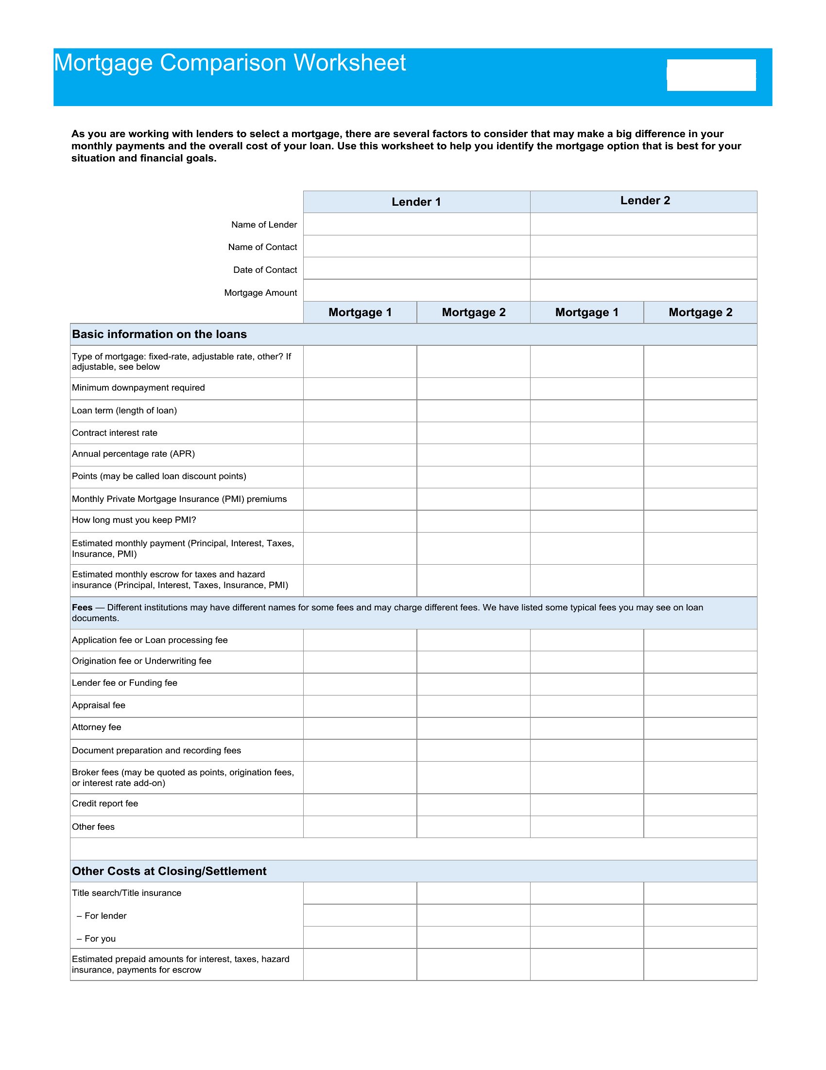
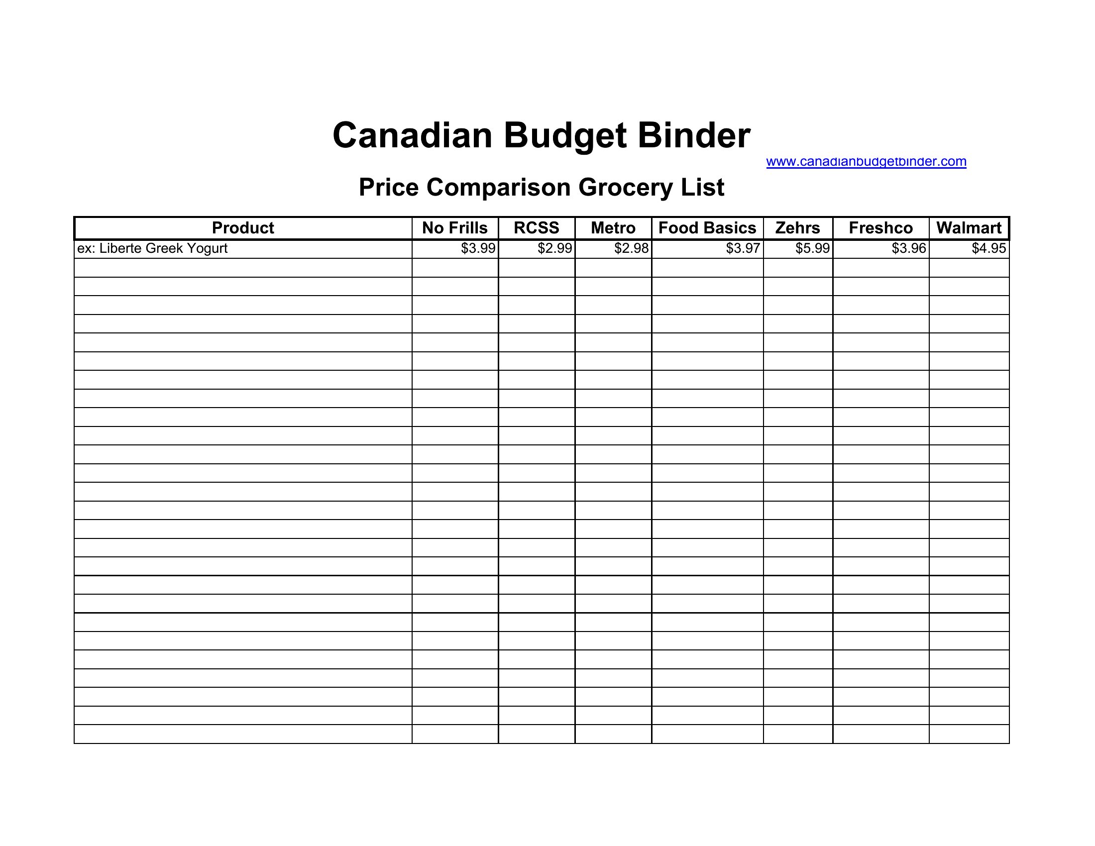
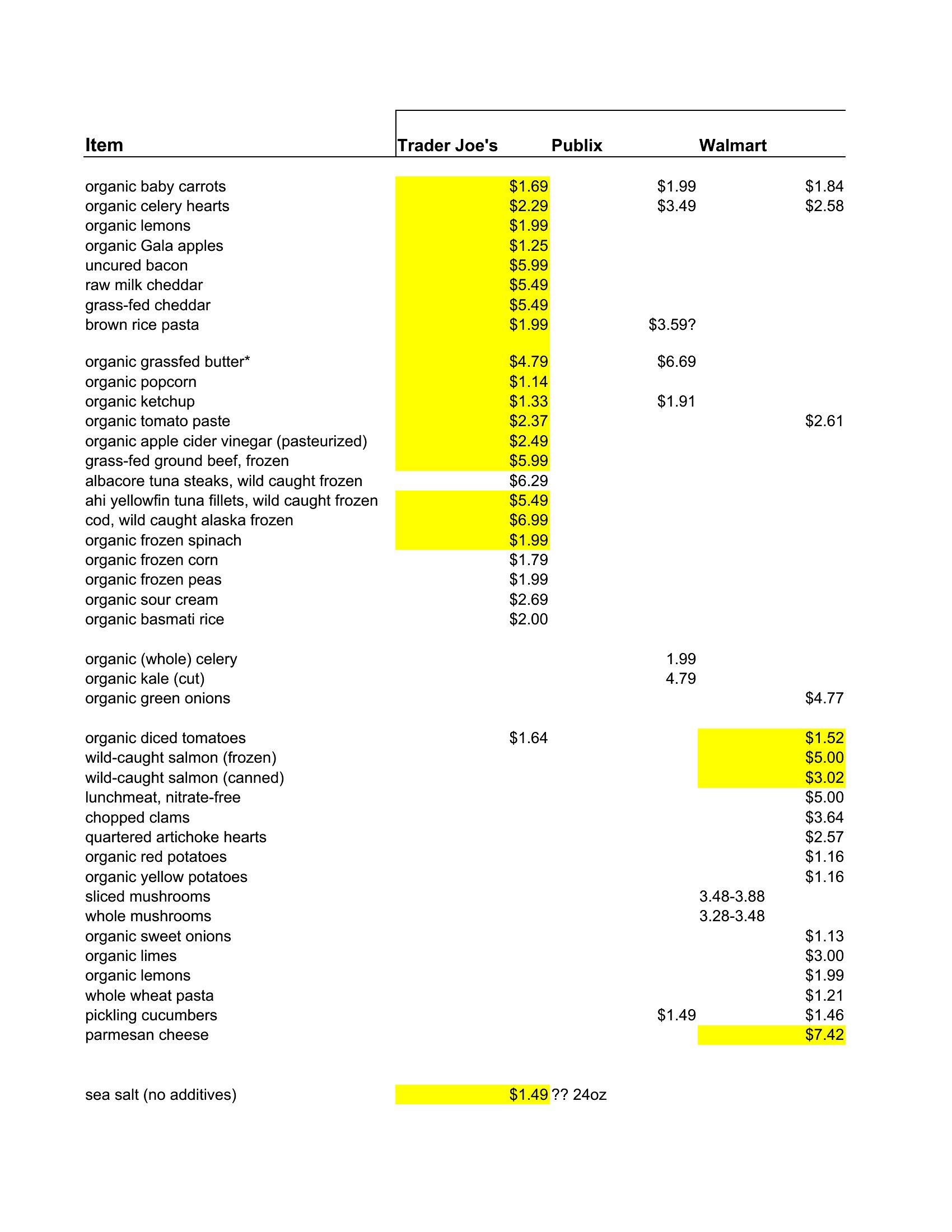
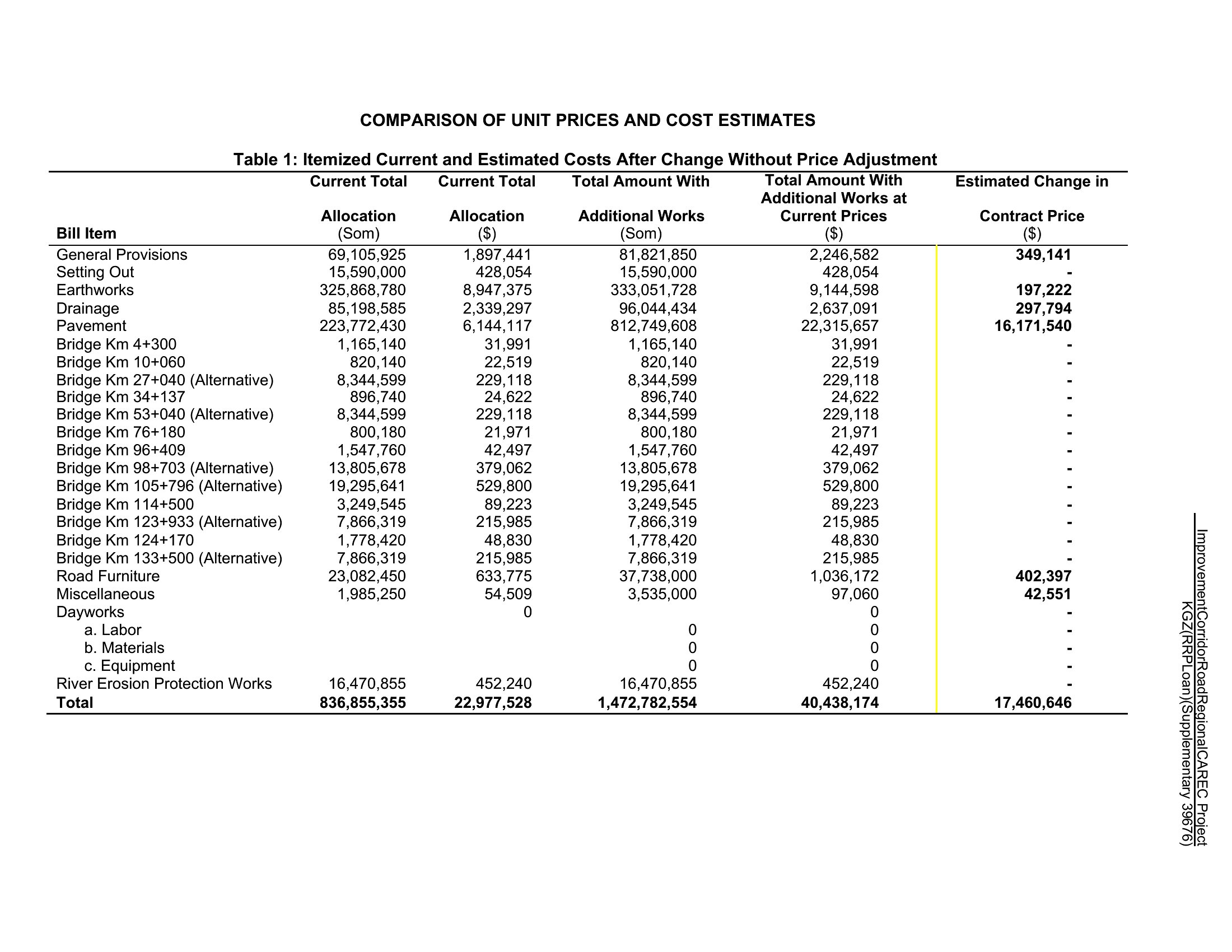
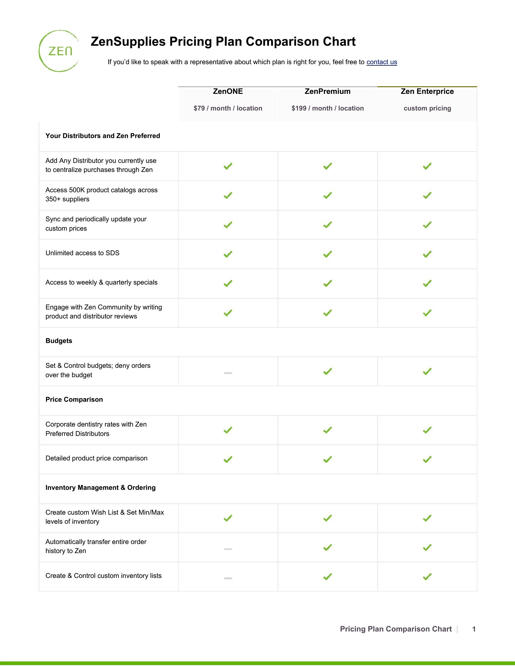
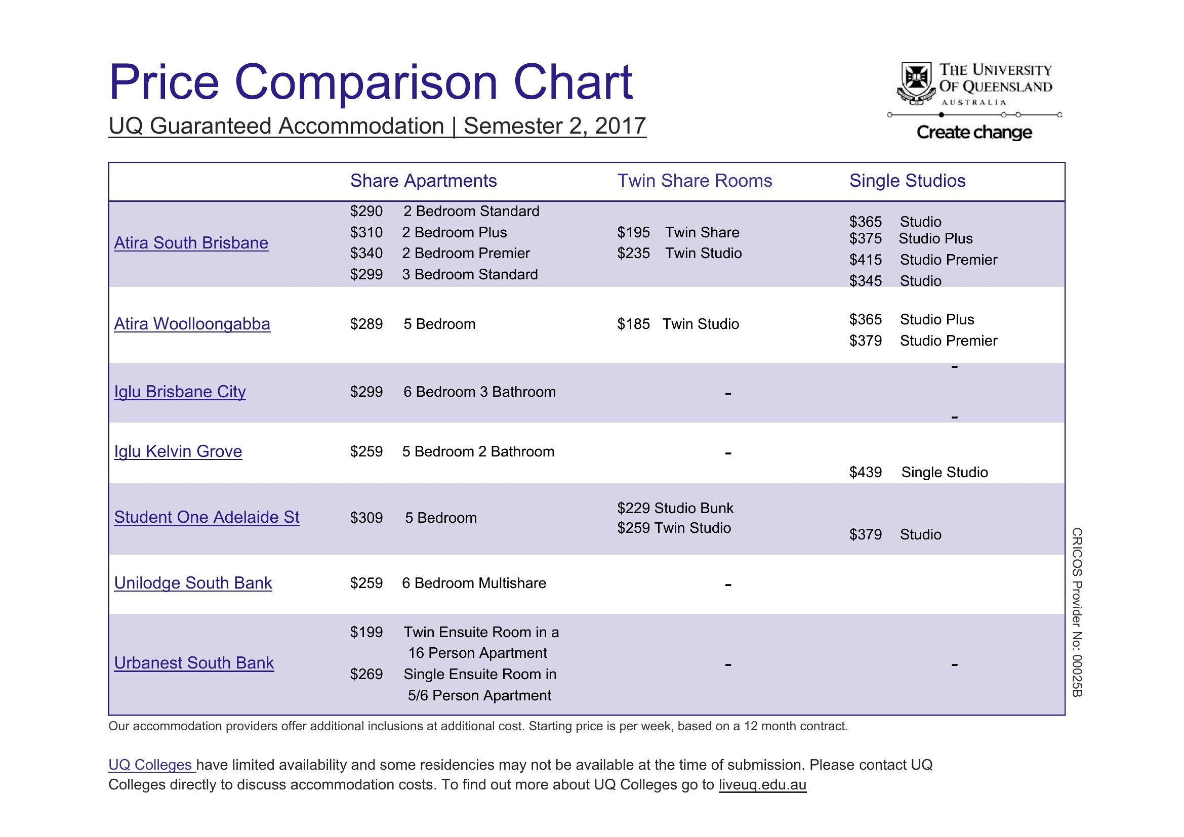
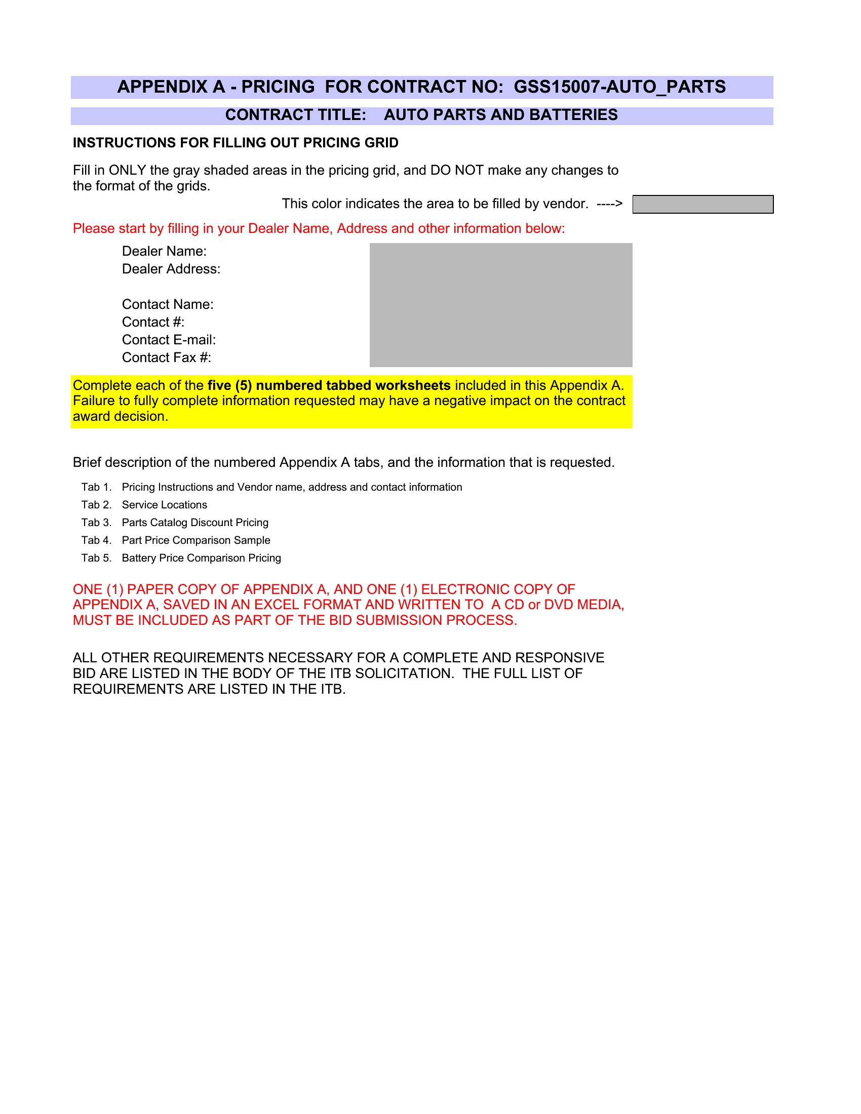
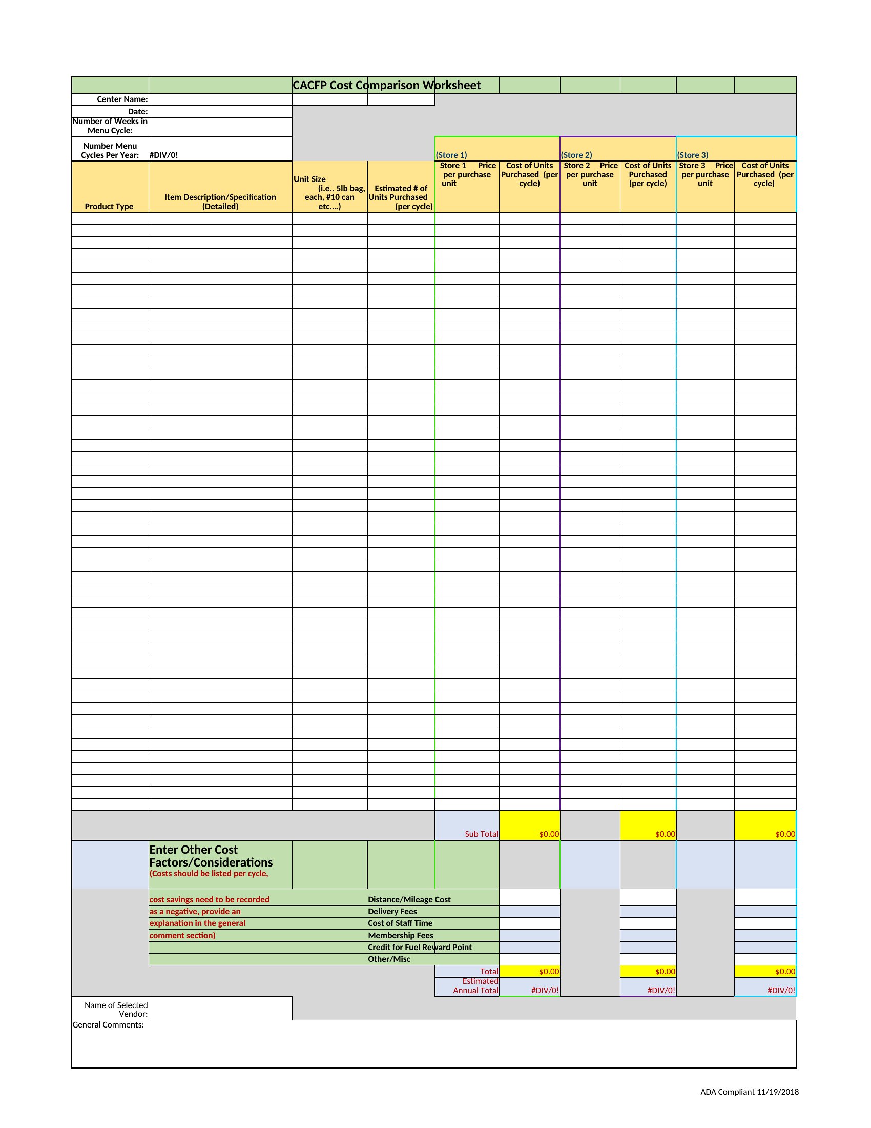

Free Price Comparison Charts (Word, Excel)
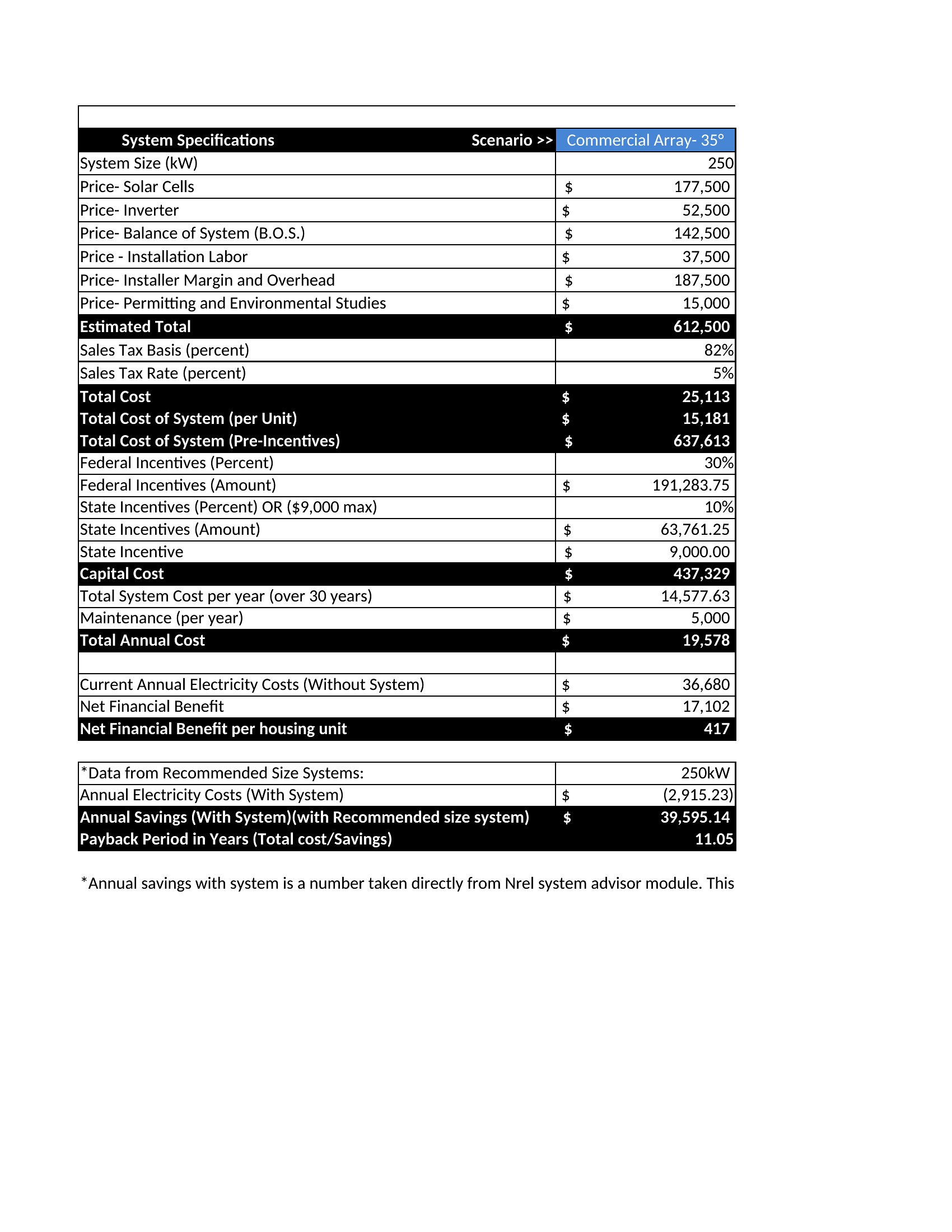
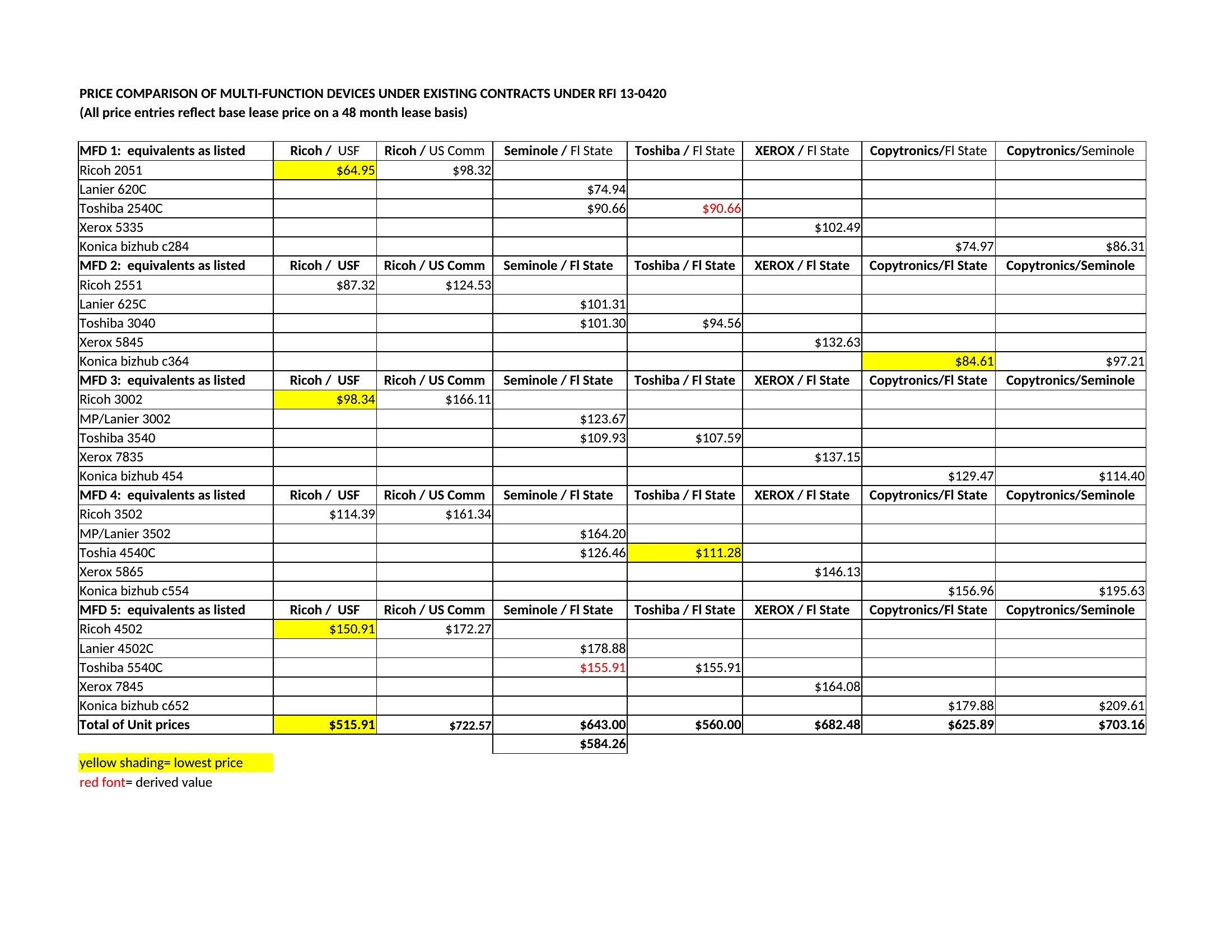
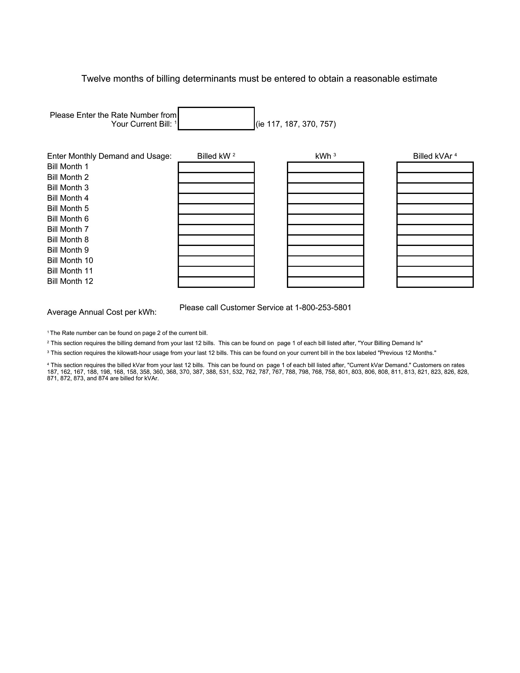
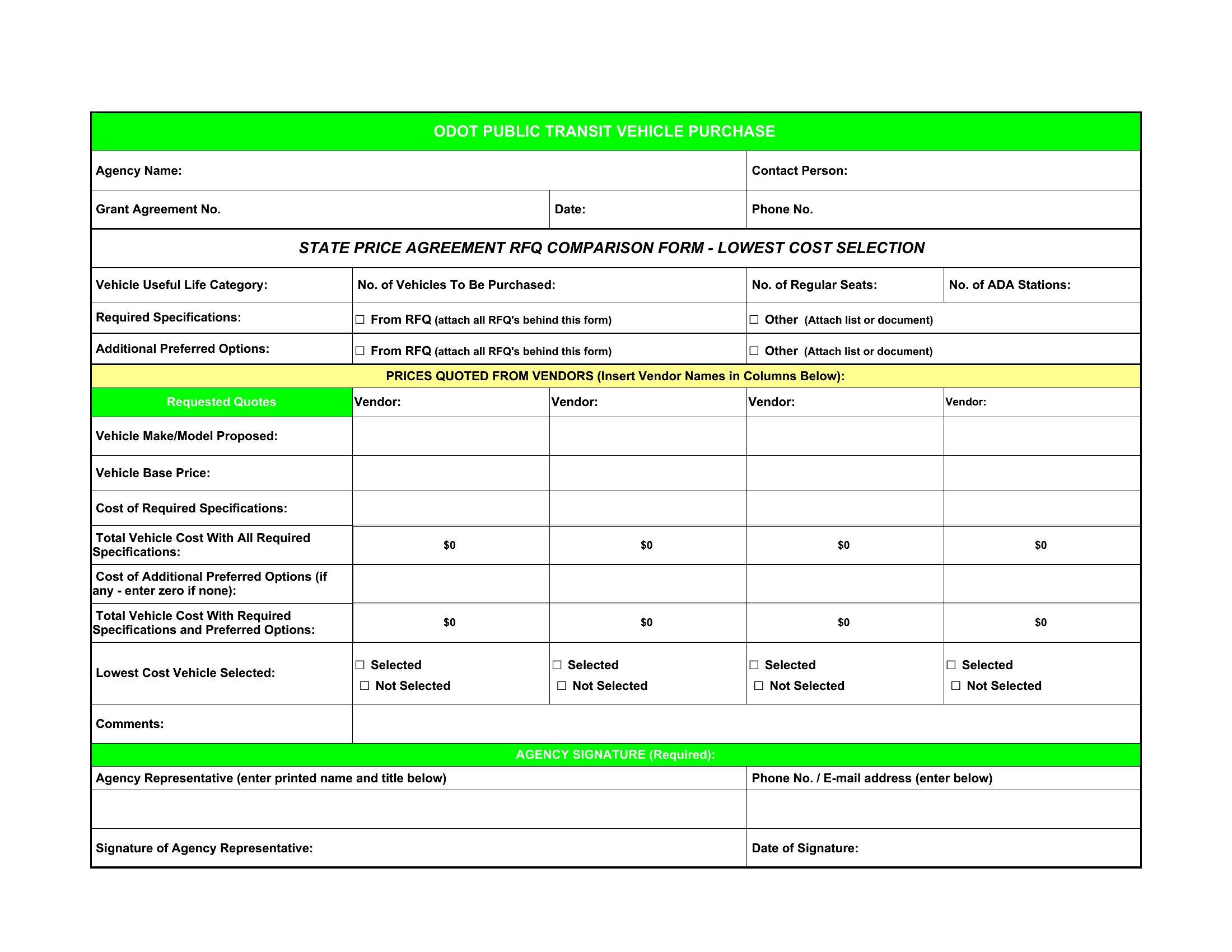
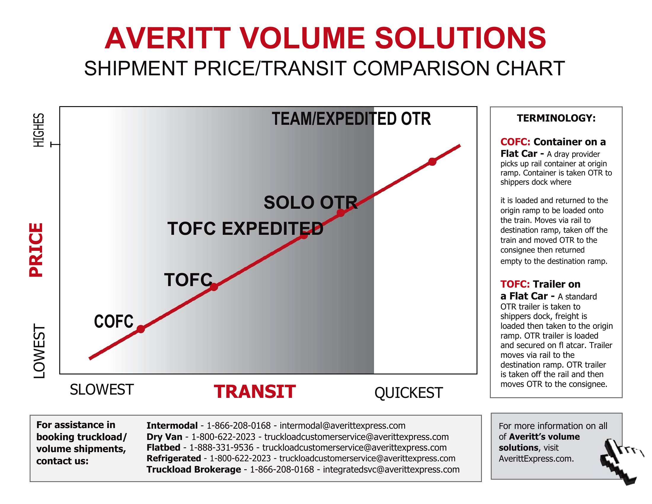
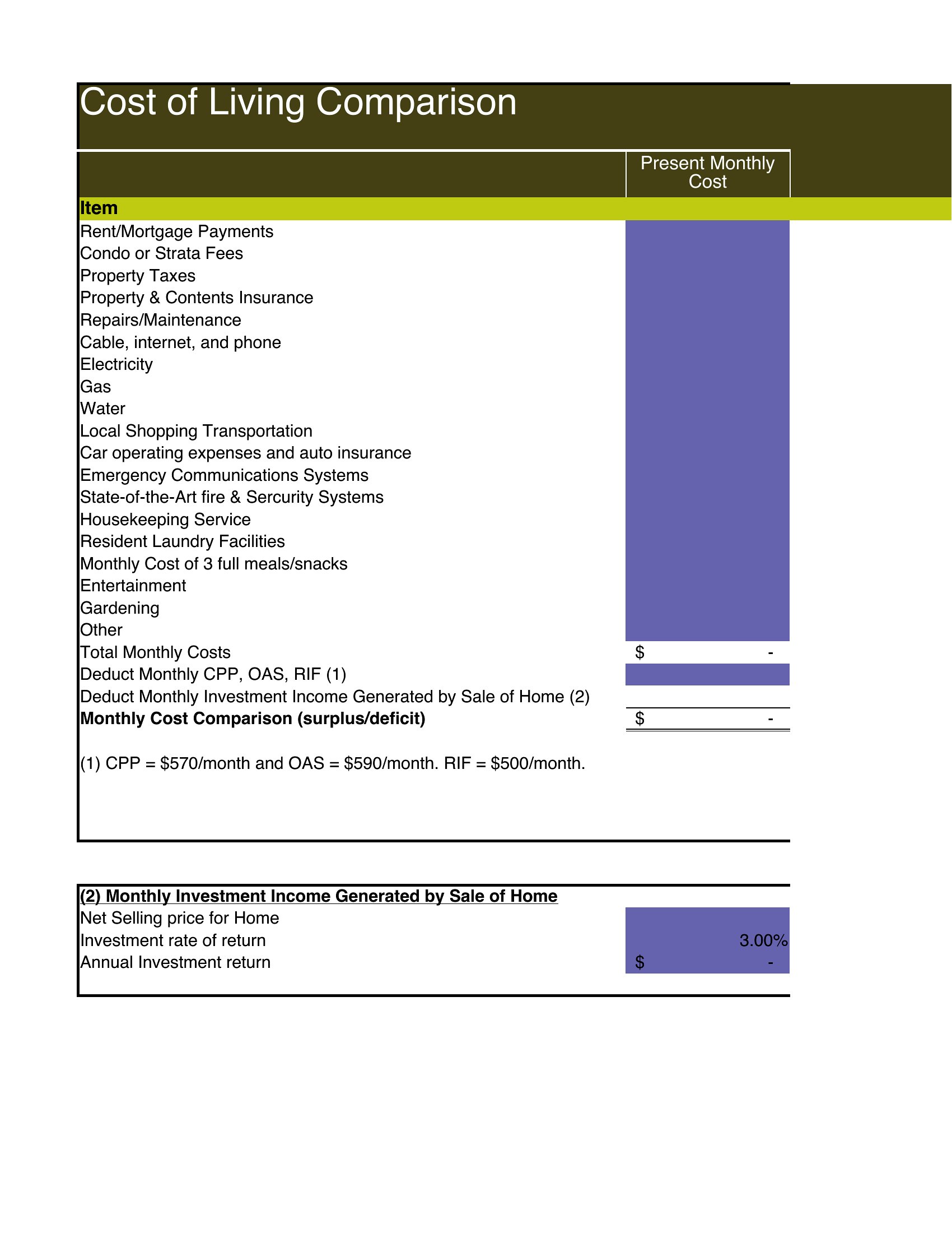
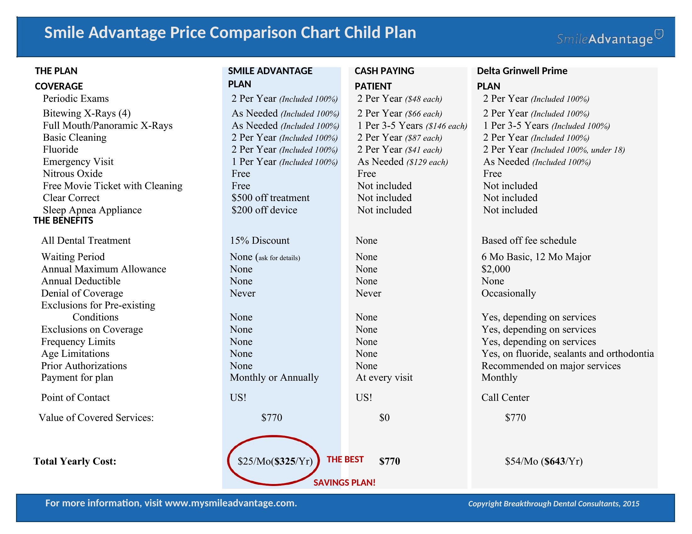
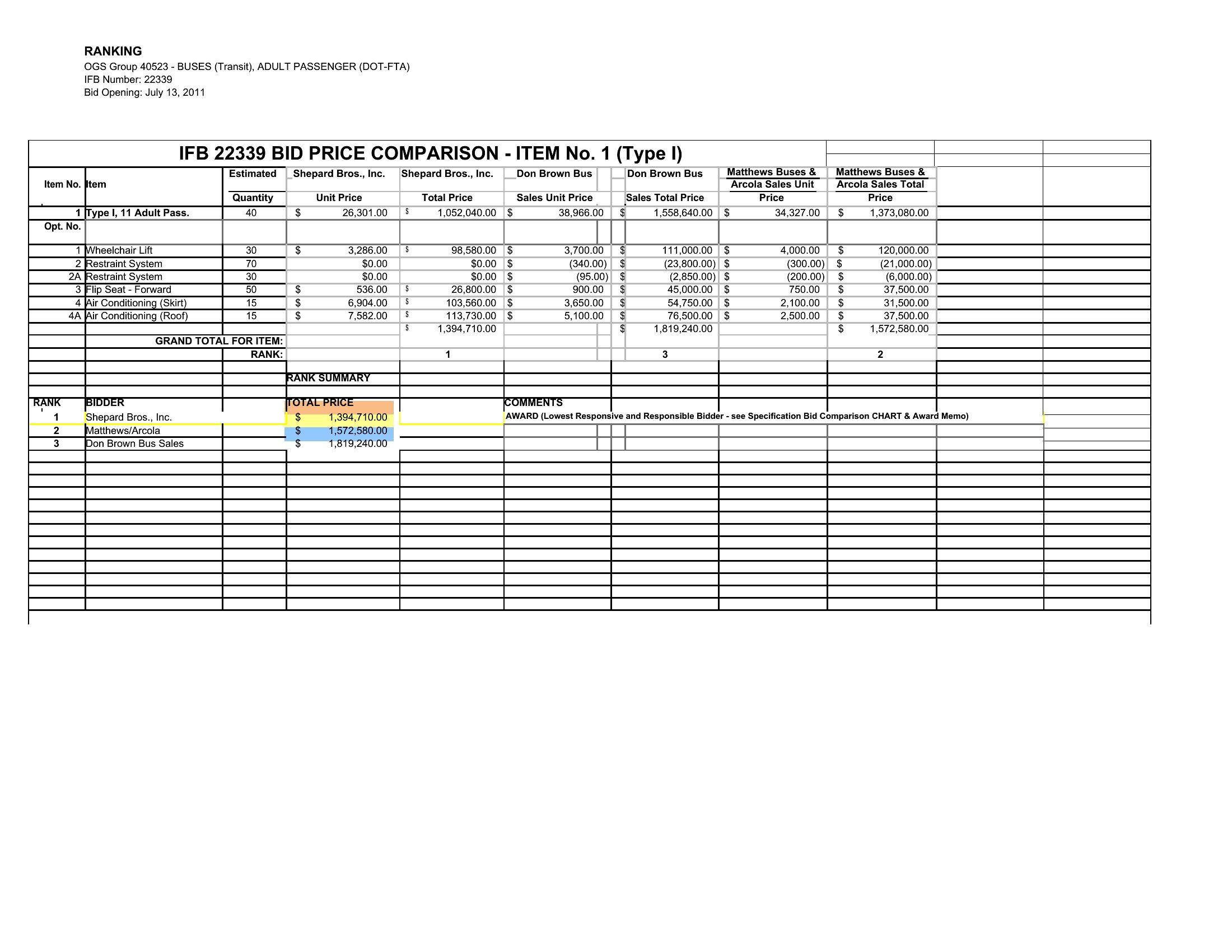
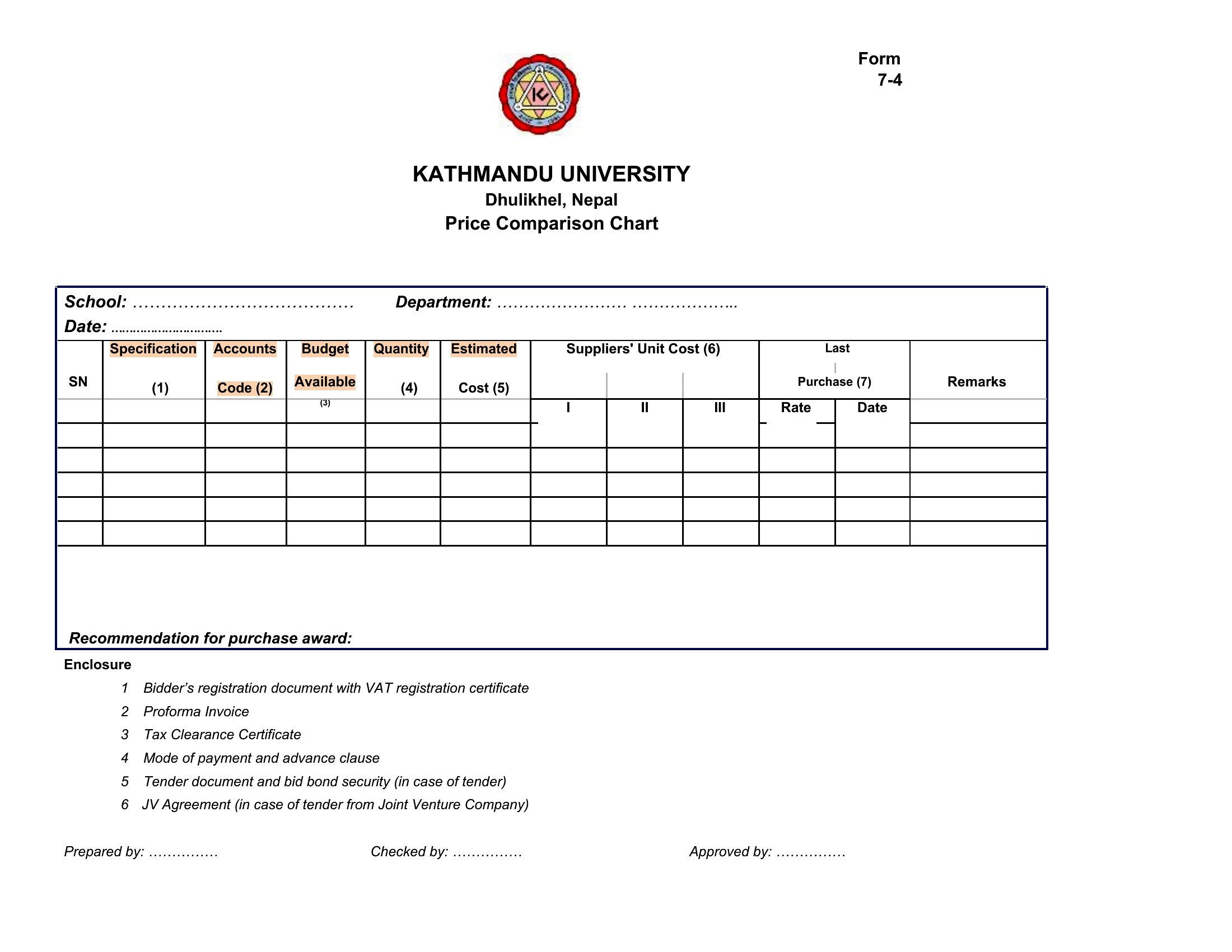
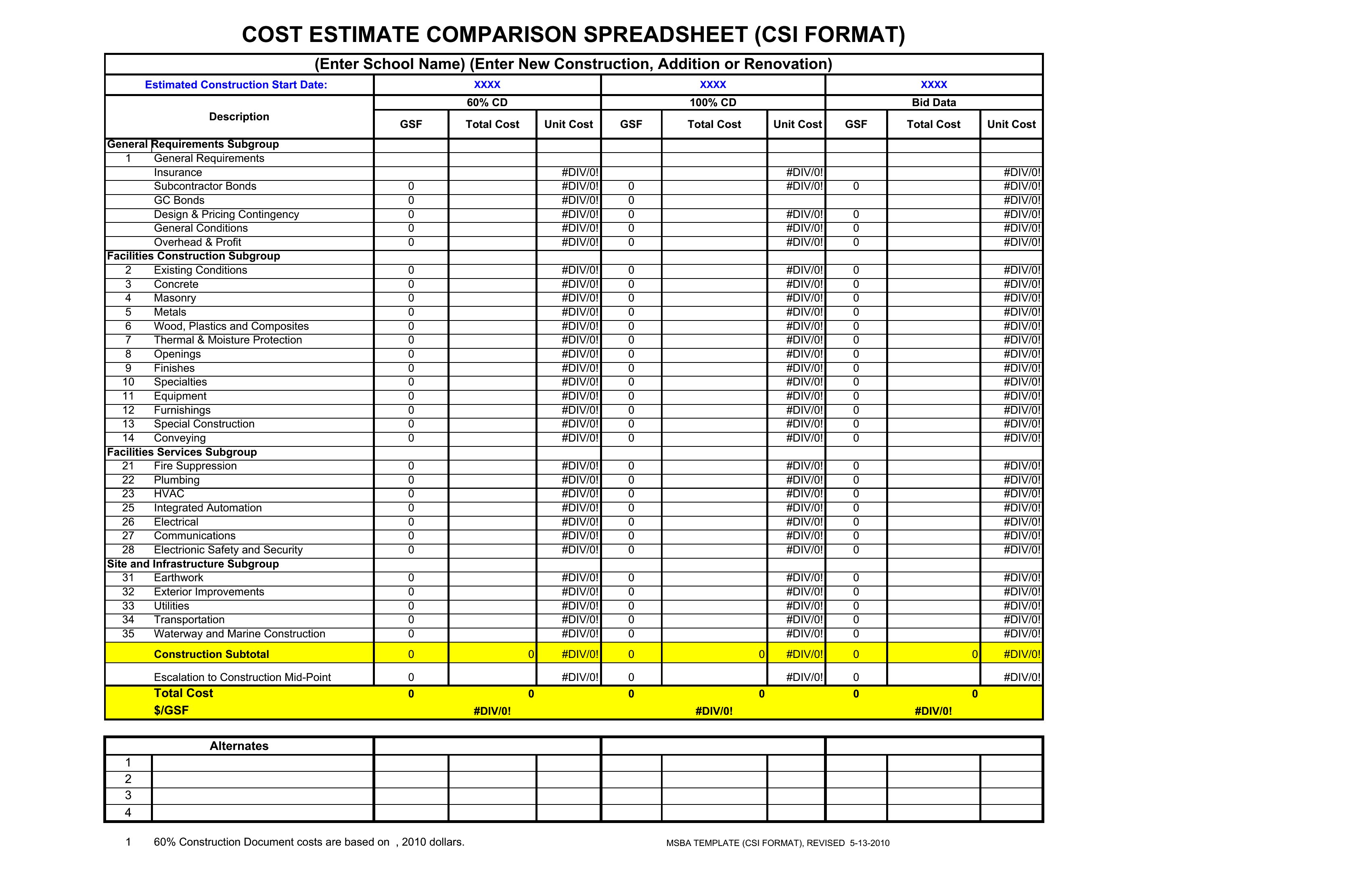
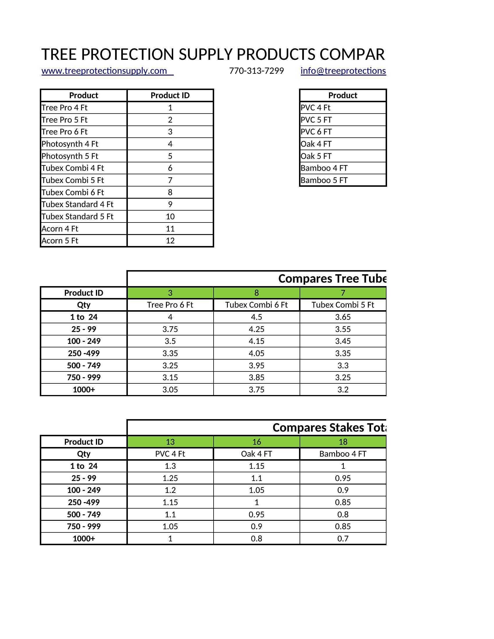
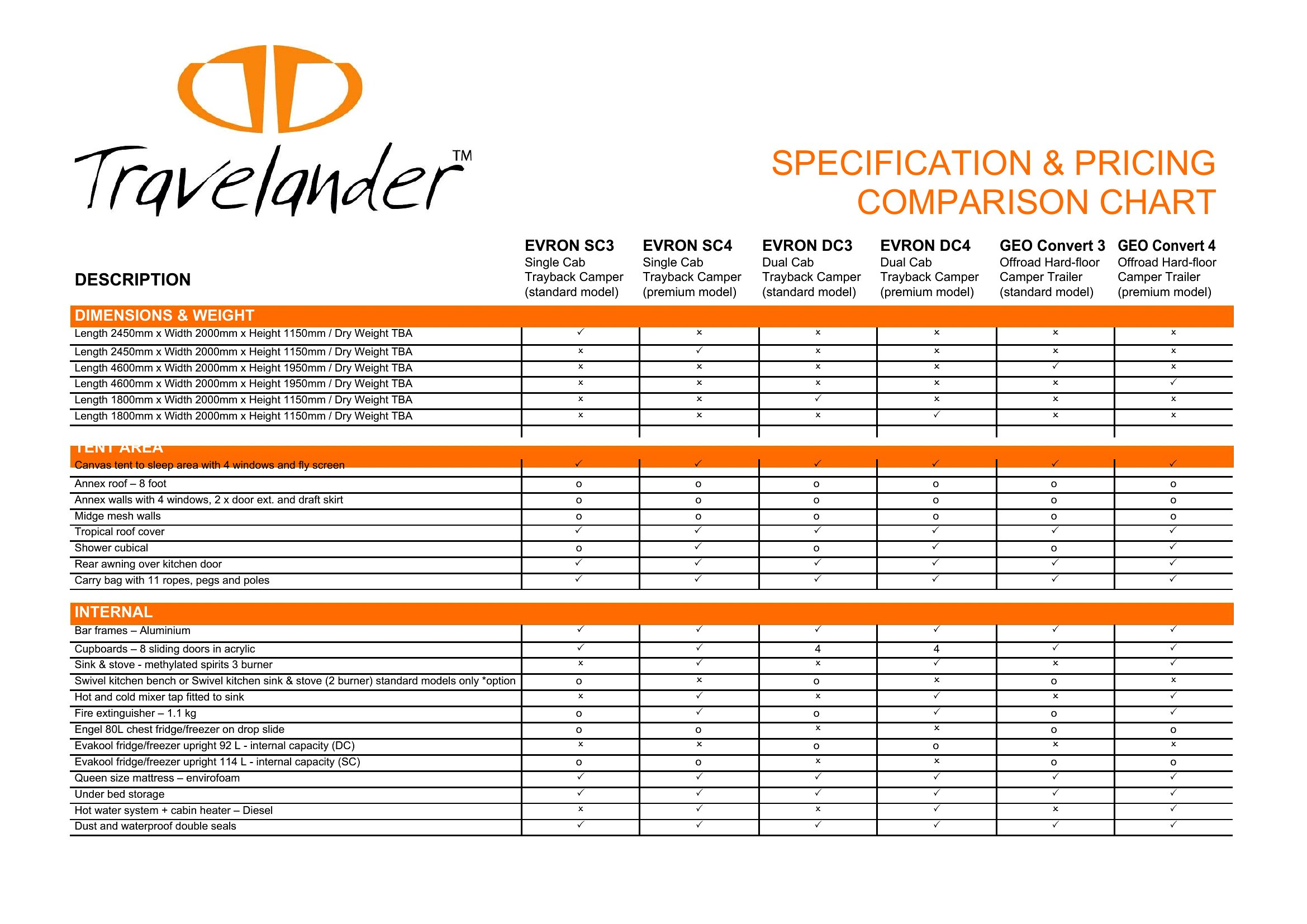
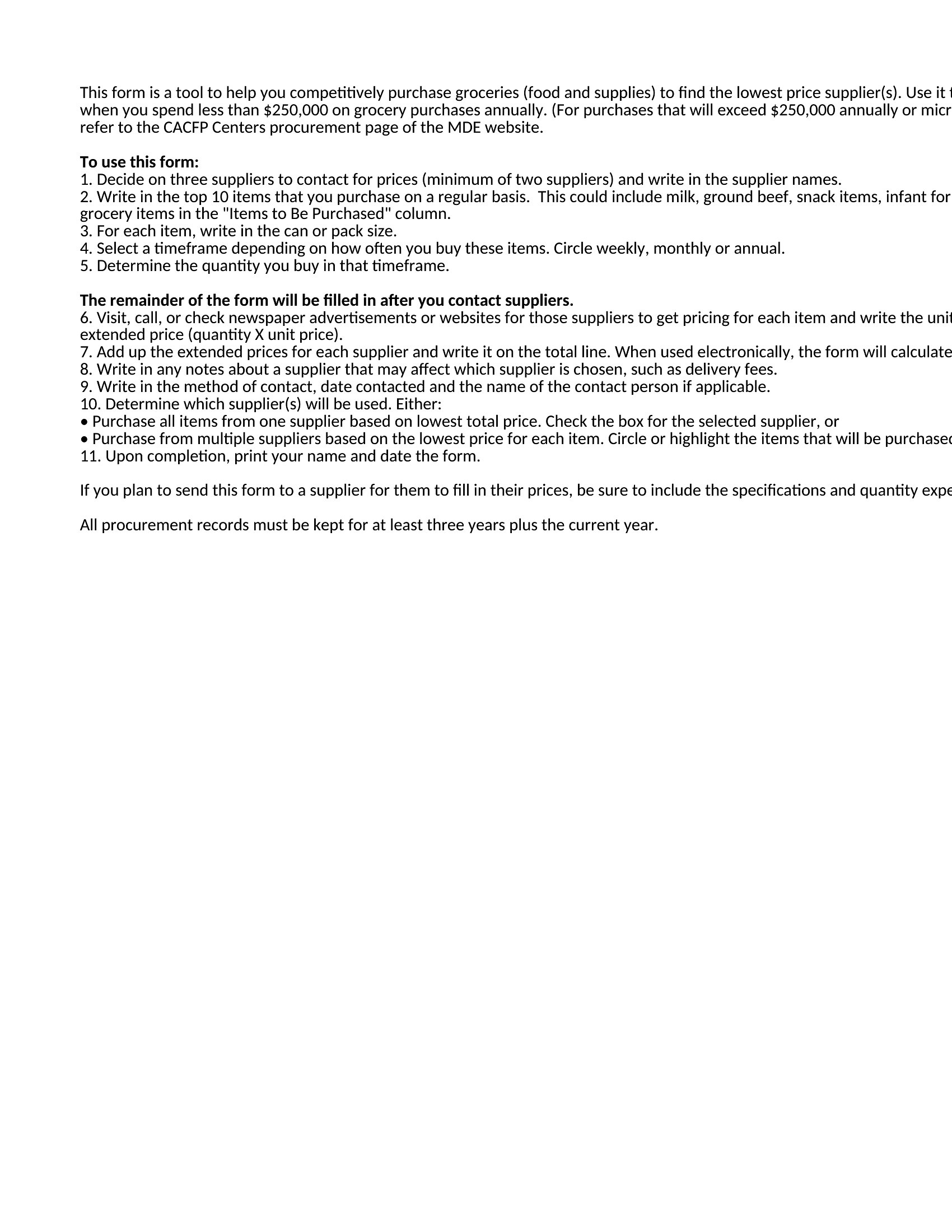
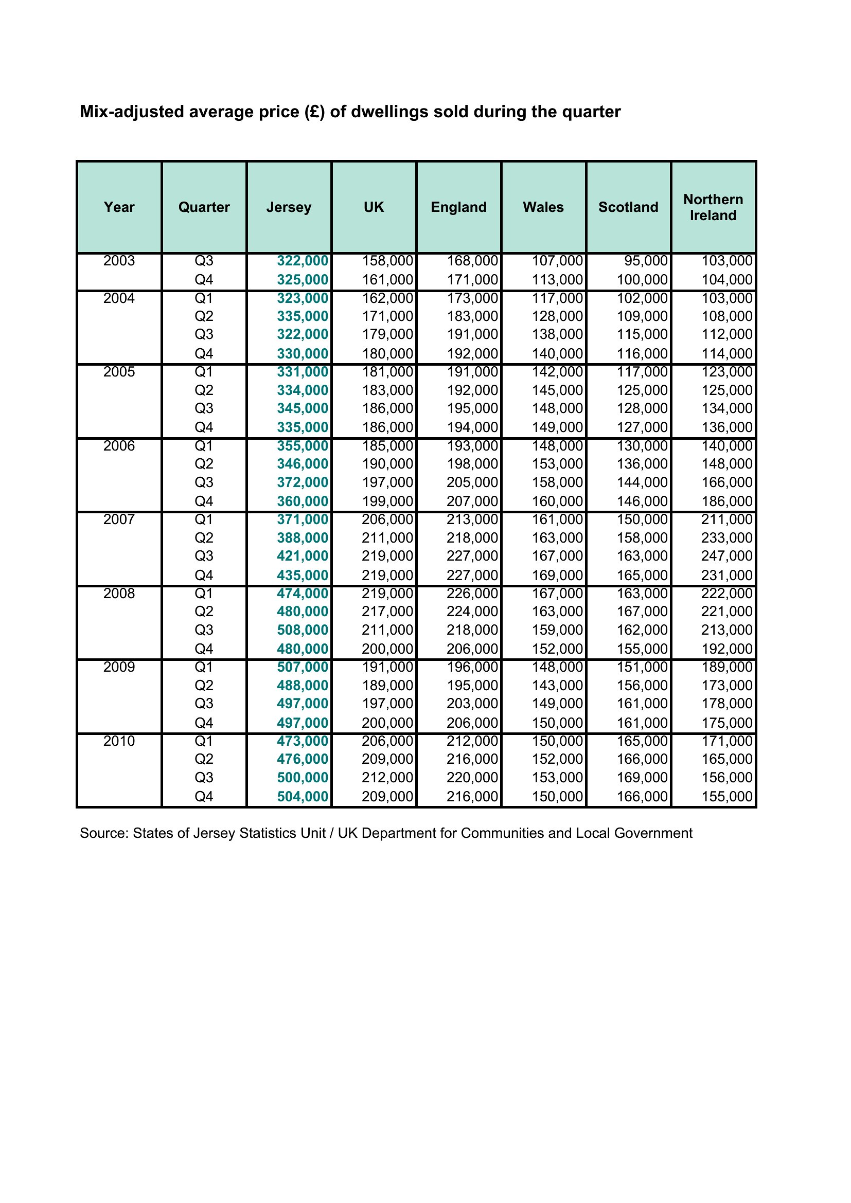
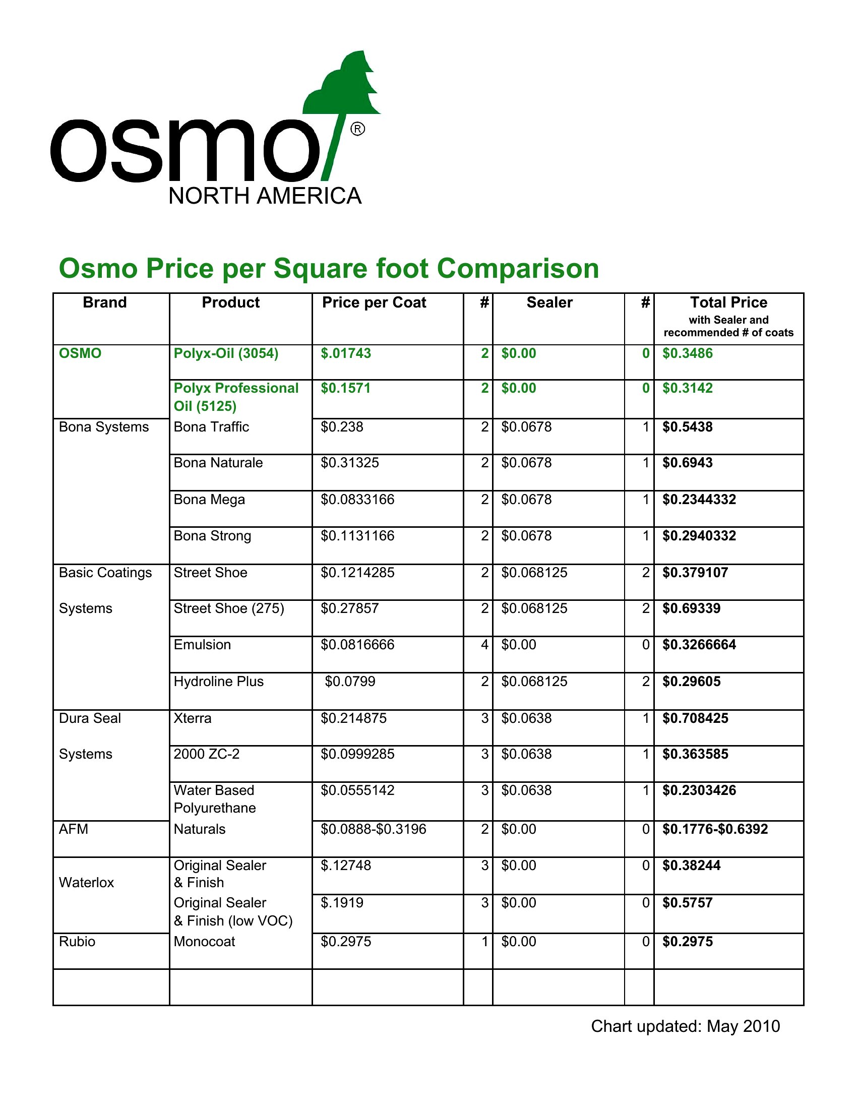
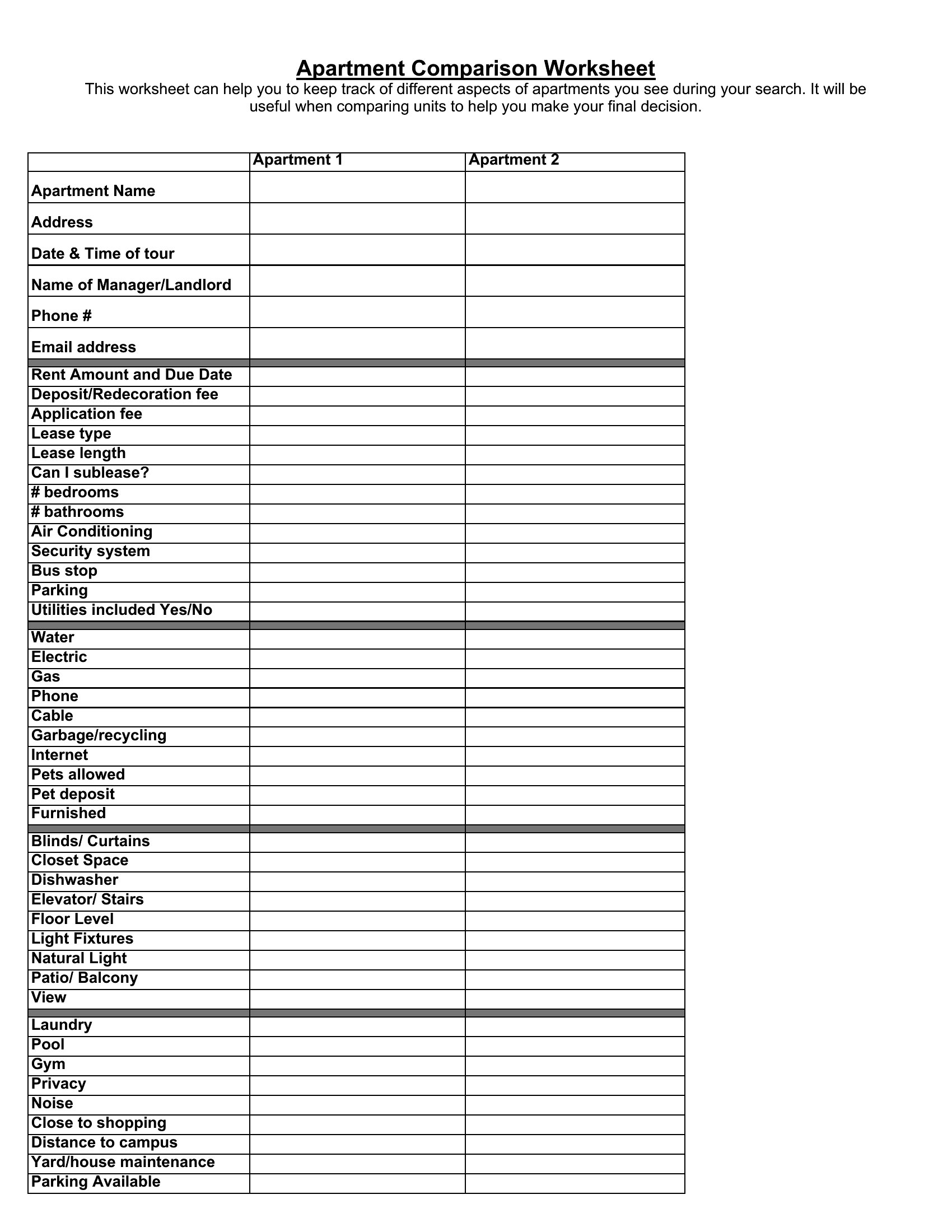
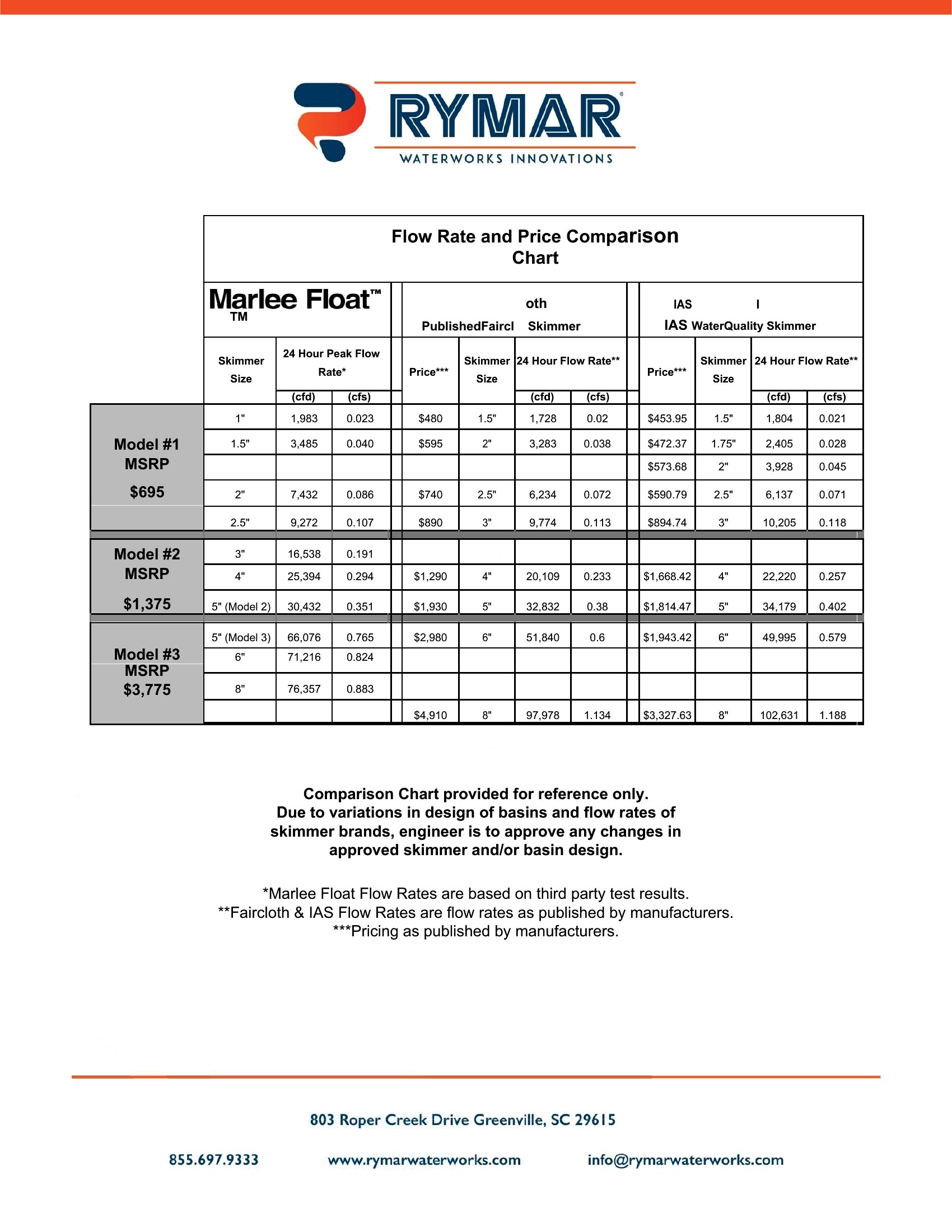
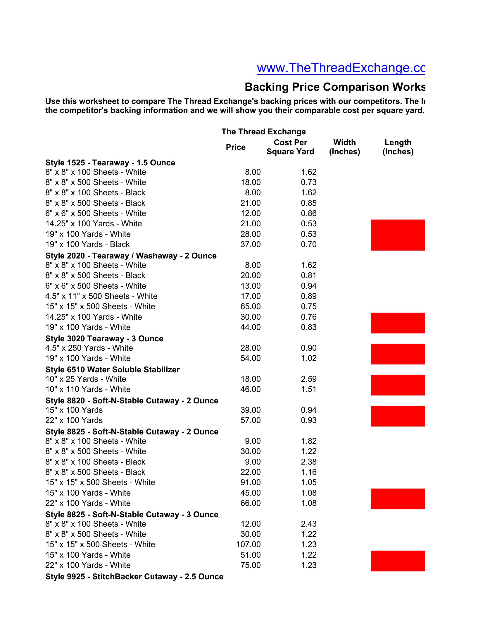
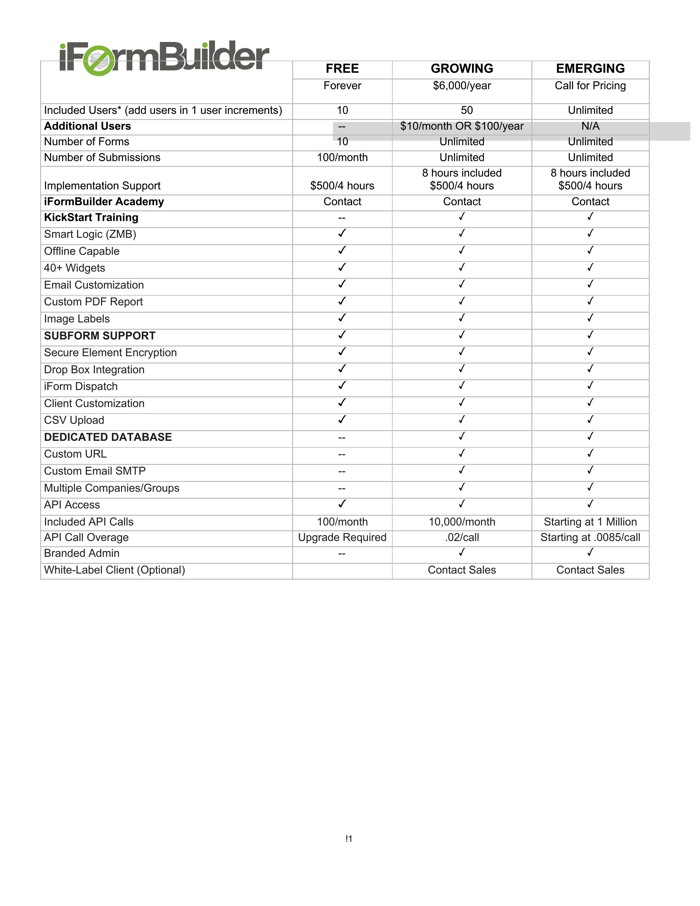
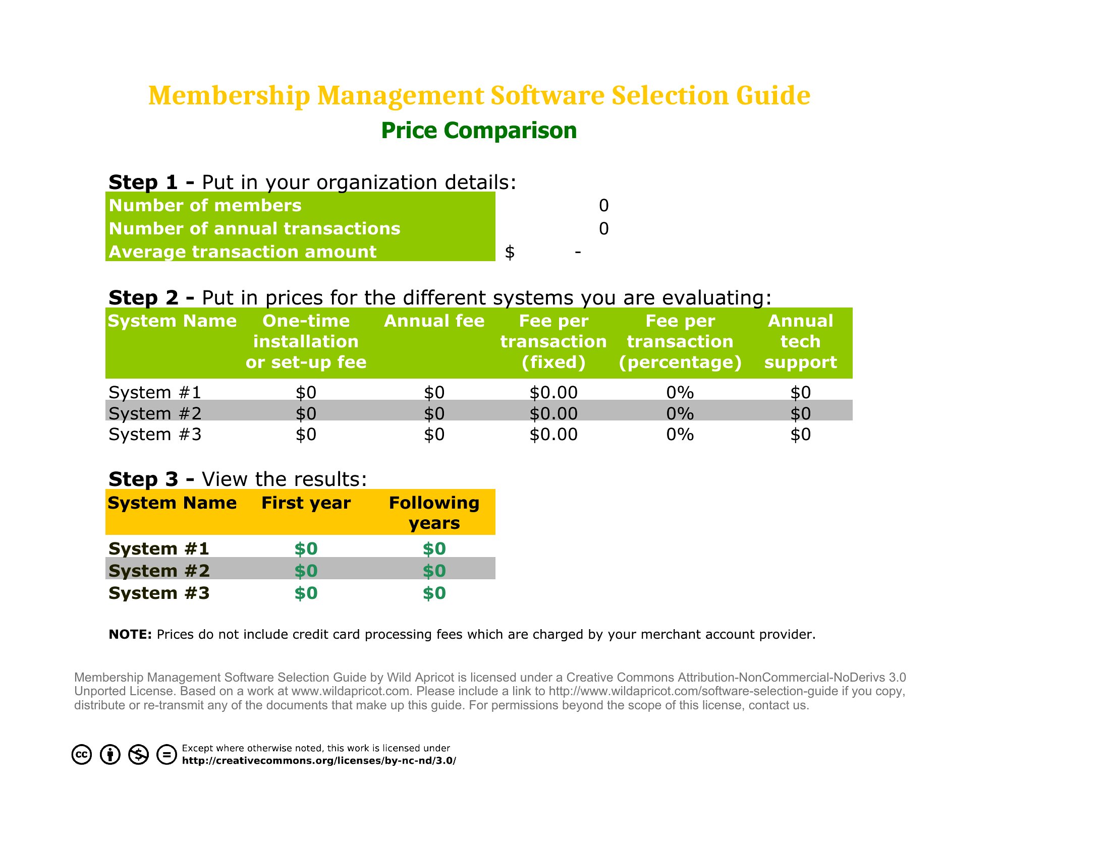
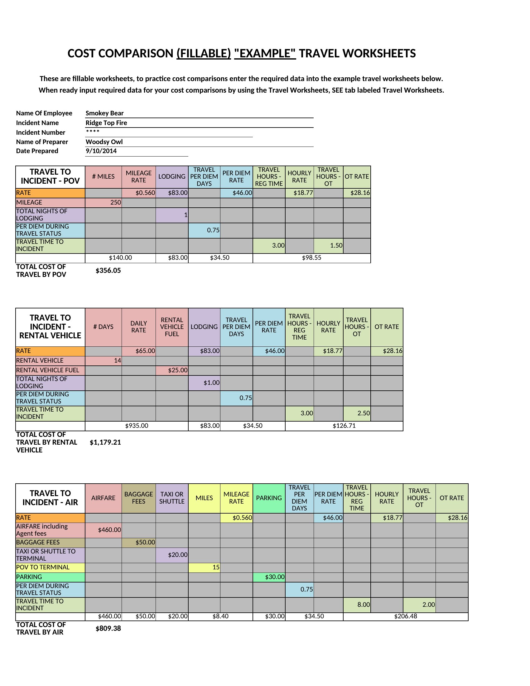
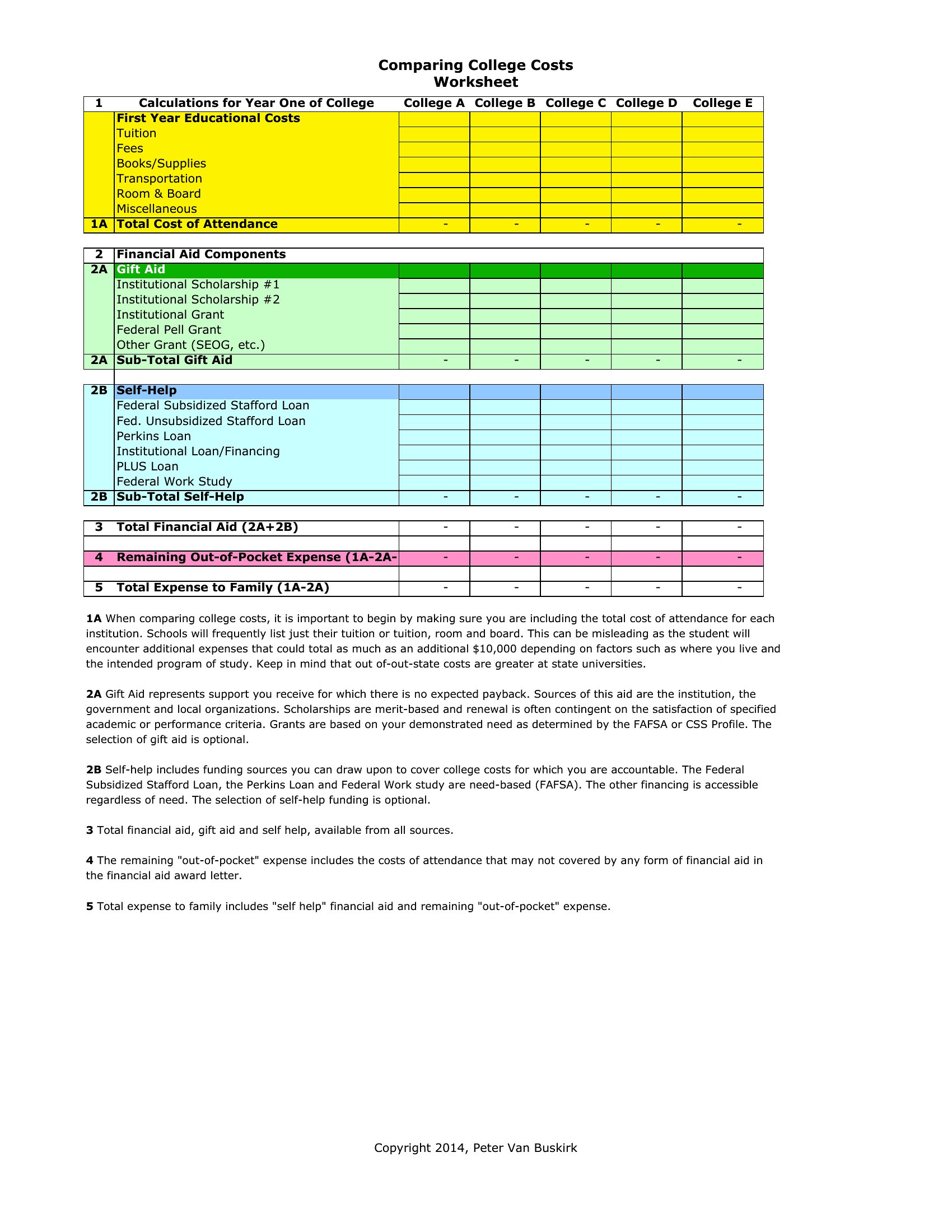
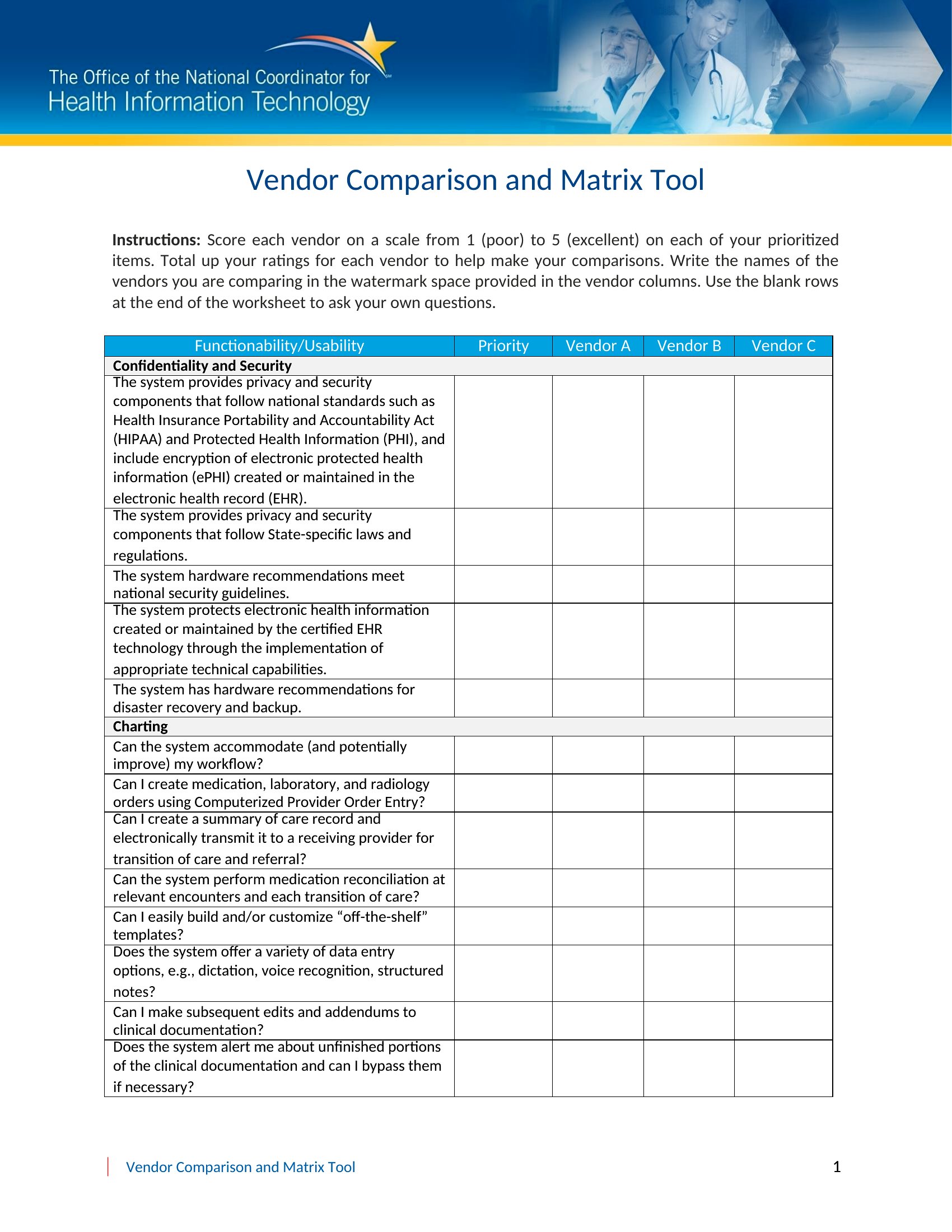
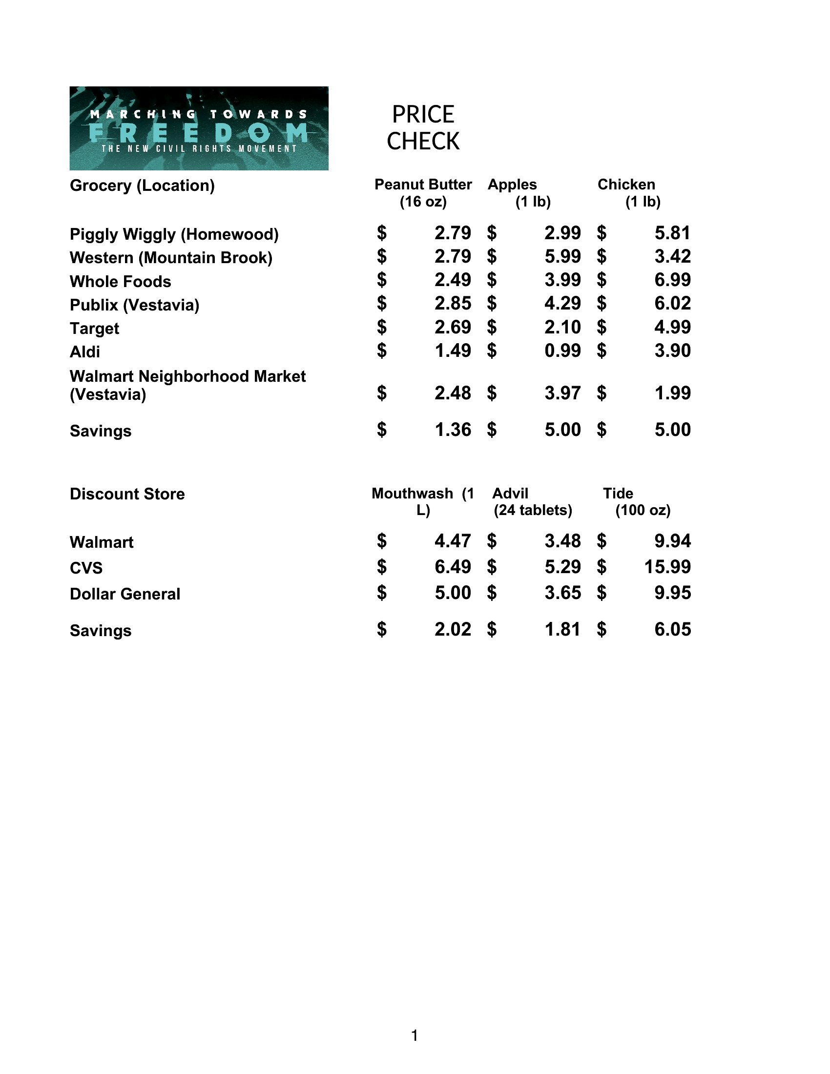
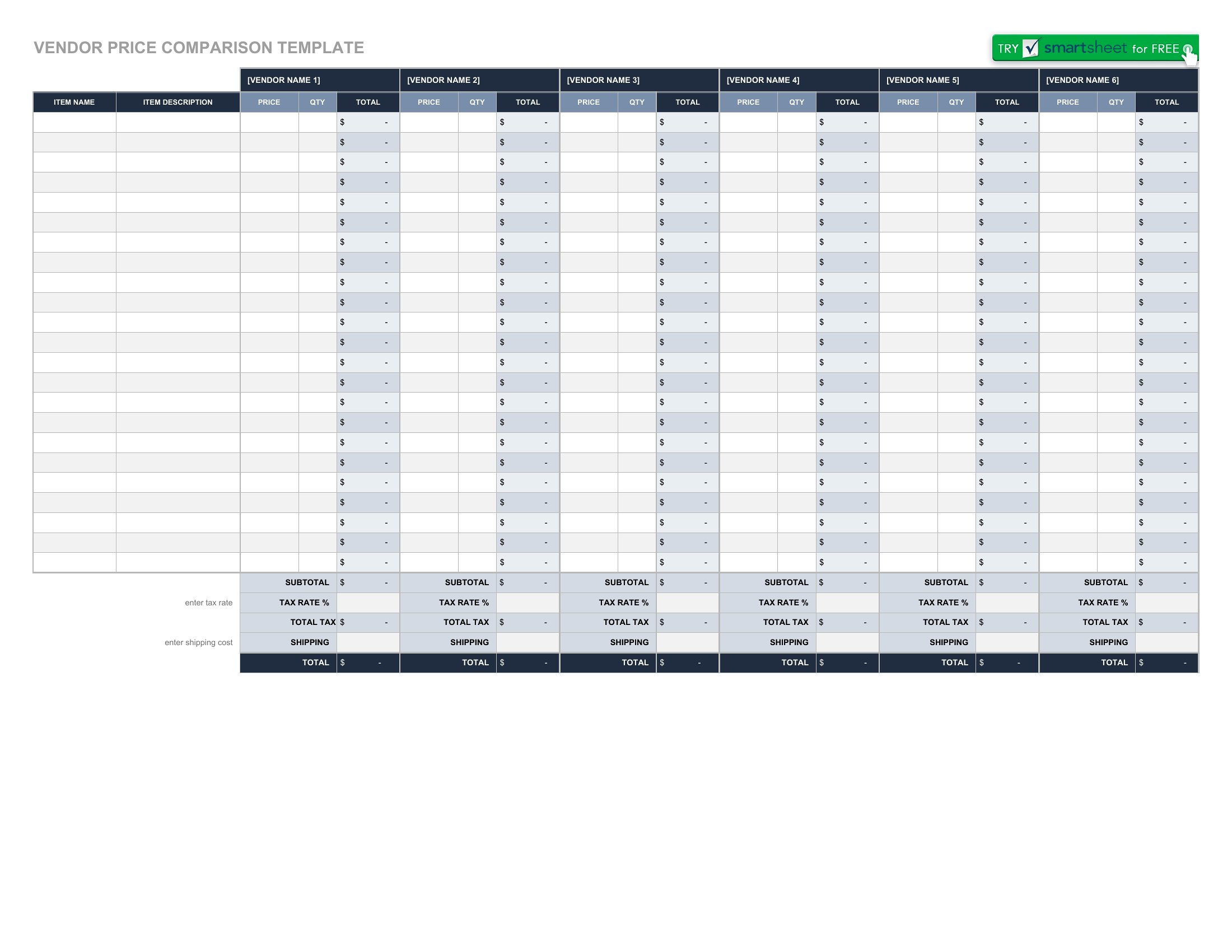
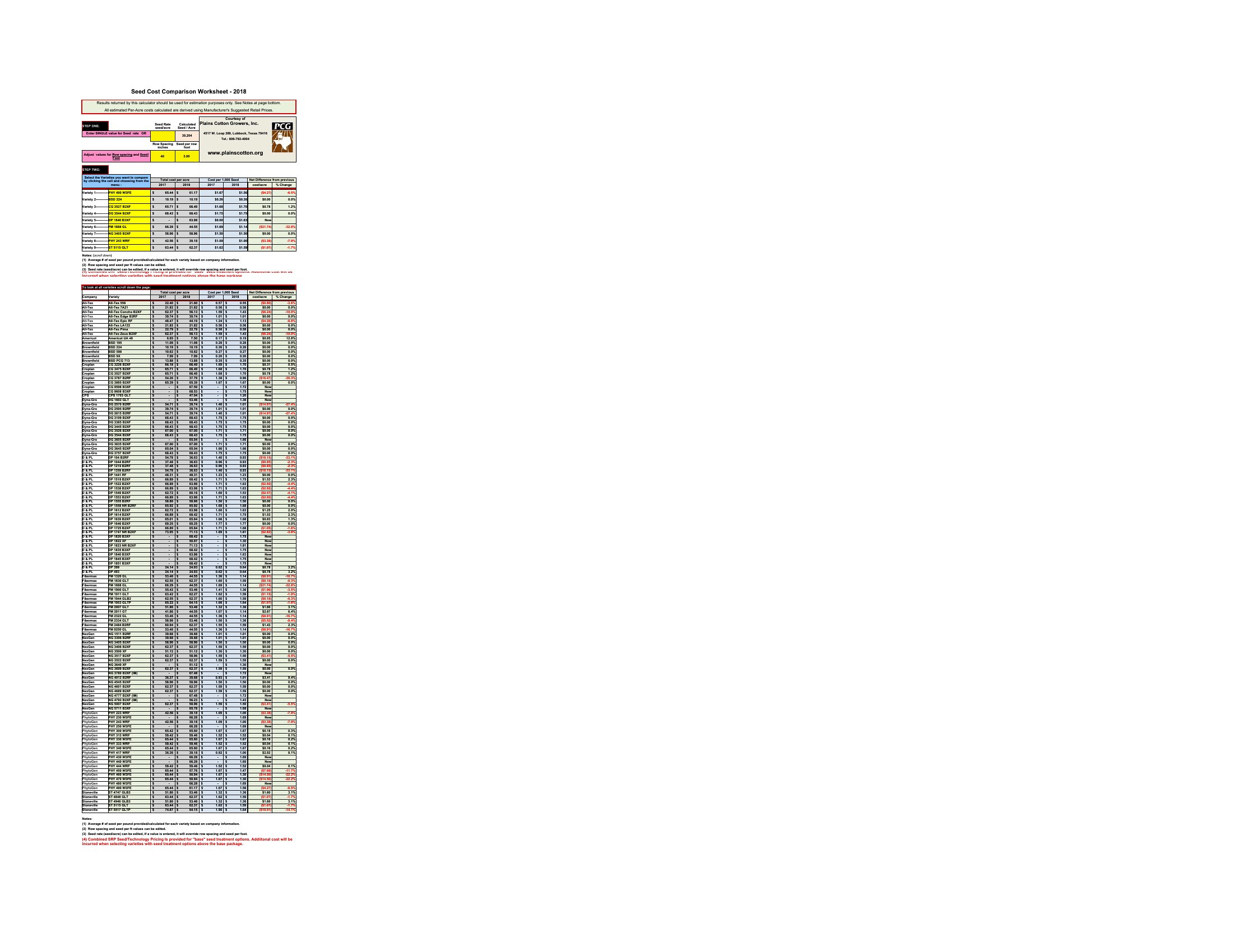
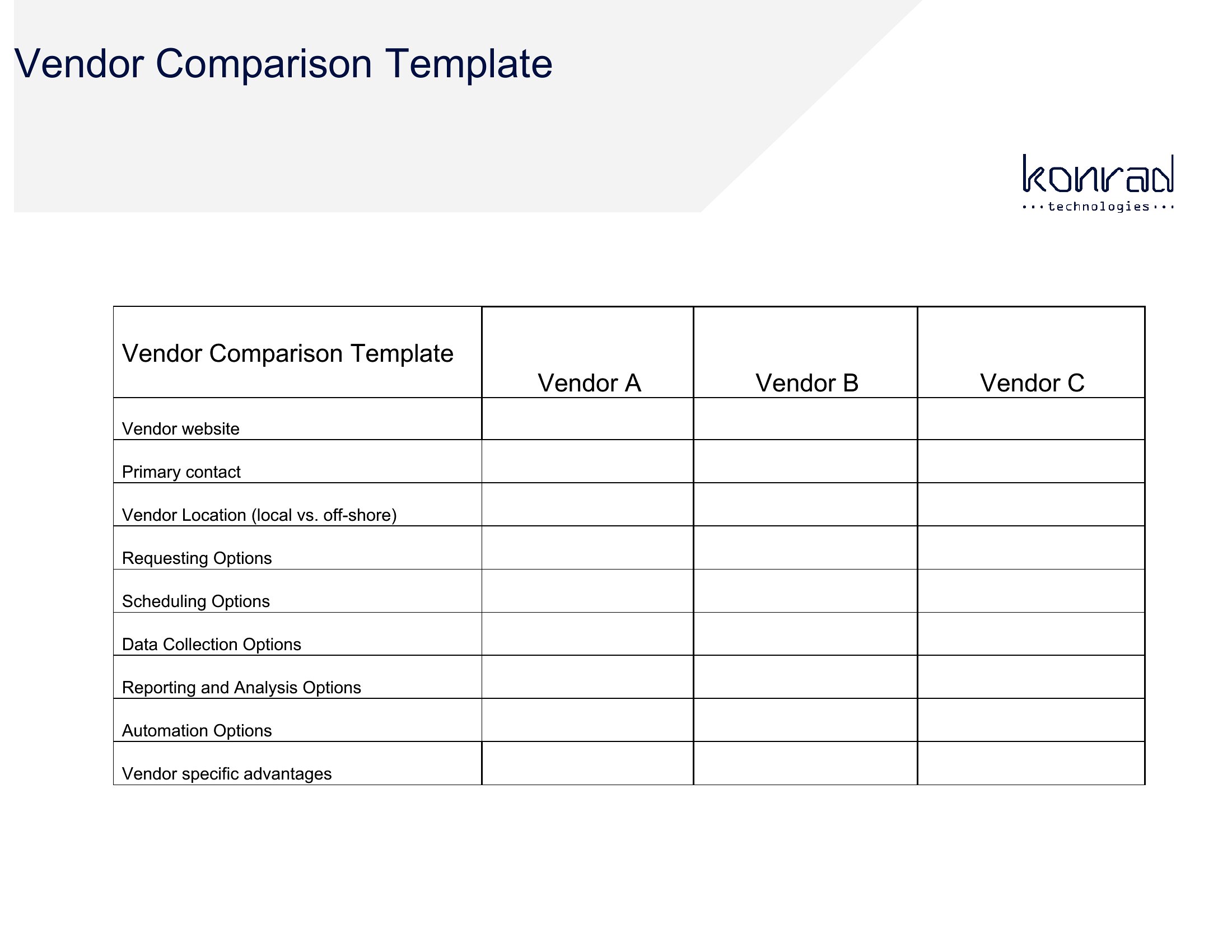
WorksheetsChoosing between vendors or products gets easier when the options sit side by side. This set of 53 price comparison charts lets you line up suppliers, features, and costs so the best value stands out. Shoppers, purchasing managers, and small-business owners can use one to compare quotes without juggling a dozen browser tabs and scribbled notes.
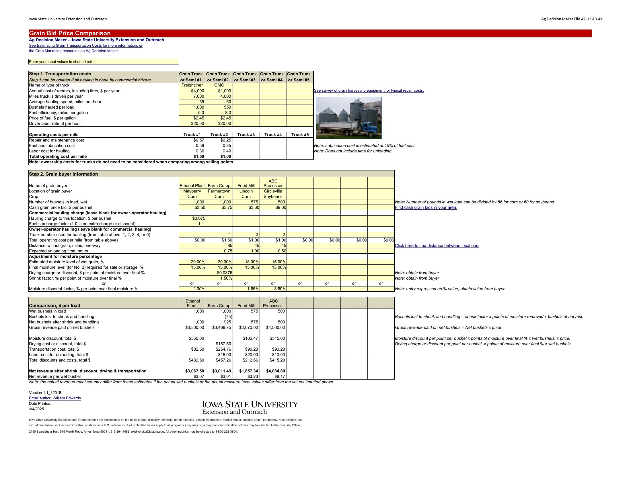
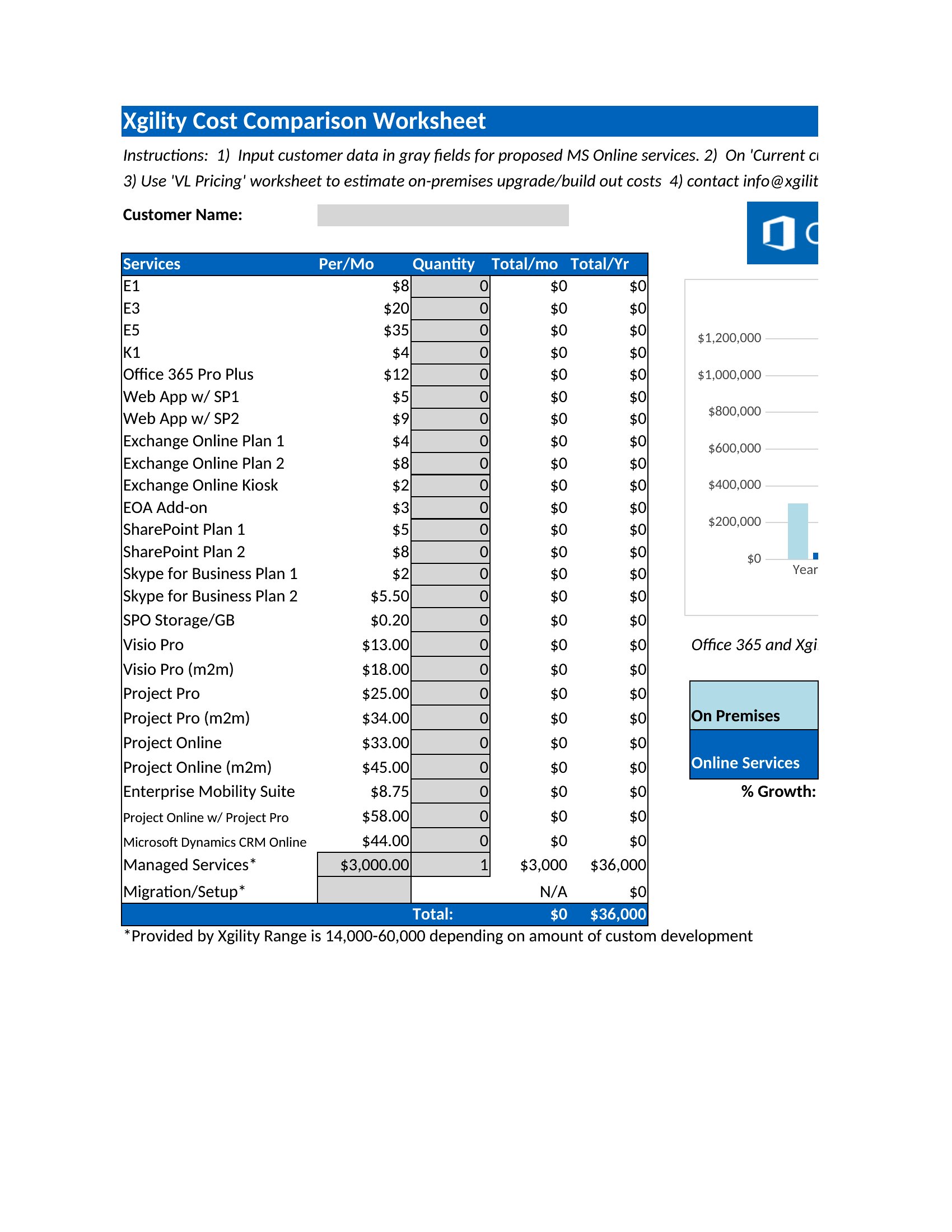
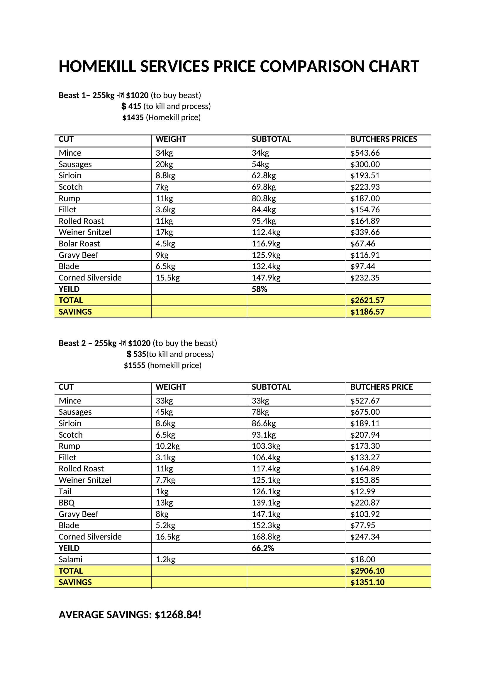
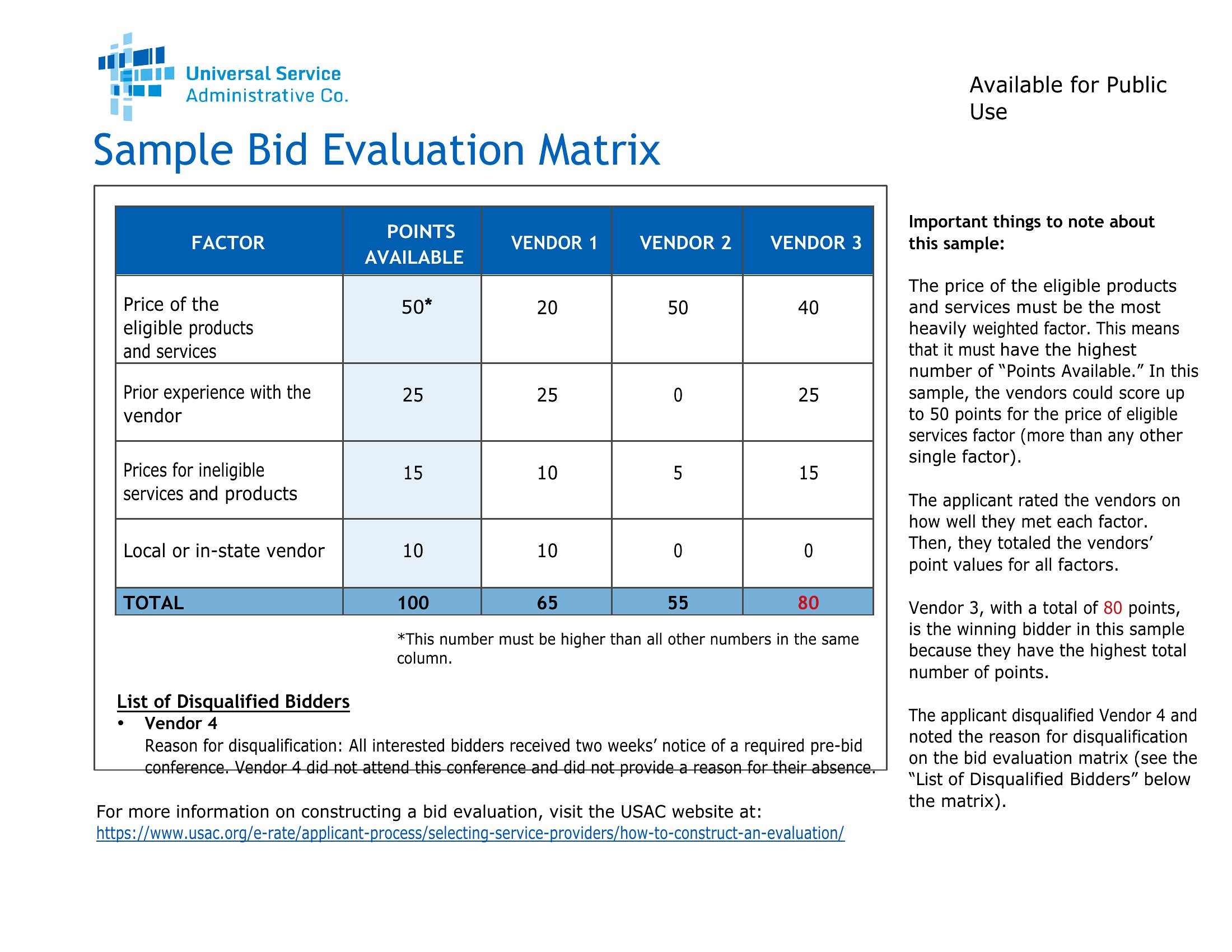
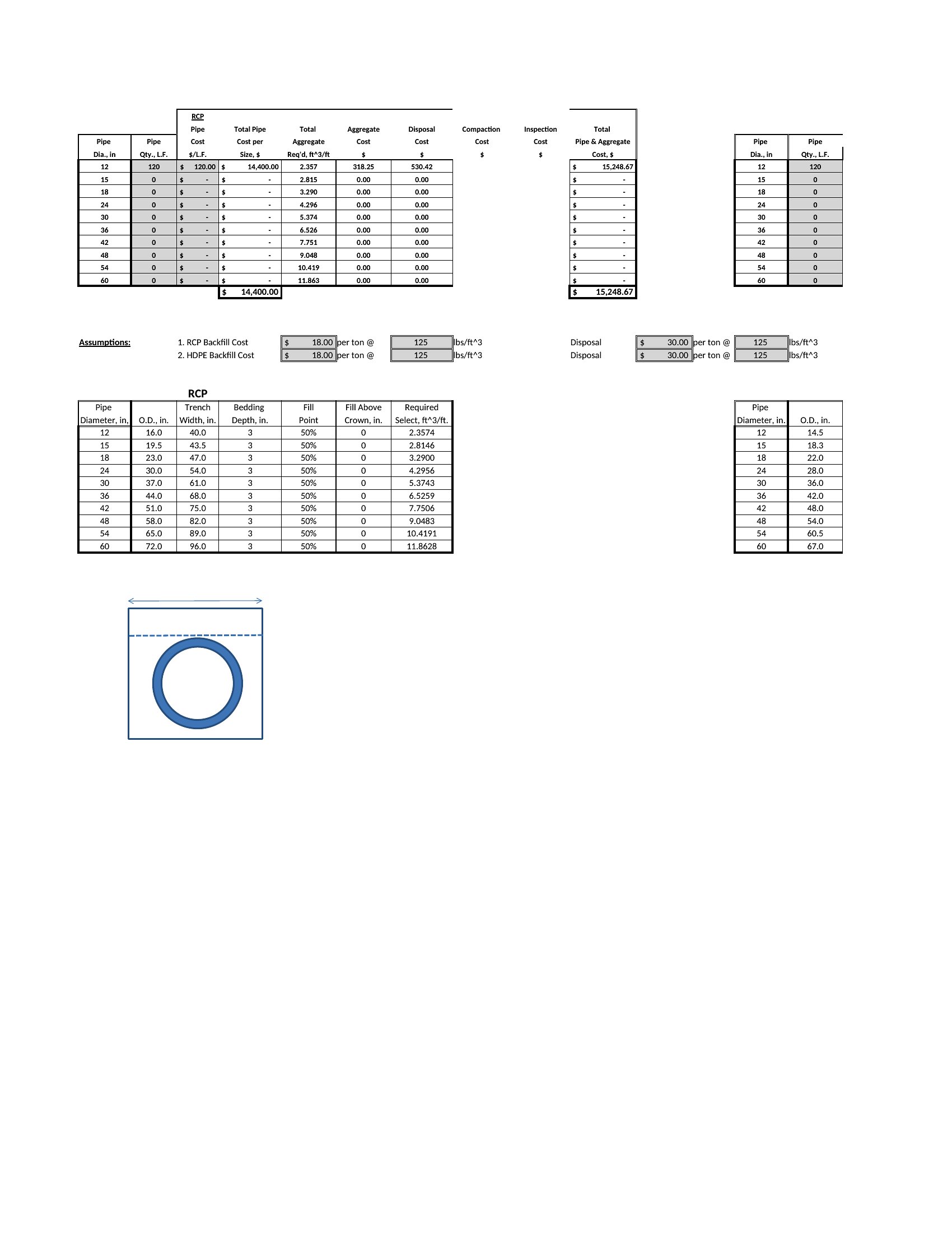
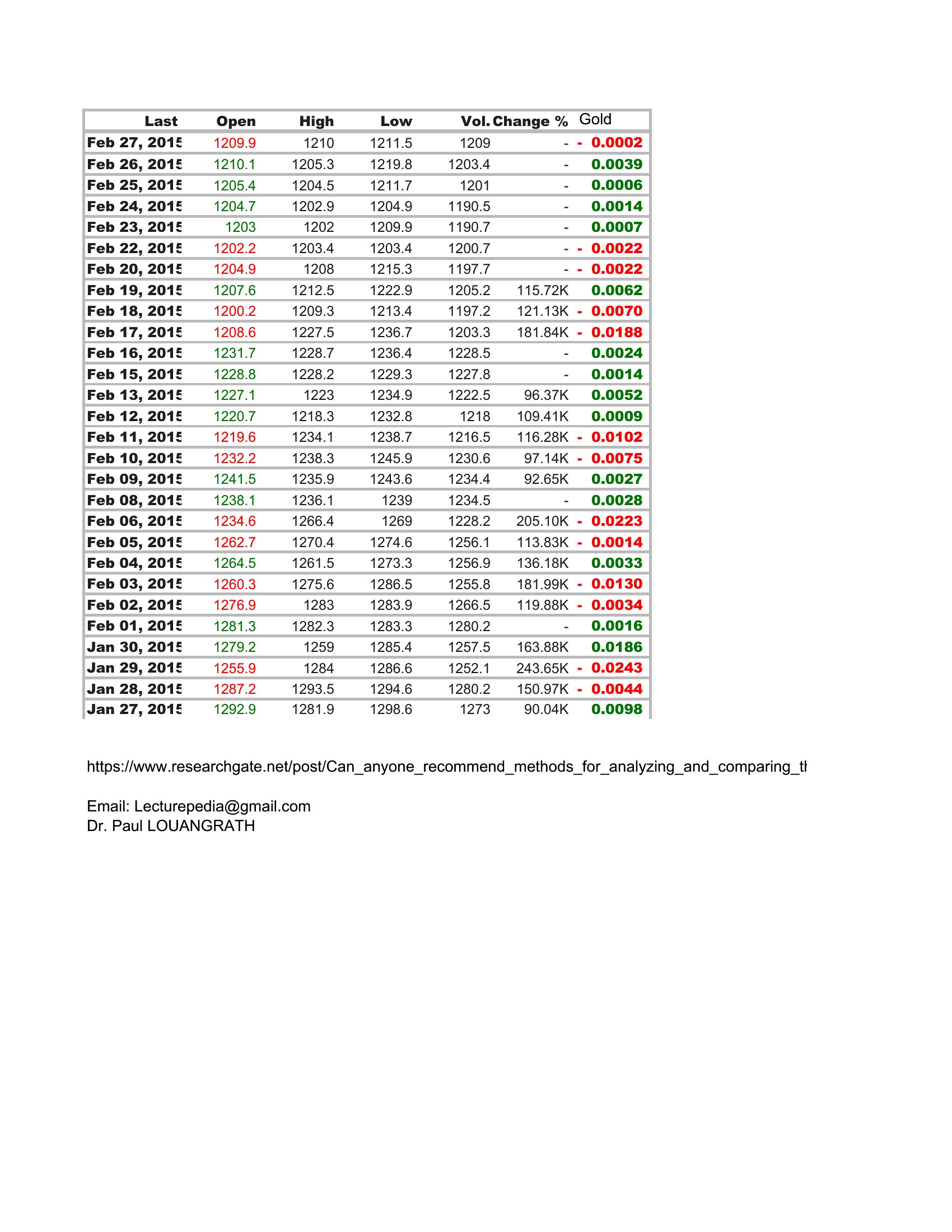
You'll find Word versions for simple comparisons and Excel sheets that total and rank options as you enter prices. Add your items, plug in the numbers, and let the layout do the sorting. A clear comparison also makes it easy to justify a purchase to a boss or a budget. Download the format that fits your decision and weigh your options with confidence.
When to use this Price Comparison Chart template
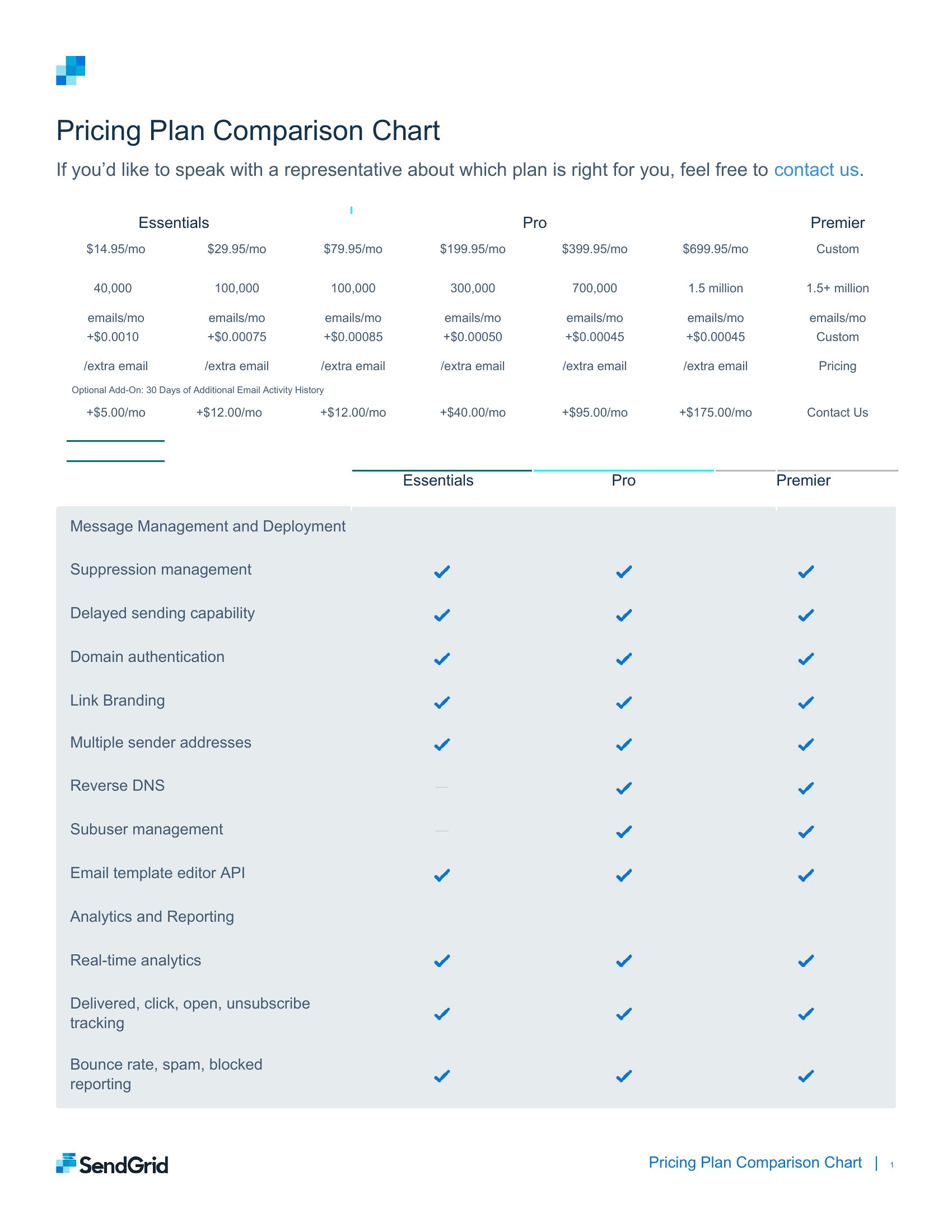
- Small-business owners evaluating three suppliers for office equipment to identify which offers the best combination of cost and warranty terms before signing a contract.
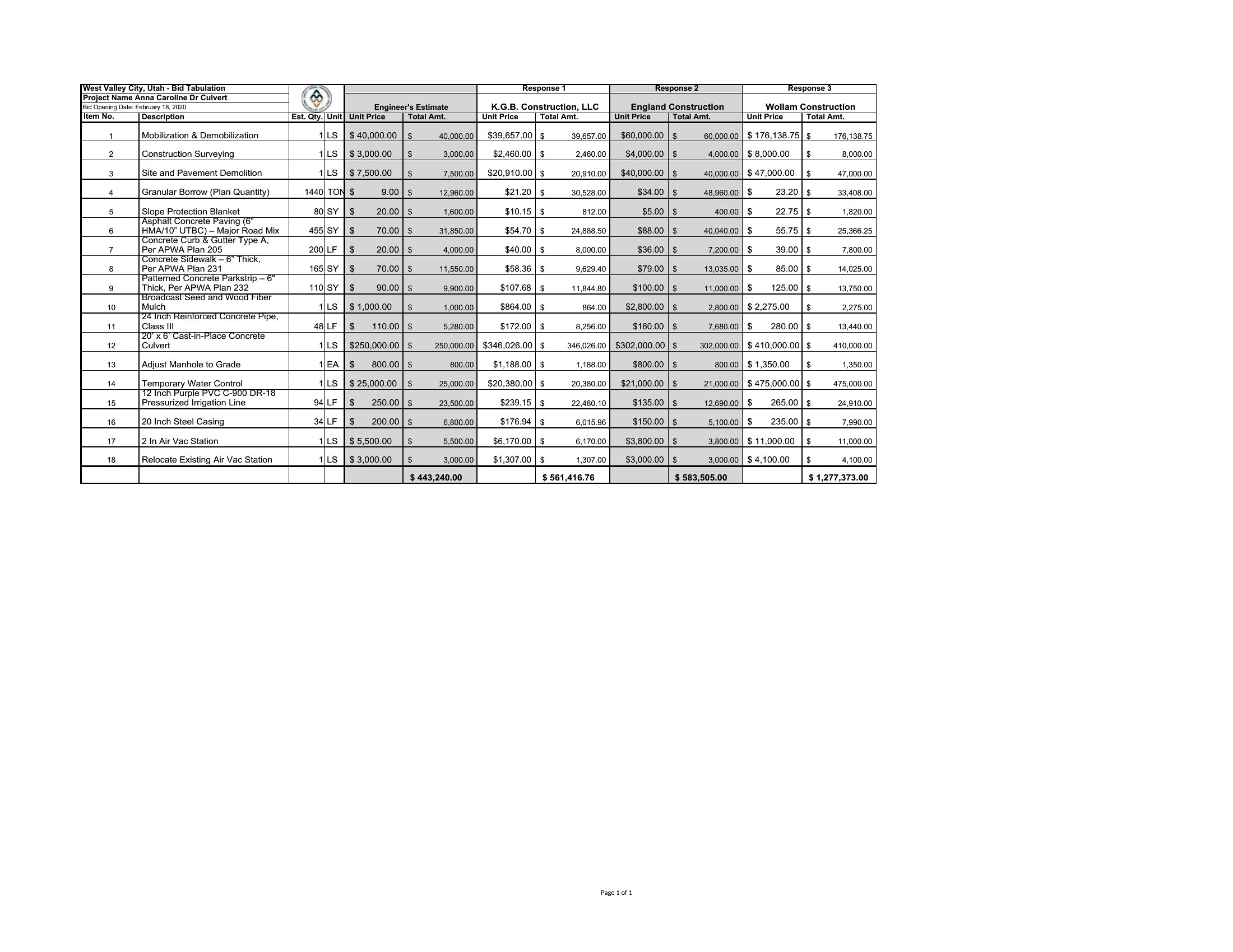
- Purchasing managers comparing quarterly quotes from five vendors for bulk inventory items to justify budget decisions to department heads.
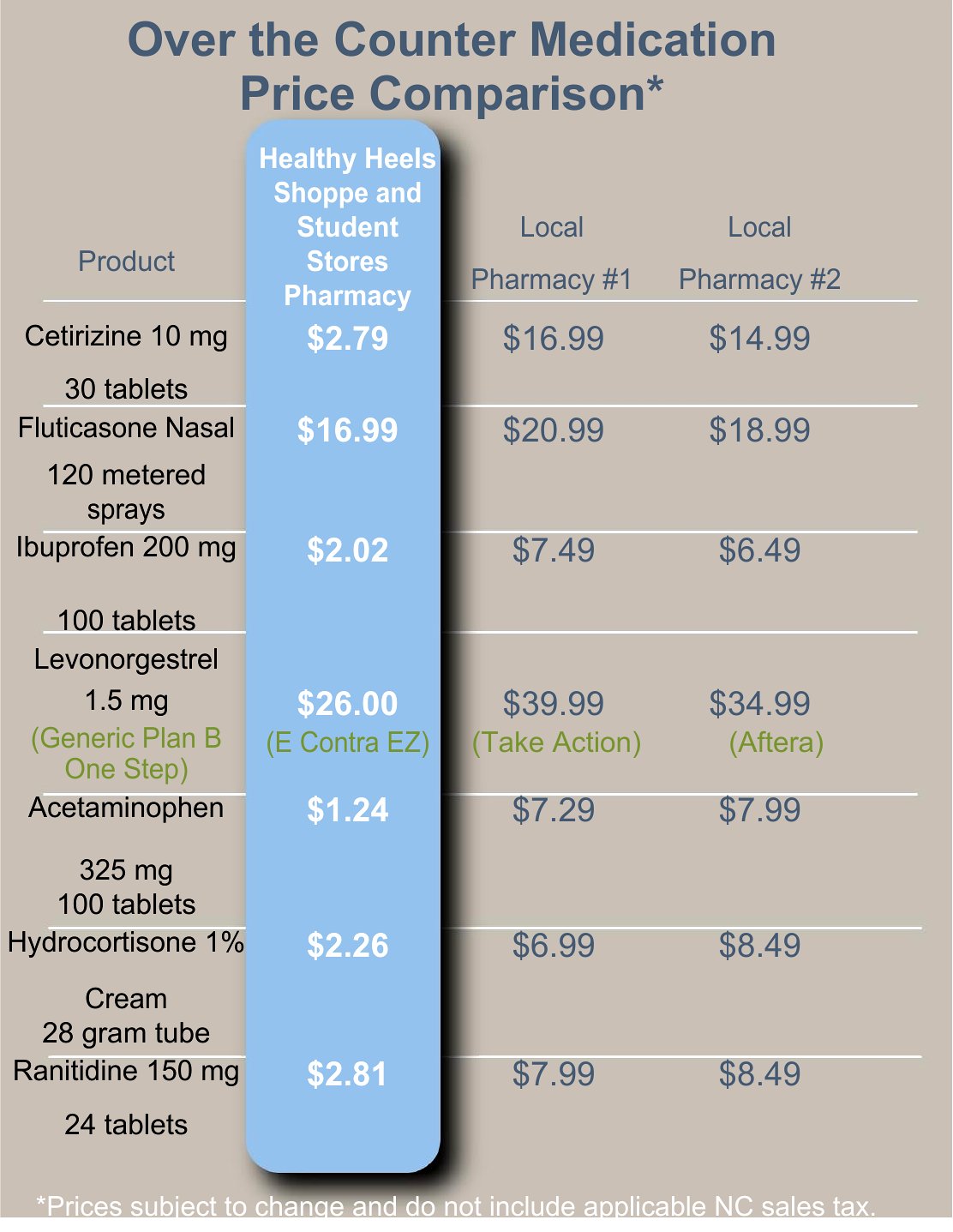
- Consumers researching high-end electronics like laptops or TVs by listing specs and prices across retailers to avoid overpaying without missing key features.
- Nonprofit coordinators assessing donations or grants by comparing funding offers from multiple sponsors to present a clear case for the best support in board meetings.
Which format should I download?
The Word format works best when you need a straightforward, text-based comparison for quick sharing or printing—like a one-time supplier analysis for a team meeting. Choose Excel if you’re working with extensive data, need formulas to calculate totals or averages, or plan to update the chart frequently, such as for ongoing vendor performance tracking. Since these are starting points, review calculations and assumptions to align with your specific needs.
Choose from 53 Price Comparison Chart Templates
How to use this Price Comparison Chart template
How can I make sure my price comparison is fair if the vendors offer different payment terms?
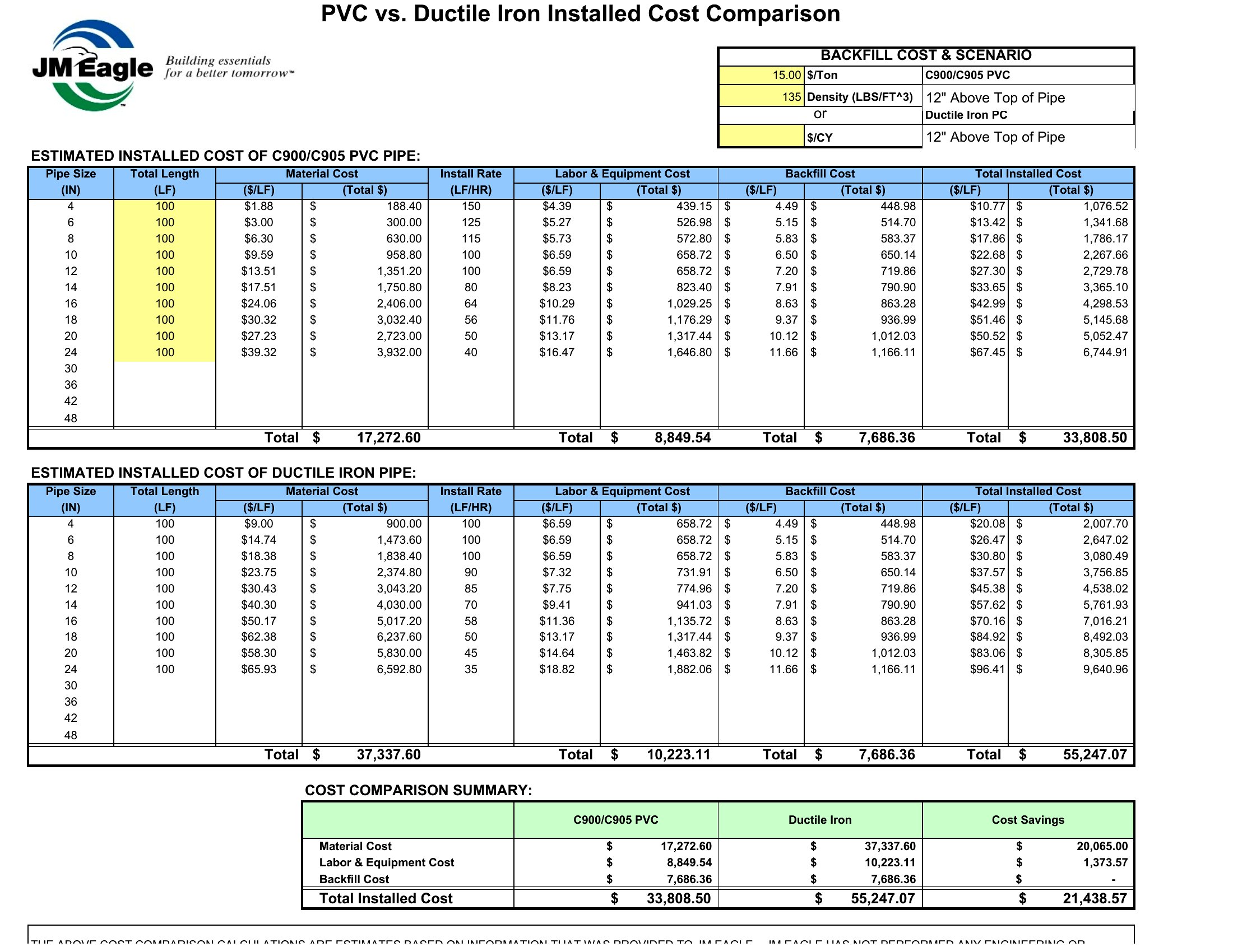
Adjust your comparison by converting all prices to a comparable metric, like the total cost per unit over a year, or include a separate column for payment terms. For example, if one vendor offers a 10% discount for upfront payment, note that alongside the listed price. This helps highlight the true value, not just the sticker price.
Can I add custom columns for features that aren’t included in the templates?
Yes, all templates allow you to modify or add columns to fit your needs. For instance, if you’re comparing software subscriptions, you might include columns for customer support response times or data migration assistance. Just ensure the new categories are relevant to your decision-making process.
What’s the best way to present this chart to stakeholders who prefer visuals over spreadsheets?
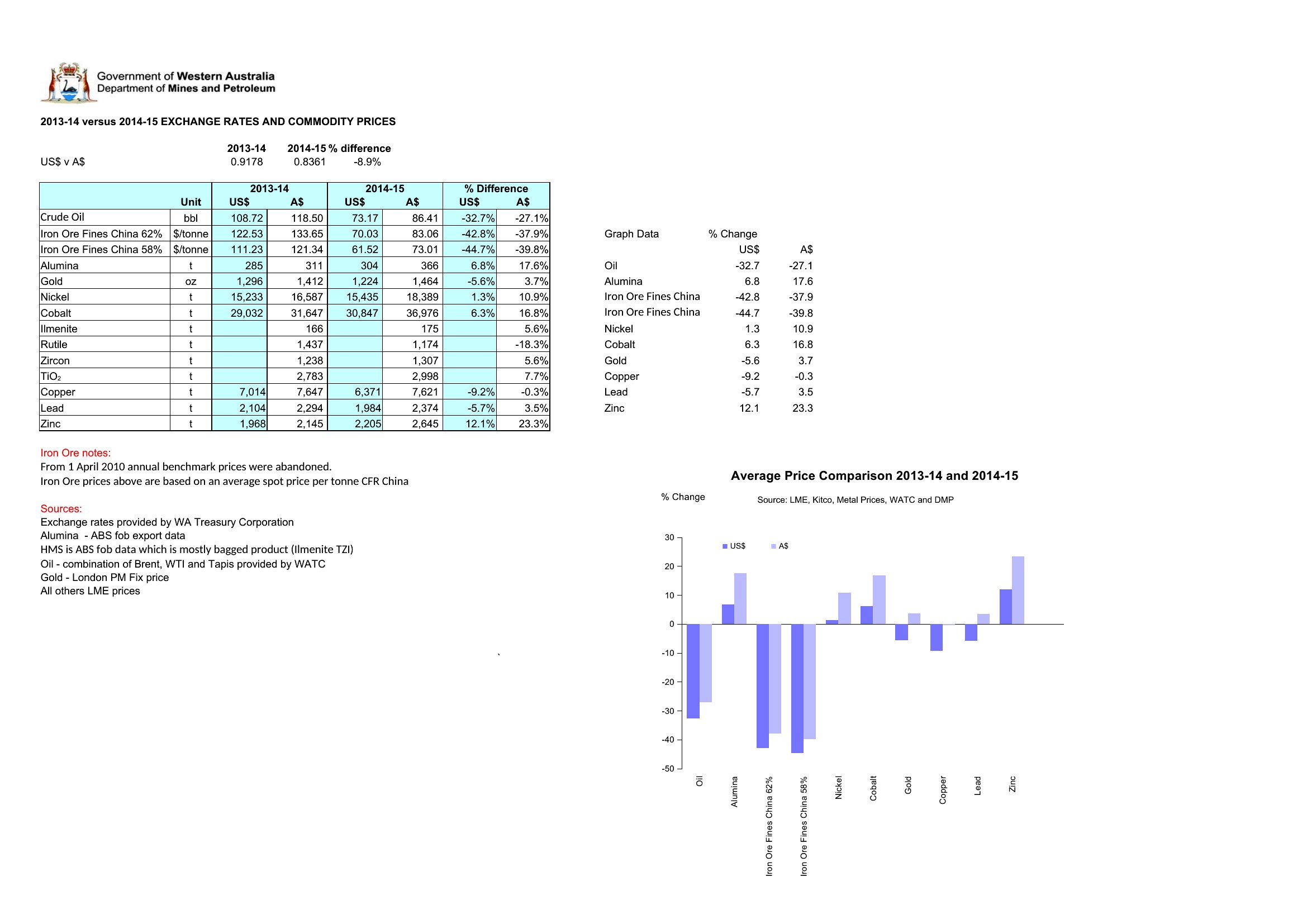
Export the Excel version as a PDF and use its built-in chart tools to create a bar or line graph highlighting key differences, like price per unit or total cost. For Word, use tables with alternating row colors and bold headers to make it scannable. Pair it with a one-page summary of your top recommendation to guide the conversation.
Comments
Join the conversation
Sign in to share your thoughts and leave a comment on this resource.