FAQ
Can I adjust the hierarchy levels if my team has a flat structure or a matrix reporting system?
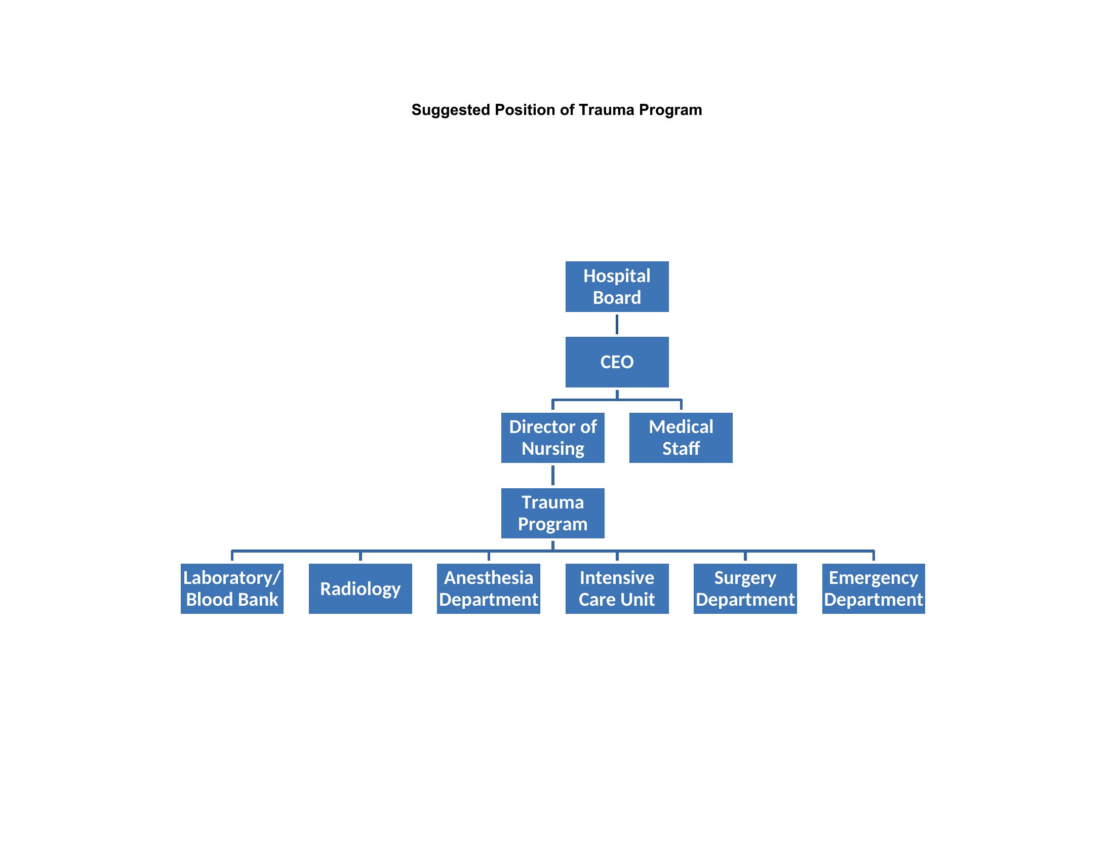
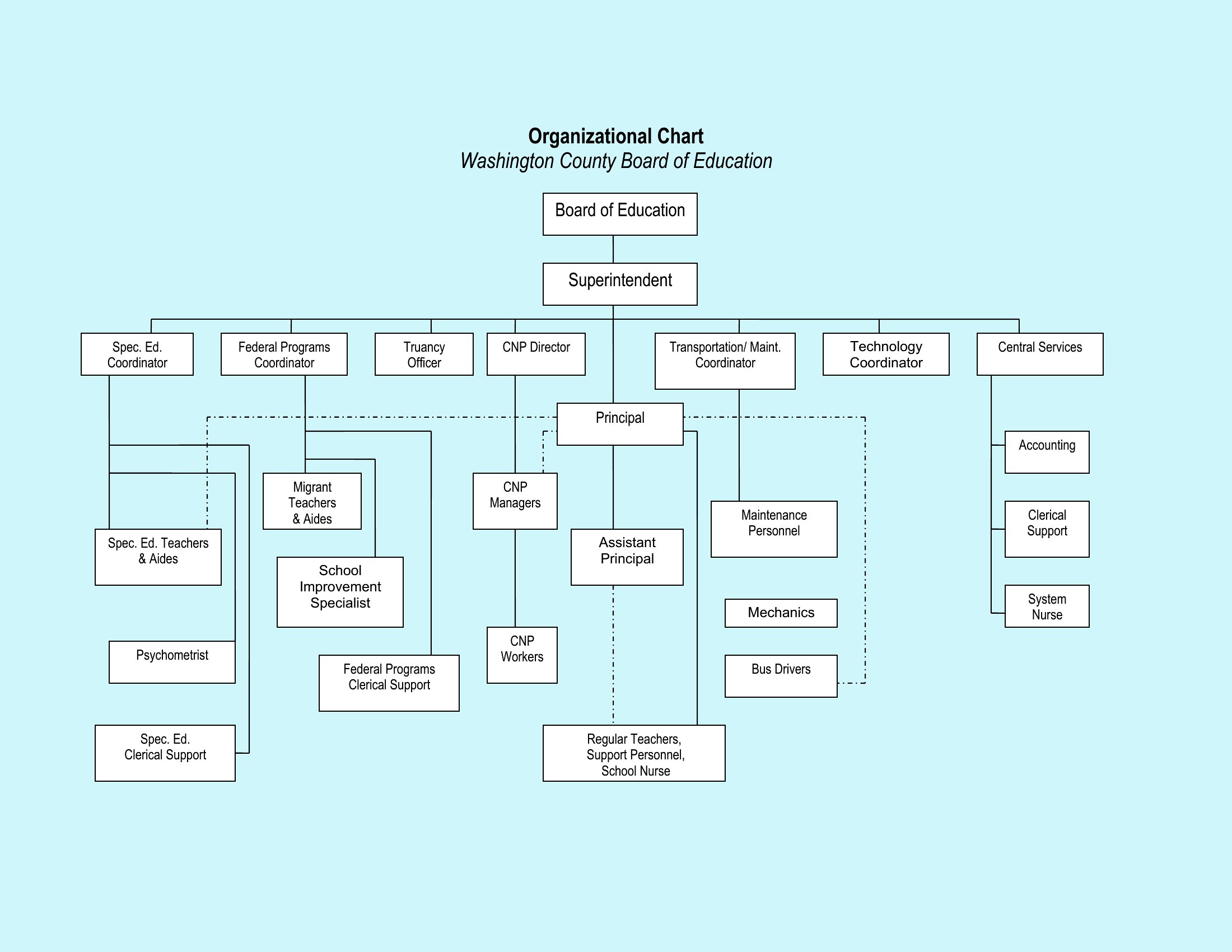
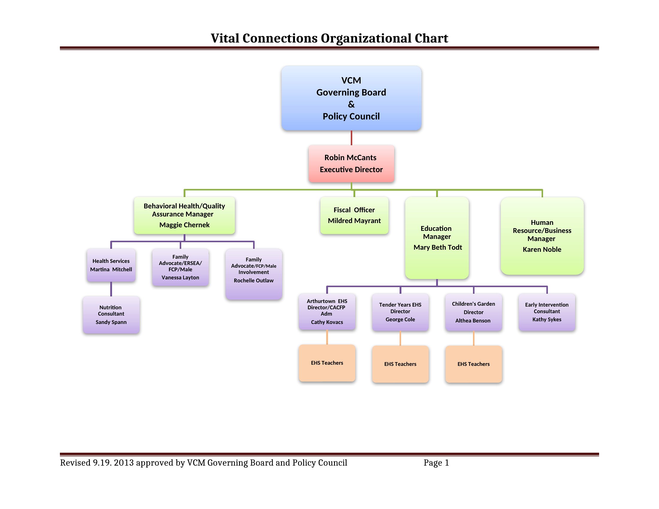
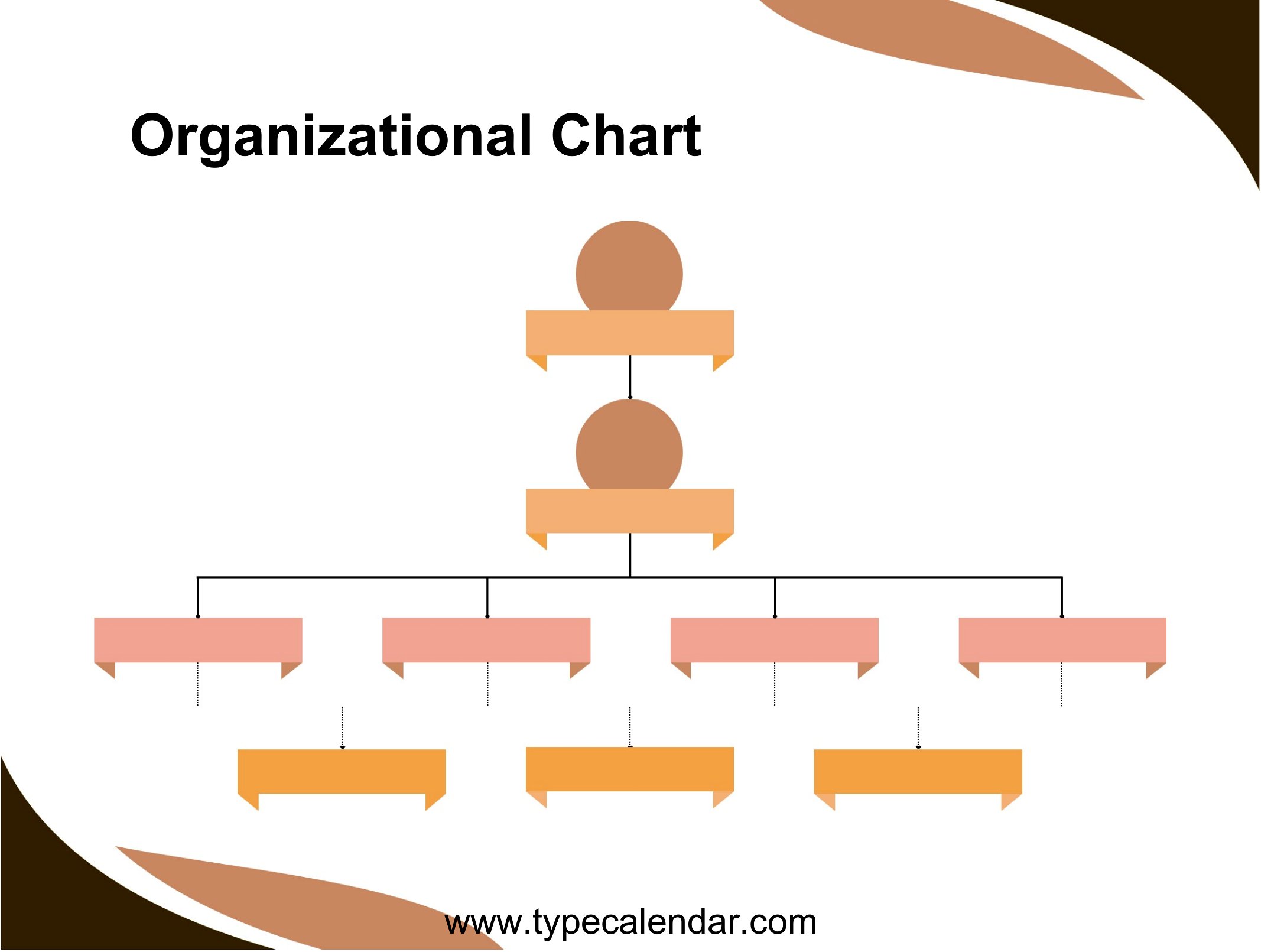
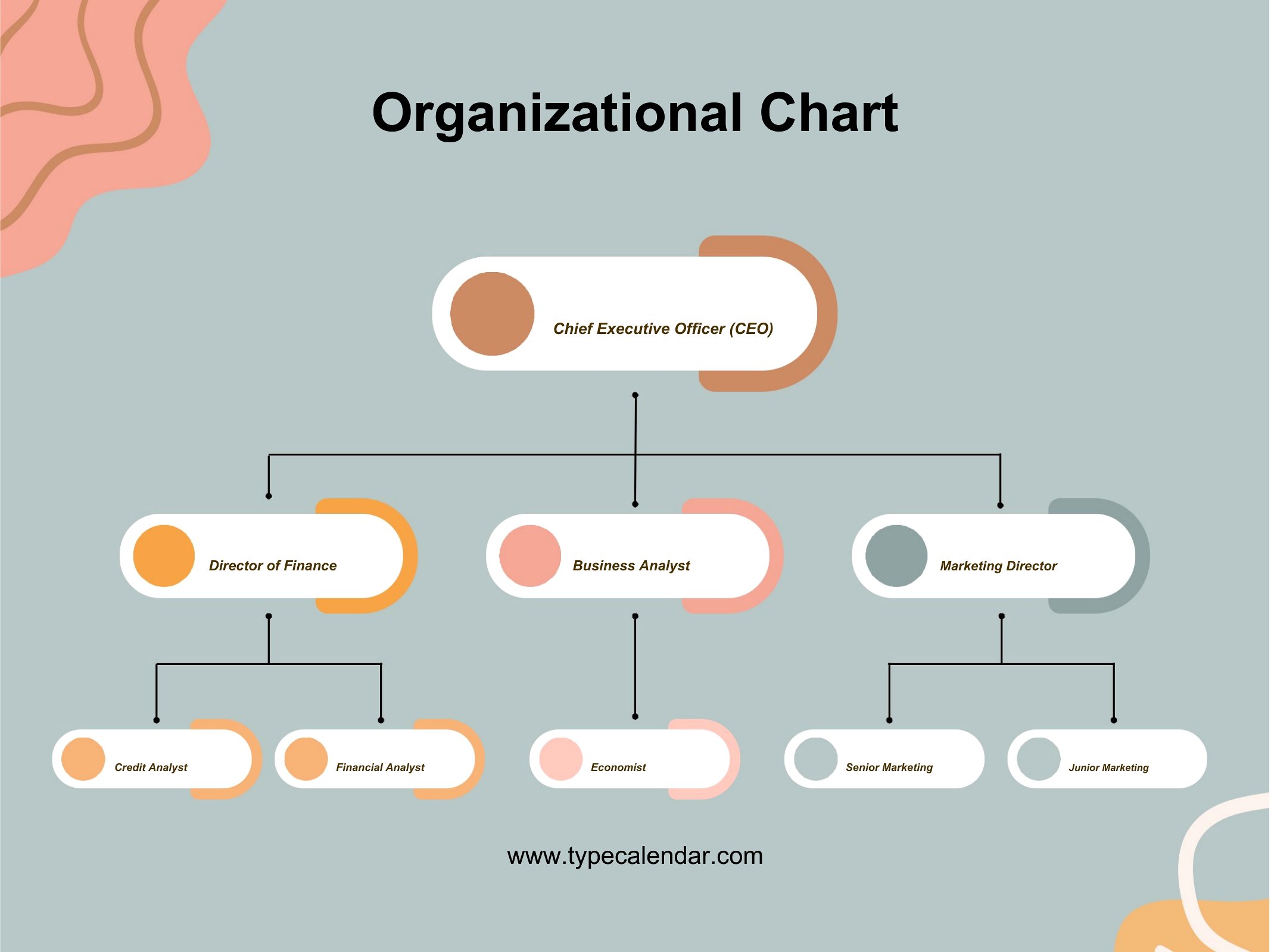
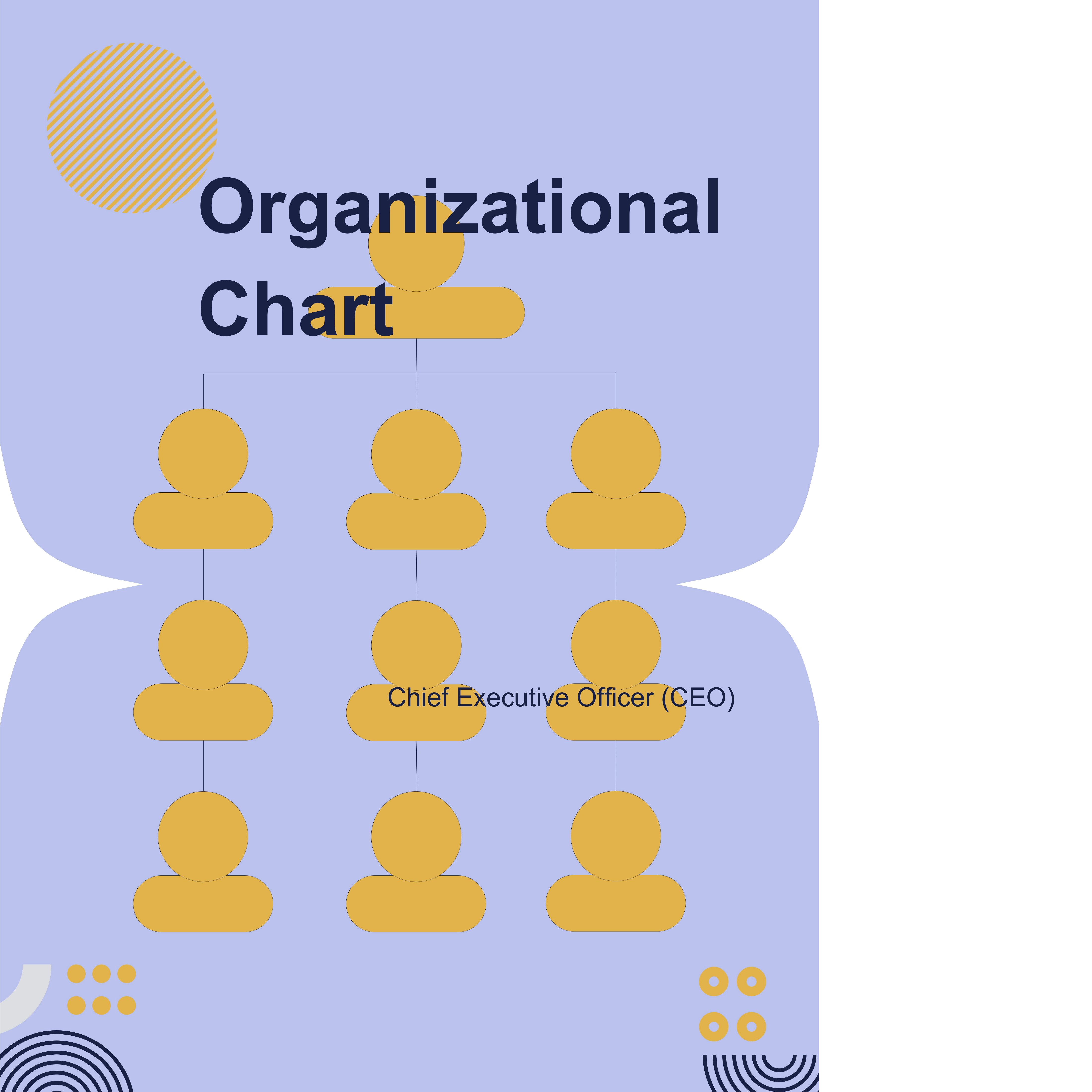
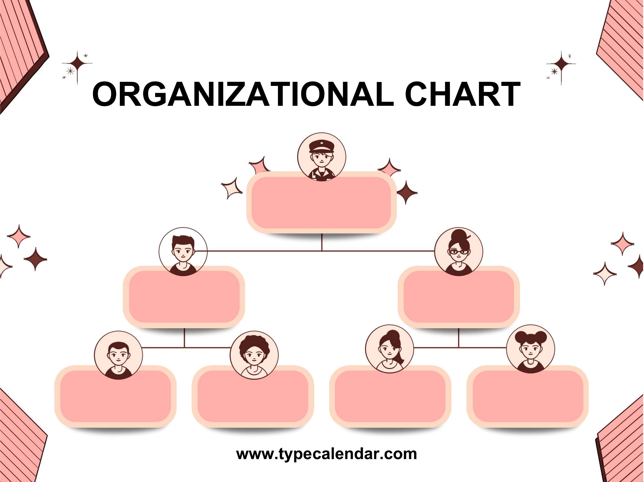
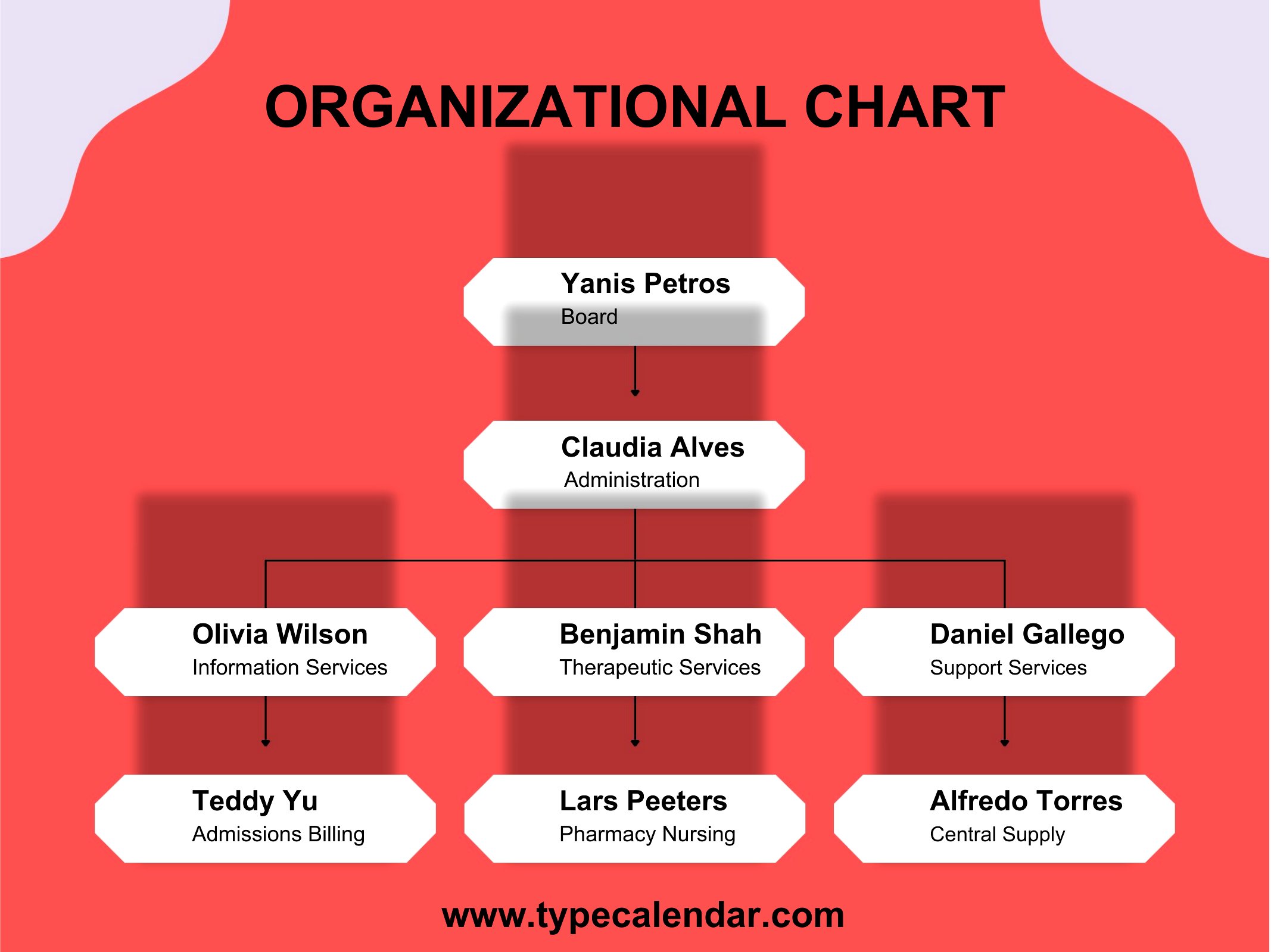
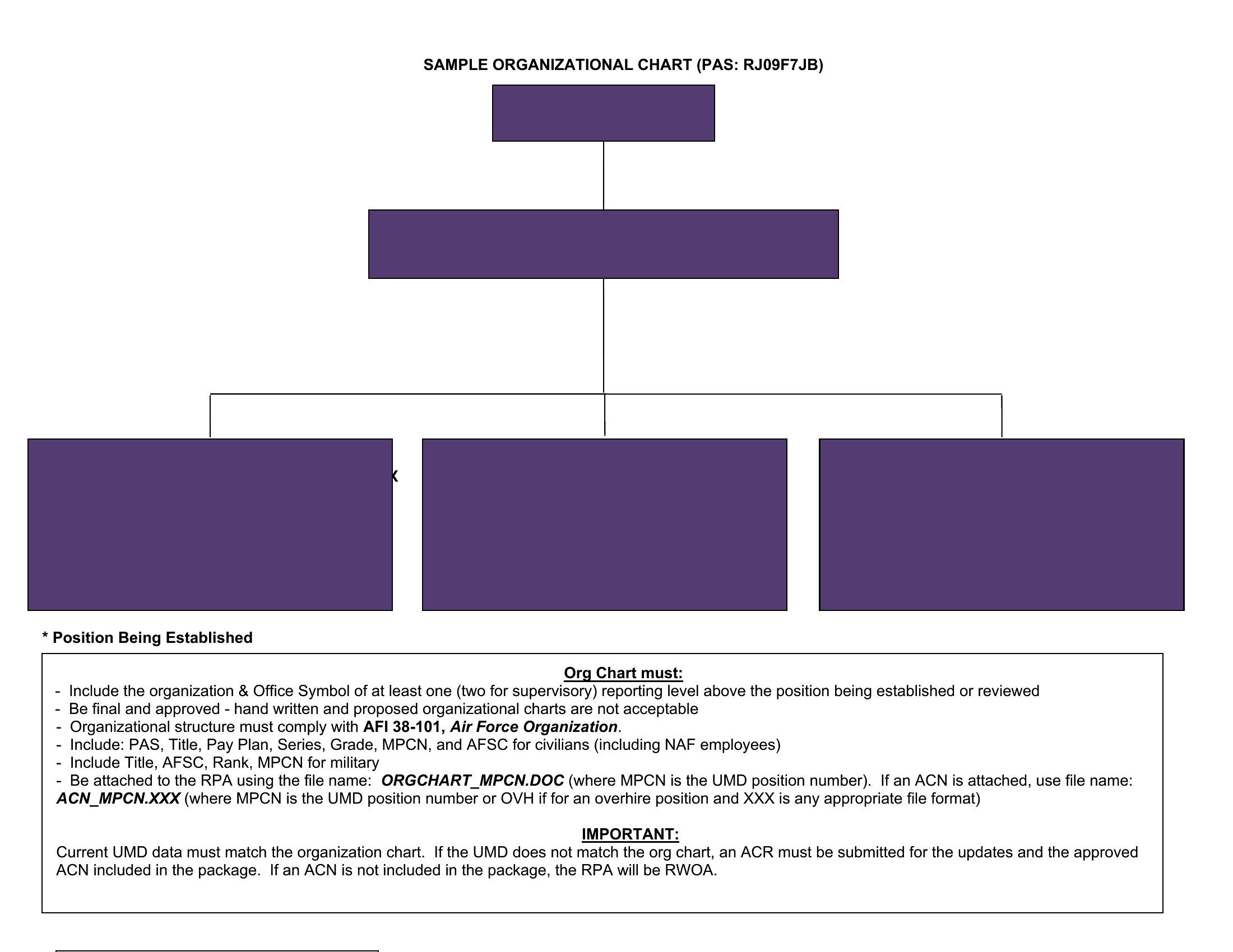
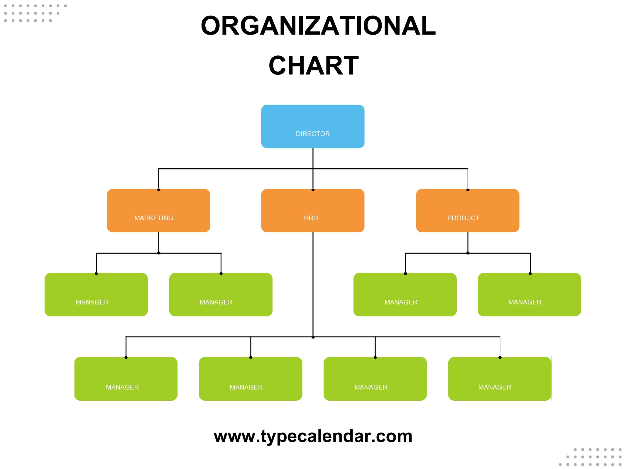
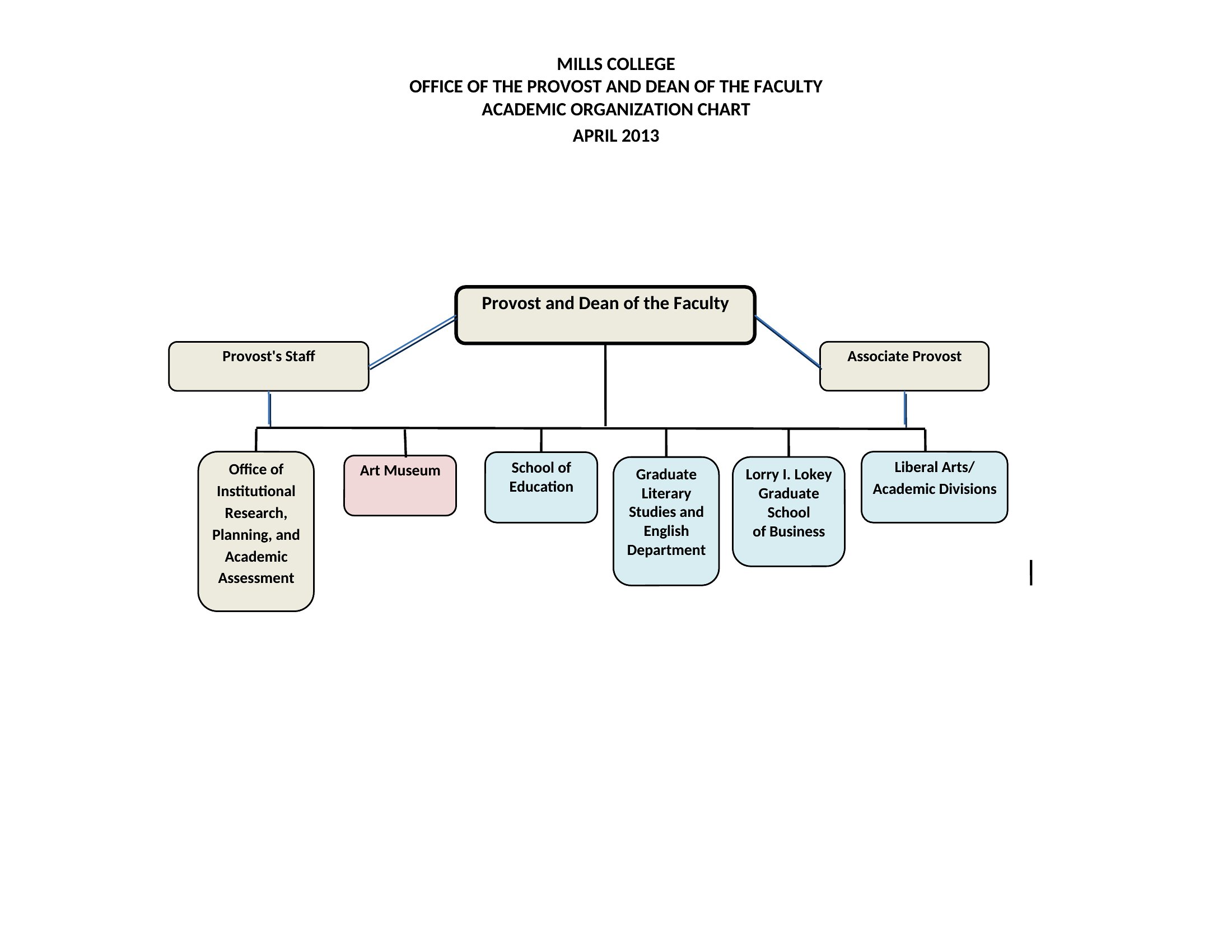
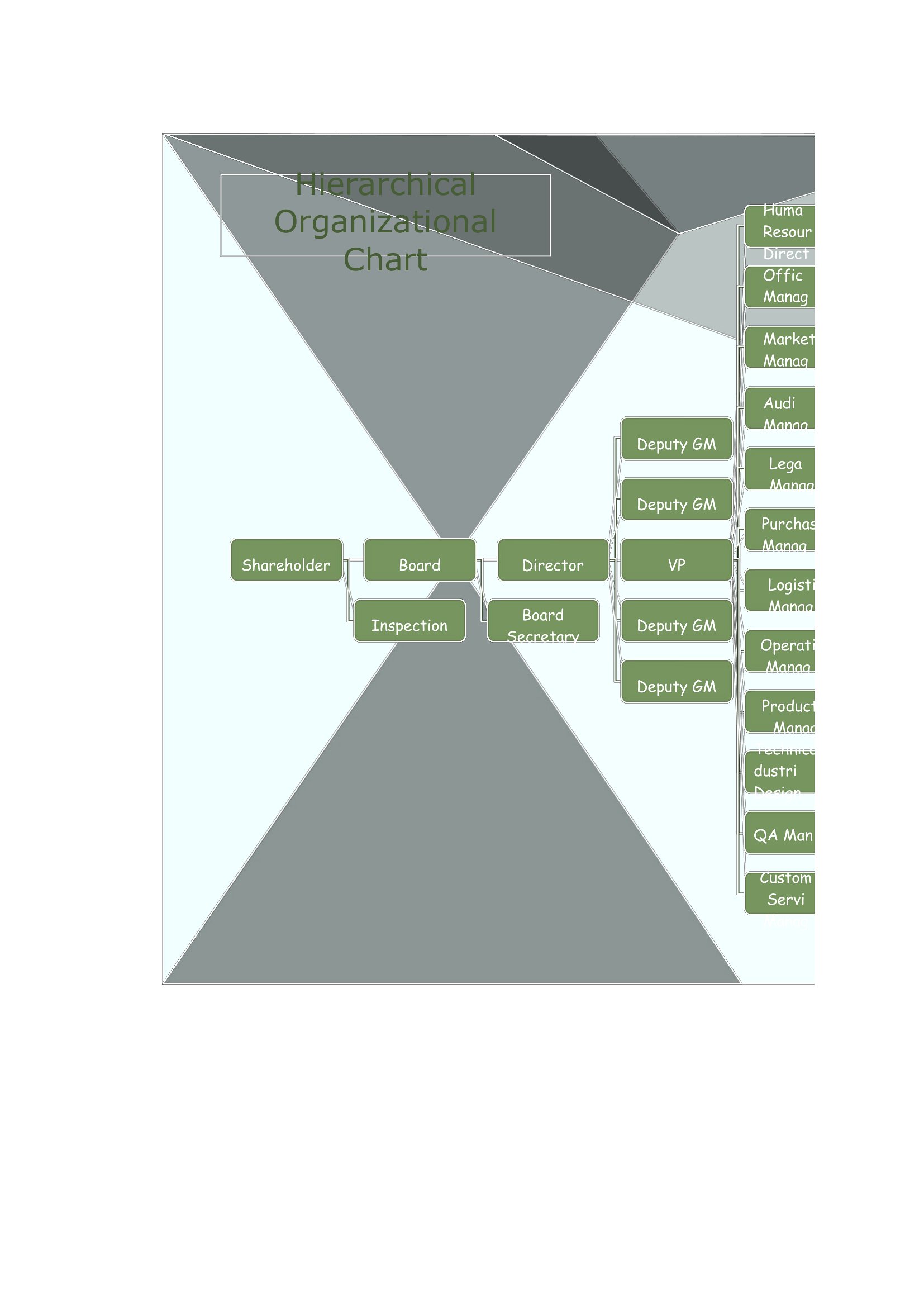
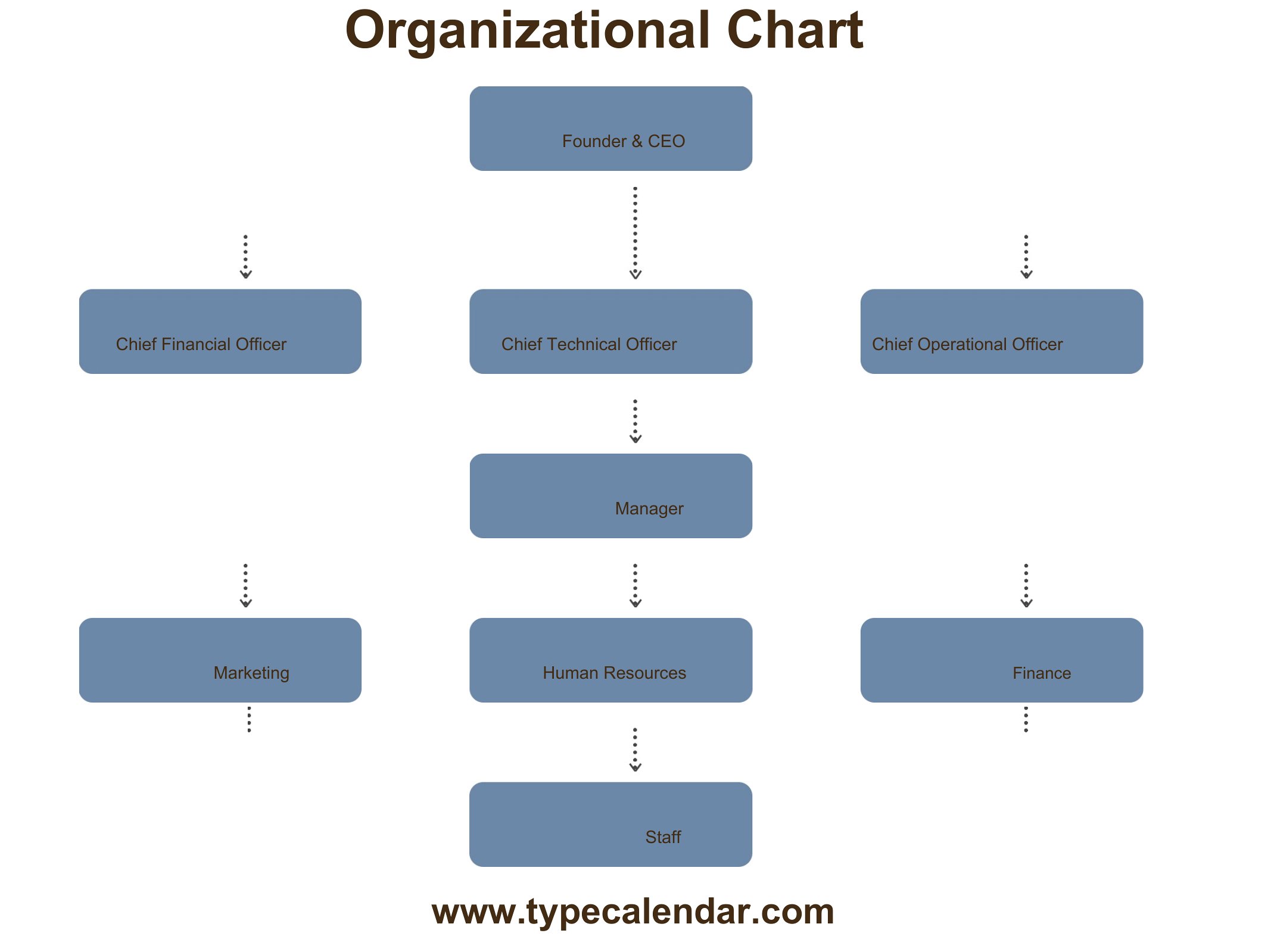
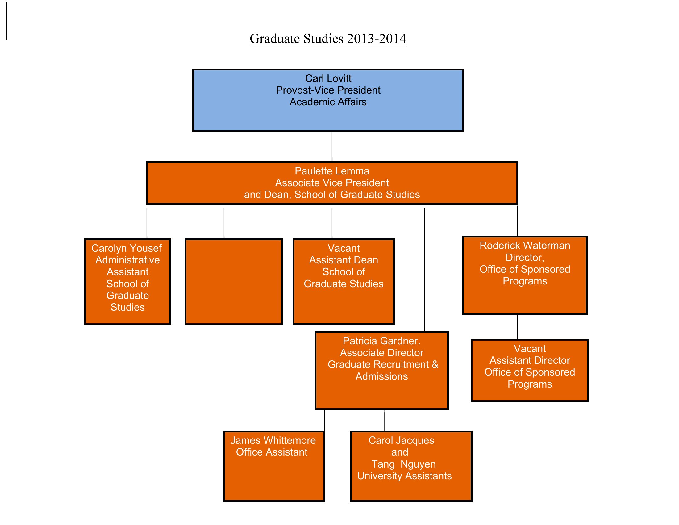
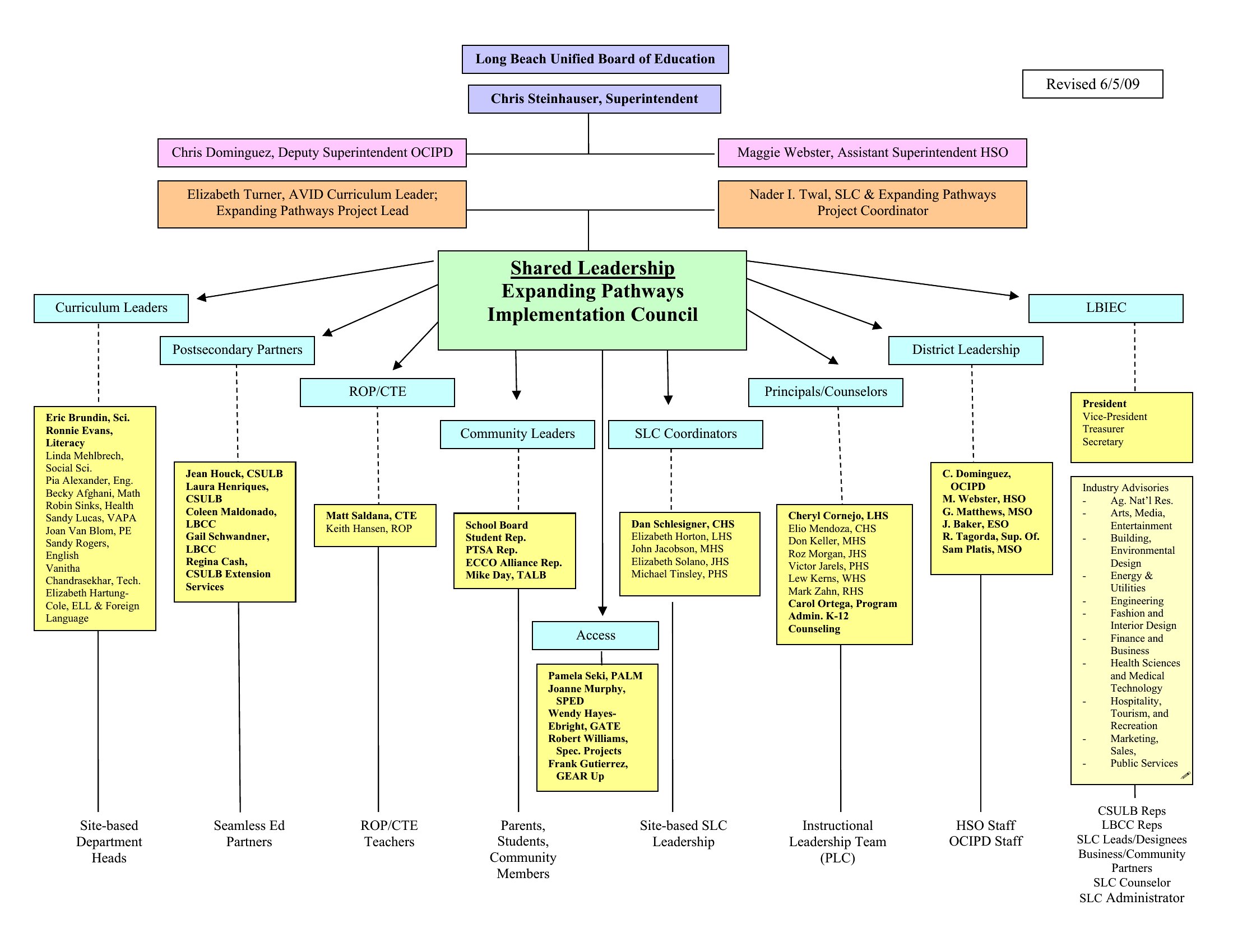
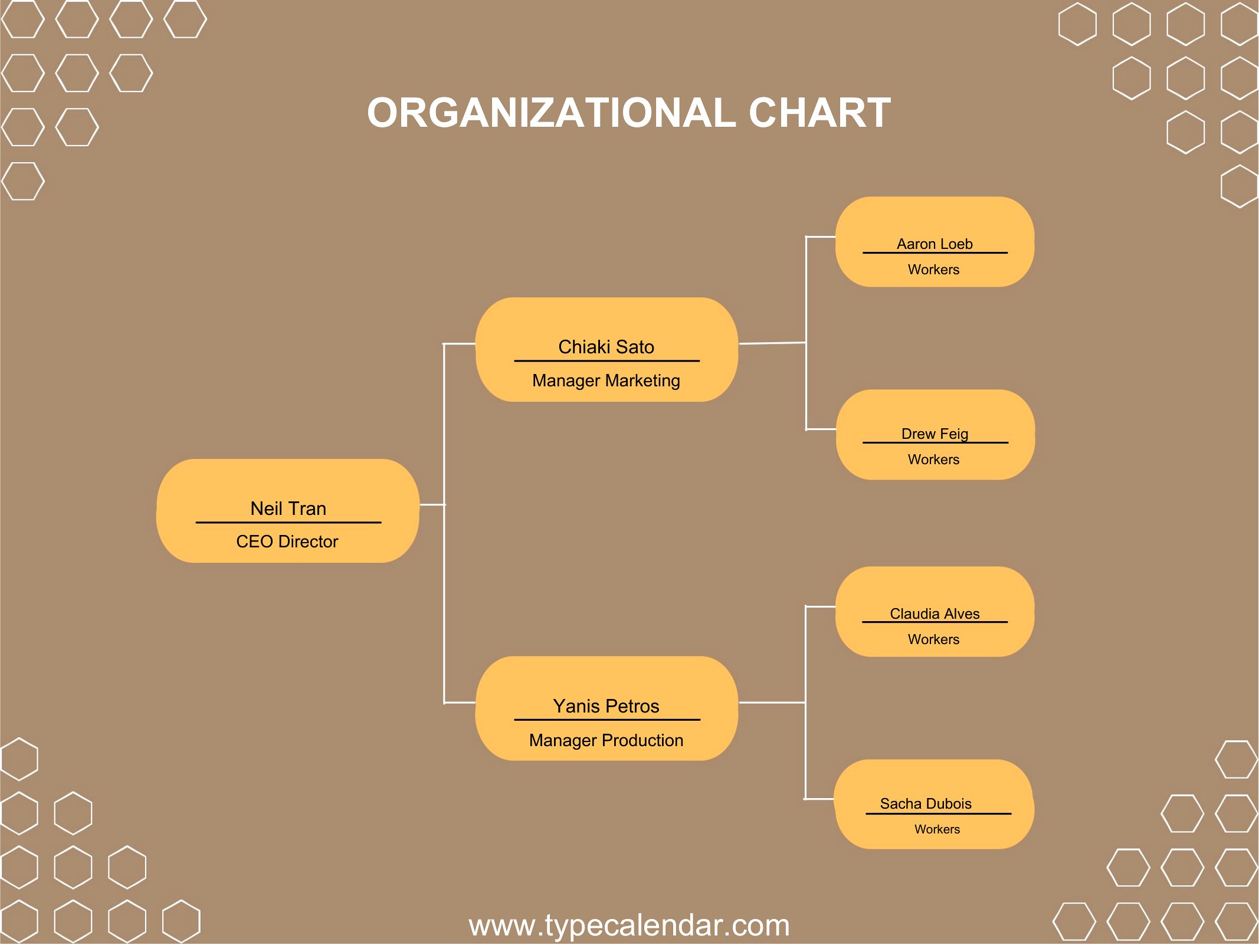
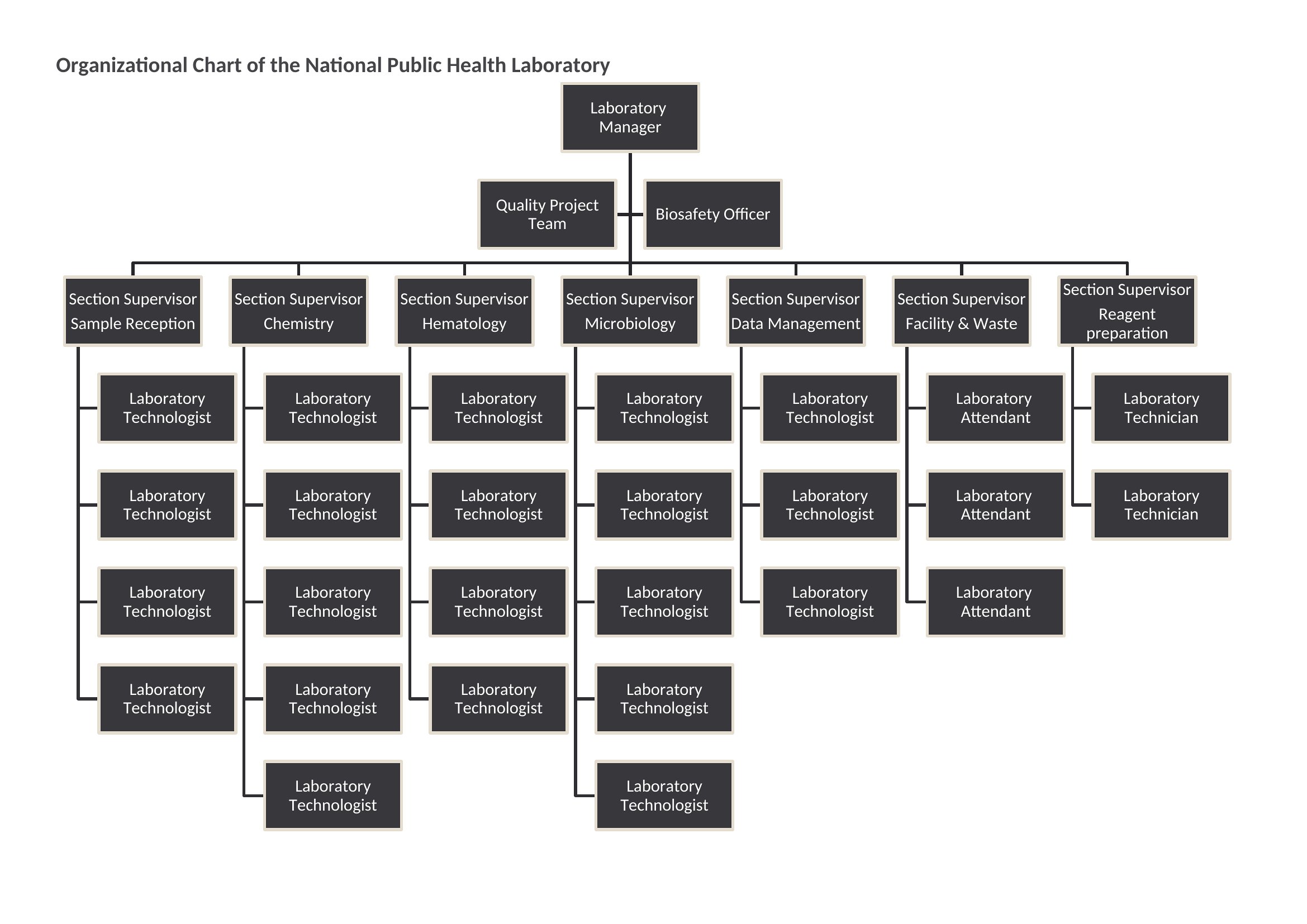
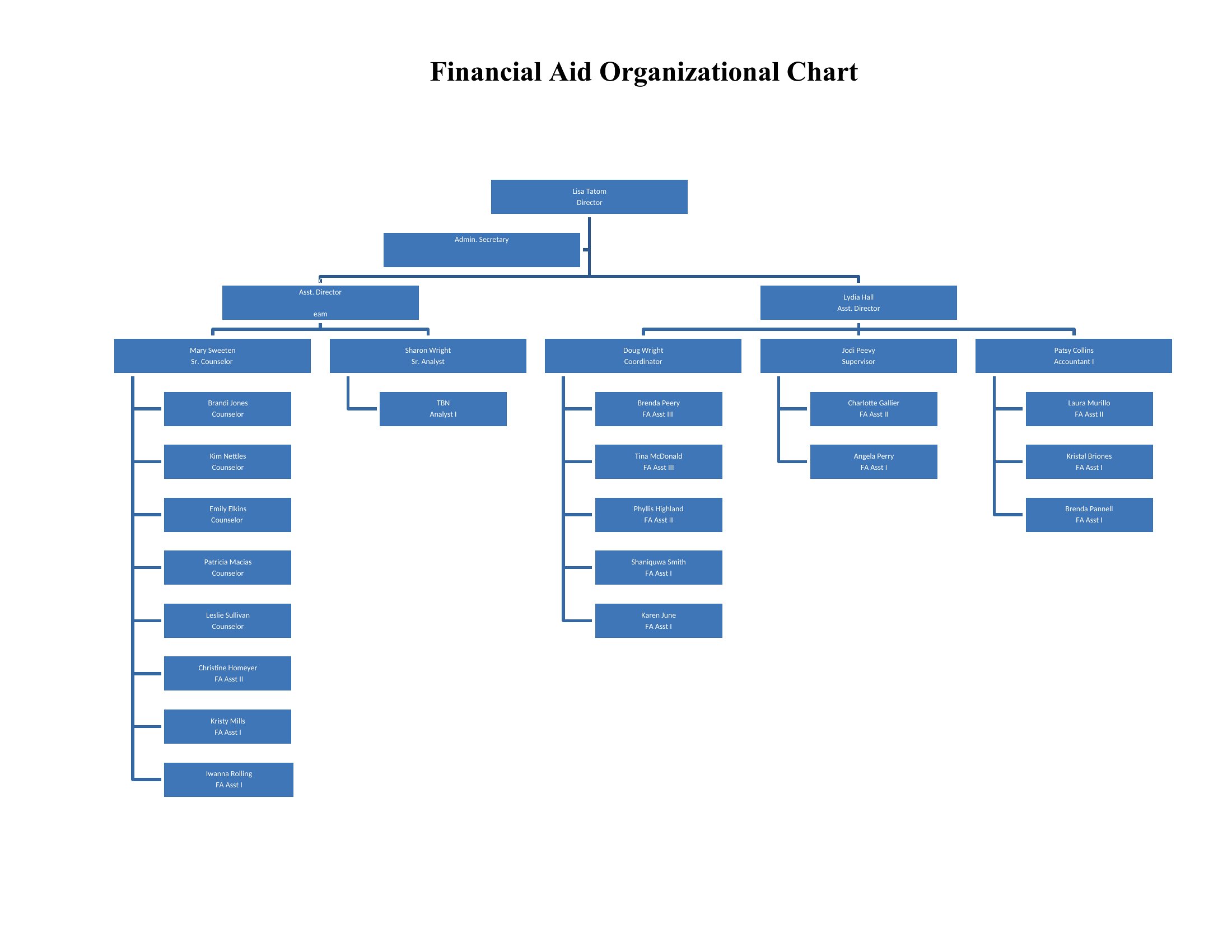
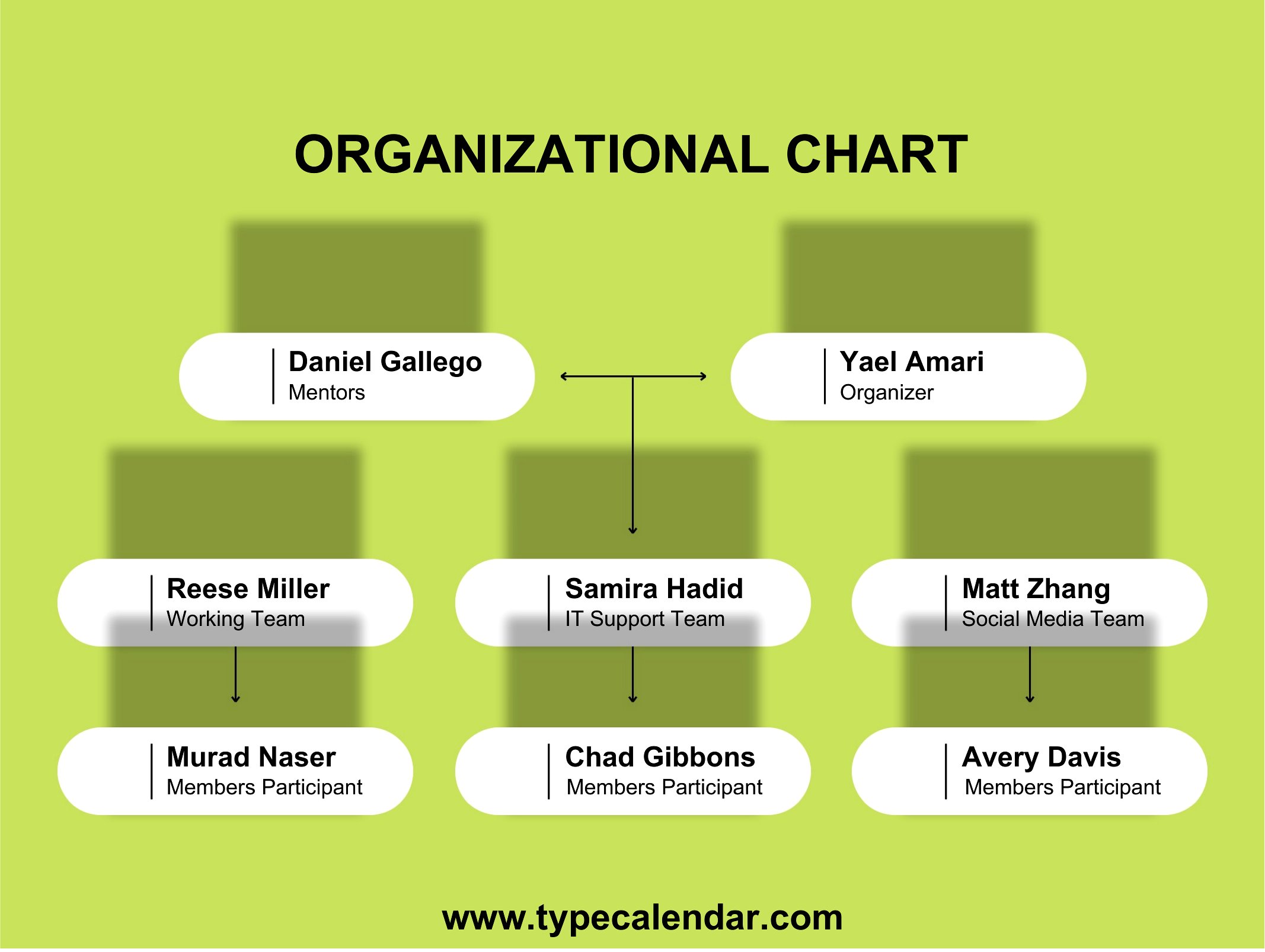
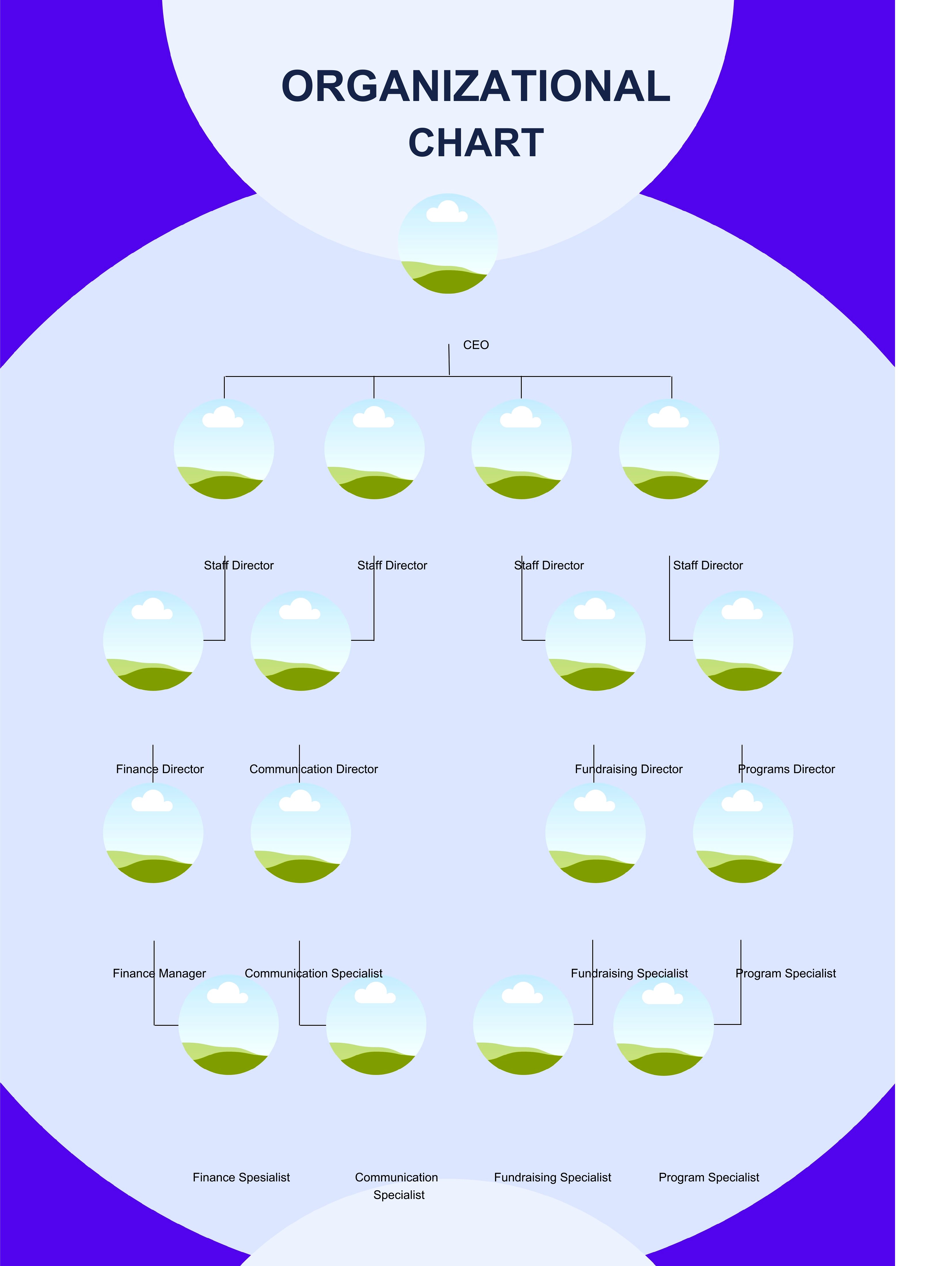
Yes, these templates start with standard tiers but are fully editable in Word or PDF. For flat structures, collapse layers or merge boxes; for matrix reporting, use color or dashed lines to show dual reporting in Word before exporting to PDF. Avoid overcomplicating—stick to 3–4 levels for clarity unless your org is deliberately unconventional.
How do I represent contractors or part-time roles that don’t fit neatly into the chart?
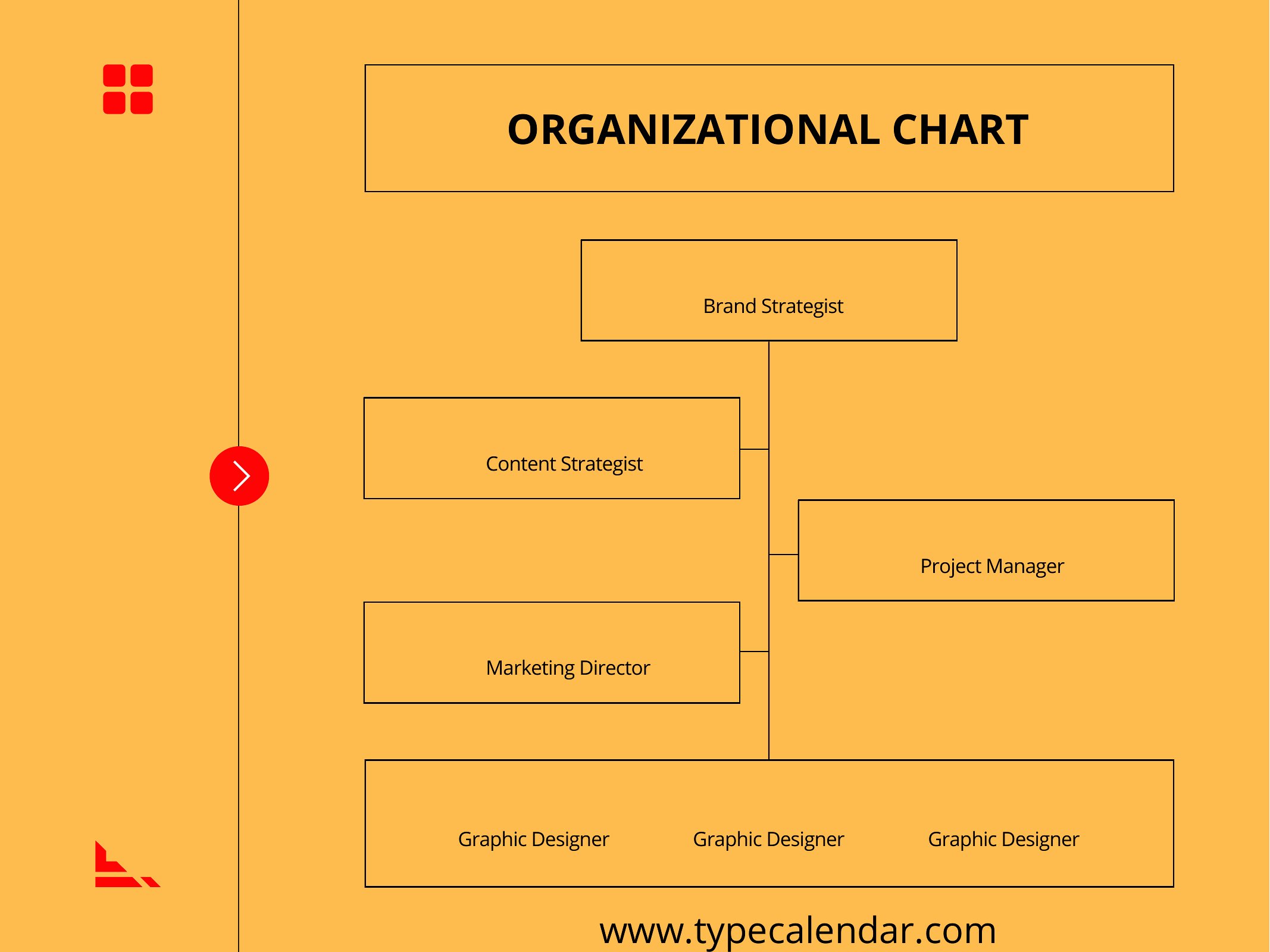
Add contractors as dotted-line boxes under the manager they collaborate with most closely, or use a separate ‘External Partners’ section at the bottom. Label them clearly (e.g., ‘Freelance Designer’) to avoid confusion. These templates focus on full-time roles, so adapt as needed—just keep the chart focused on core reporting lines.
Will these charts work for non-profits or government agencies with specific title conventions?
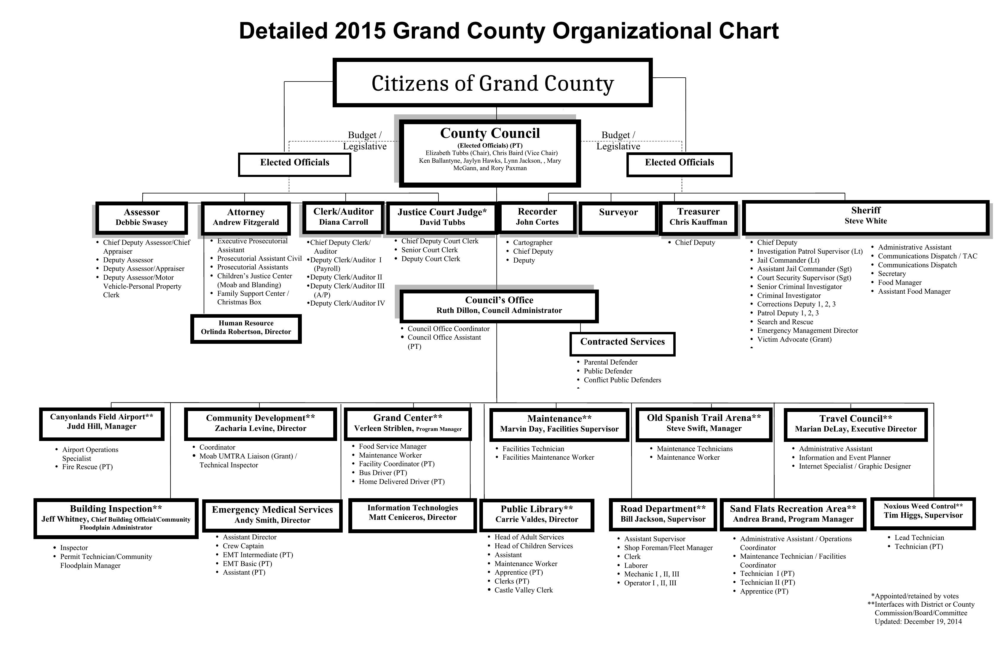
Absolutely, but replace generic terms like ‘Director’ or ‘Manager’ with your org’s exact titles (e.g., ‘Program Coordinator’ or ‘Policy Analyst’) in Word. For agencies with strict naming rules, save the final version as a PDF to prevent accidental edits. These templates are structural tools, not prescriptive—tailor them to your workforce’s actual roles.
Comments
Join the conversation
Sign in to share your thoughts and leave a comment on this resource.