Skip to content
50% off this one-time $1.99 pack with HALFOFF — or unlimited with Pro.HALFOFF
Premium

Free Waterfall Chart Templates (Word, Excel)
Diagrams
svitoyarapaliychuk by svitoyarapaliychuk
Updated 0 downloads Quality-checked template

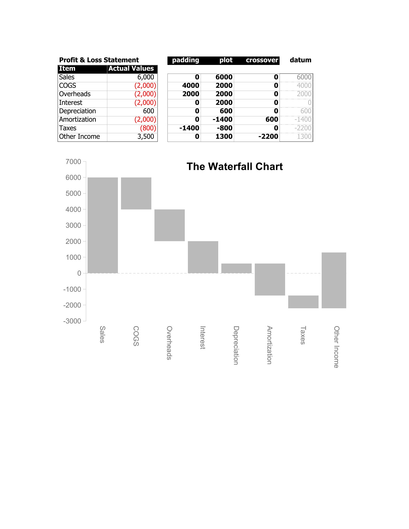
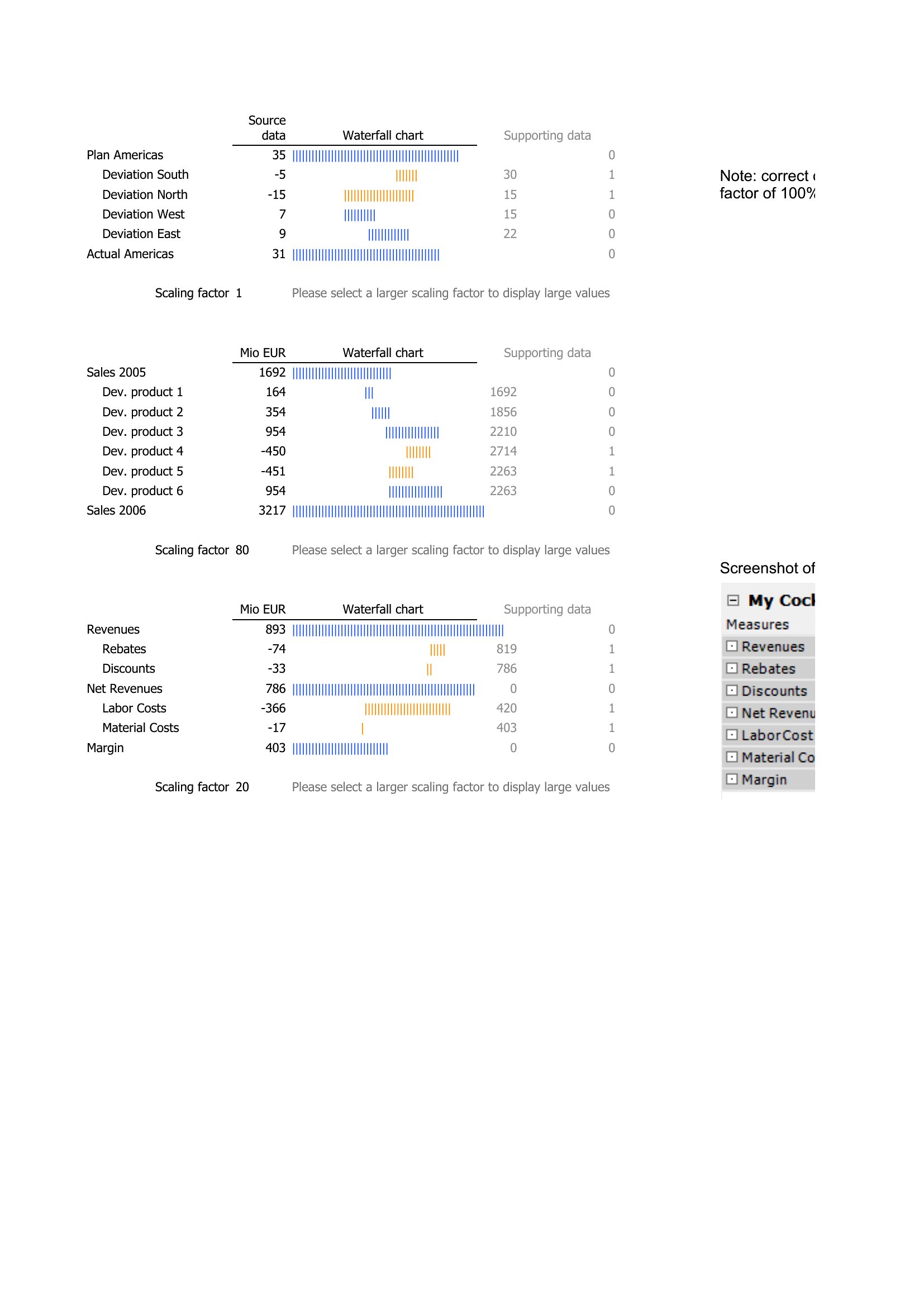
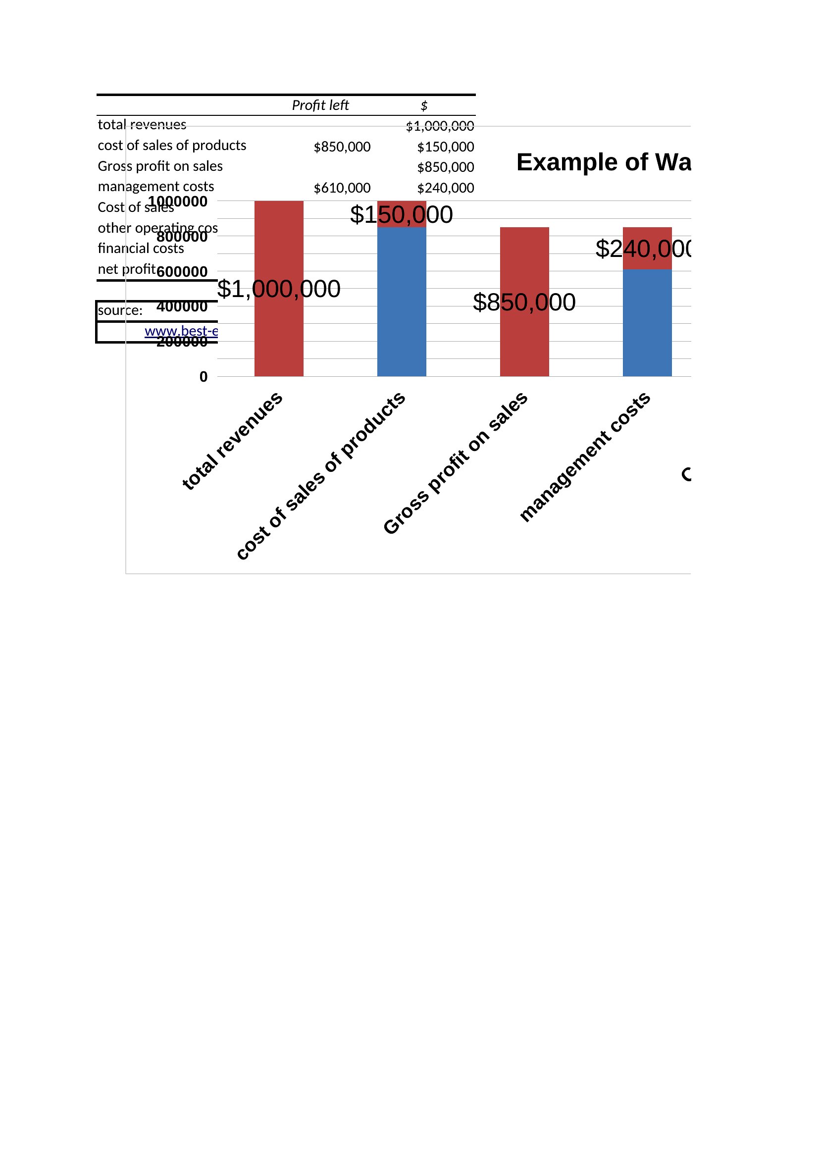
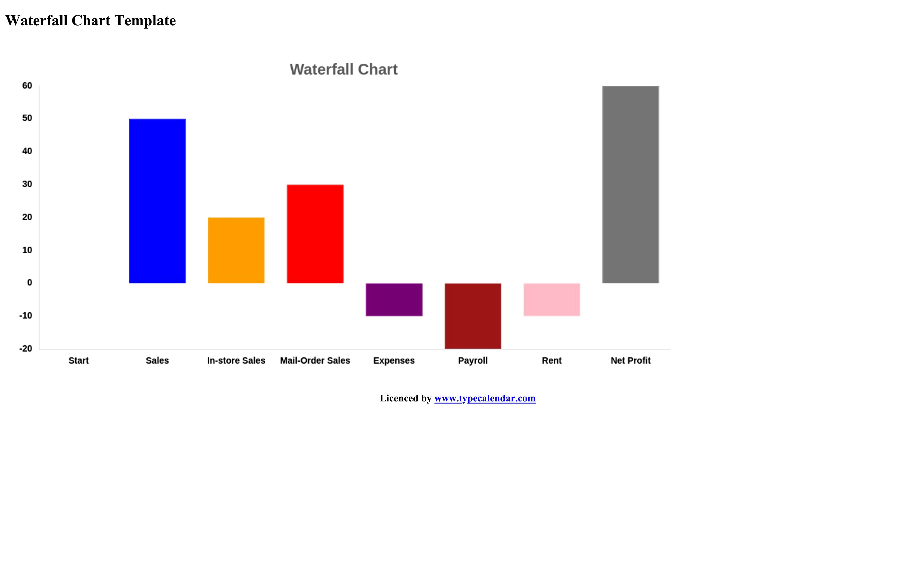
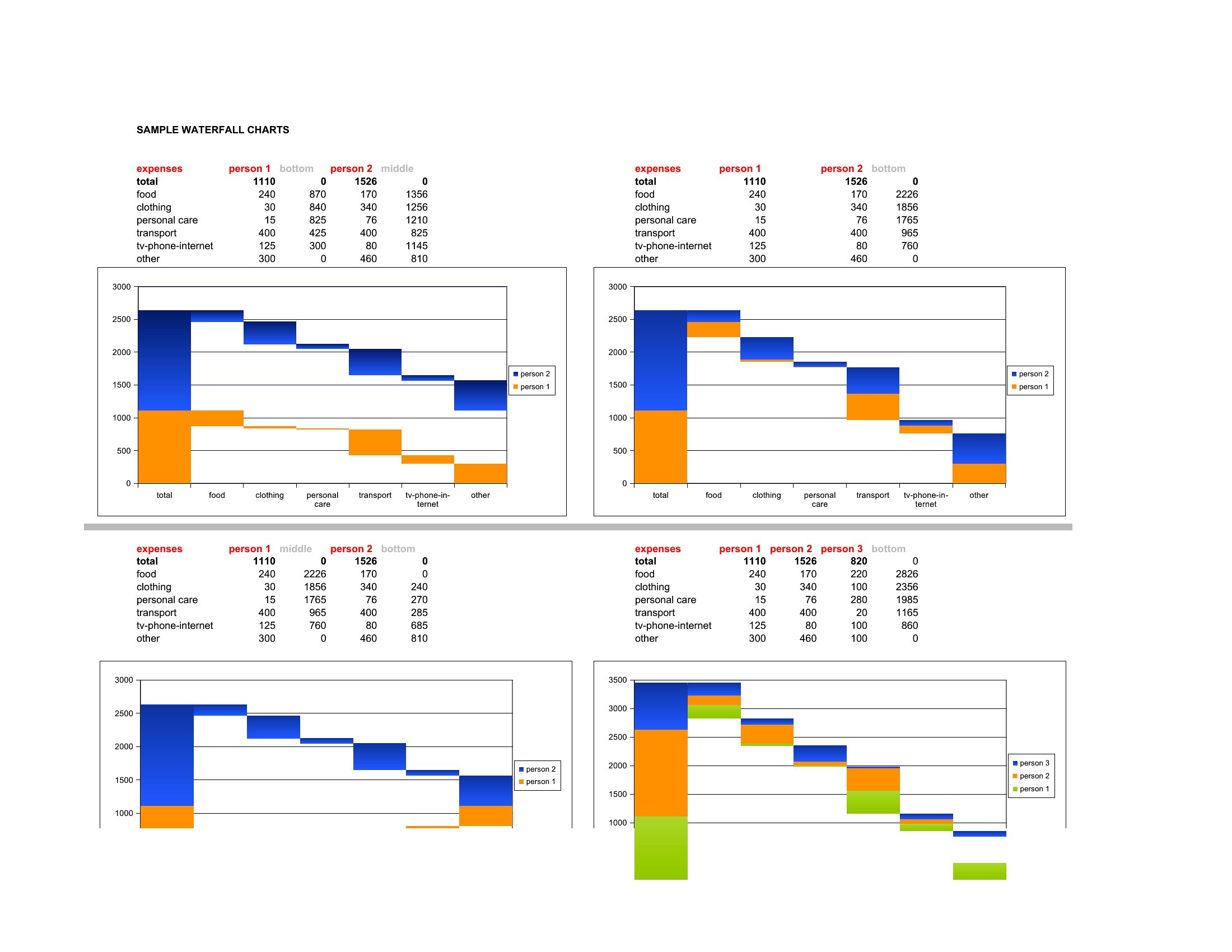
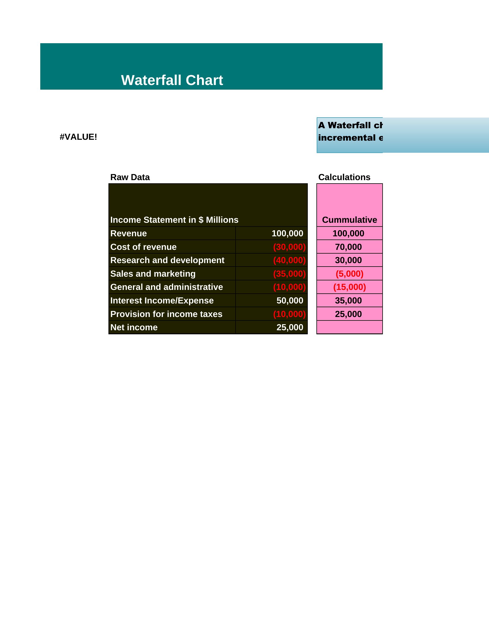
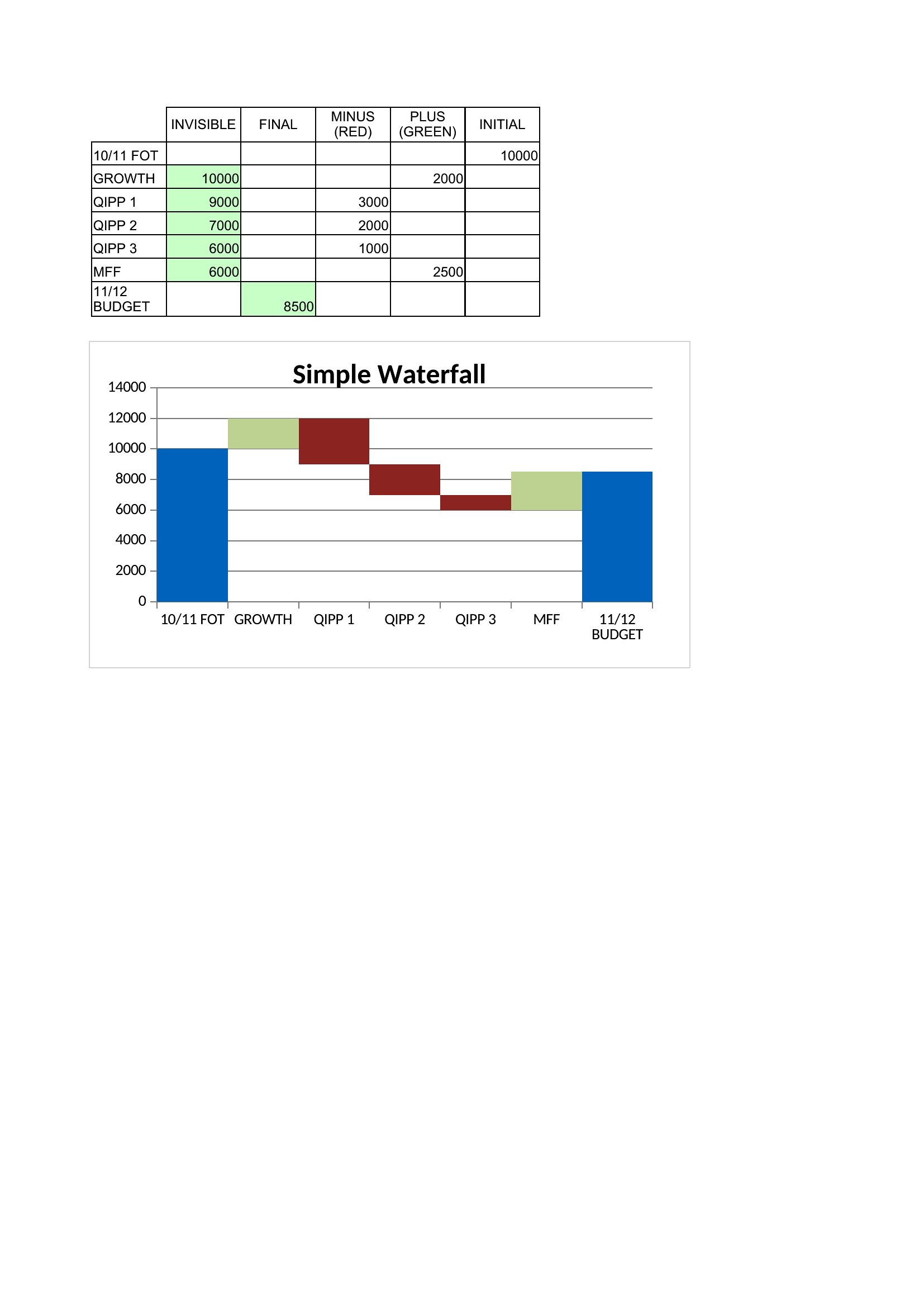
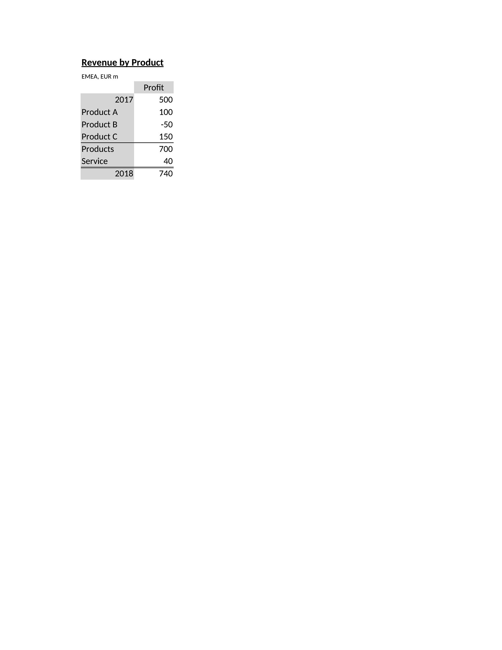
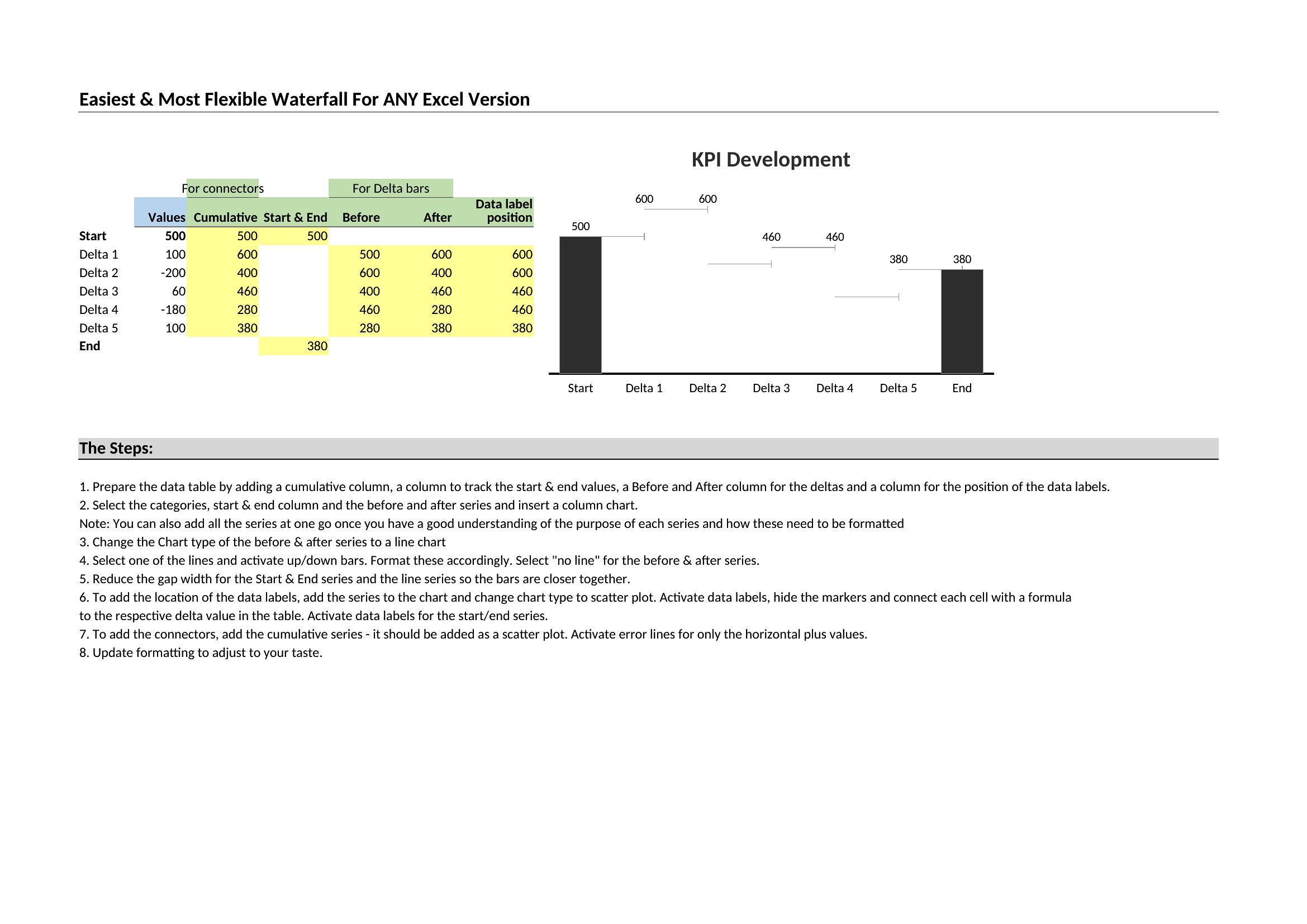
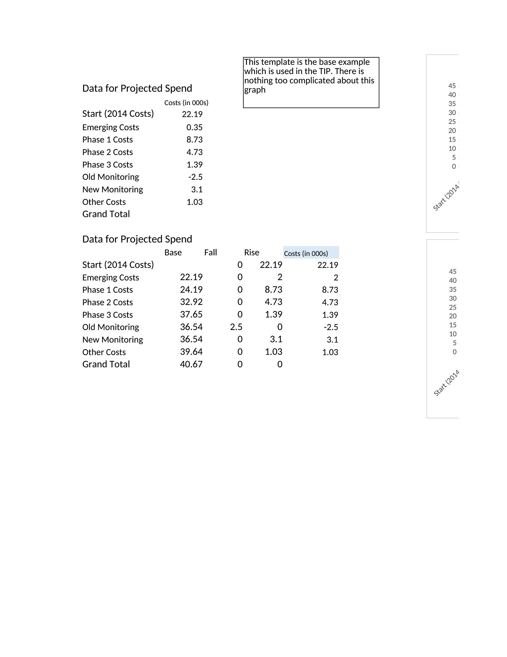
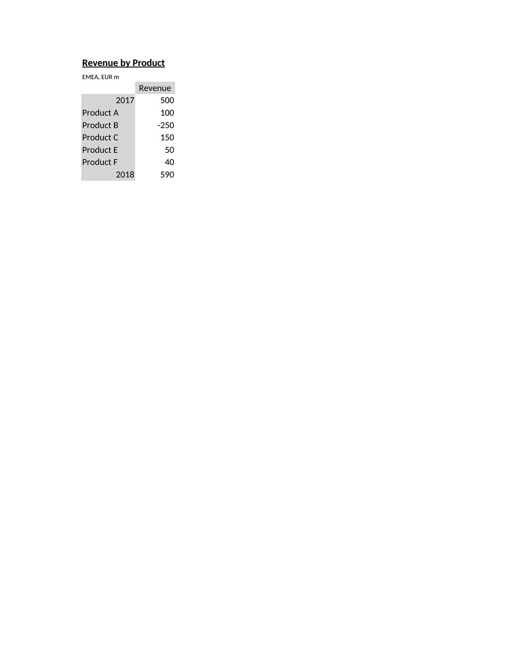
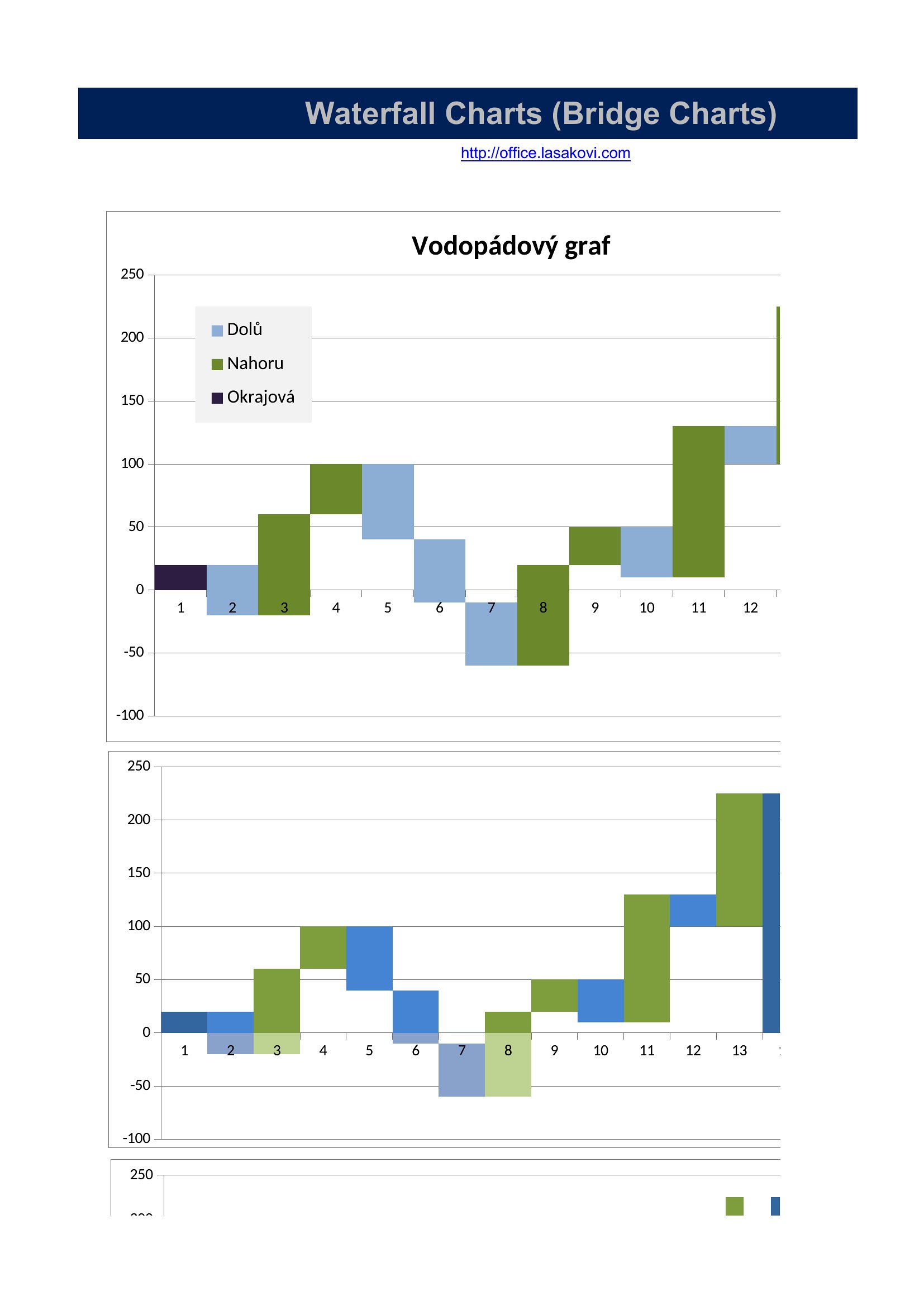
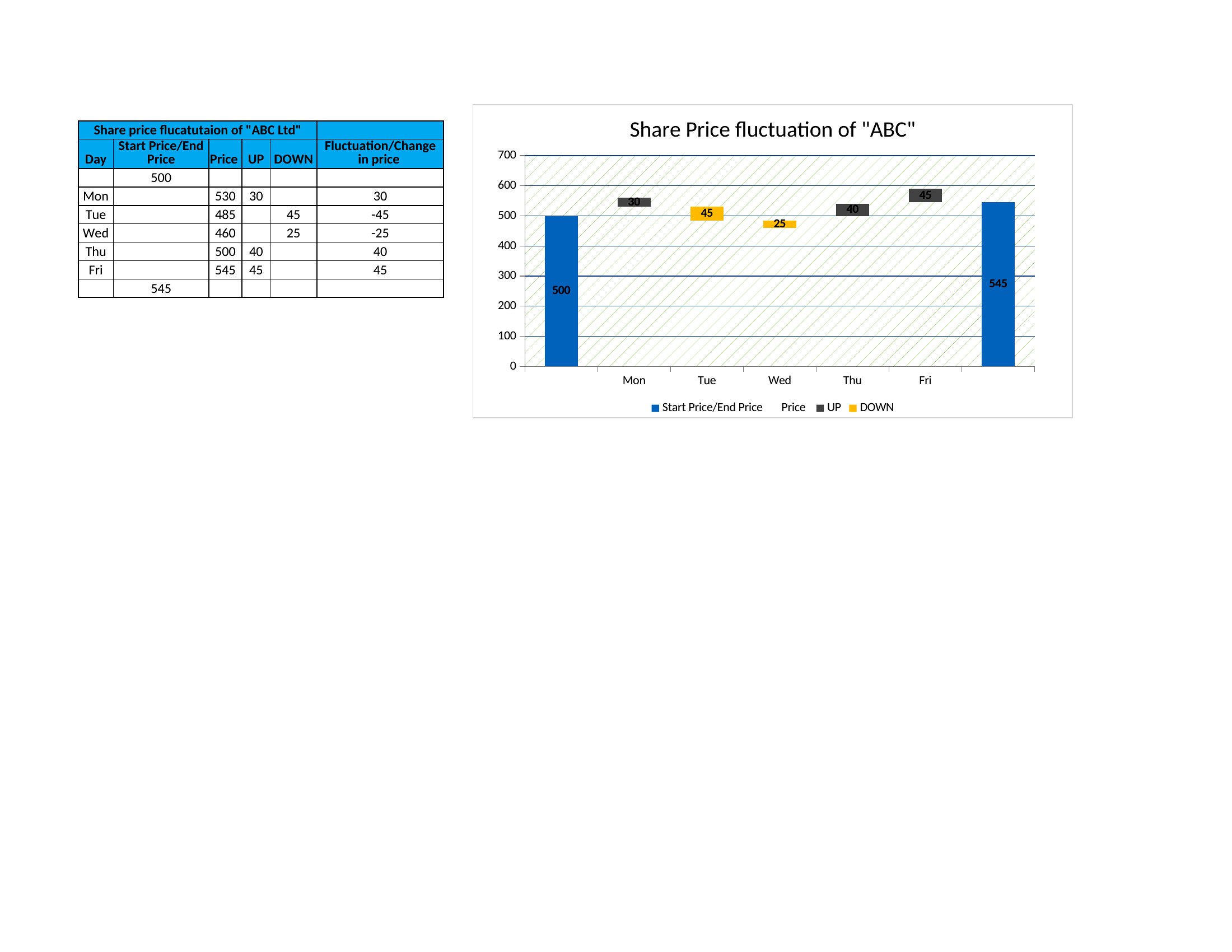
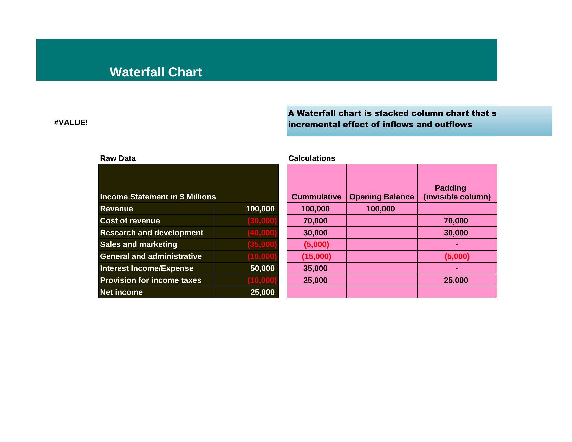
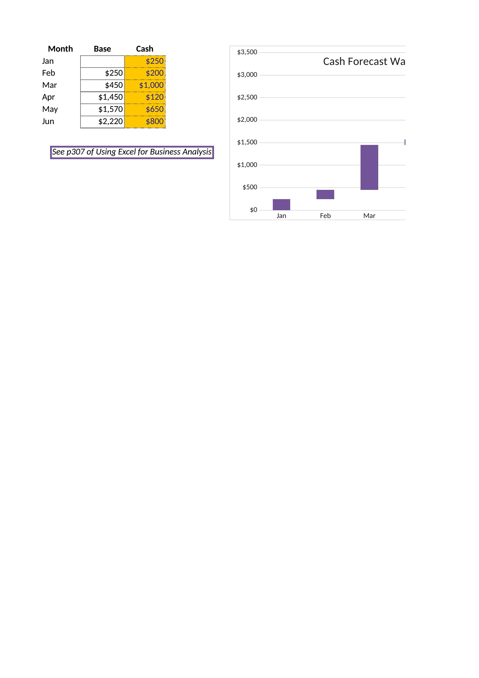
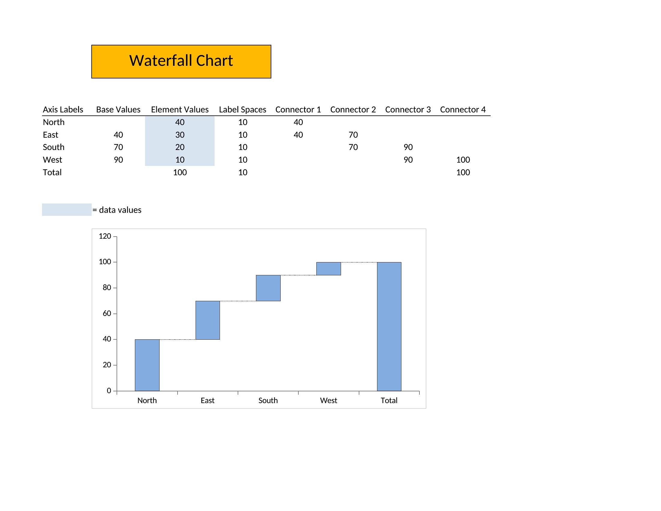
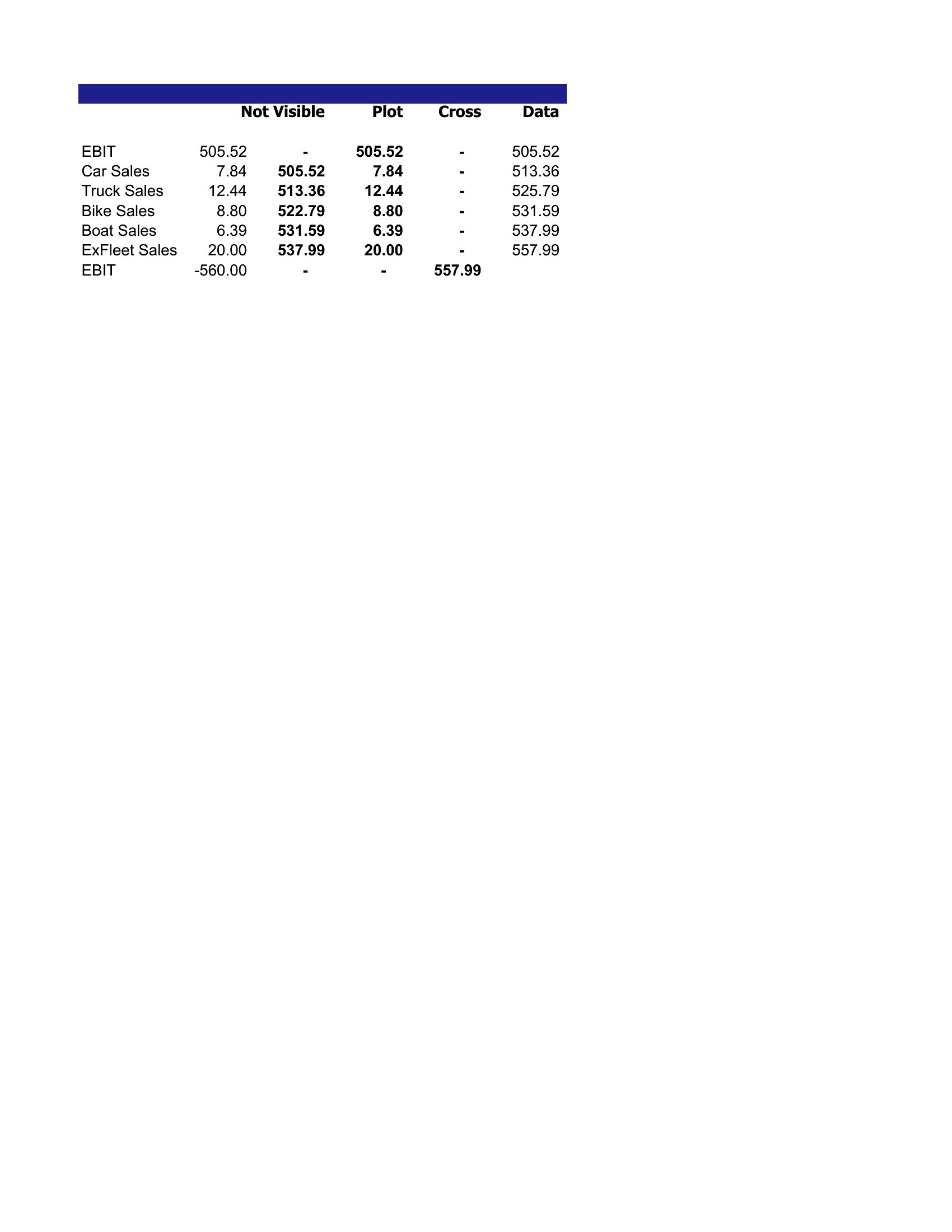
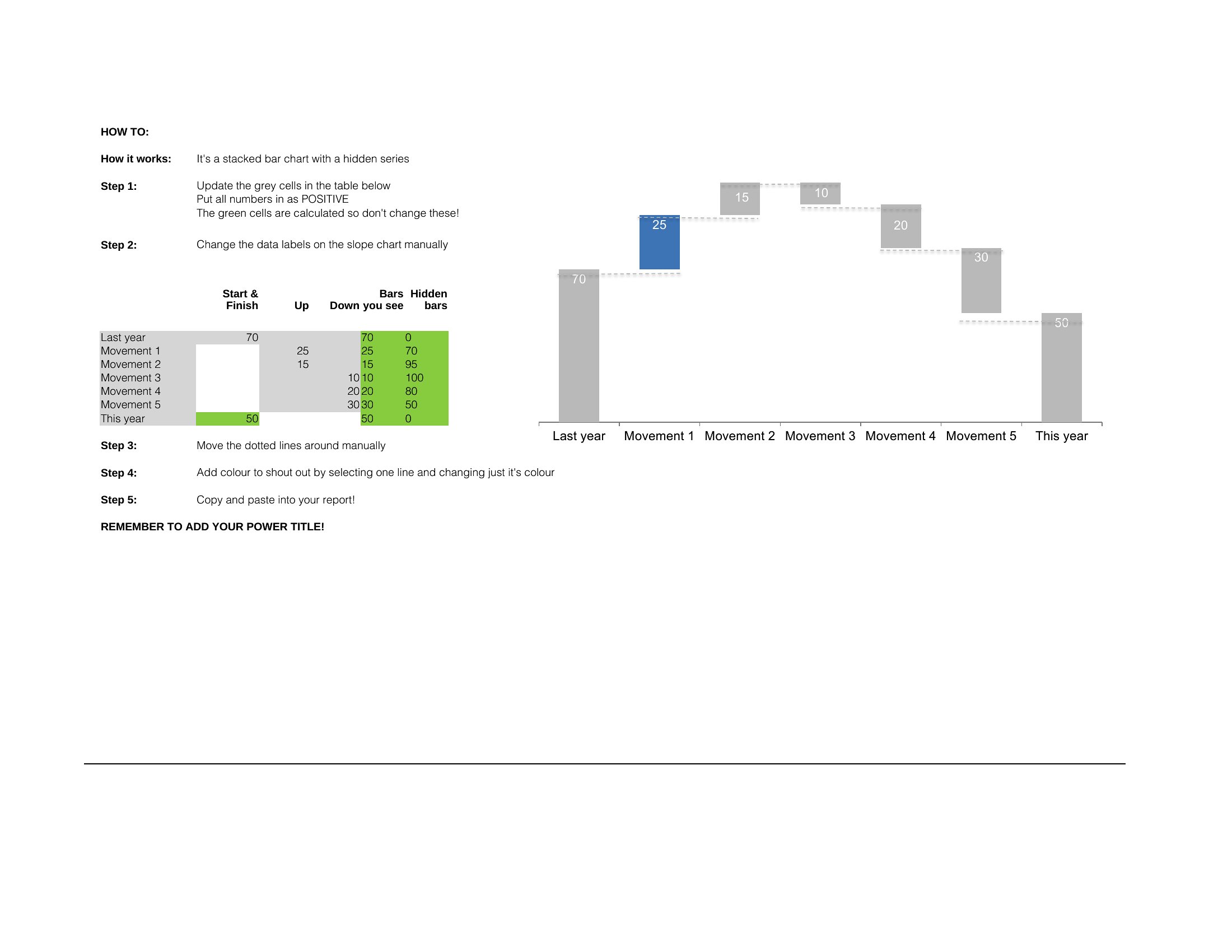
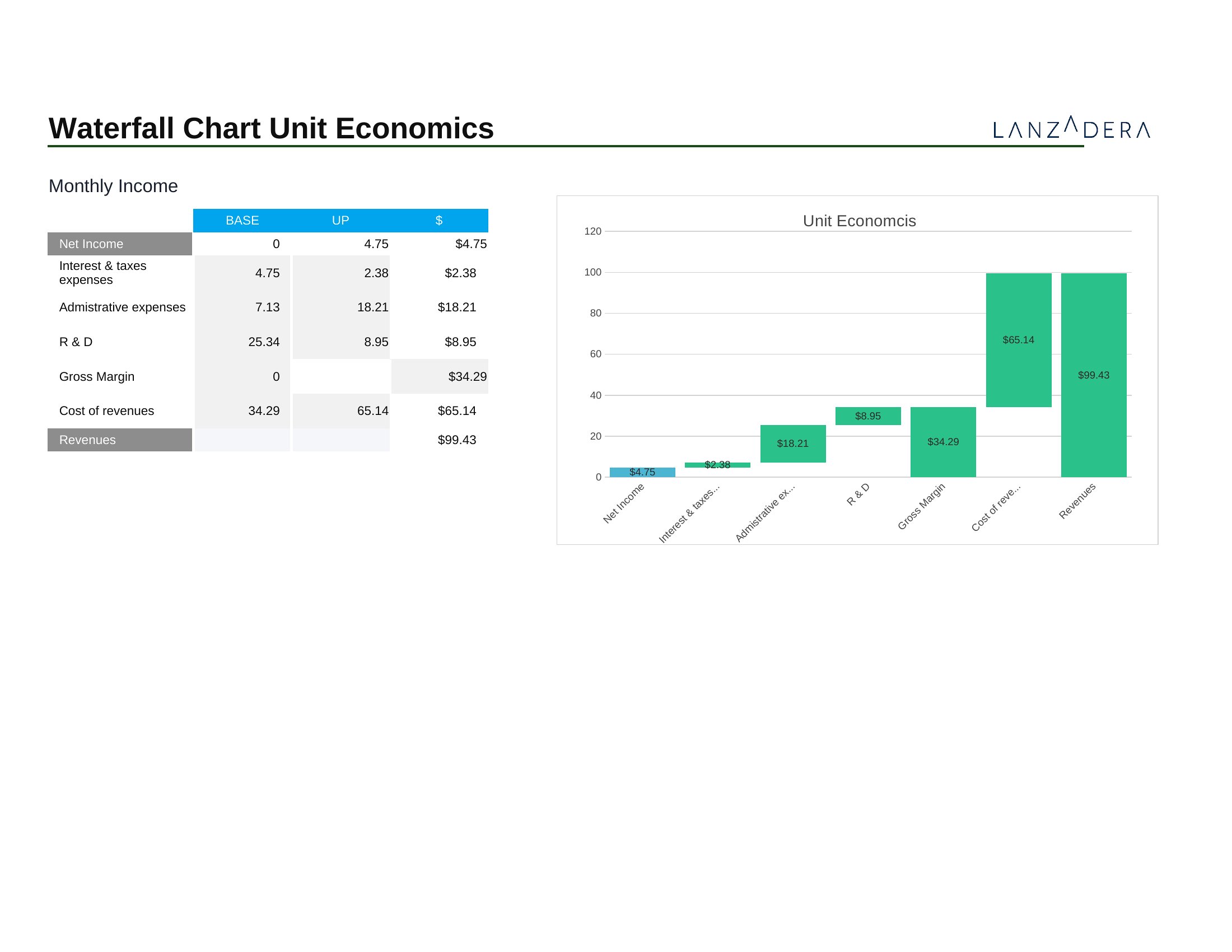
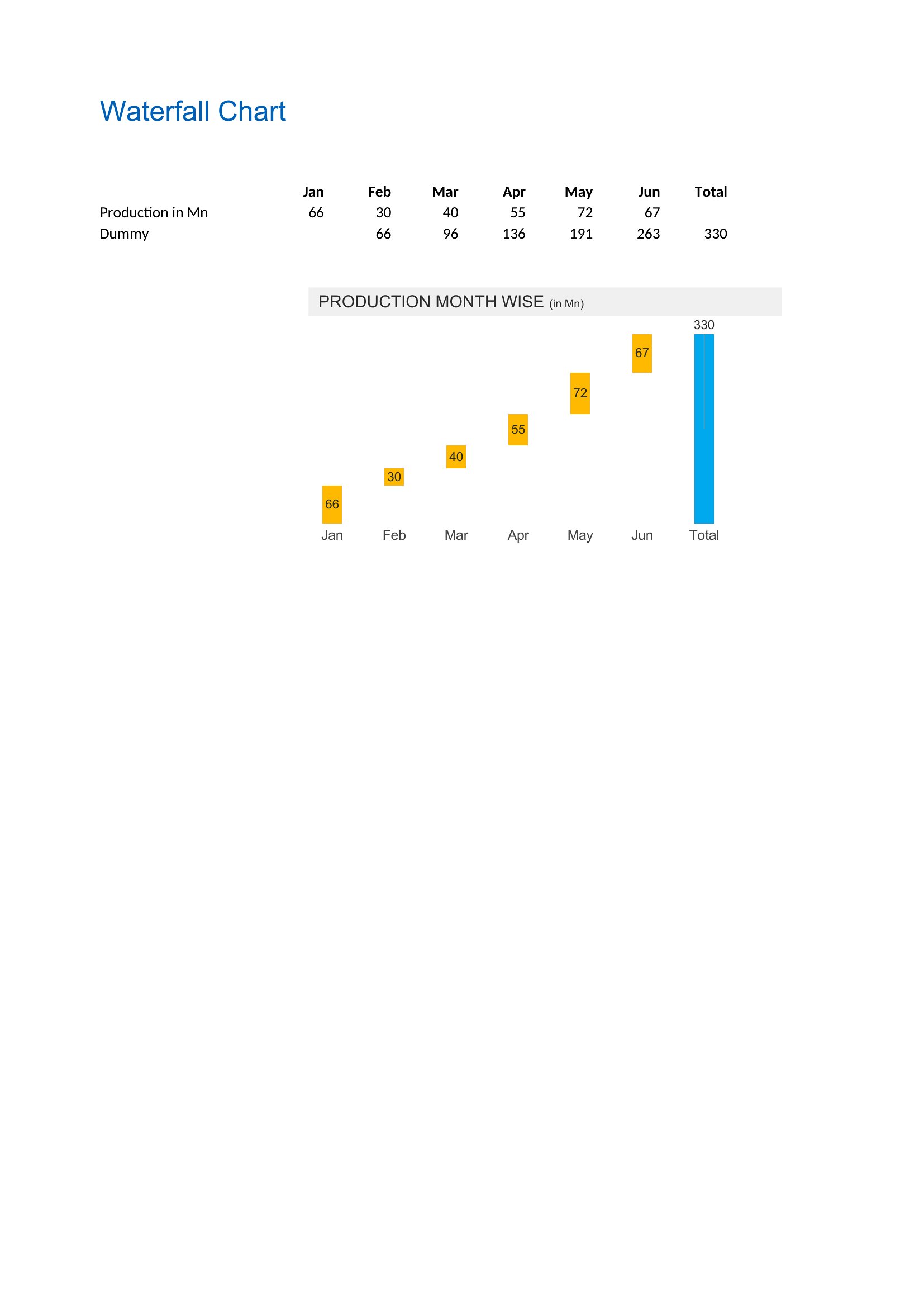
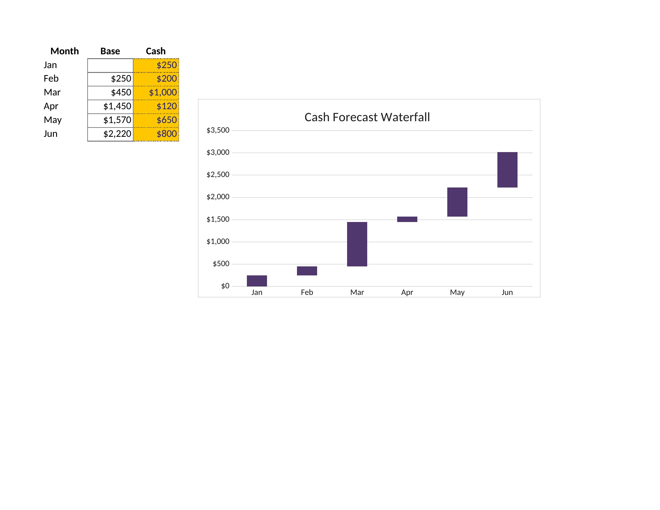
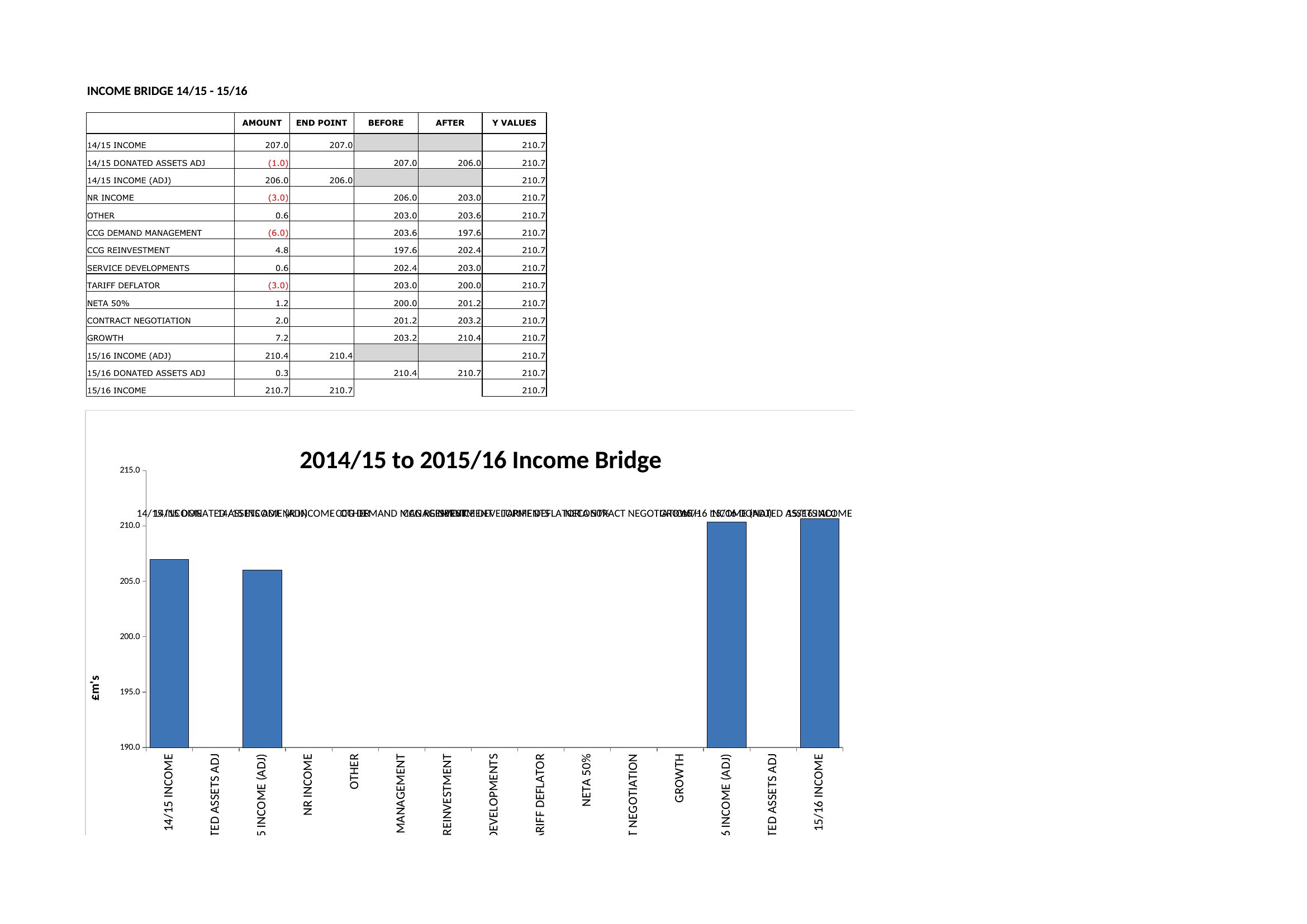
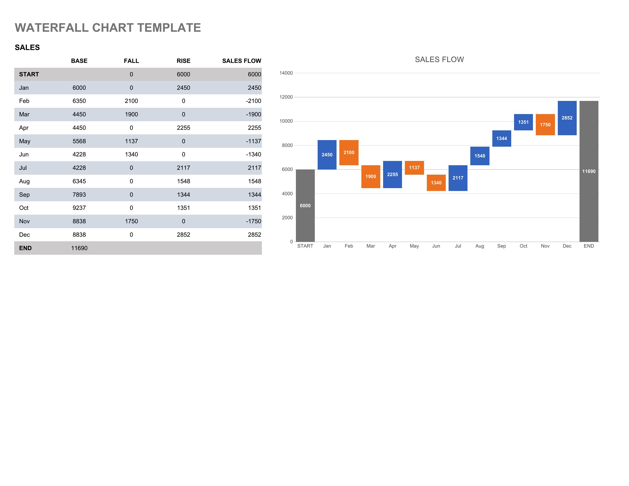
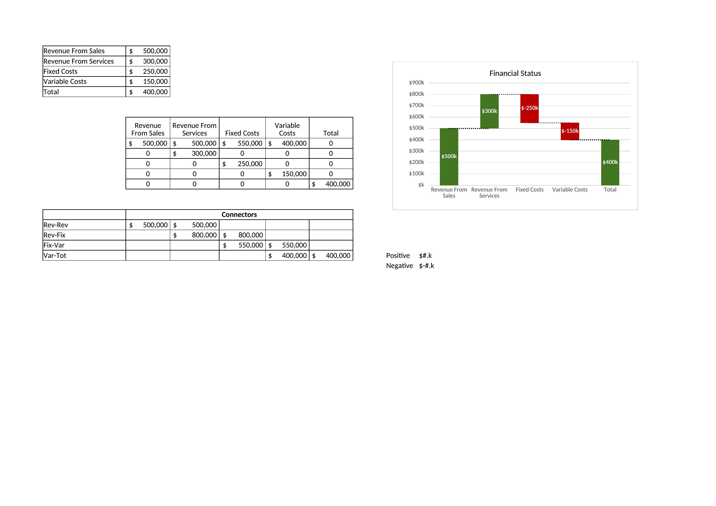
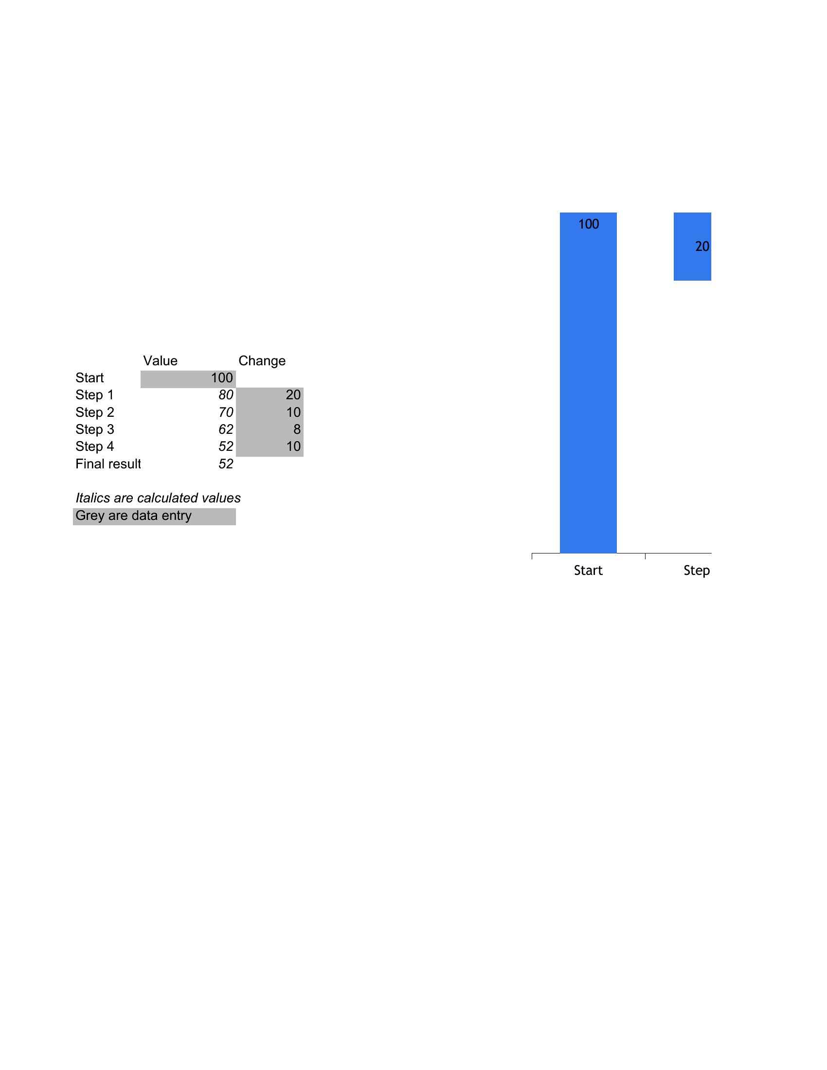
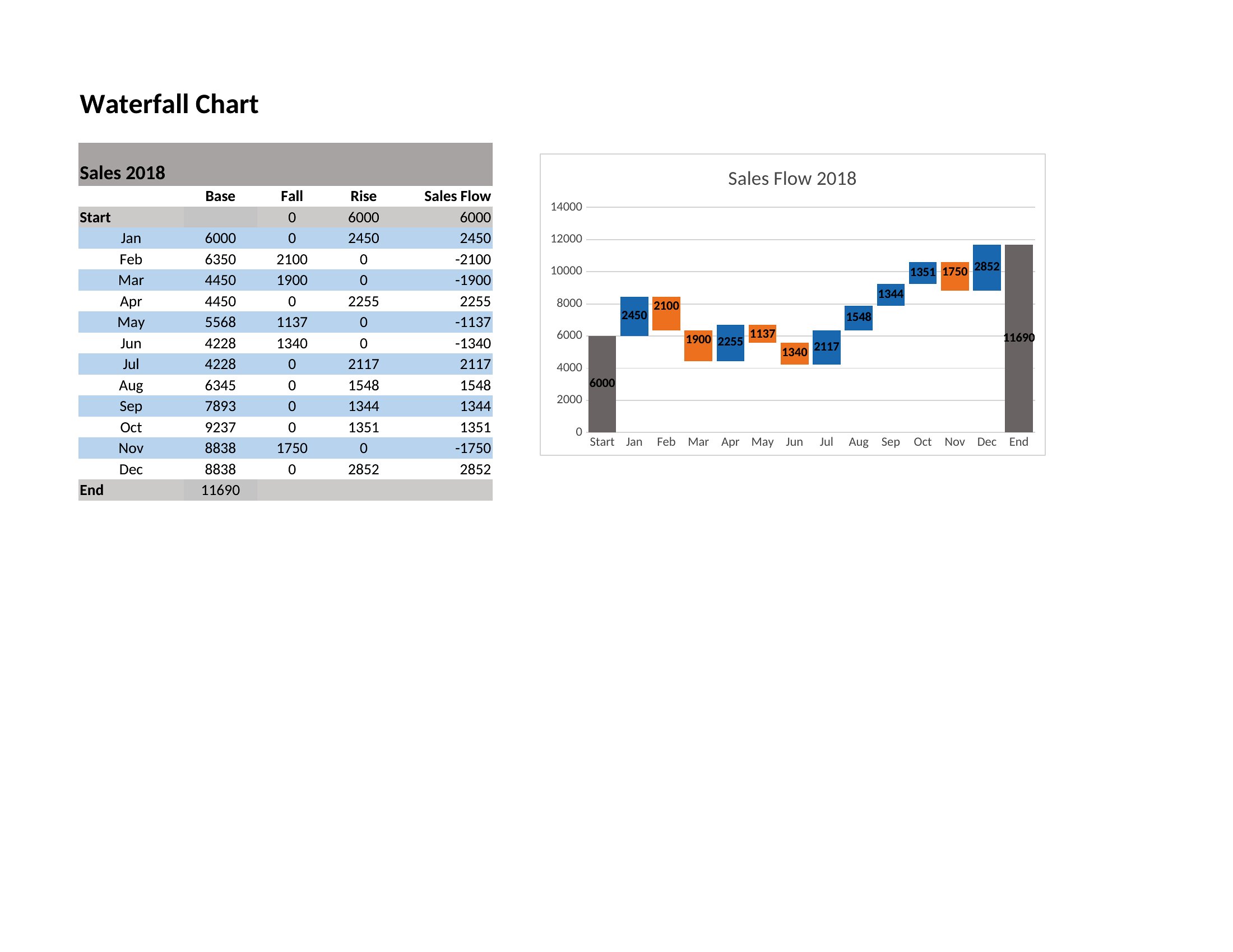
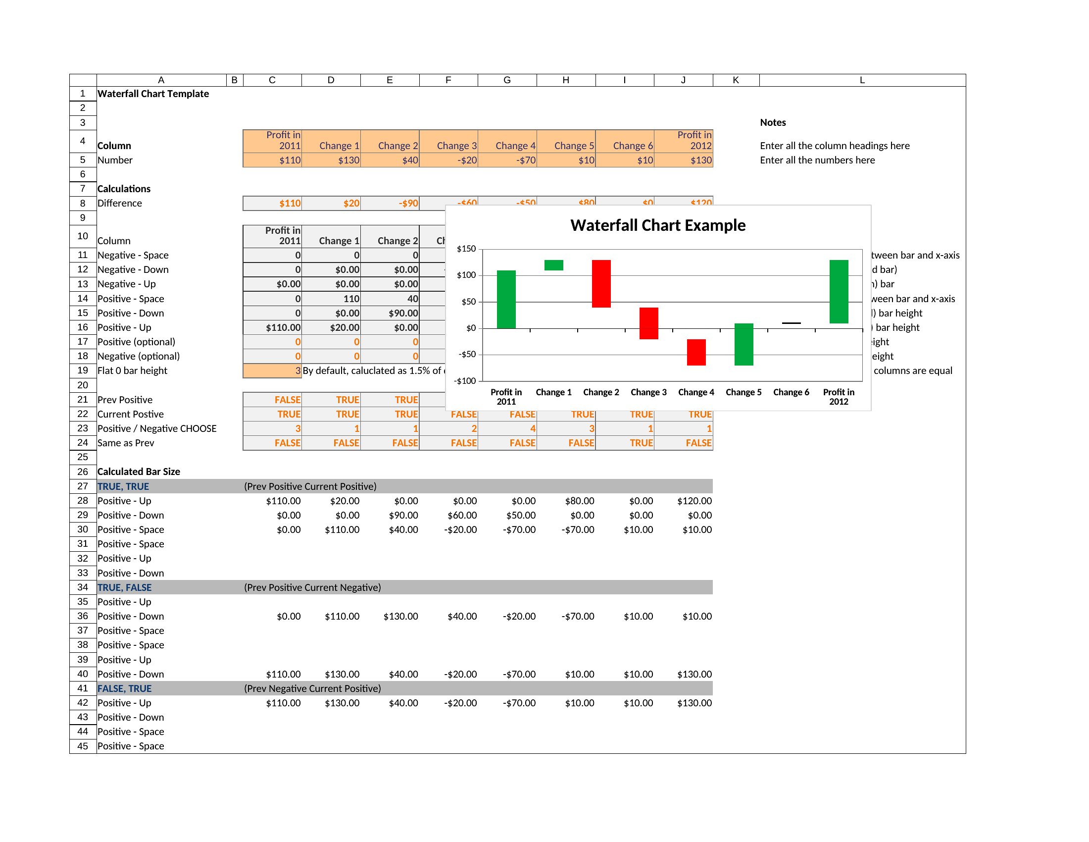
A waterfall chart shows how a starting value rises and falls step by step until it reaches a final total, making it perfect for explaining profit changes, budget swings, or inventory flow. These 43 templates give analysts, finance teams, and project managers a clean framework for turning a column of numbers into a story stakeholders can follow at a glance.
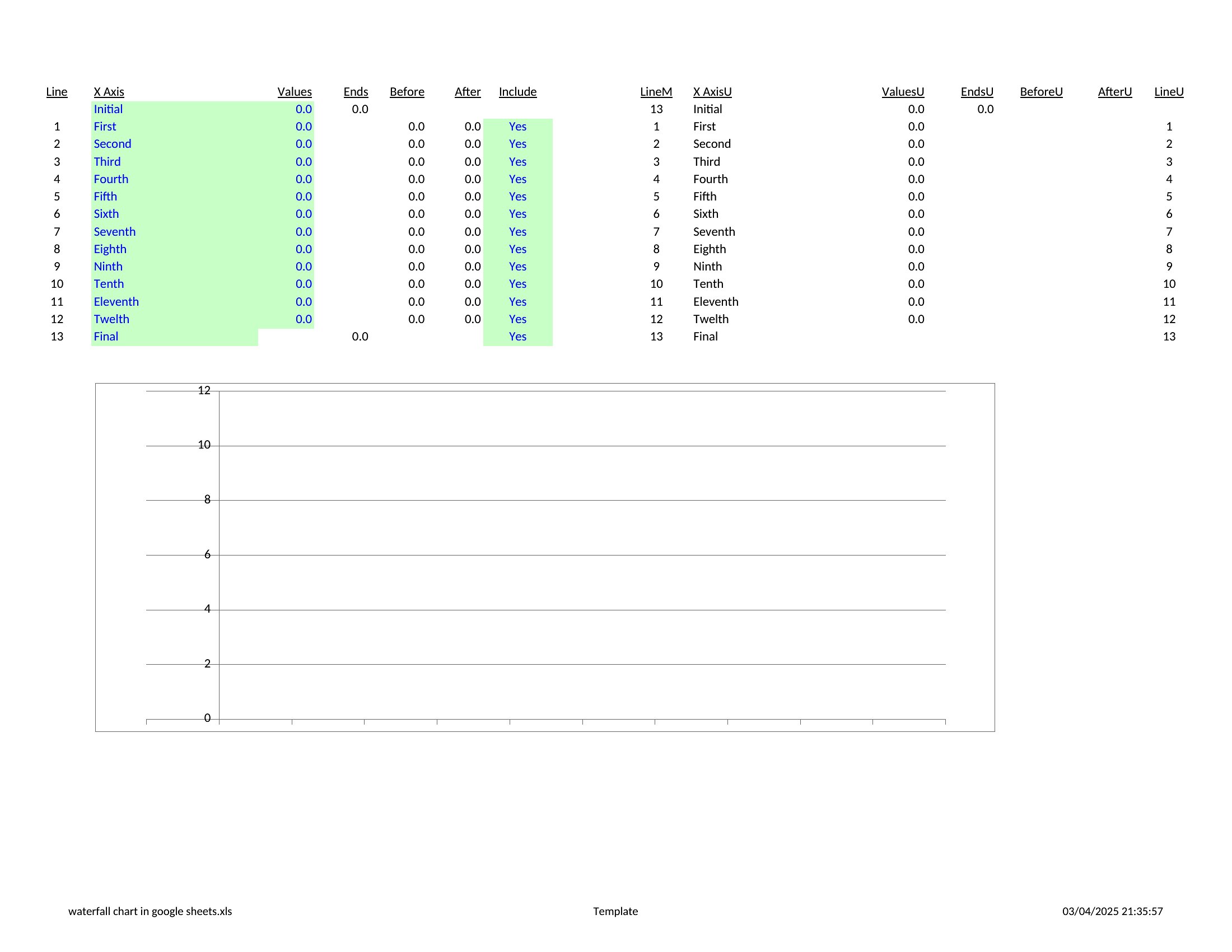
The Excel versions do the heavy lifting, recalculating bars as you update figures, while the Word layouts drop neatly into reports and presentations. Plug in your own values, relabel the categories, and the chart reshapes itself. Download the version that matches your data and present month-over-month changes without building the visual by hand.

When to use this Waterfall Chart template

  • A finance manager explaining quarterly revenue drops to executives by breaking down cost increases, revenue adjustments, and one-time expenses in a single visual.
  • A project lead tracking budget variances for a construction team, highlighting material cost spikes, labor savings, and unexpected delays in a way non-finance stakeholders grasp immediately.
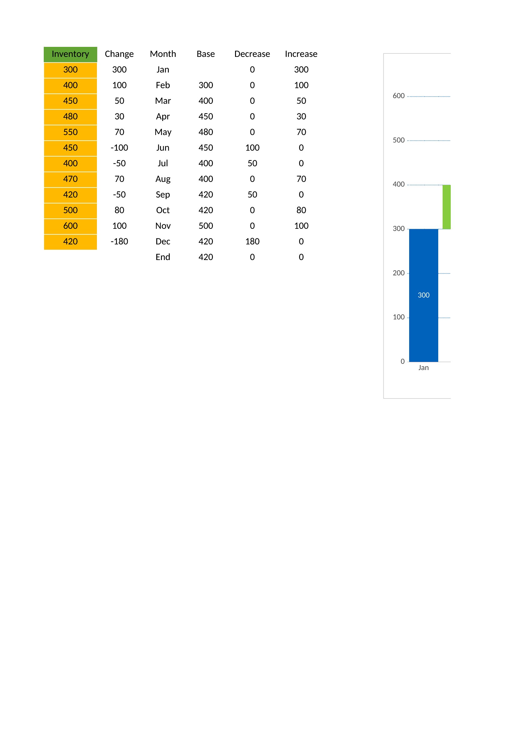
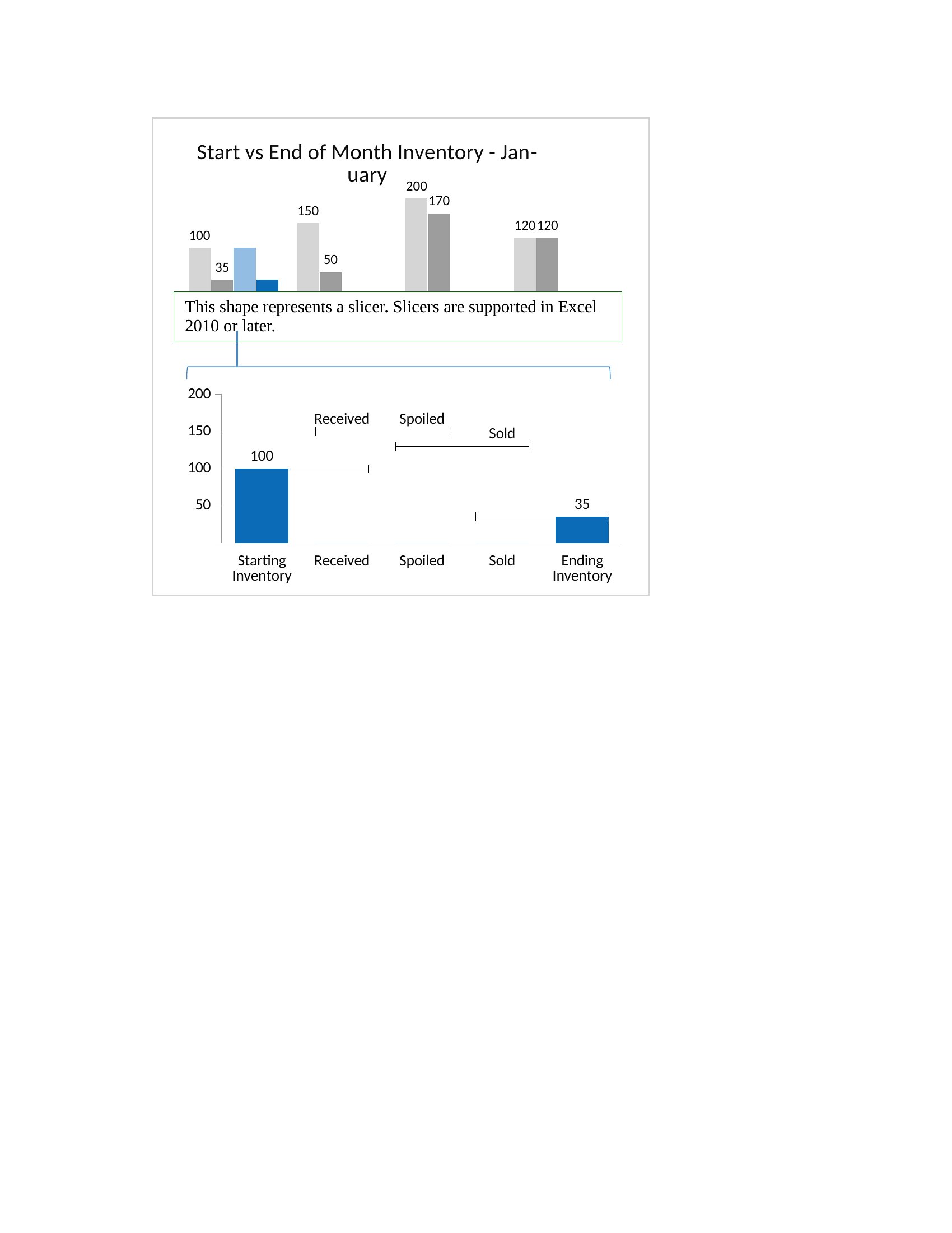
  • A supply chain analyst presenting inventory fluctuations to a retail buyer, showing how initial stock levels changed due to supplier delays, promotions, and waste reduction initiatives.
  • A small business owner reviewing year-over-year profit shifts with an accountant, comparing last year’s net income to this year’s adjustments for inflation, new hires, and unexpected repairs.

Which format should I download?

WordExcel

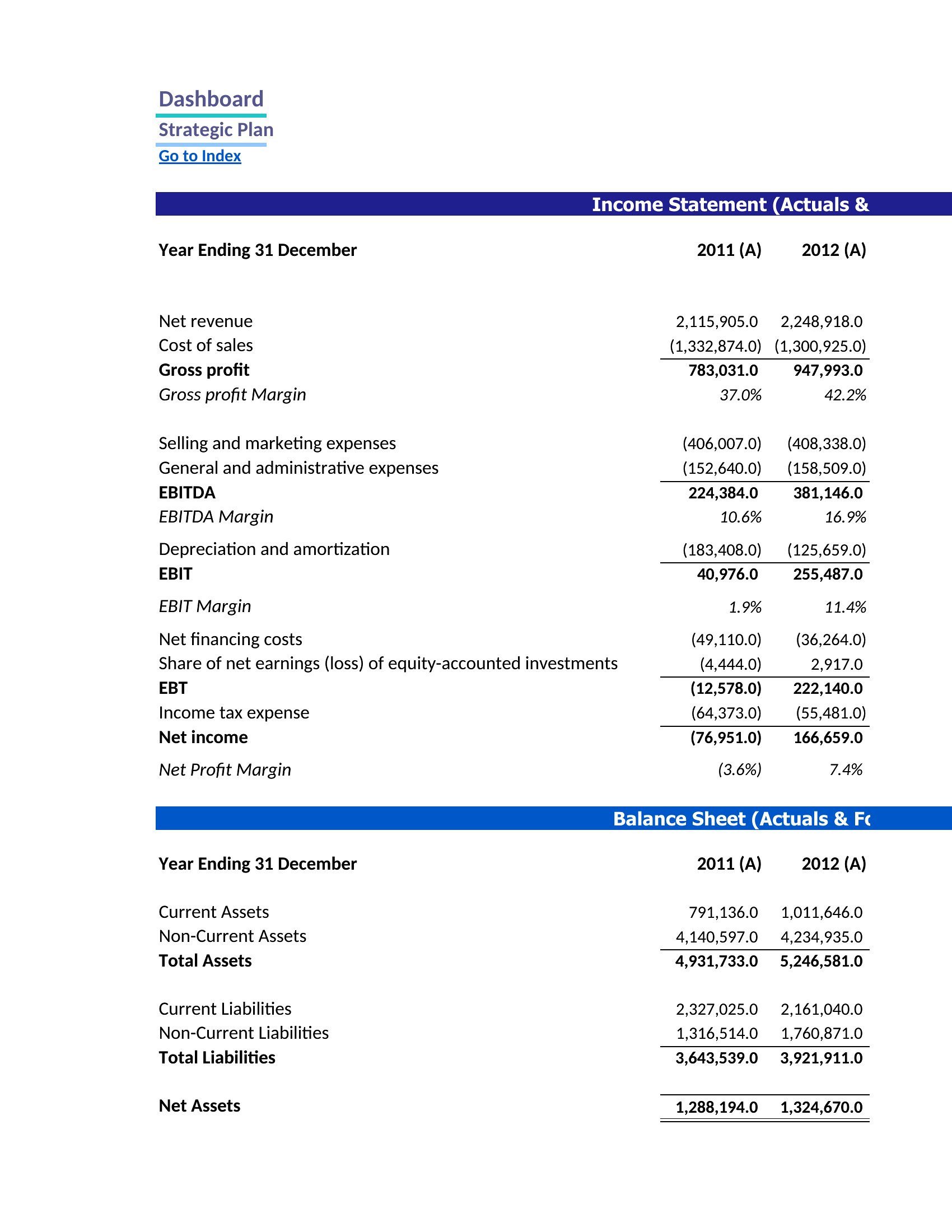
Use the Excel format for most needs—it’s the most flexible, with built-in calculations to auto-populate your actual numbers and dynamically update the chart. The Word format is ideal if you need to embed the chart in a report or presentation but don’t have Excel, as it lets you paste a static image or snippet while keeping your narrative intact. Choose Word when collaboration with non-technical teams is key, as they can annotate directly in the document without worrying about formulas.

Choose from 43 Waterfall Chart Templates
How to use this Waterfall Chart template

Can I adjust the chart to show negative values as downward arrows instead of upward?

Yes, most of these templates allow you to customize the direction of arrows or bars. In Excel, you can modify the conditional formatting rules or data series properties to flip the orientation for negative values. The Word versions may require pasting the chart as an object and editing it directly in Excel before inserting it back.
What if my final total doesn’t match the expected outcome?

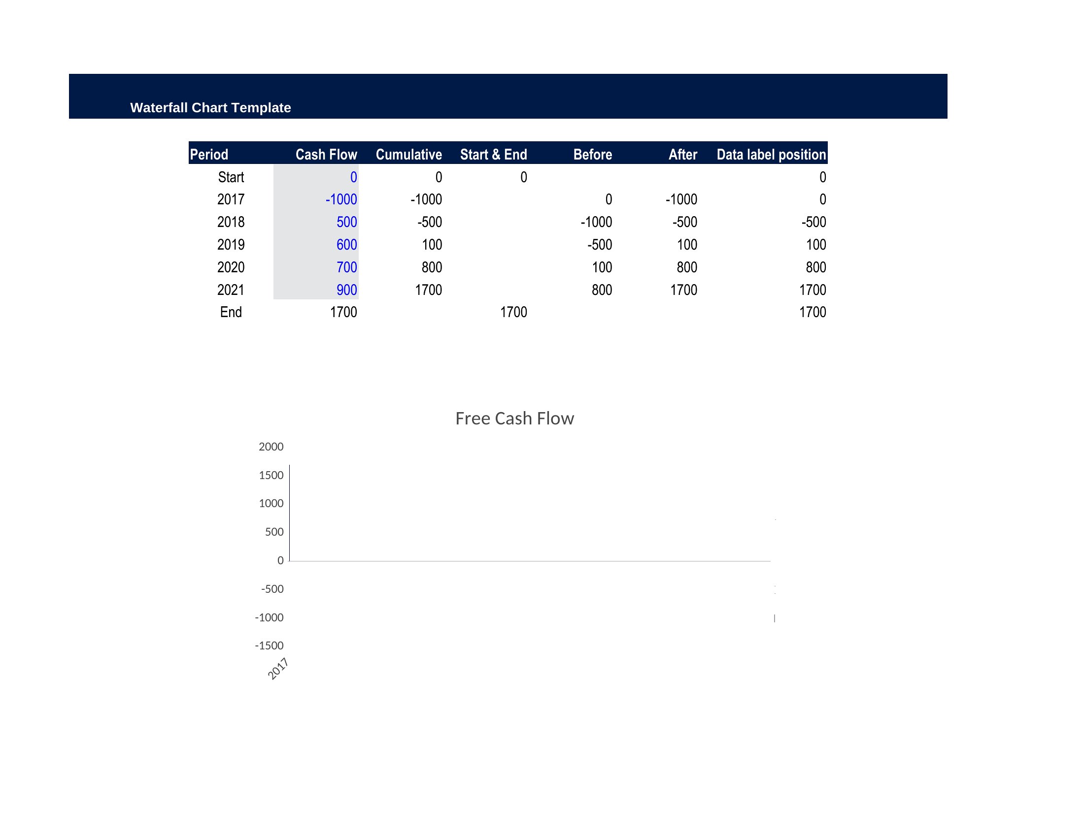
Double-check the starting value and each incremental change for typos or misplaced decimals. The Excel templates are designed to auto-calculate totals, so discrepancies usually stem from input errors. For Word versions, ensure the chart is linked to the correct data range or repaste it from Excel to refresh the calculations.
Do these templates work for comparing multiple scenarios, like ‘best-case’ vs. ‘worst-case’ budgets?
The templates focus on single-series waterfall charts, which are best for one scenario at a time. To compare scenarios, you’ll need to create separate charts or use Excel’s ‘What-If Analysis’ tools to layer multiple waterfall charts side by side. For side-by-side comparisons in Word, consider inserting multiple static chart images with clear labels.
Comments

Join the conversation

Sign in to share your thoughts and leave a comment on this resource.

Newsletter

Get Weekly Design Updates

Join our community to receive curated resources and inspiration.

Weekly Tips Resources Early Access

We respect your privacy. Confirmation email required. Privacy Policy