Free Printable T-Chart Templates (Word, PDF)
WorksheetsTemplates
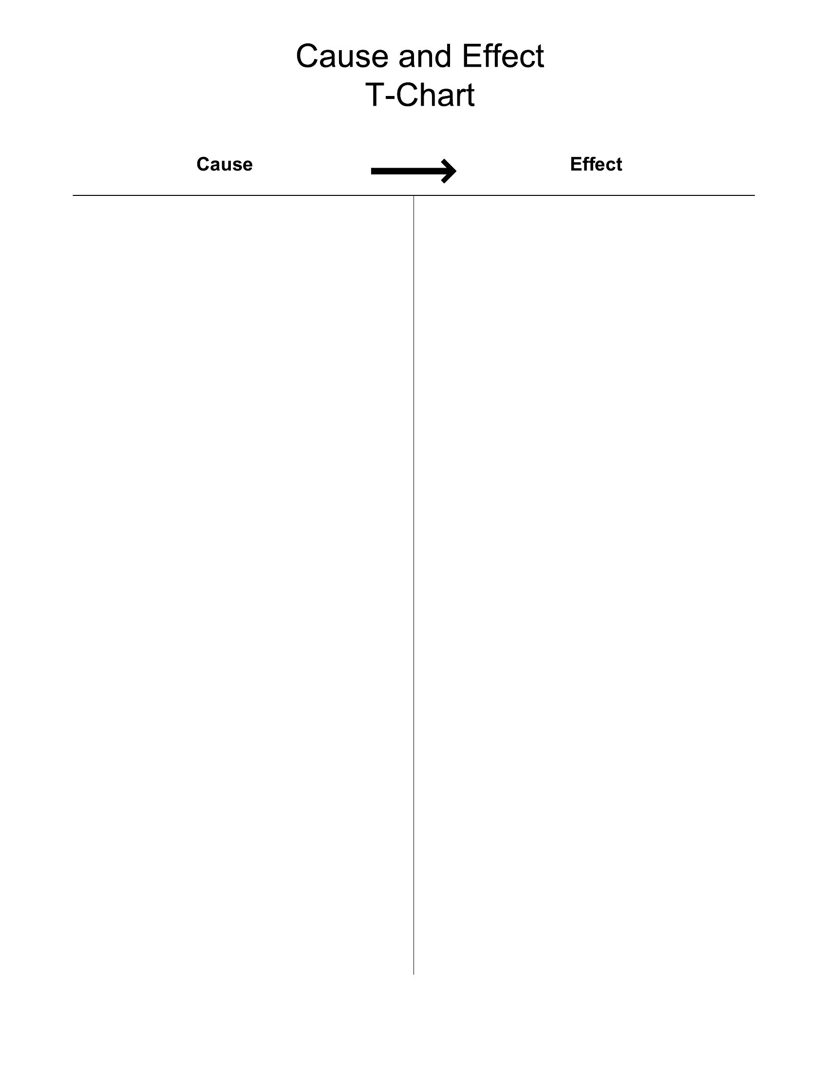
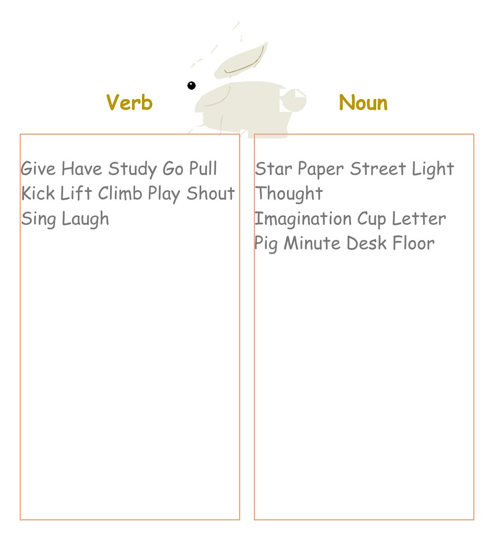
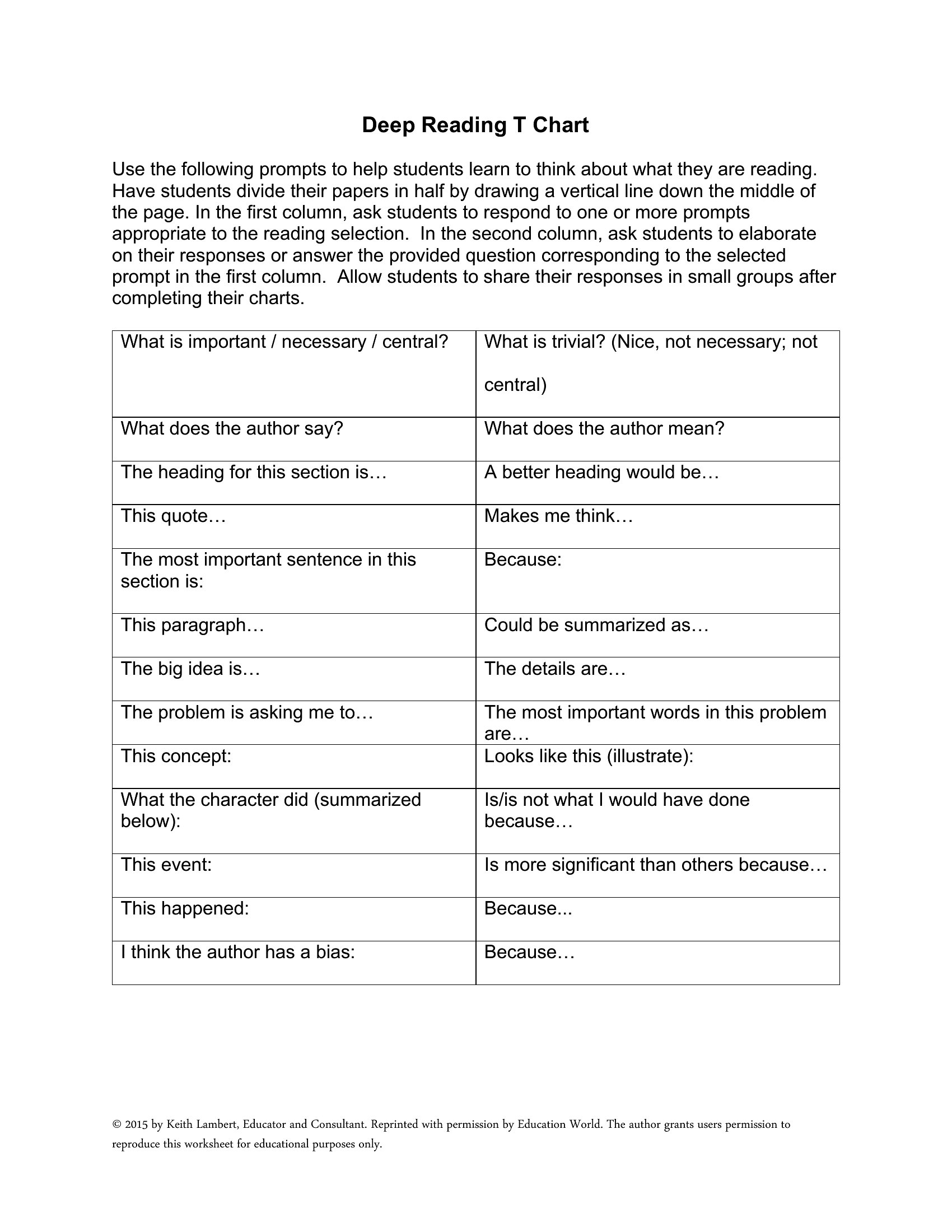
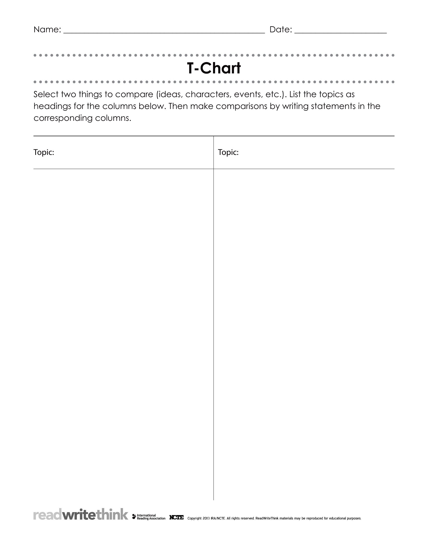
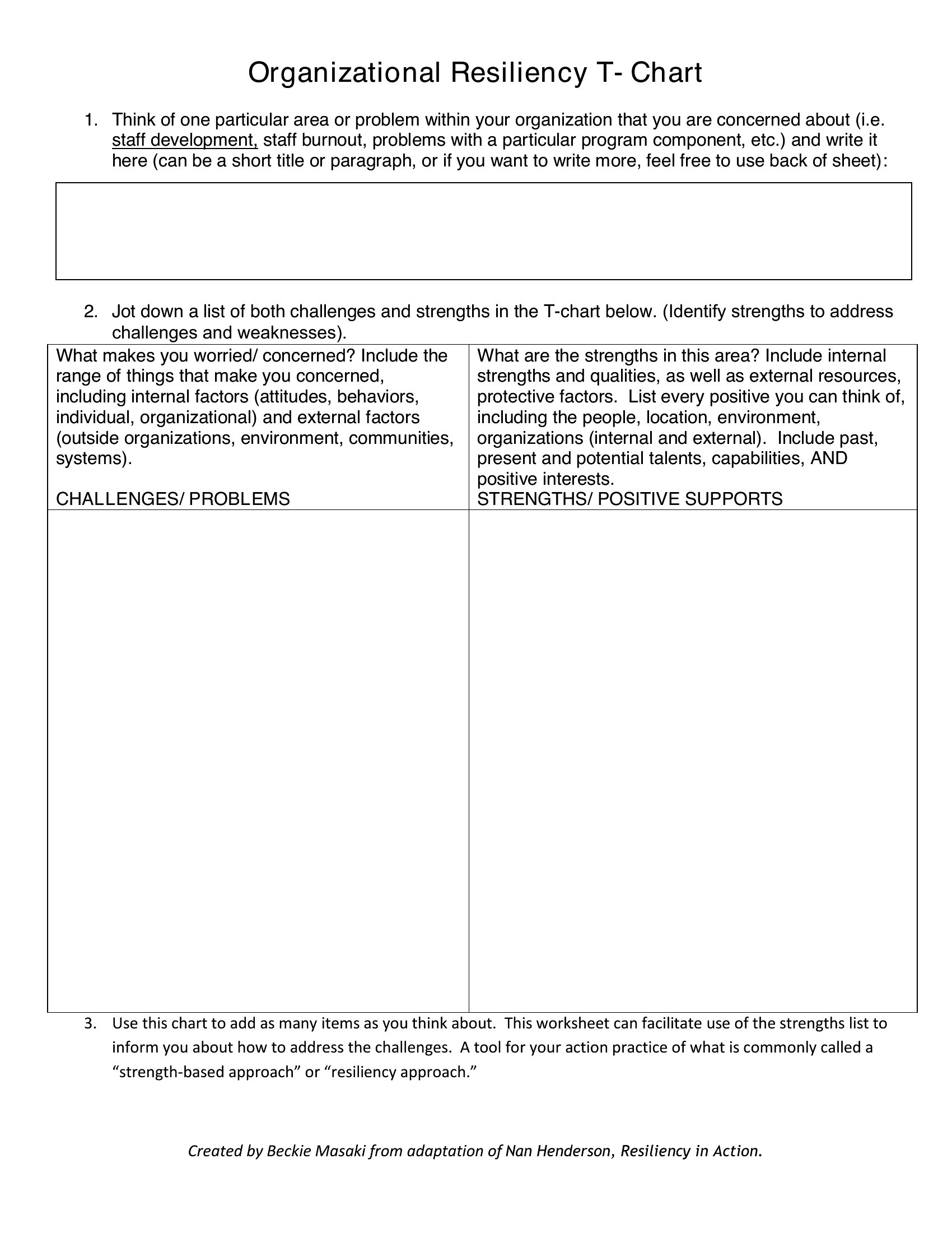
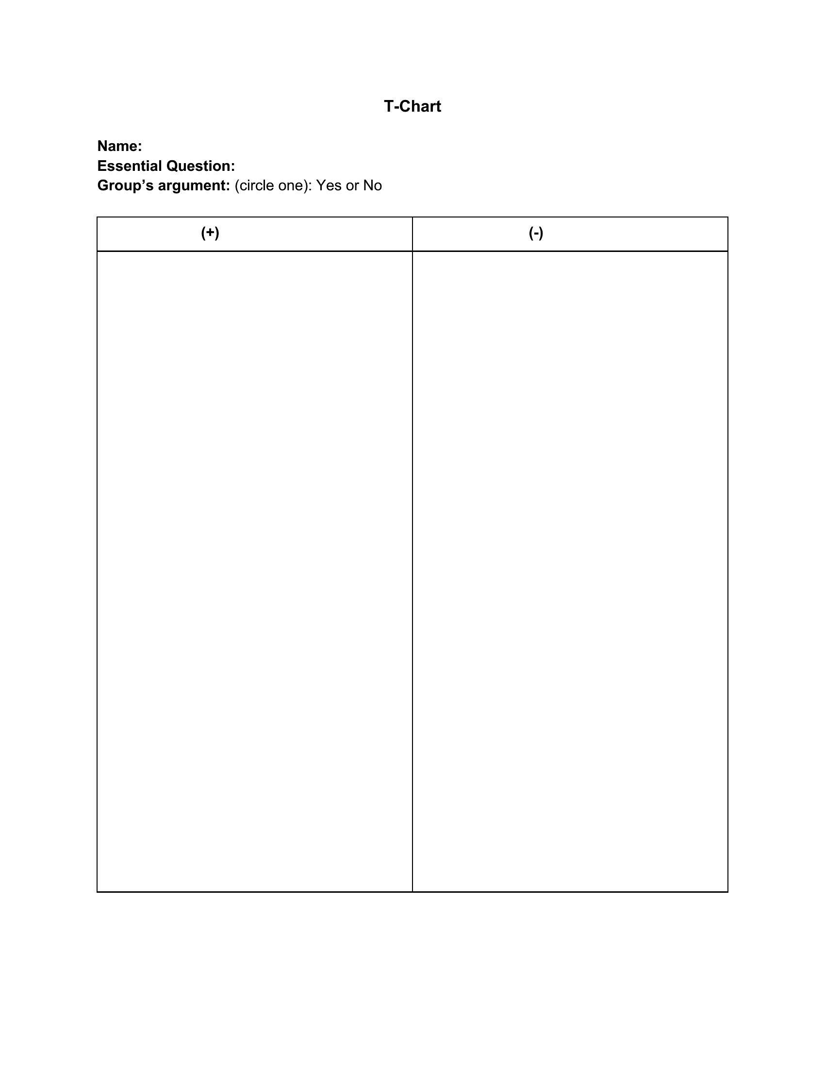
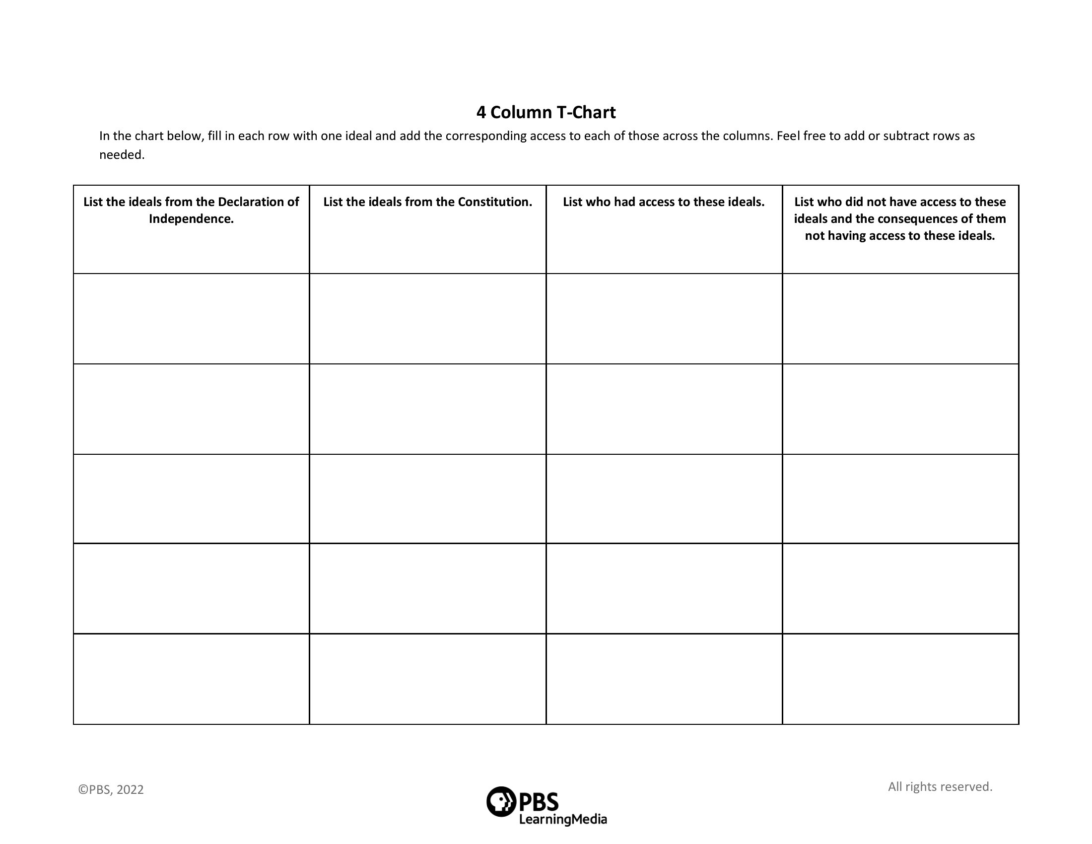
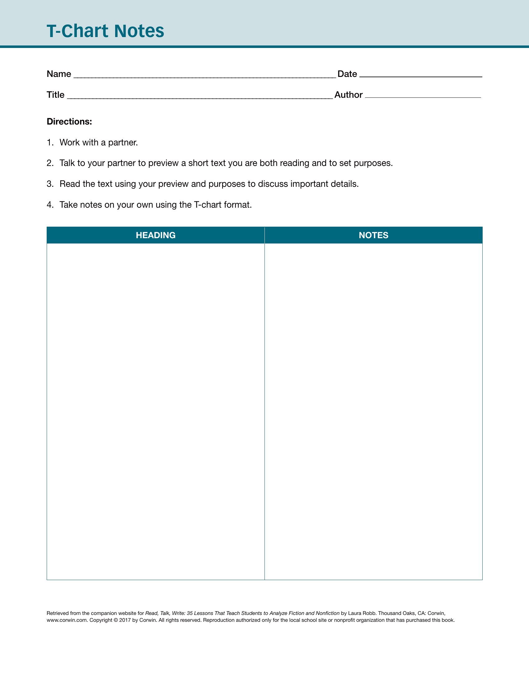
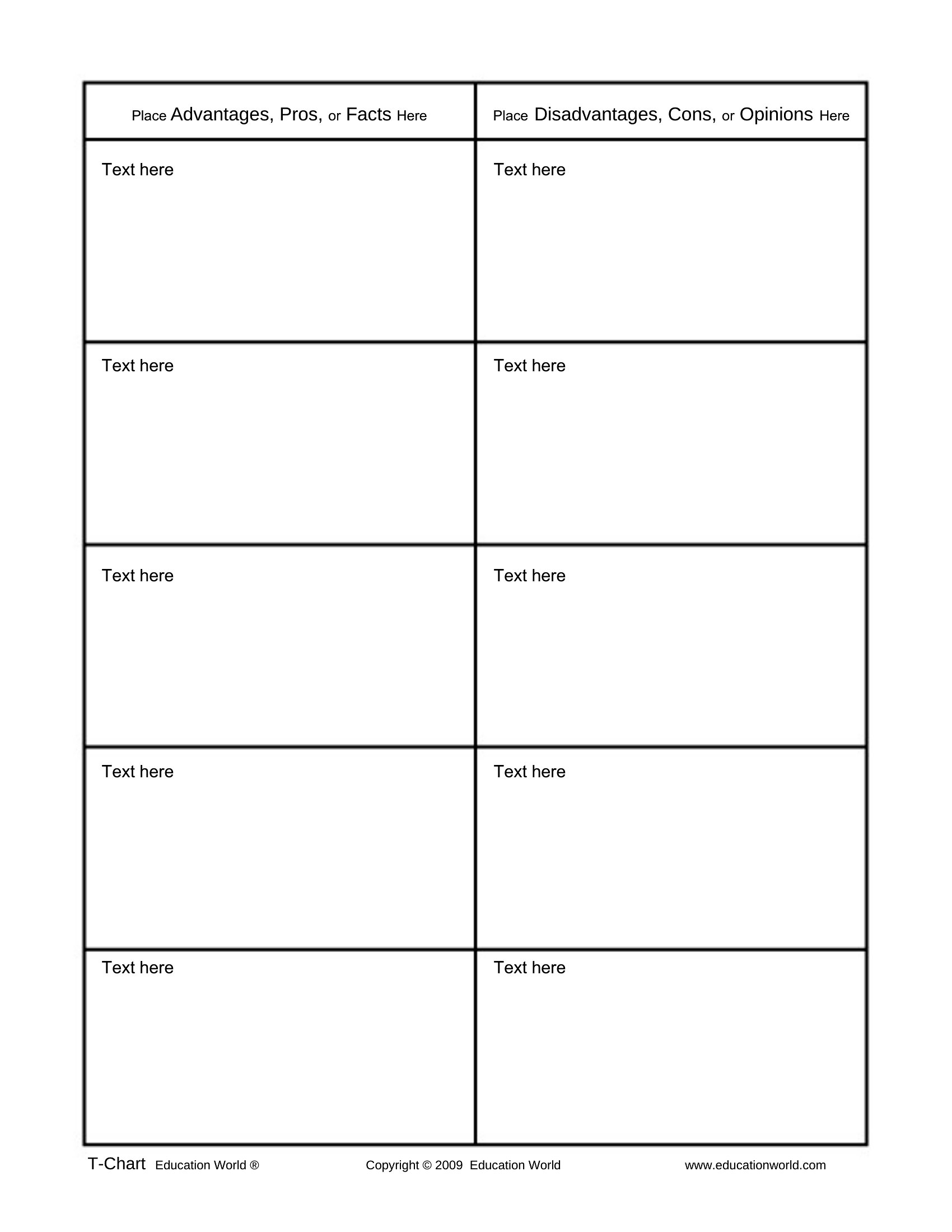
Word T Chart
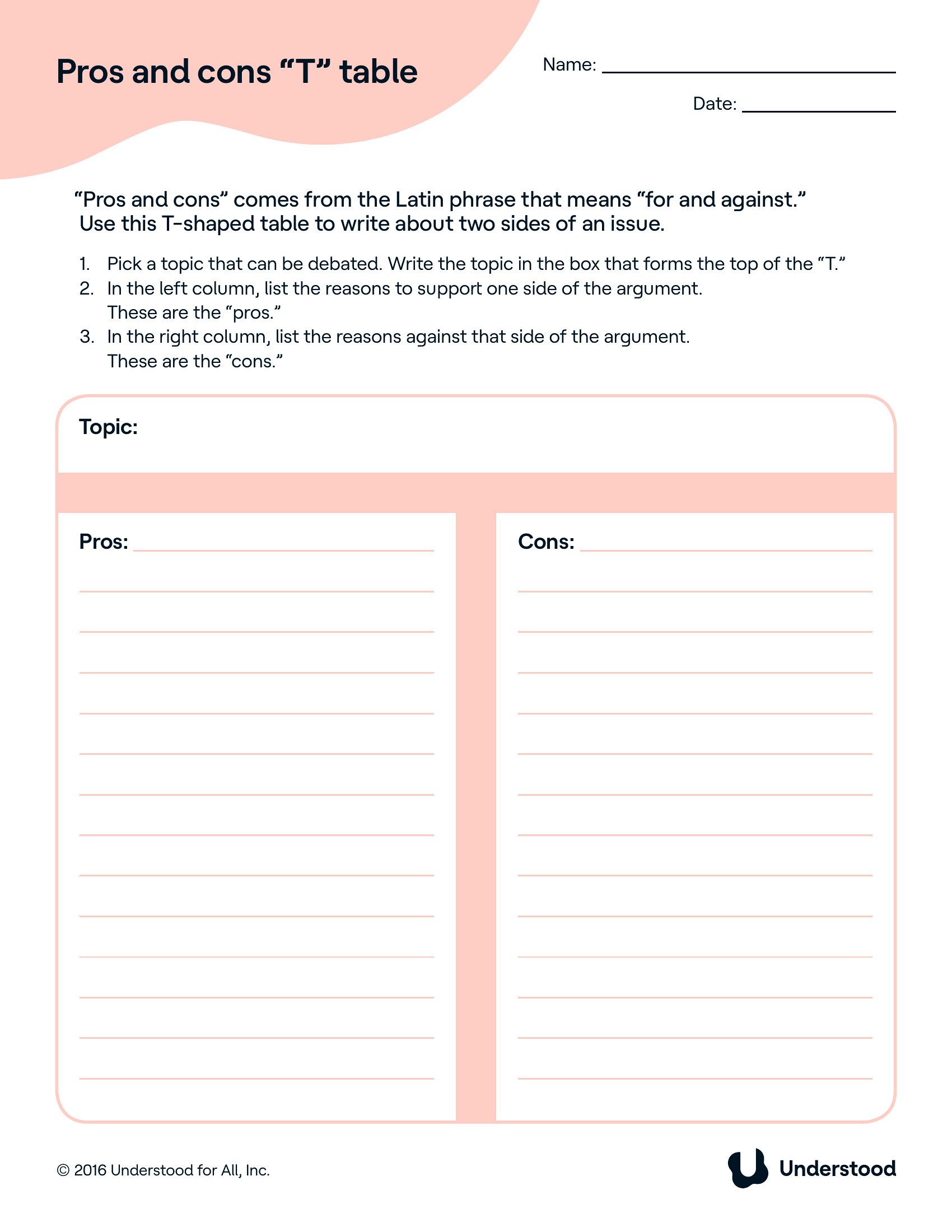
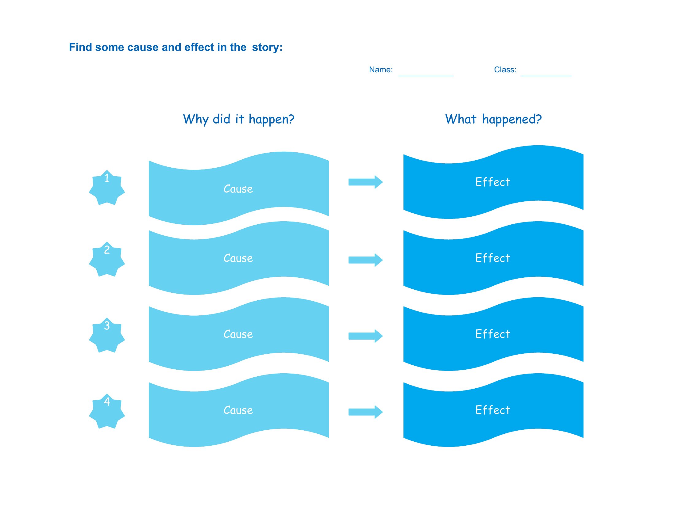
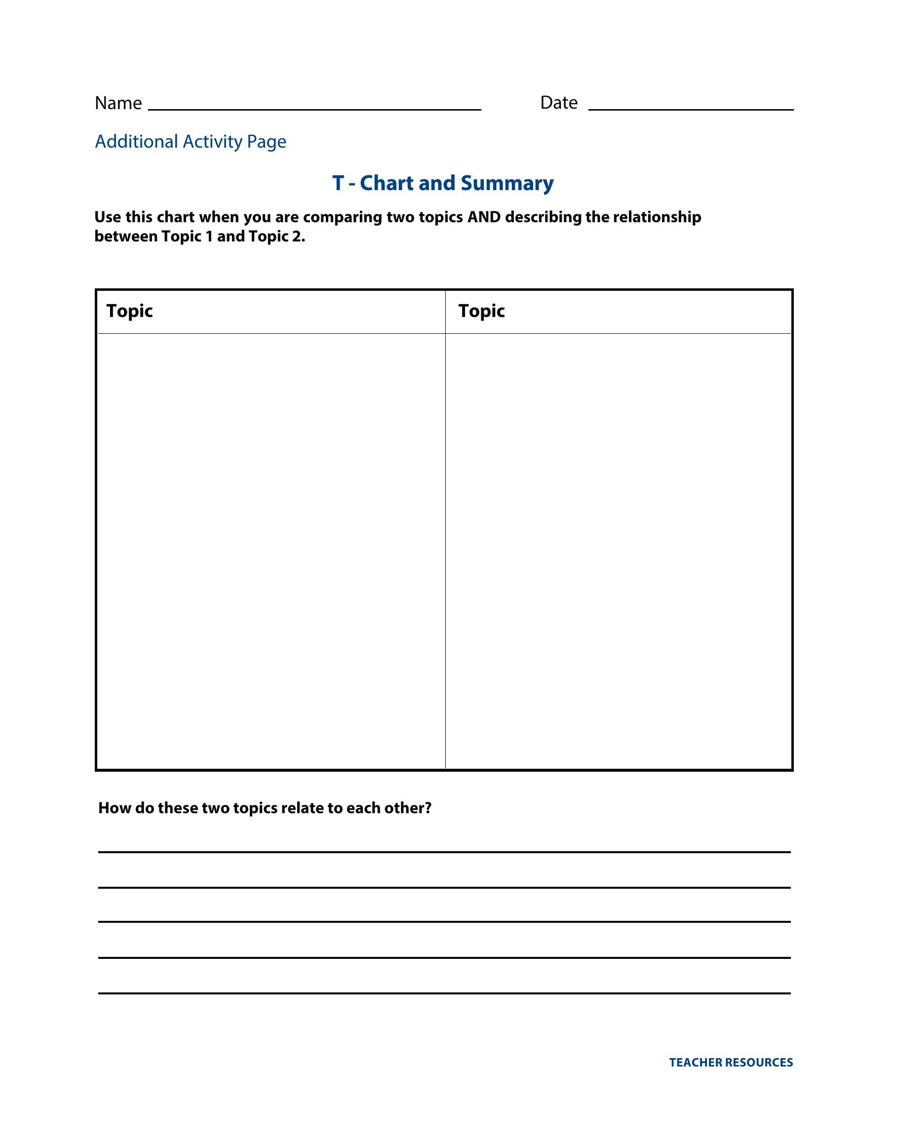
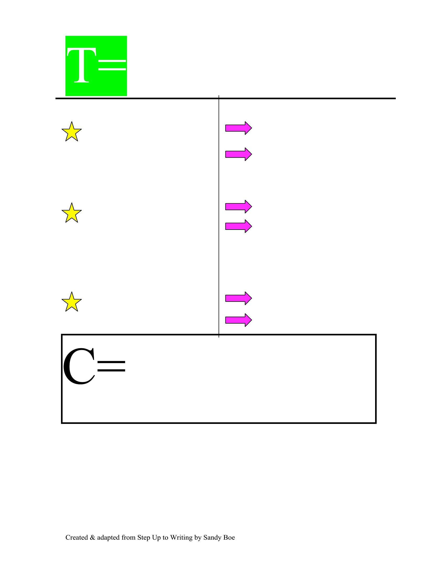
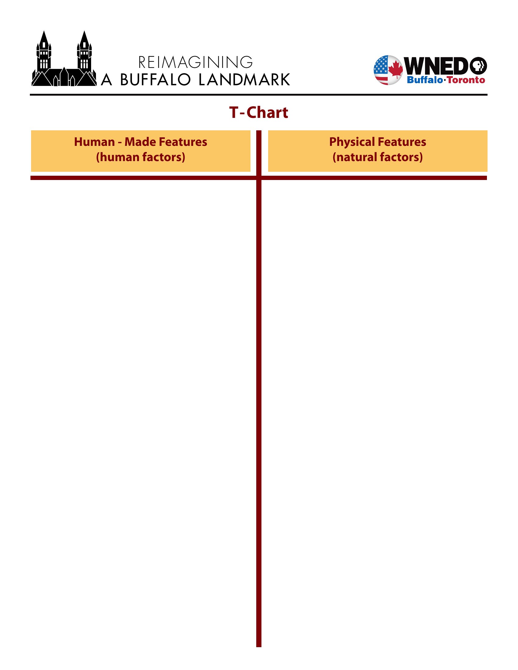
Free T Chart
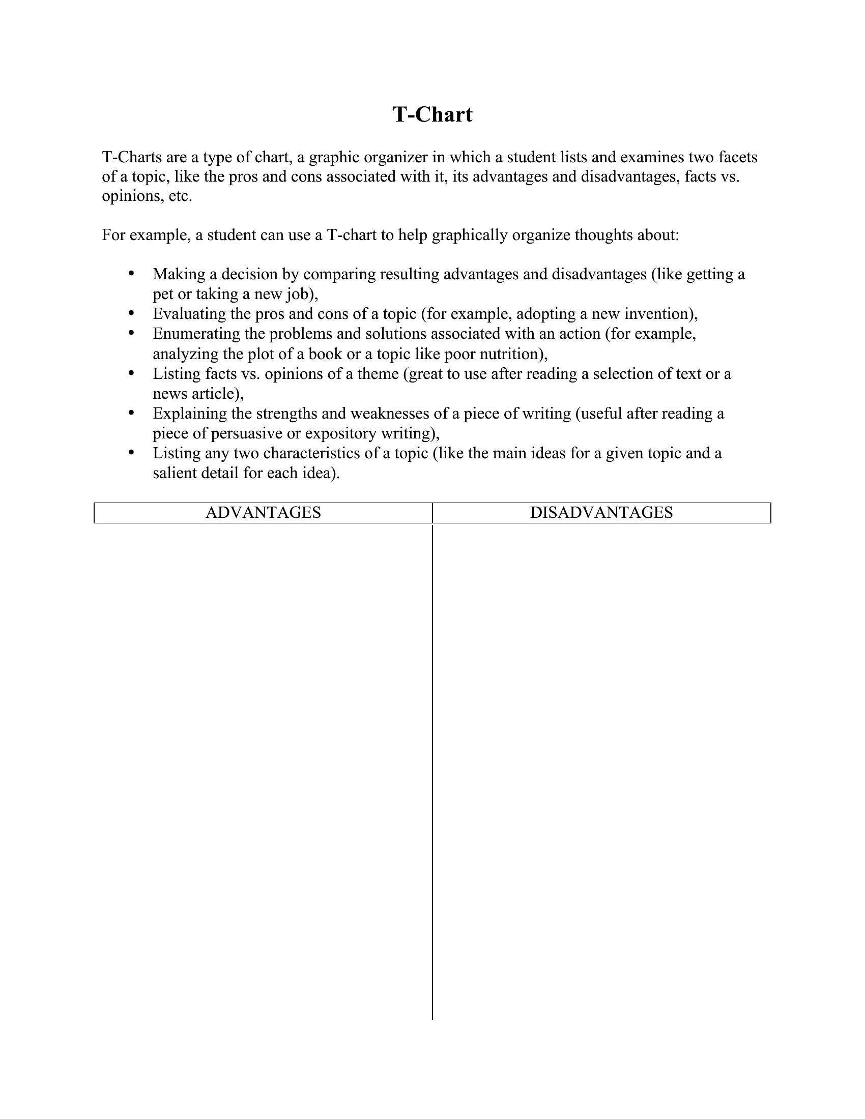
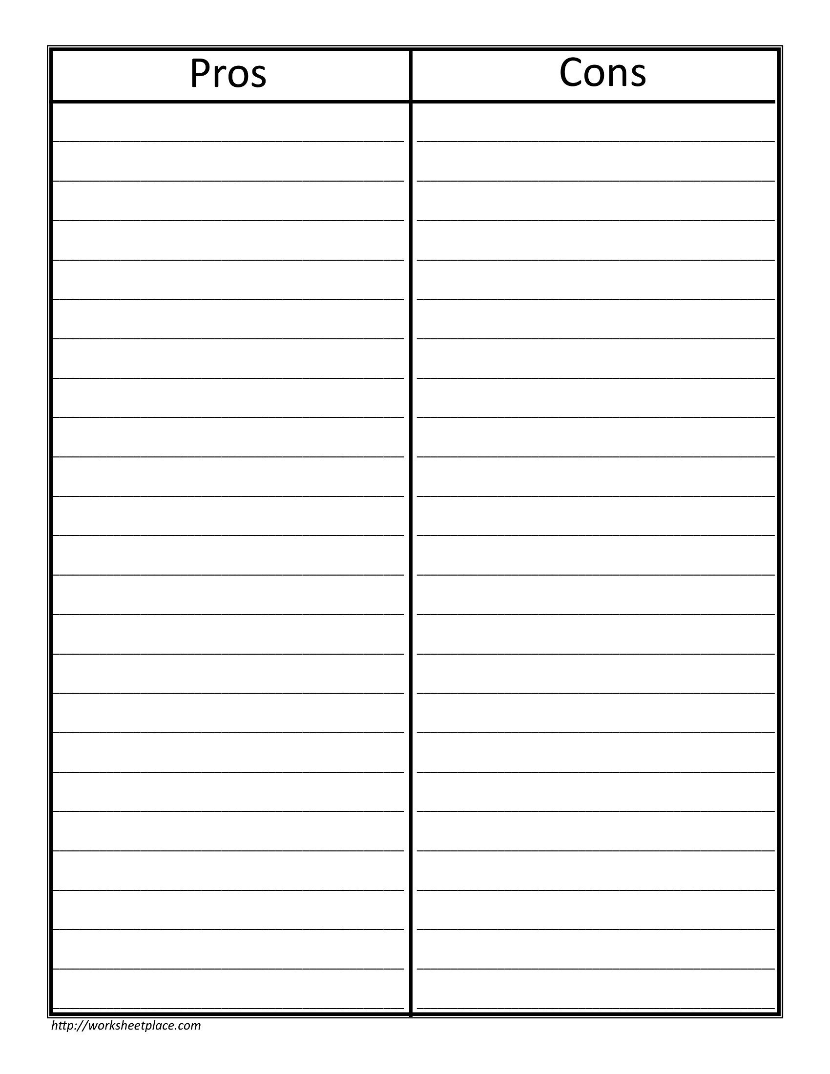
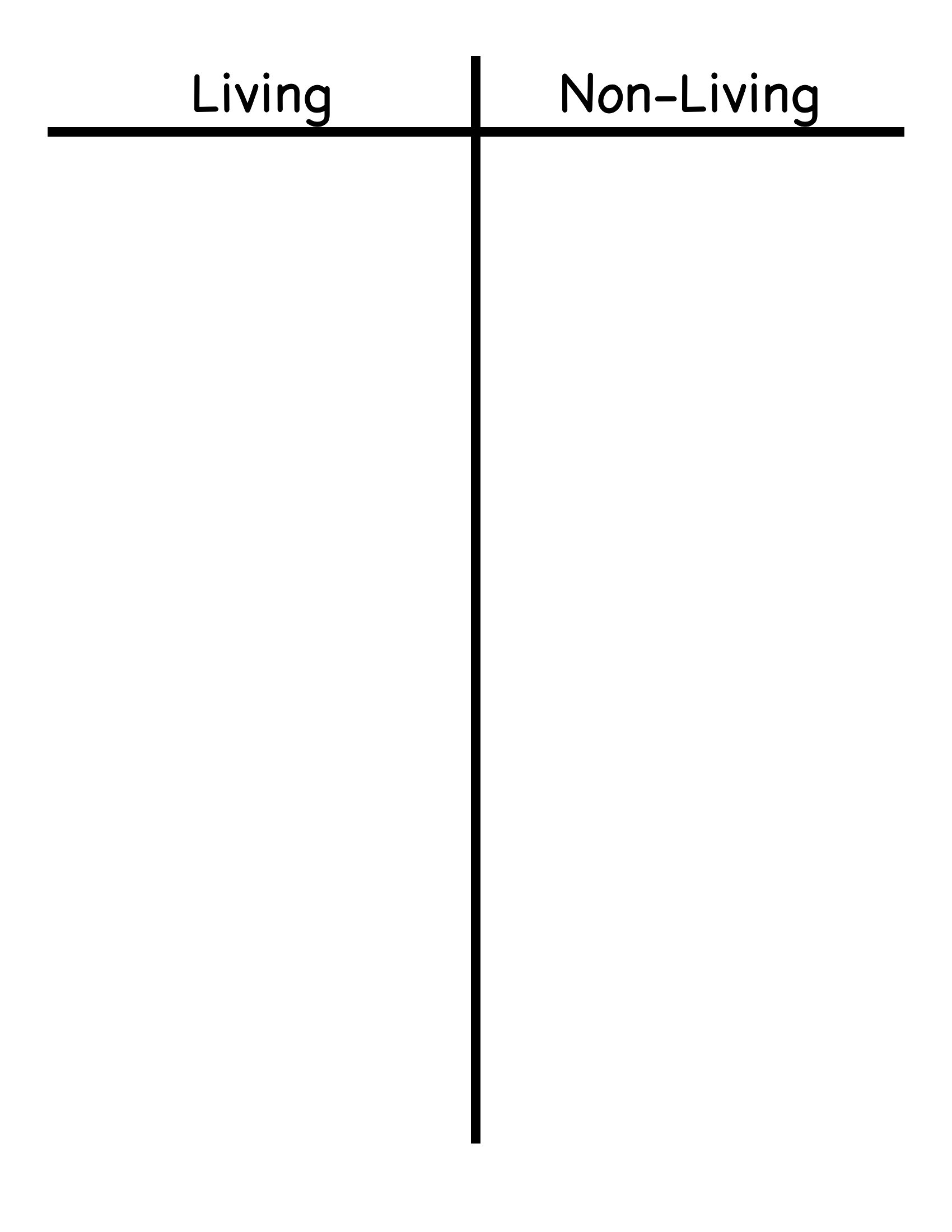
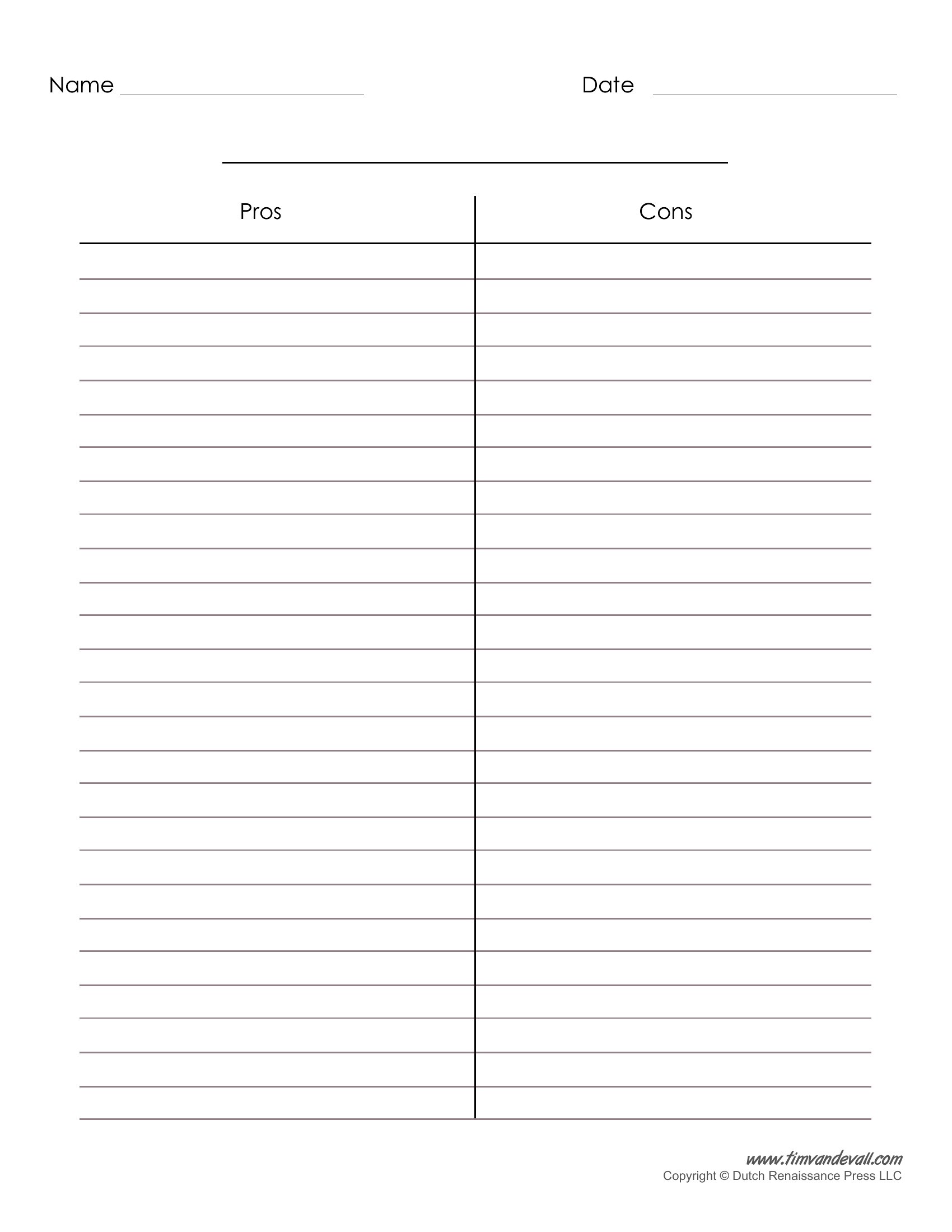
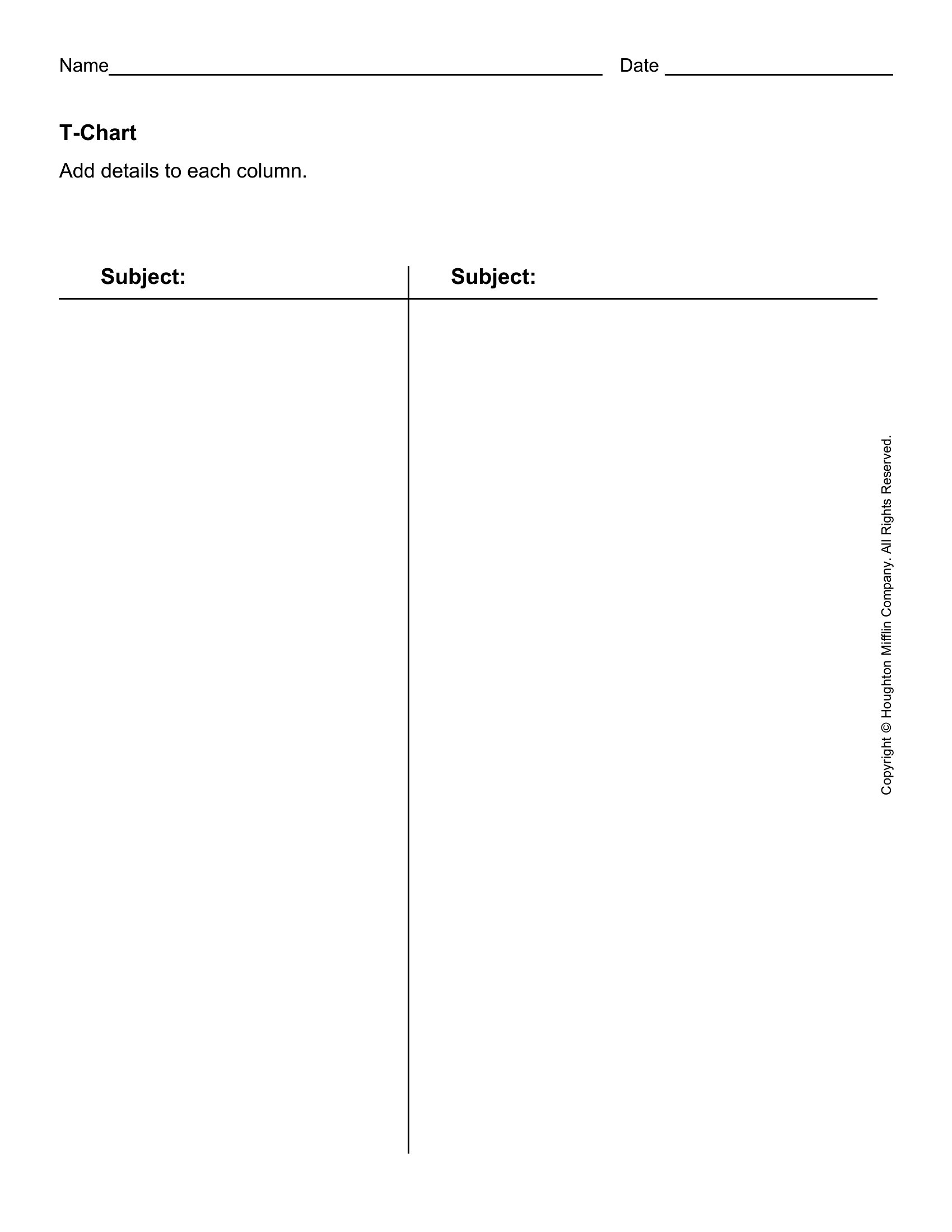
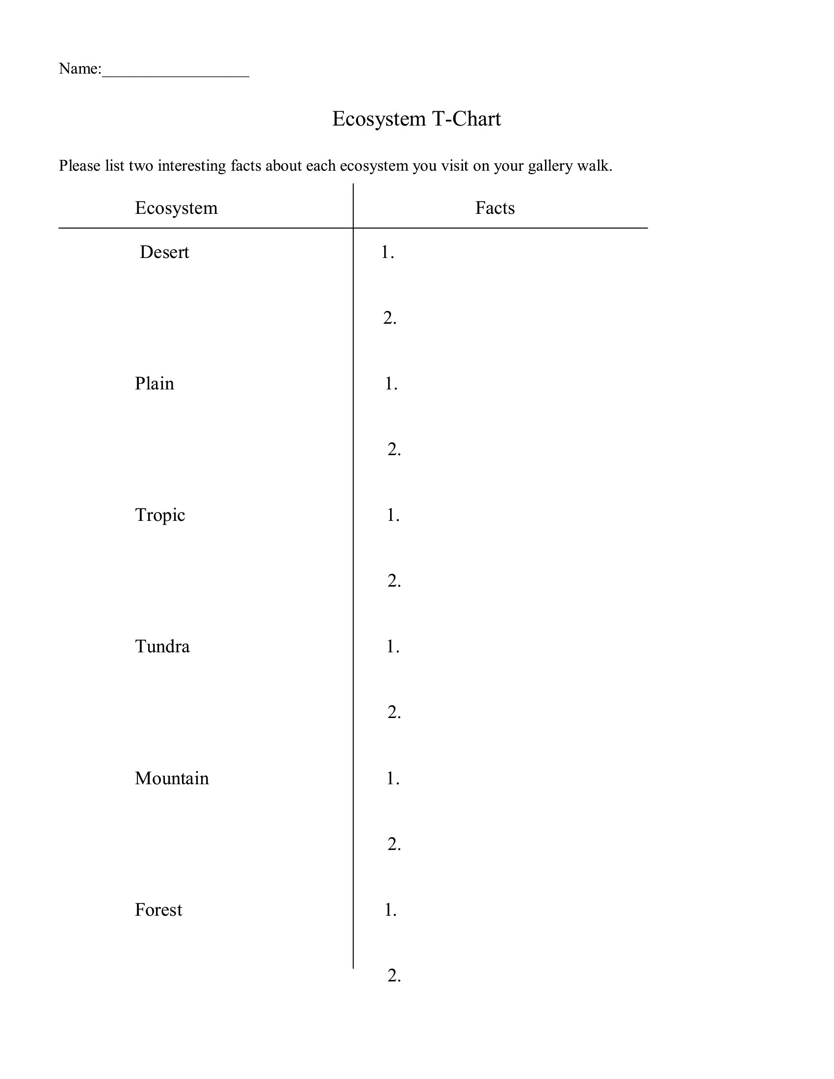
Pdf T Chart
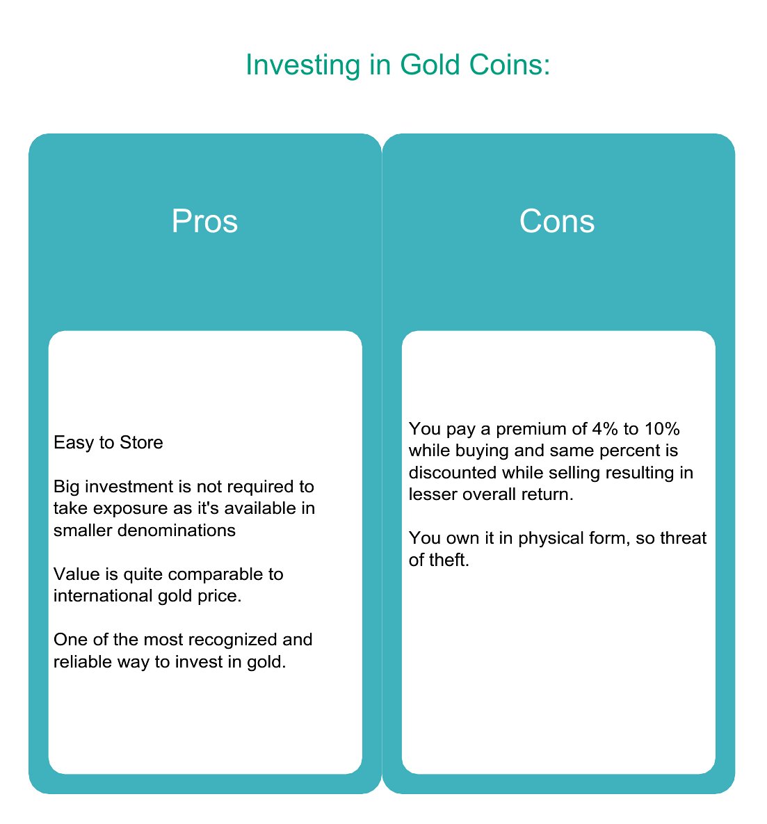
T Chart Free Pdf
FAQ
Can I use a T-chart template to compare complex topics with more than two categories?
These templates focus on two-column comparisons, but you can adapt them by adding sub-bullets or a second T-chart side-by-side for layered analysis. For example, split one column into 'short-term effects' and 'long-term effects' under a broader 'consequences' heading. Keep it visual by using arrows or icons to connect related ideas.
How do I make sure my T-chart stays balanced visually when filling in long lists?
Use the templates’ evenly split columns to your advantage by keeping bullet points concise or numbering them for clarity. If one side grows too long, consider adding a second T-chart on a new page with a clear header like ‘Part 2: Additional Factors.’ Stick to consistent font sizes and spacing to maintain readability, as the gridlines in these templates are designed to prevent misalignment.
Are these templates suitable for data analysis, like comparing sales figures or survey responses?
While these T-charts work for qualitative comparisons (e.g., ‘reasons for high vs. low sales’), they’re not designed for quantitative data like exact numbers. For numerical analysis, pair a T-chart with a separate spreadsheet or bar graph template. Use the T-chart to summarize *why* differences exist—like ‘customer feedback trends’—rather than the raw data itself.
Comments
Join the conversation
Sign in to share your thoughts and leave a comment on this resource.