Free Printable T-Chart Templates (Word, PDF)
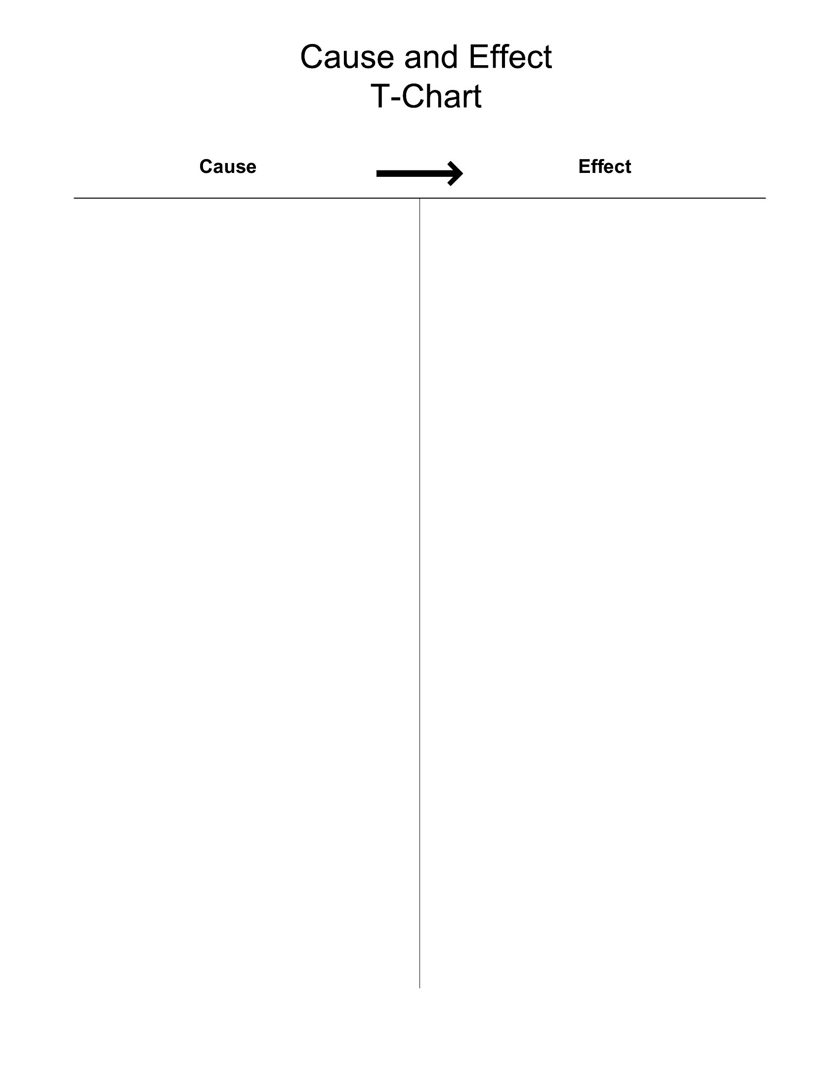
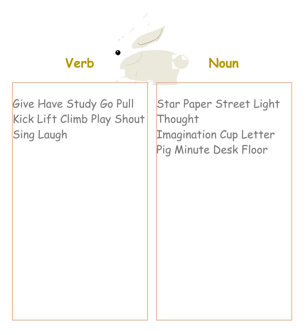
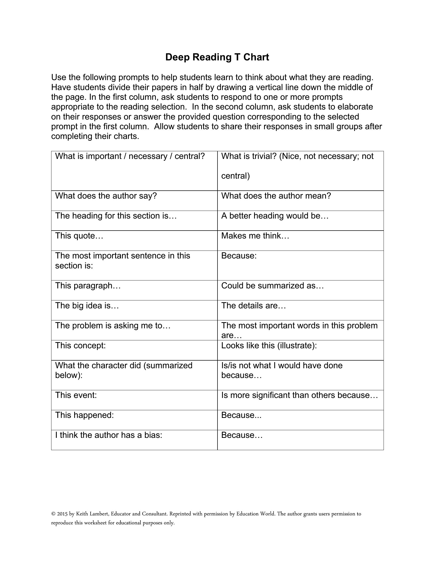
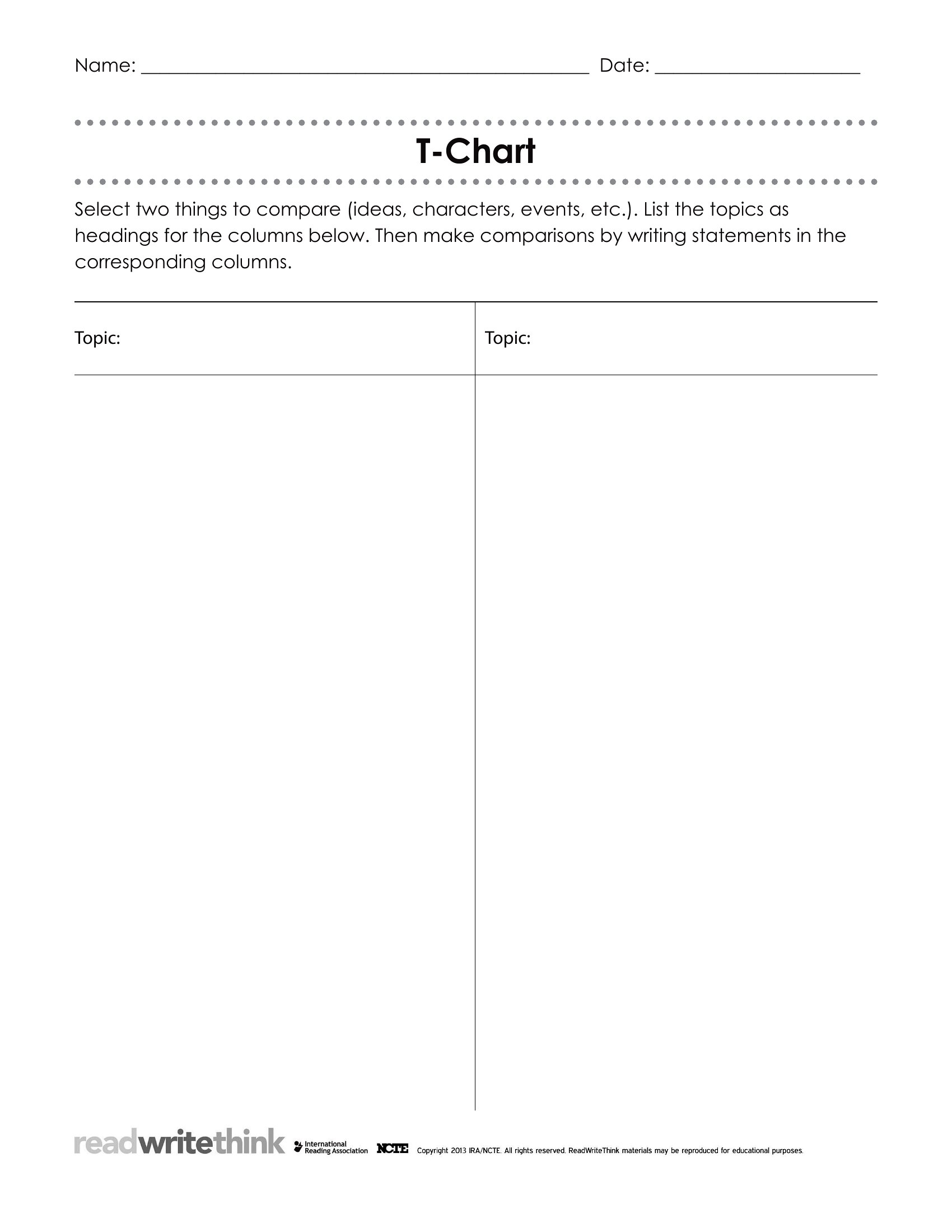
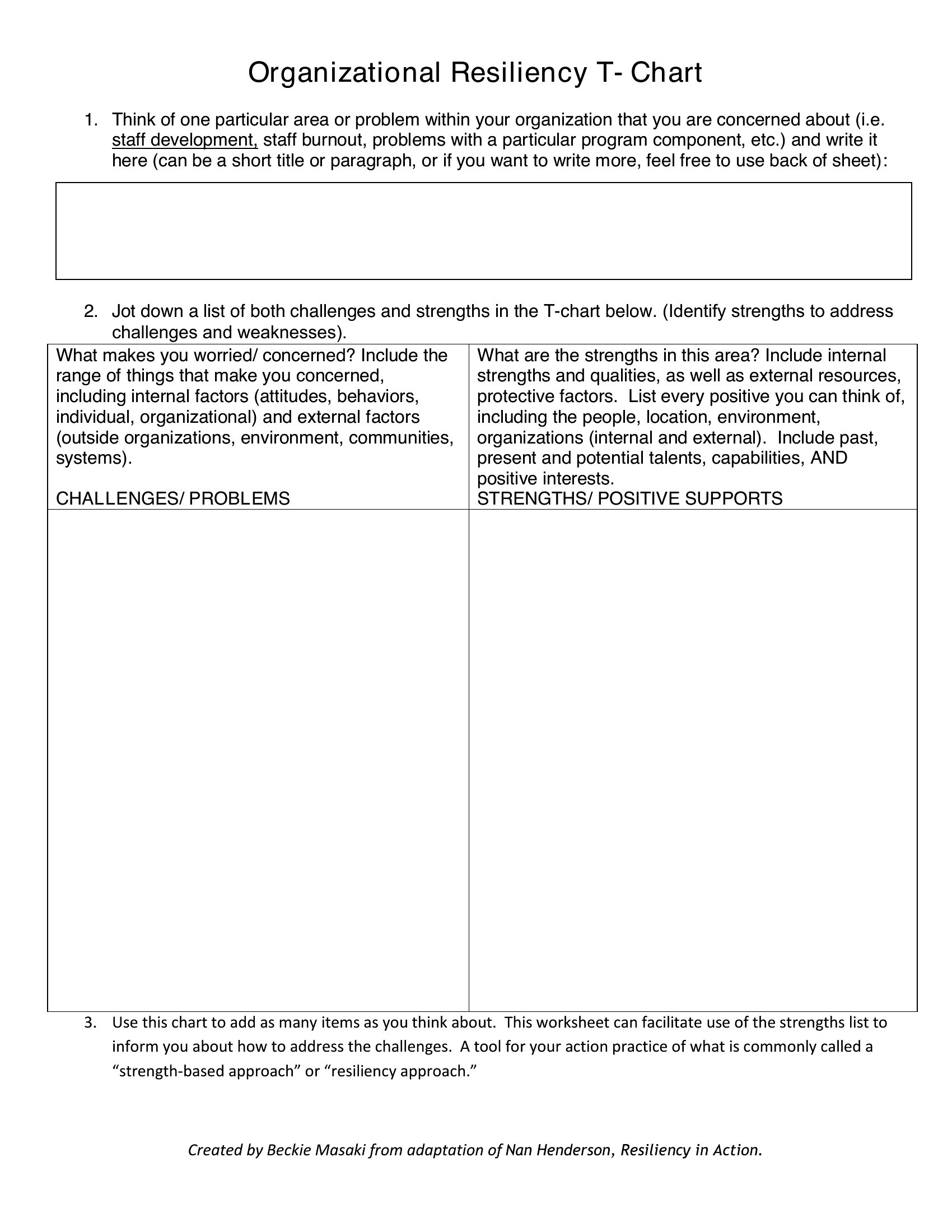
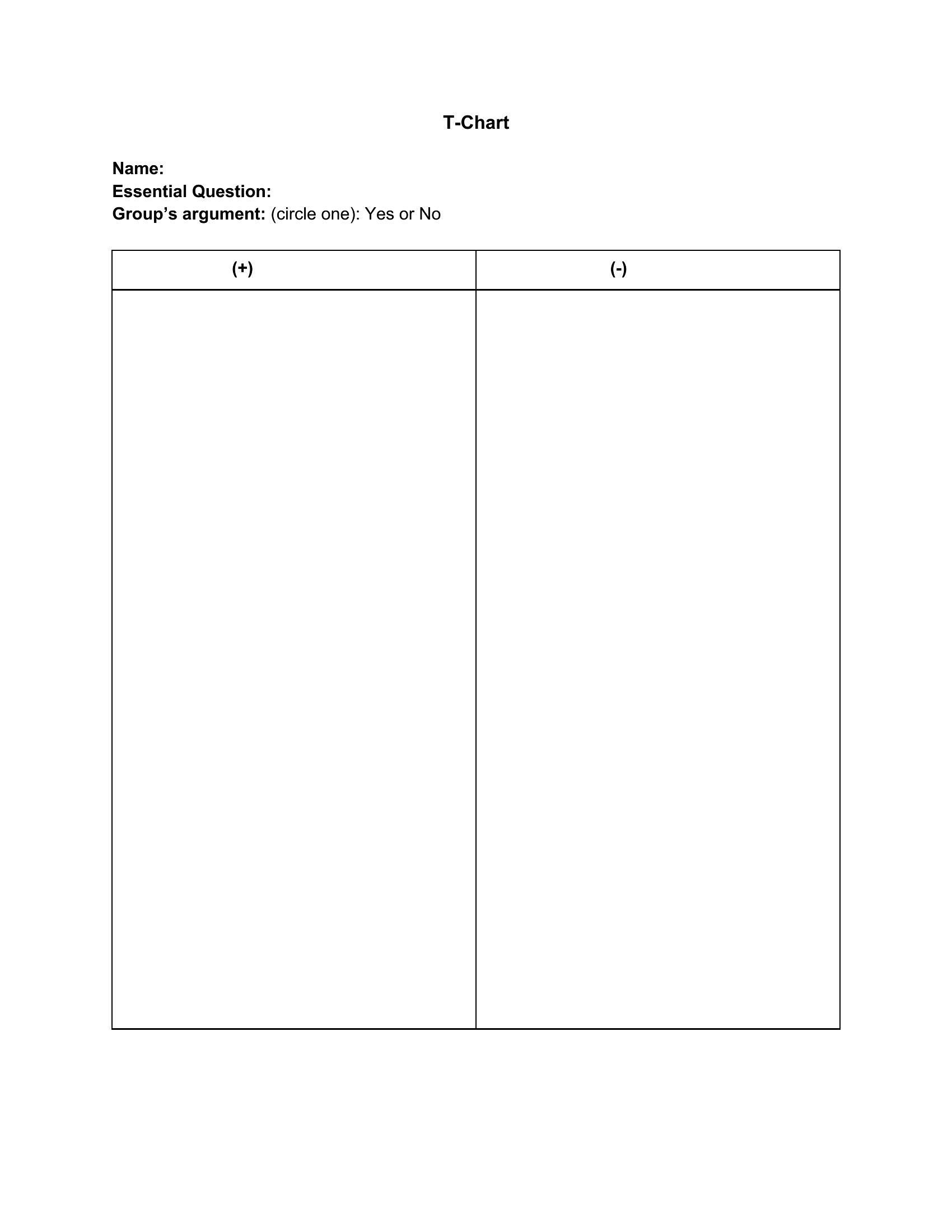
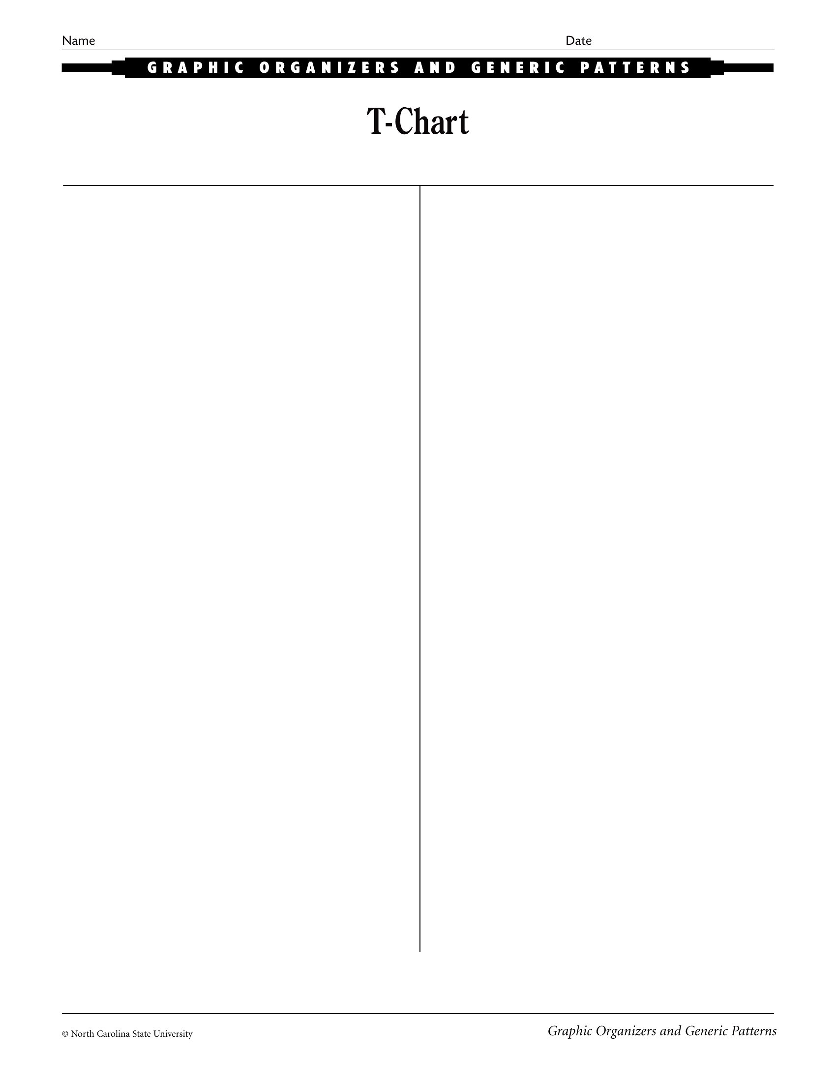
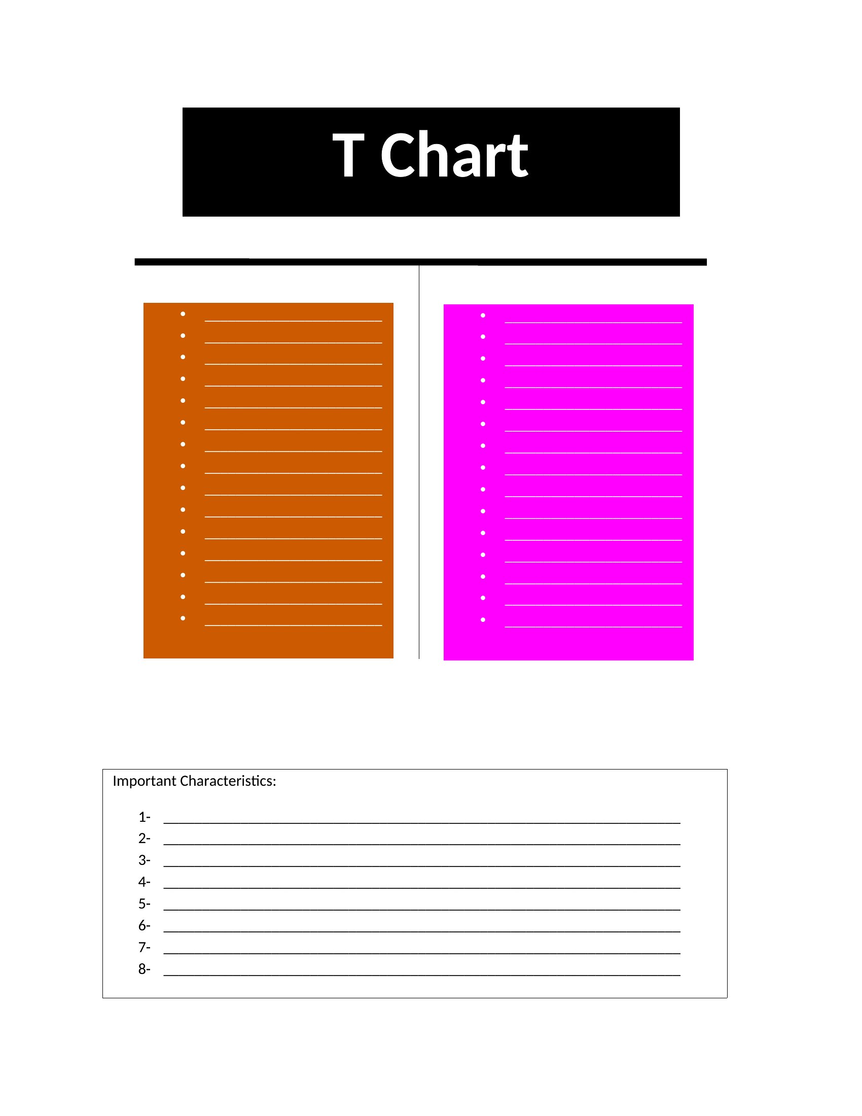
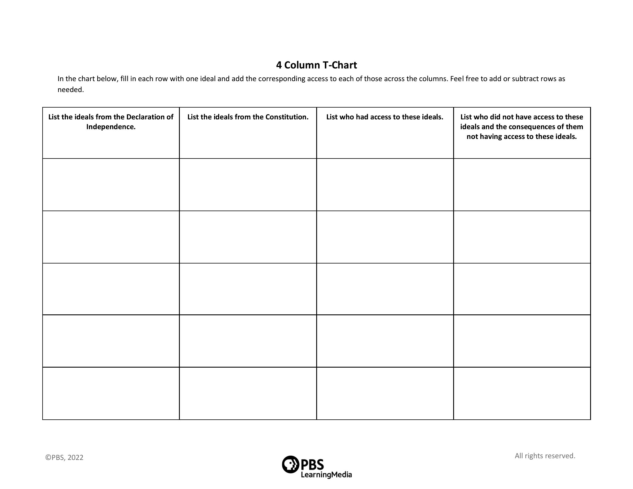
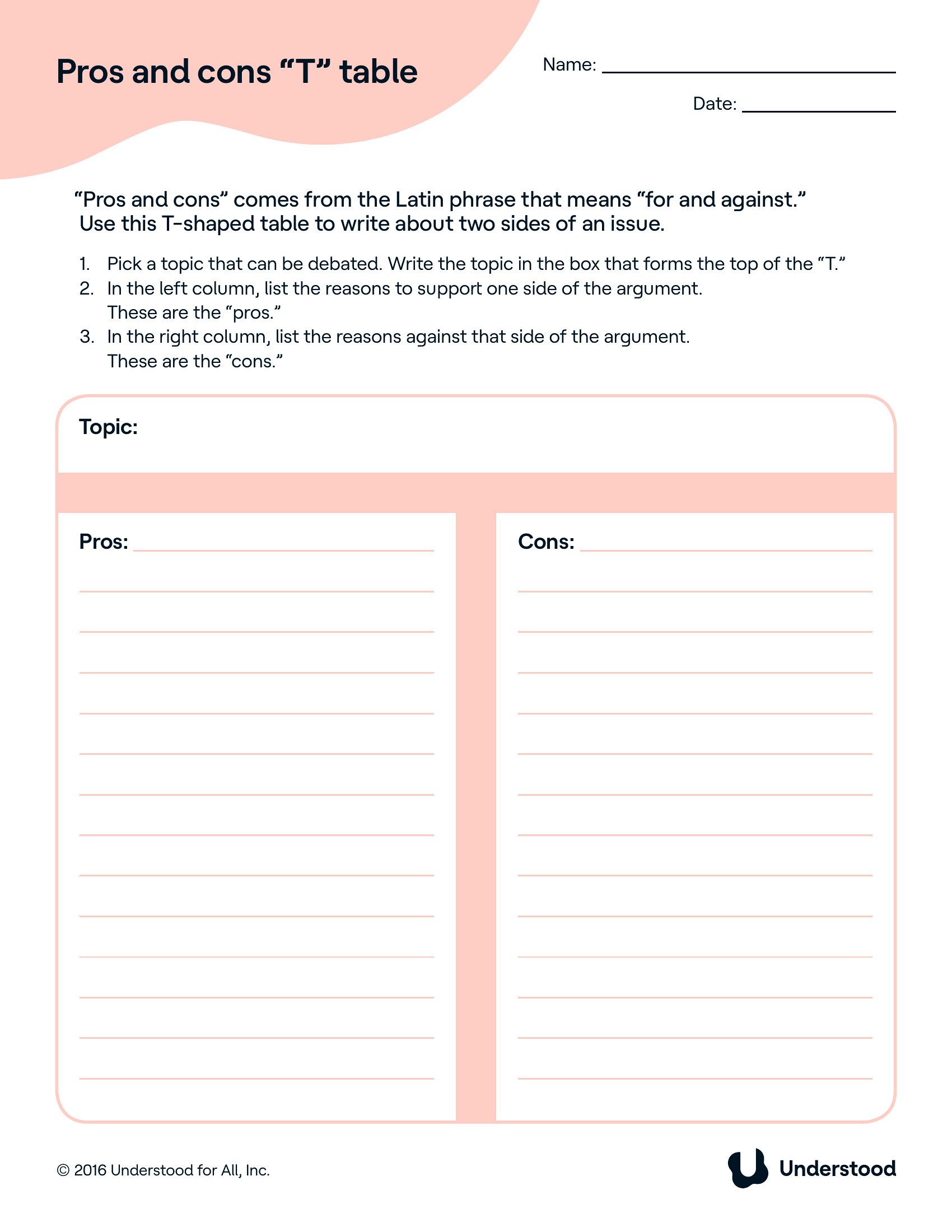
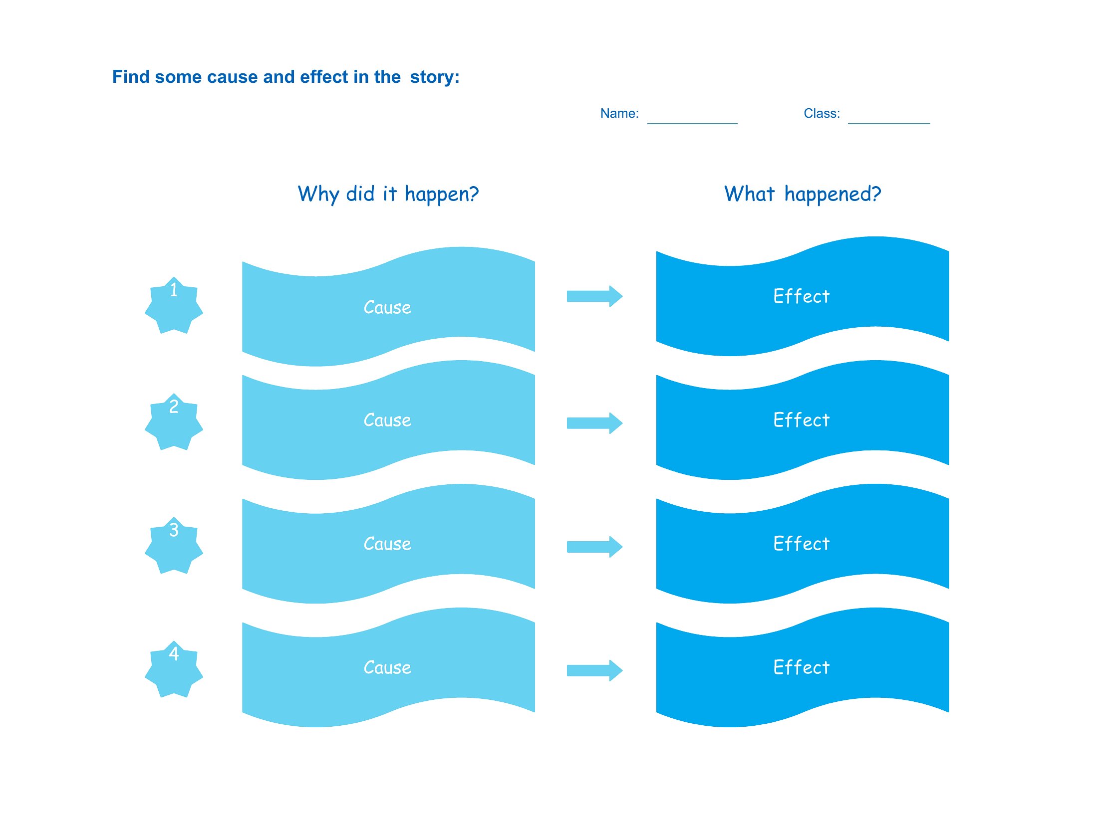
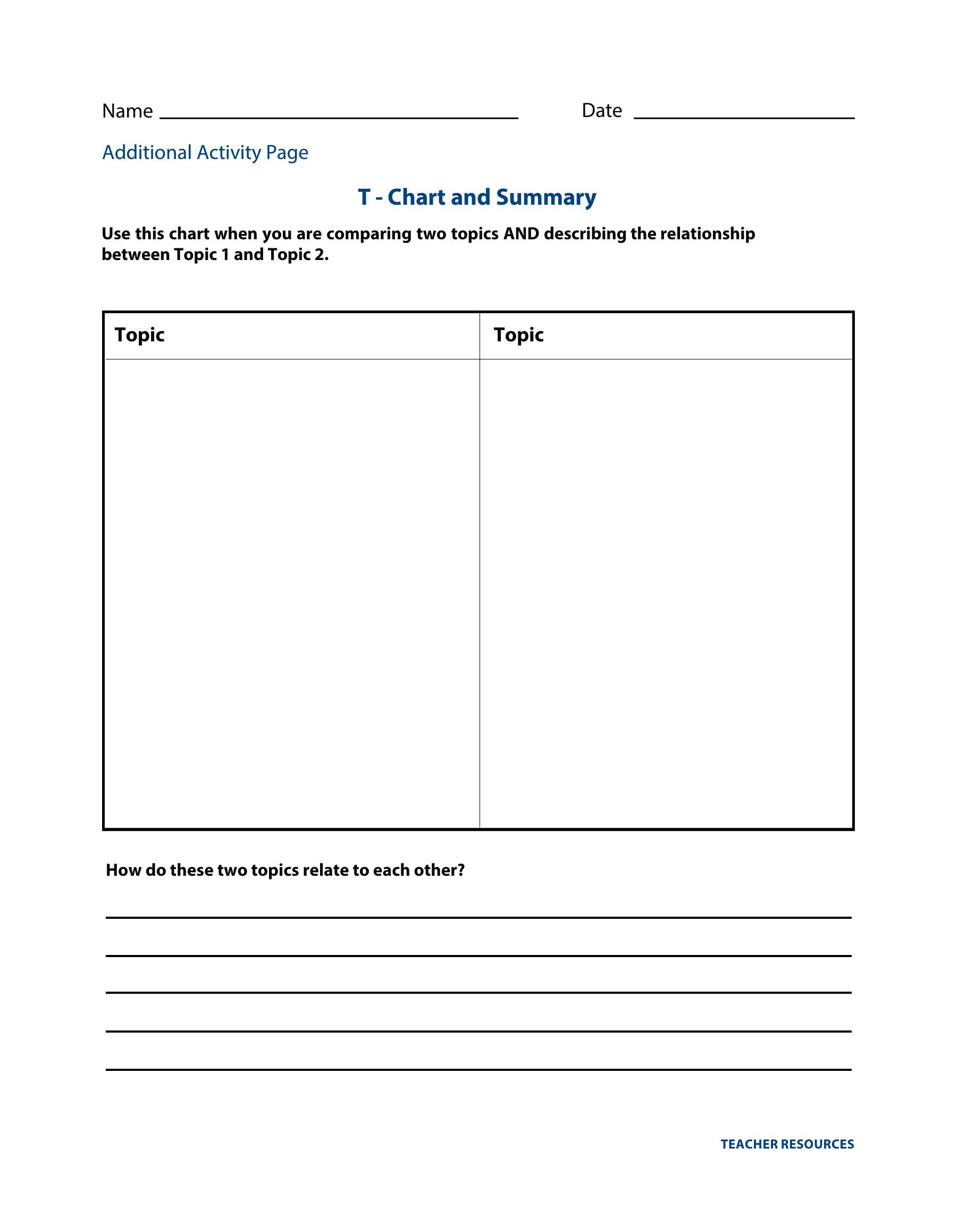
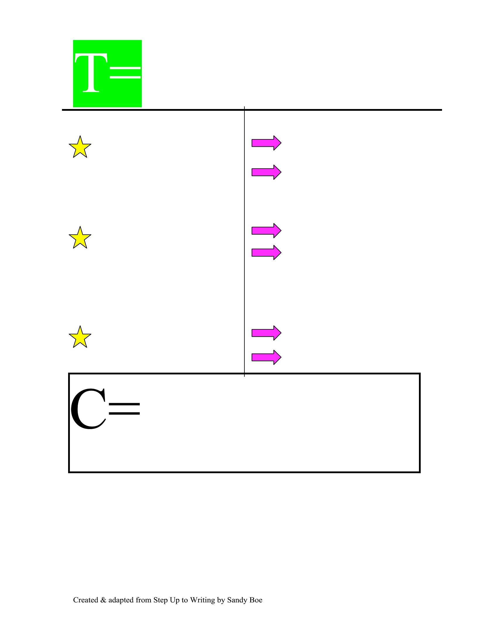
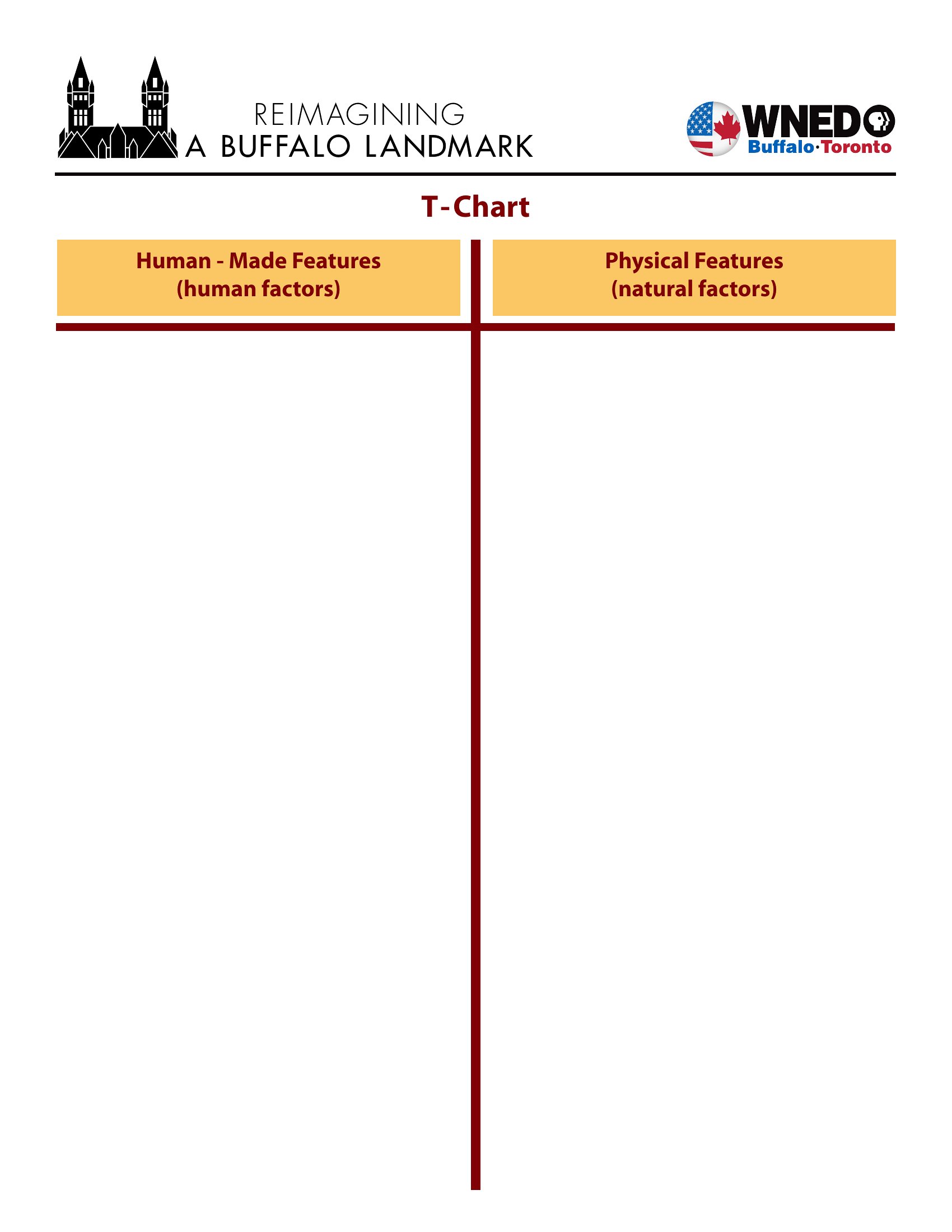
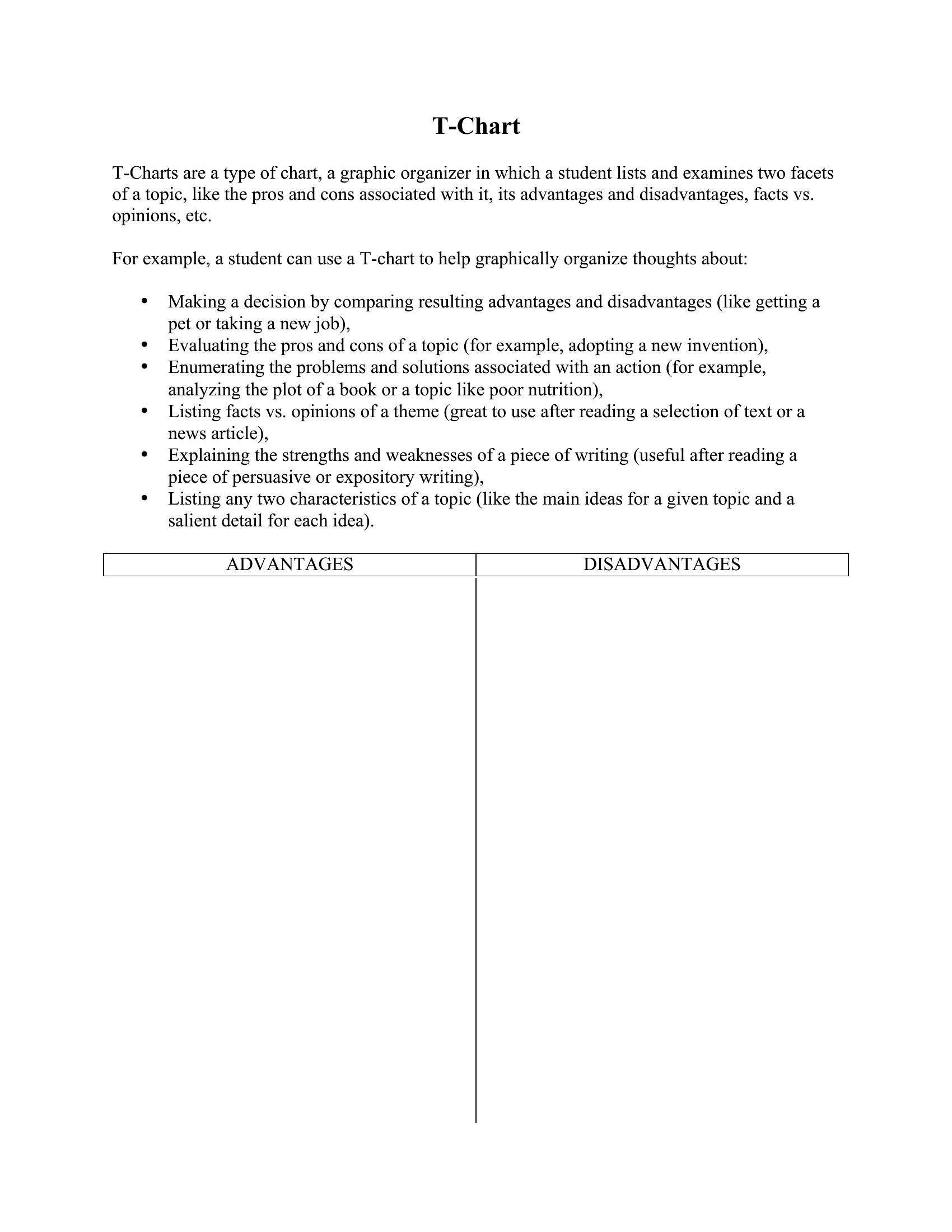
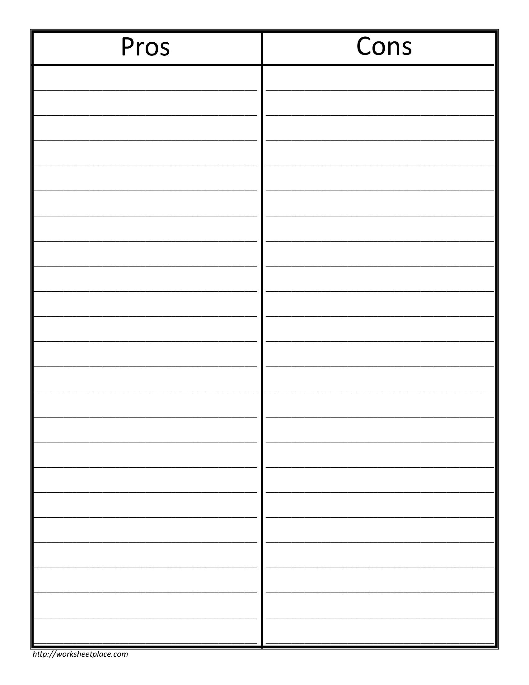
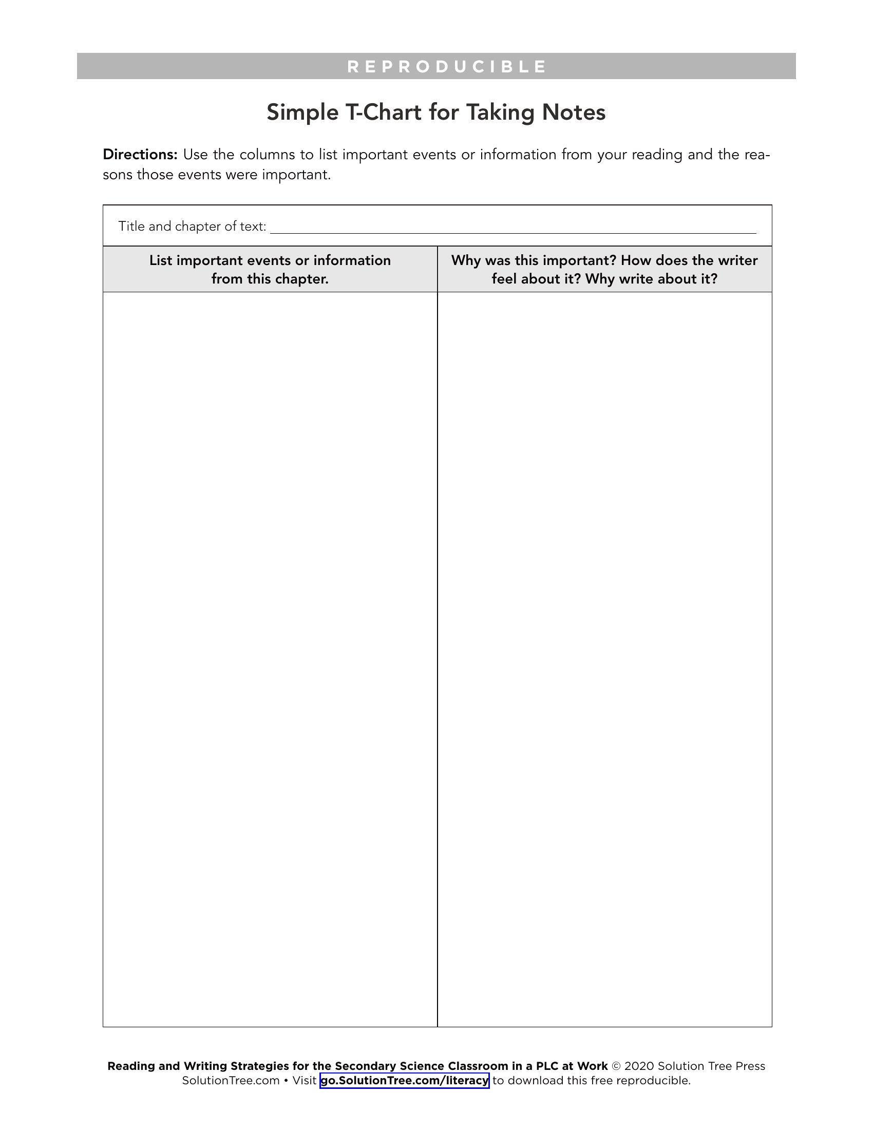
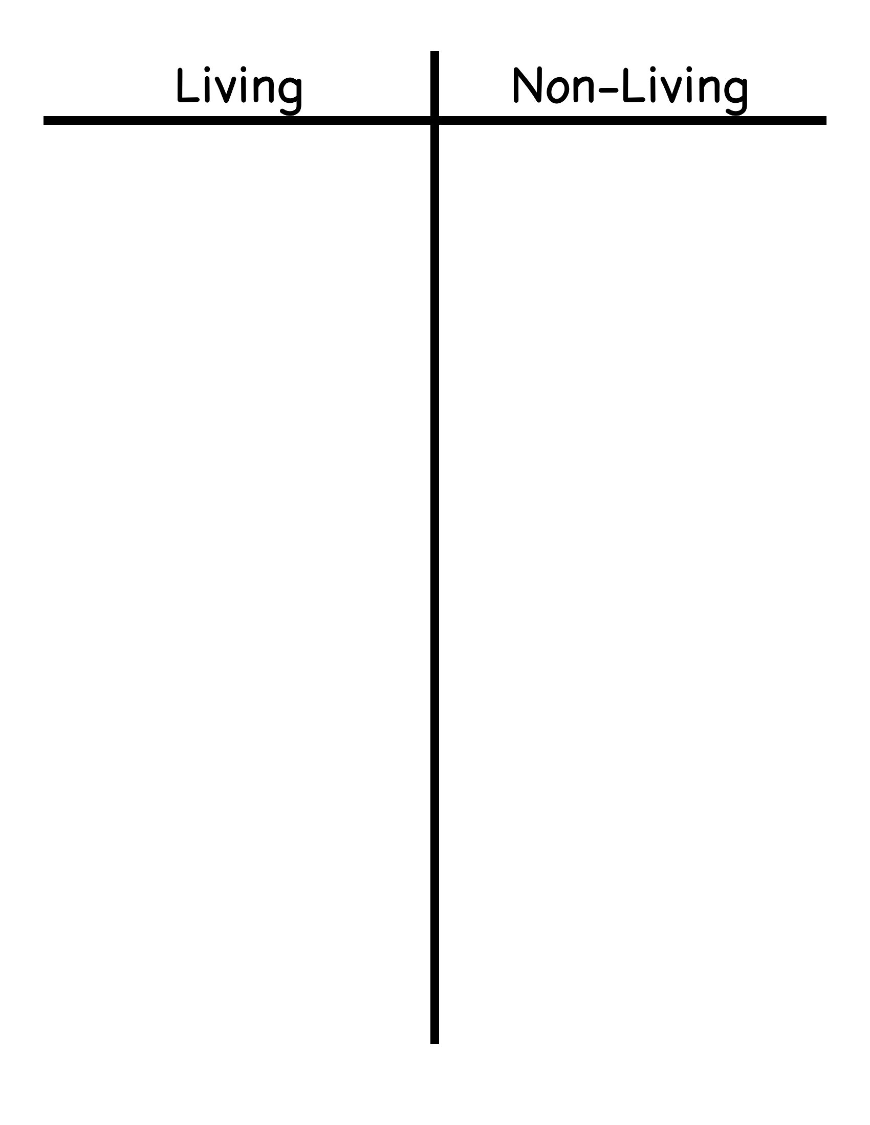
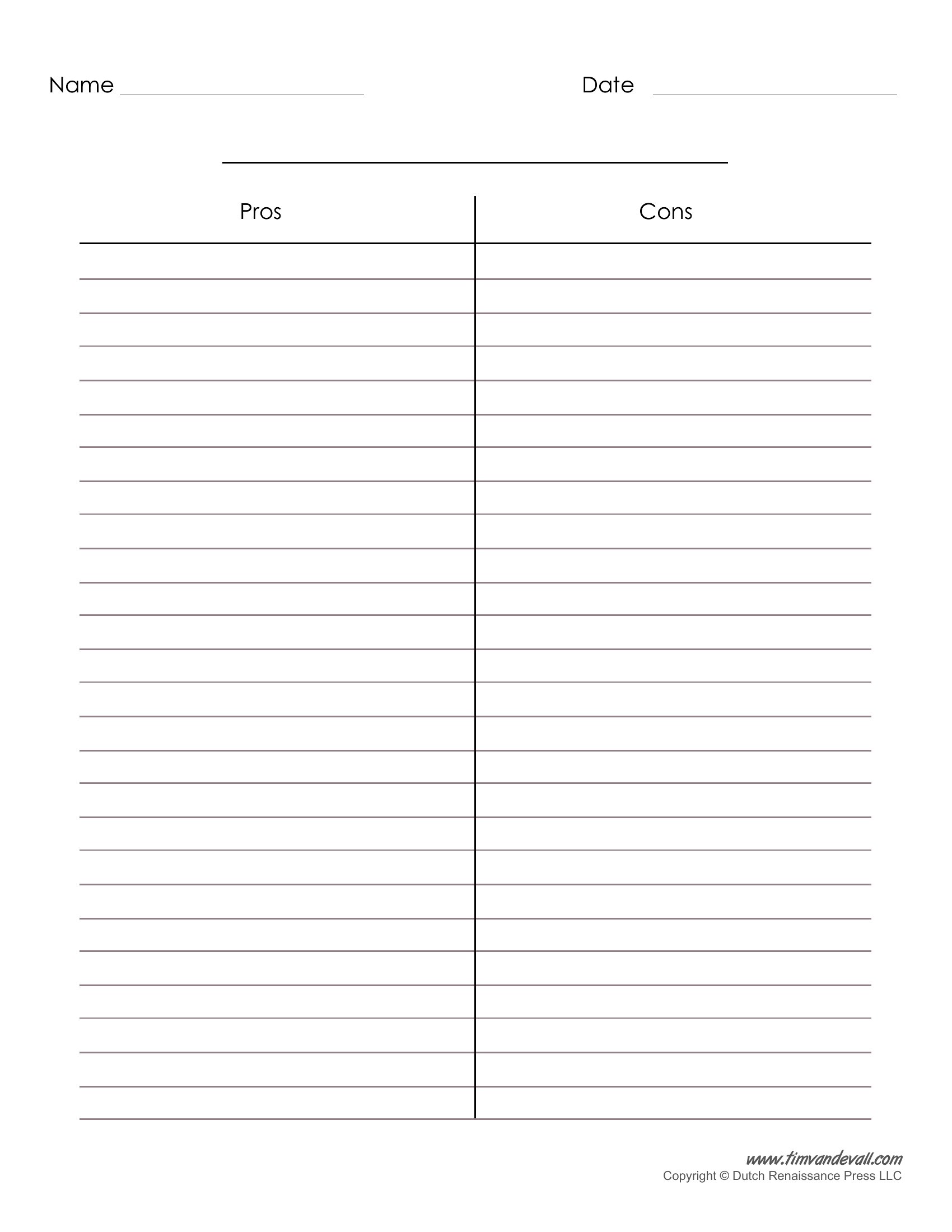
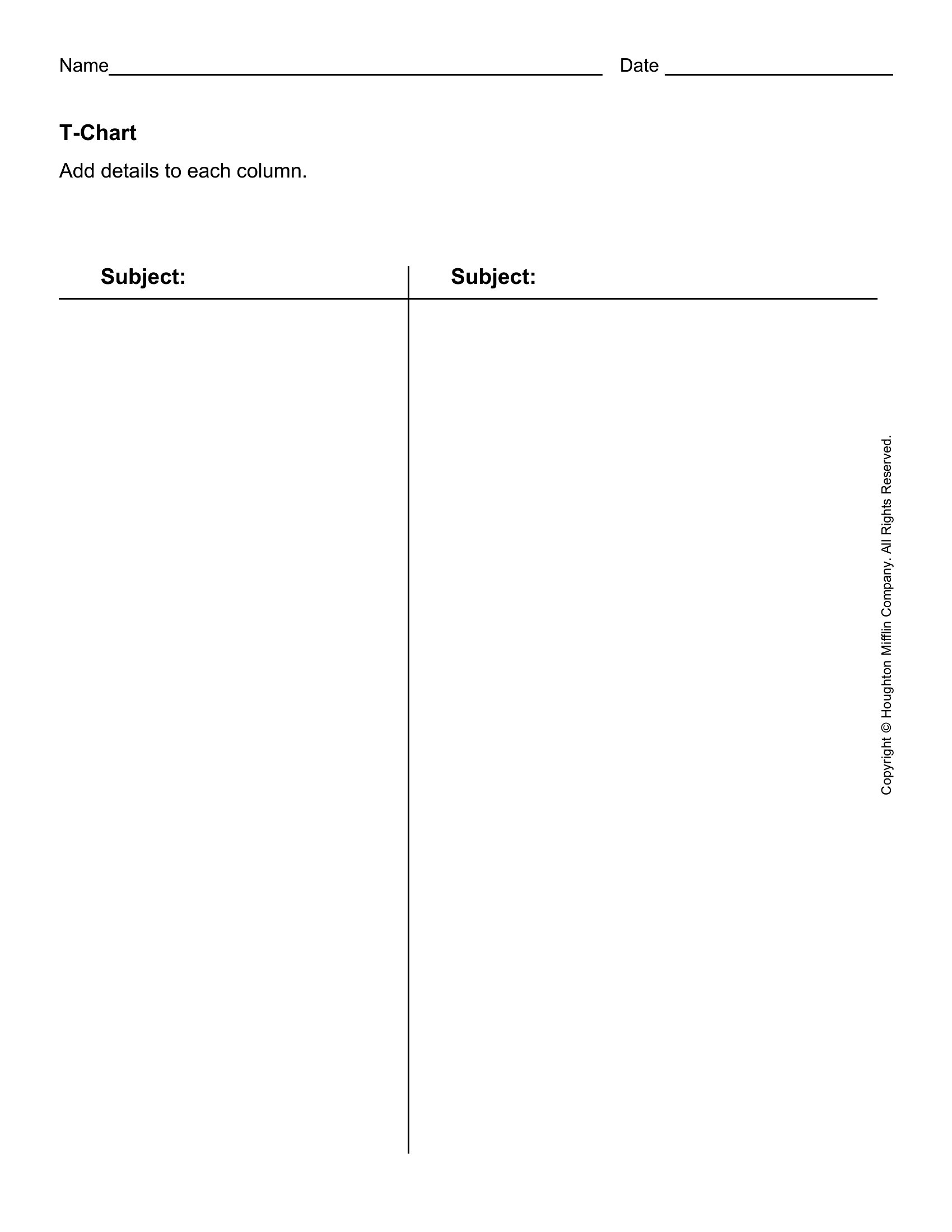
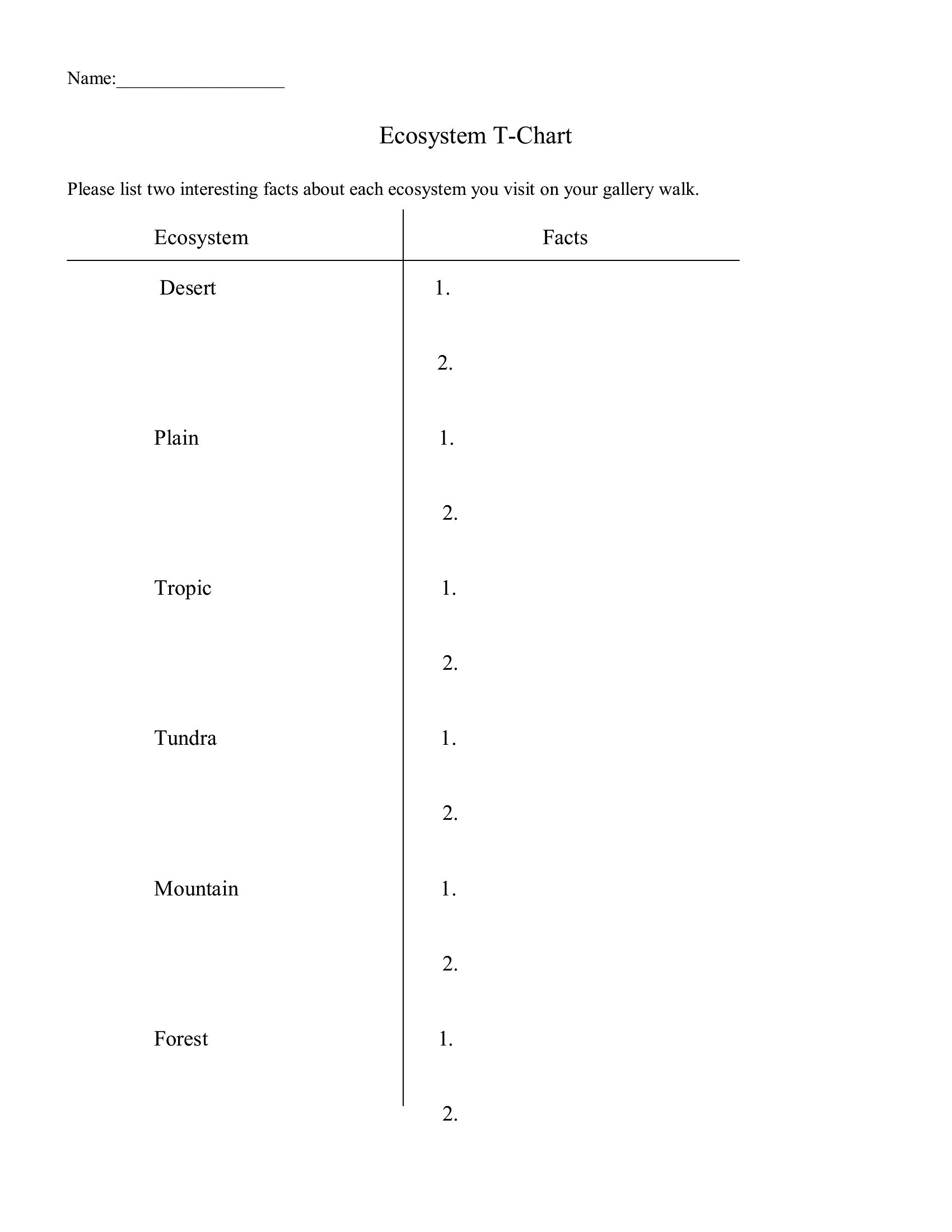
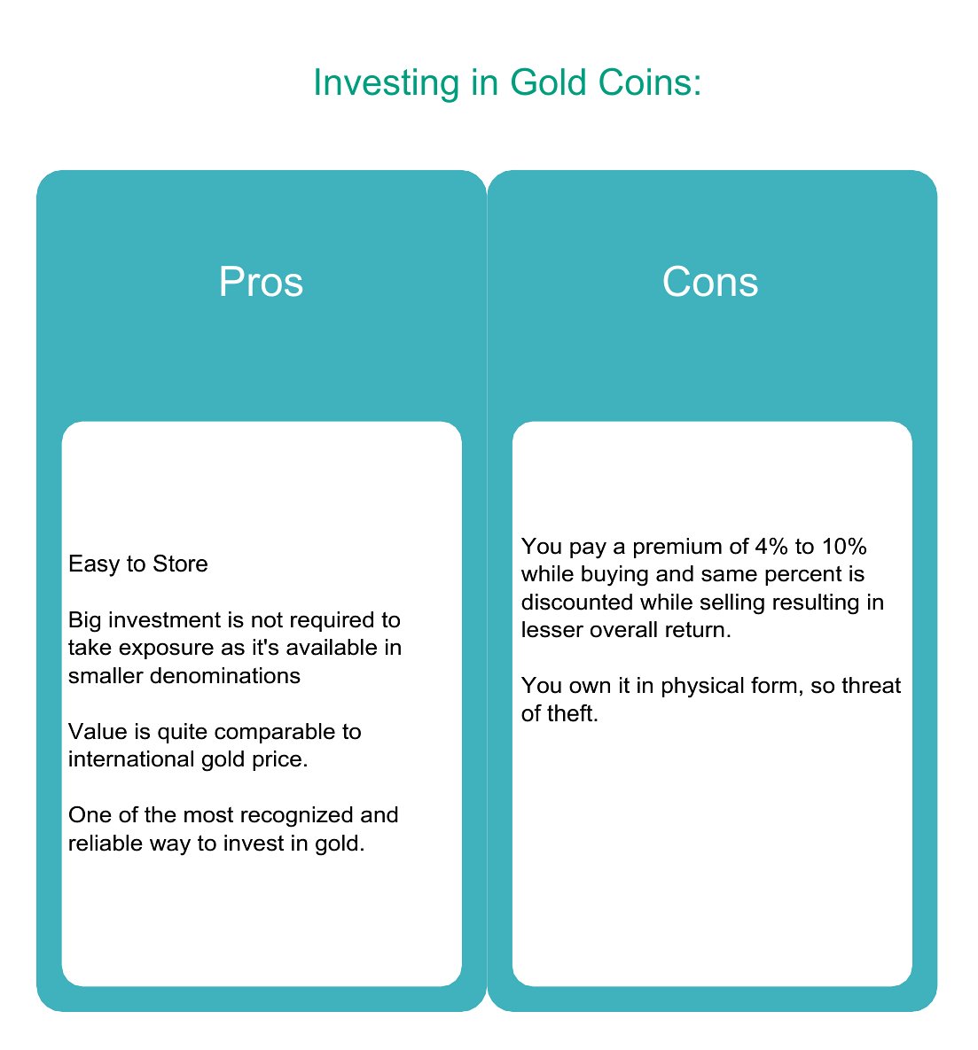
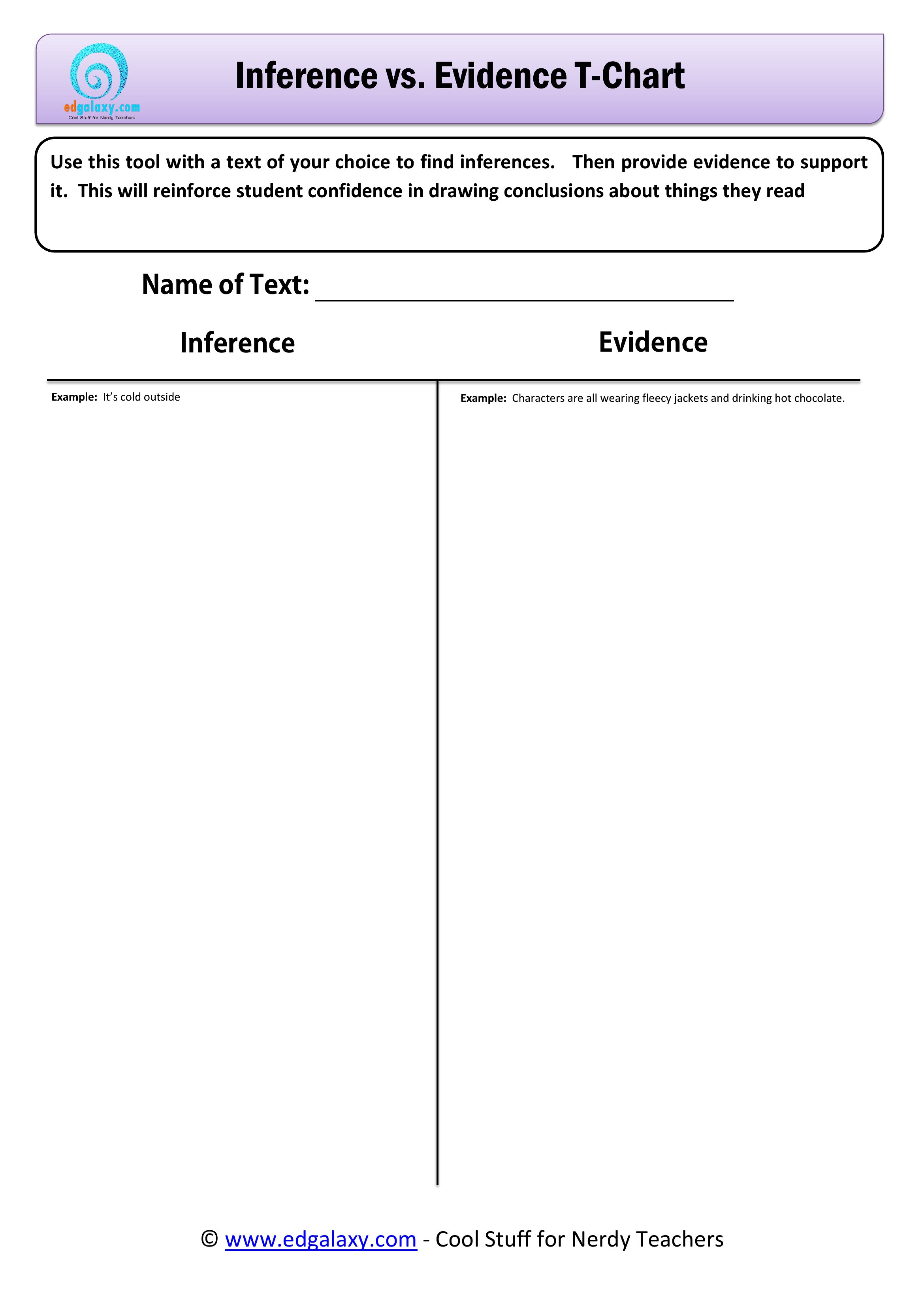
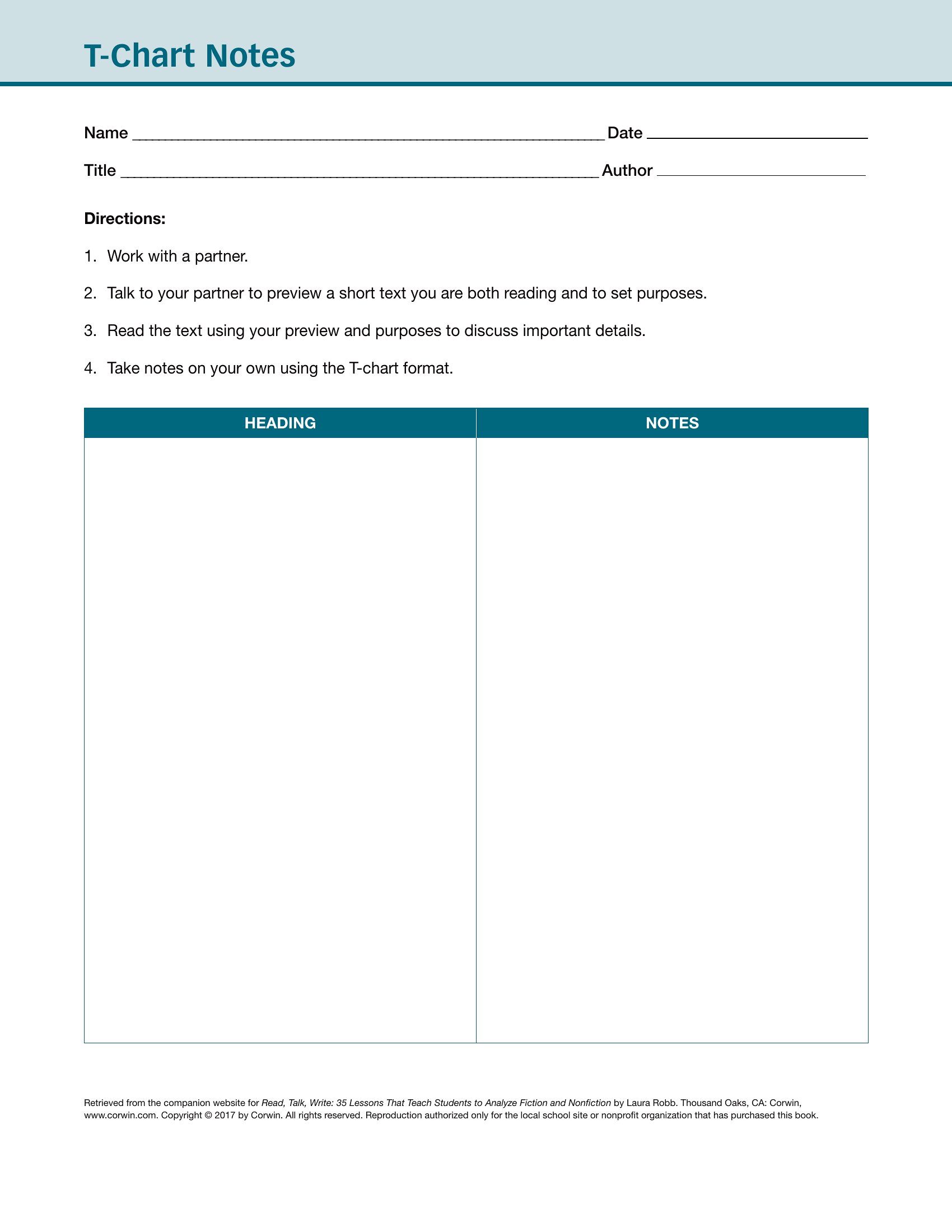
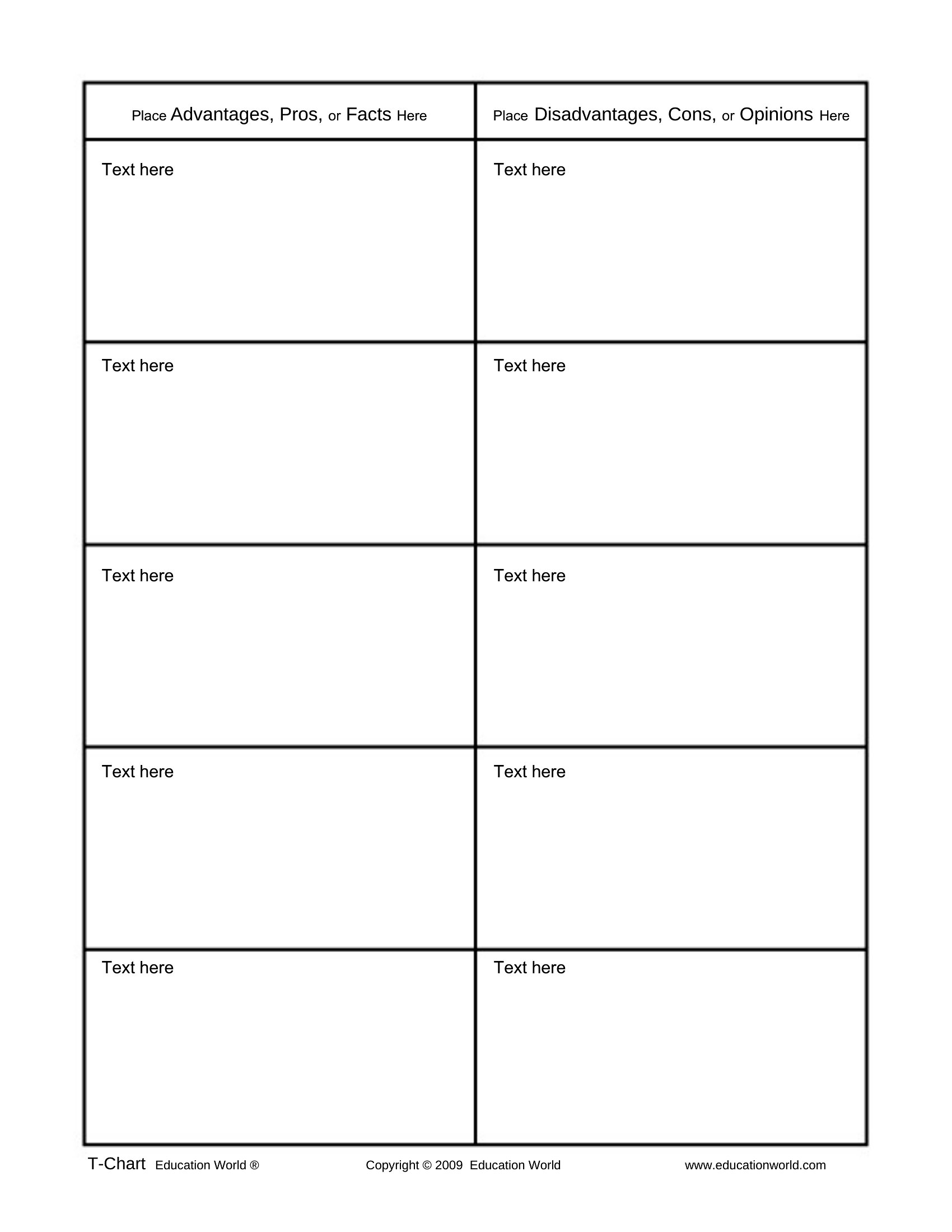
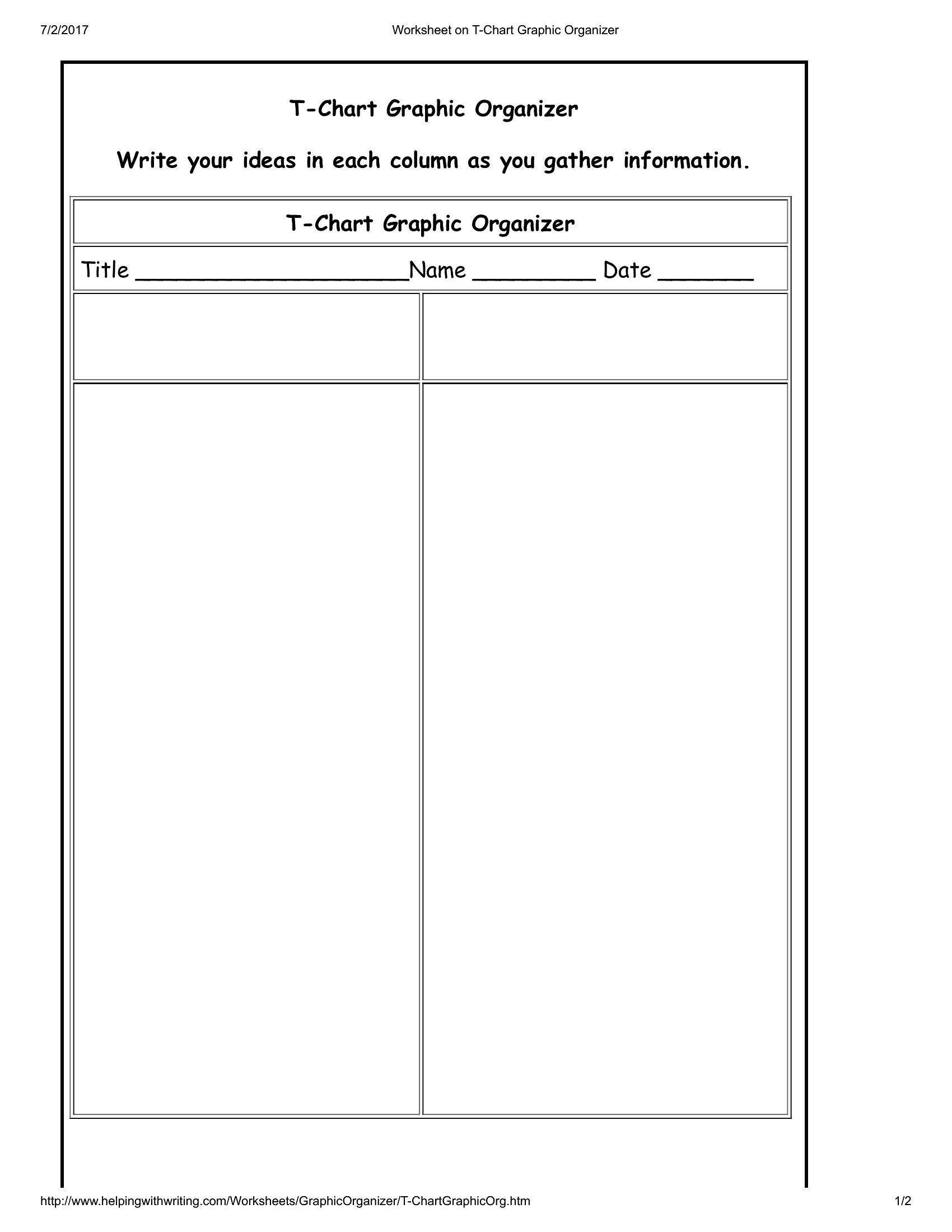
WorksheetsA T-chart is one of the simplest ways to weigh two sides of anything, from pros and cons to cause and effect. This set of 49 T-chart templates gives teachers, students, and planners a clean two-column layout for comparing ideas, sorting information, or organizing a lesson. Each one keeps the two sides evenly split so the comparison stays easy to read.
Print the PDFs for classroom handouts or worksheets, or edit the Word versions to add your own headings and prompts. Label the columns, fill in the points, and you've got a quick visual for a discussion or an assignment. Pick the design that fits the activity and print as many as your group needs.
When to use this T-Chart template
- Middle school teachers use T-charts to help students compare historical events—like the causes and effects of the Industrial Revolution—by listing key factors side by side during group discussions.
- Parents planning family vacations sort activities into 'must-do' and 'maybe-later' columns on a T-chart to visually prioritize budget-friendly options for kids and adults.
- Small business owners weigh pros and cons of hiring freelancers versus full-time employees by filling a T-chart with cost, flexibility, and workload considerations before making decisions.
- Therapists guide clients through self-reflection exercises by splitting a T-chart into 'triggers' and 'coping strategies' to identify patterns in stress responses during sessions.
Which format should I download?
Use Word for editable T-charts that let you adjust column headings or add notes after printing, ideal when you’ll customize content frequently—like tailoring lesson plans for different grade levels. PDFs work better for static, print-ready versions, such as classroom handouts or worksheets you’ll distribute without changes. Since both formats here are designed for simplicity, either works for basic comparisons, but Word adds flexibility for revisiting details later.
Choose from 49 T-Chart Templates
Free T Chart
How to use this T-Chart template
Can I use a T-chart template to compare complex topics with more than two categories?
These templates focus on two-column comparisons, but you can adapt them by adding sub-bullets or a second T-chart side-by-side for layered analysis. For example, split one column into 'short-term effects' and 'long-term effects' under a broader 'consequences' heading. Keep it visual by using arrows or icons to connect related ideas.
How do I make sure my T-chart stays balanced visually when filling in long lists?
Use the templates’ evenly split columns to your advantage by keeping bullet points concise or numbering them for clarity. If one side grows too long, consider adding a second T-chart on a new page with a clear header like ‘Part 2: Additional Factors.’ Stick to consistent font sizes and spacing to maintain readability, as the gridlines in these templates are designed to prevent misalignment.
Are these templates suitable for data analysis, like comparing sales figures or survey responses?
While these T-charts work for qualitative comparisons (e.g., ‘reasons for high vs. low sales’), they’re not designed for quantitative data like exact numbers. For numerical analysis, pair a T-chart with a separate spreadsheet or bar graph template. Use the T-chart to summarize *why* differences exist—like ‘customer feedback trends’—rather than the raw data itself.
Comments
Join the conversation
Sign in to share your thoughts and leave a comment on this resource.