Free Printable Pie Chart Templates (PDF)
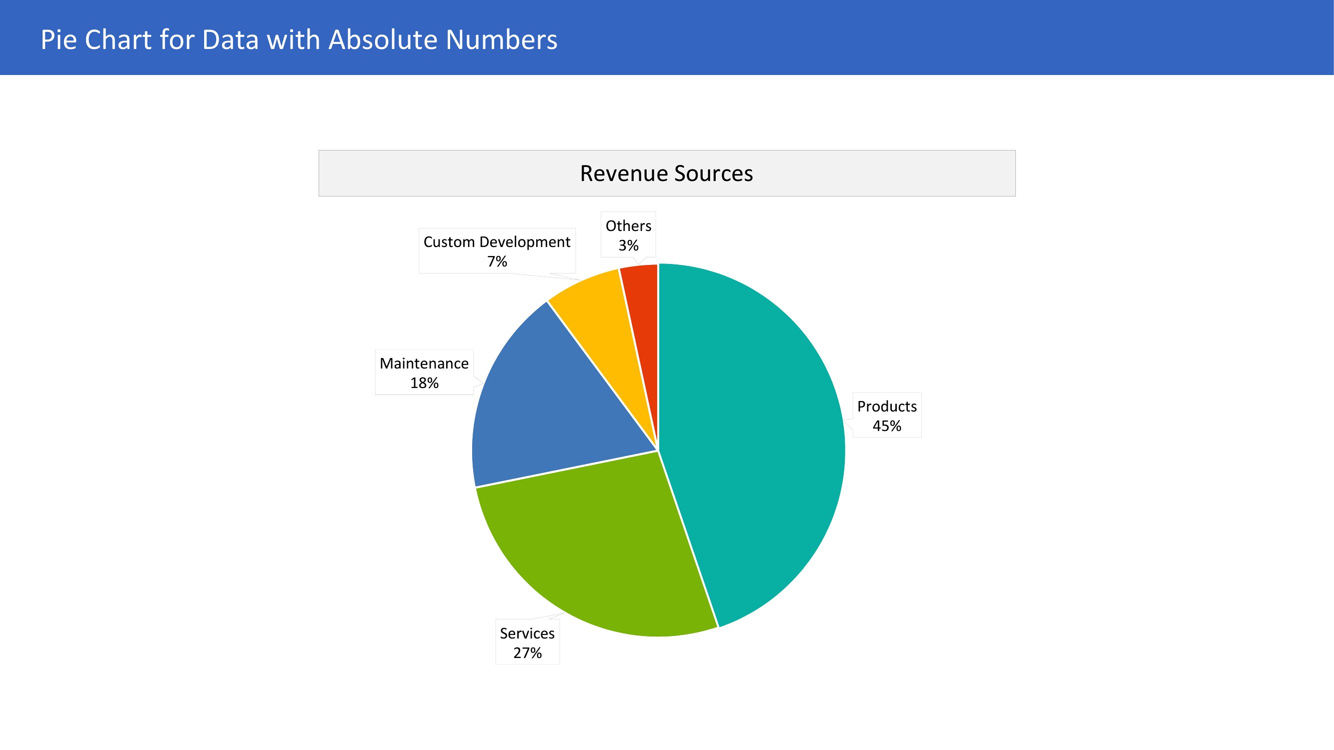
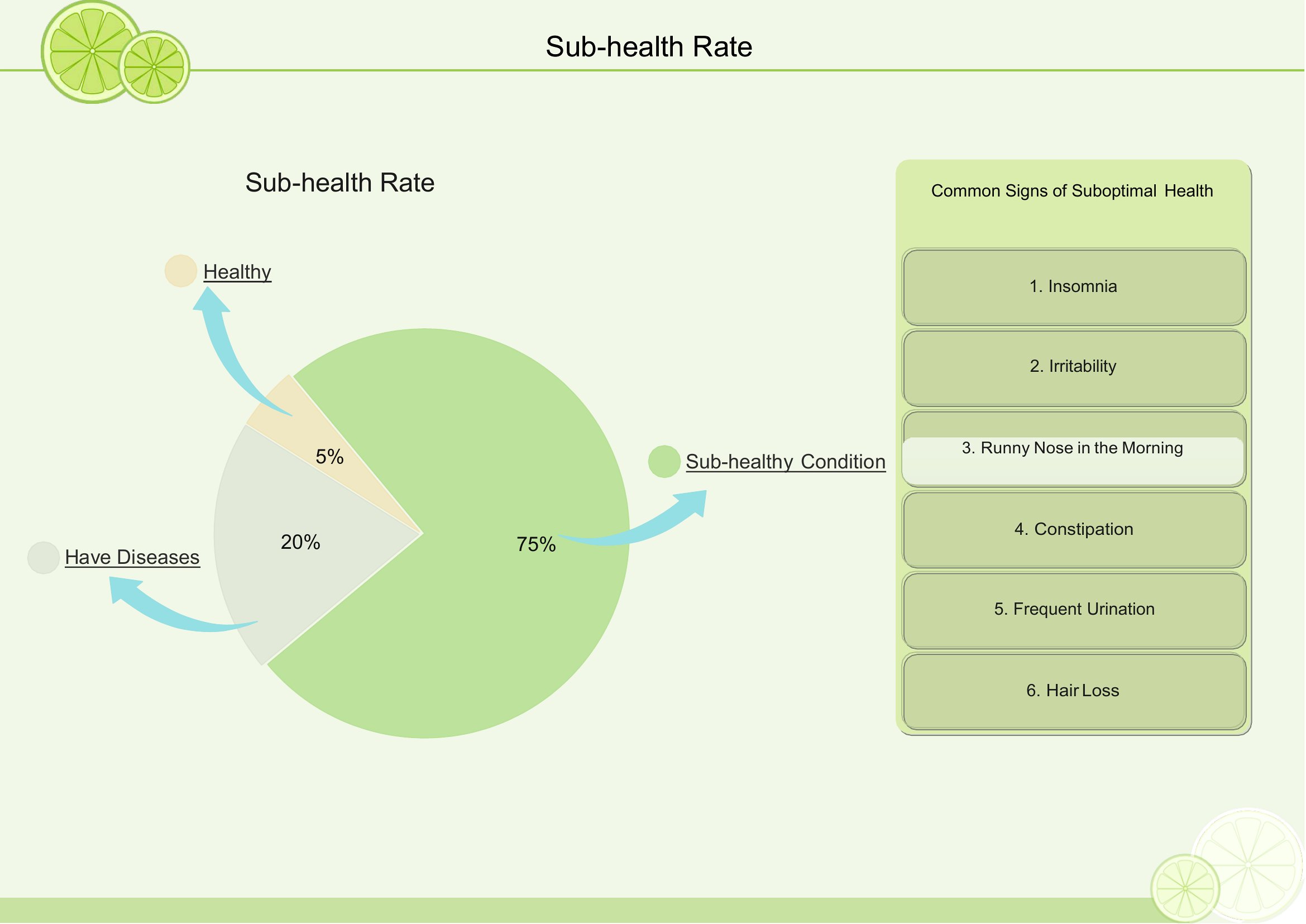
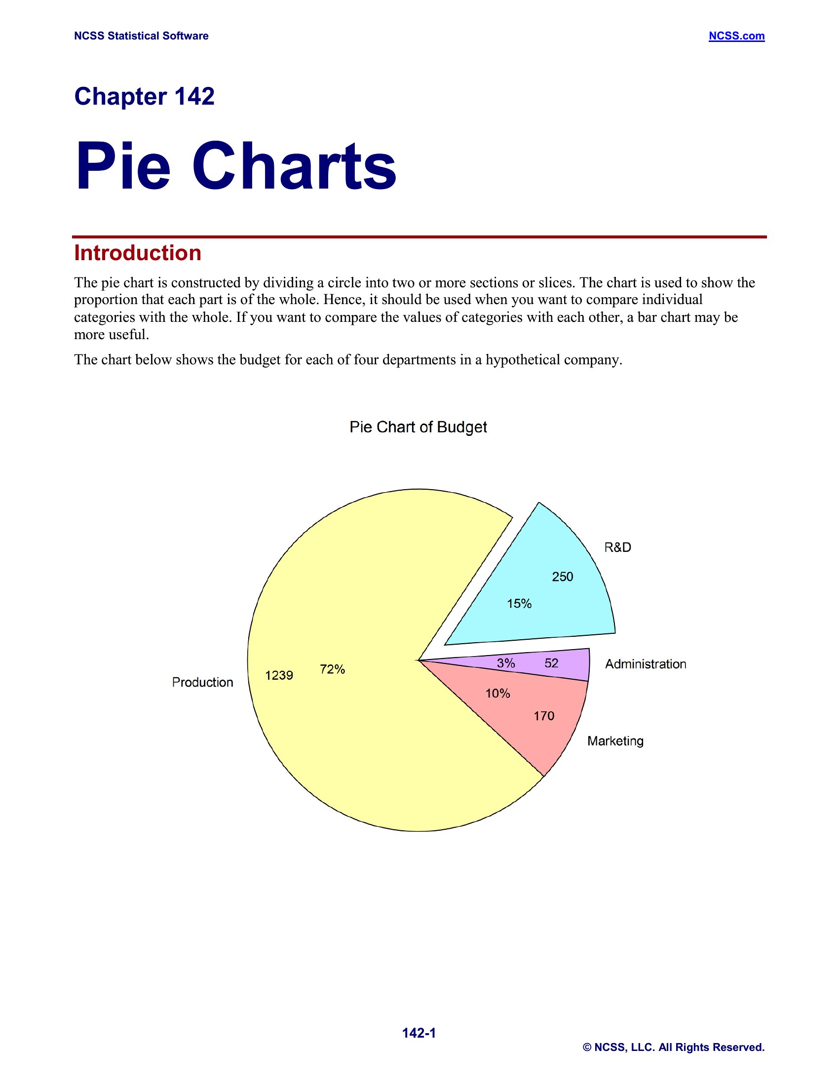
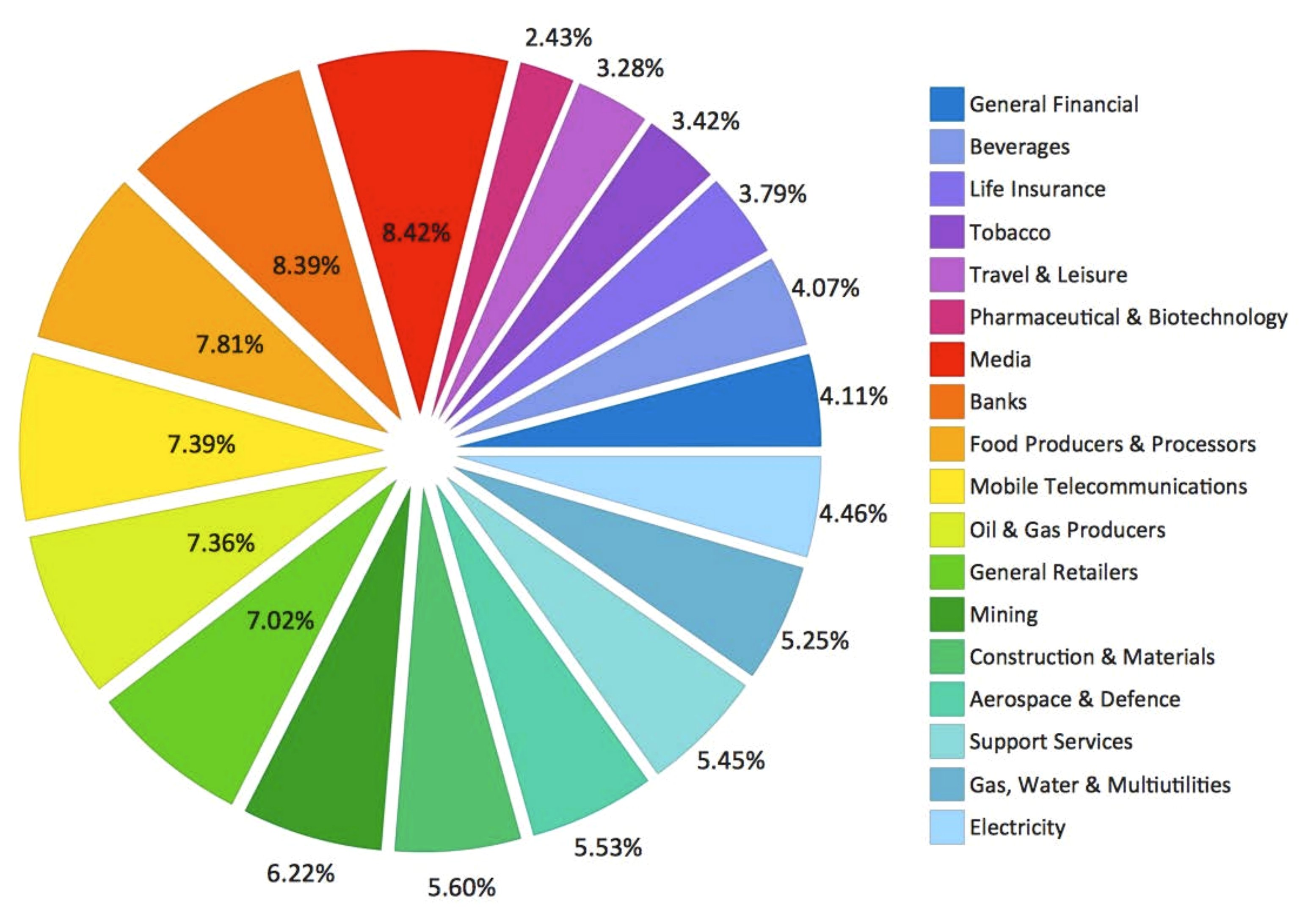
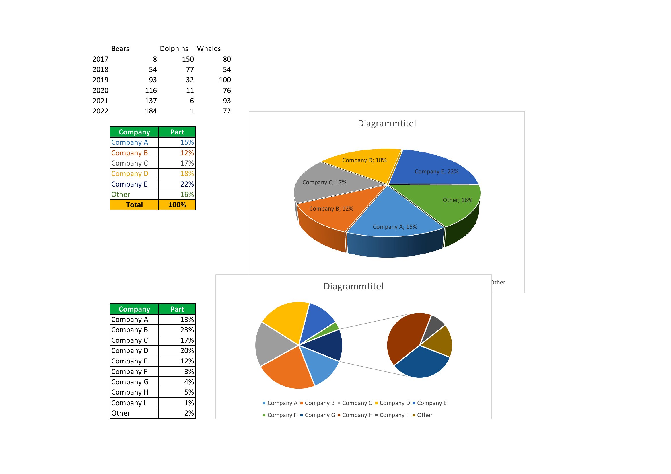
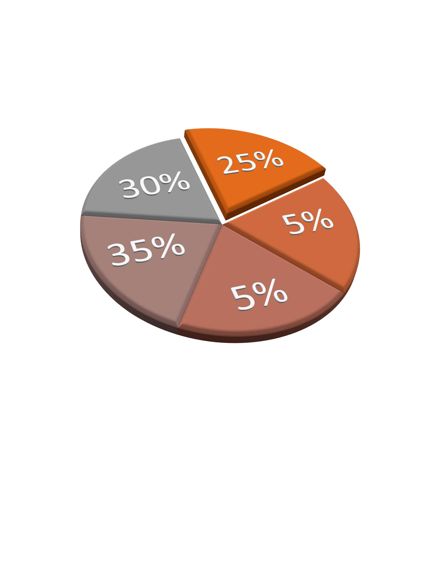
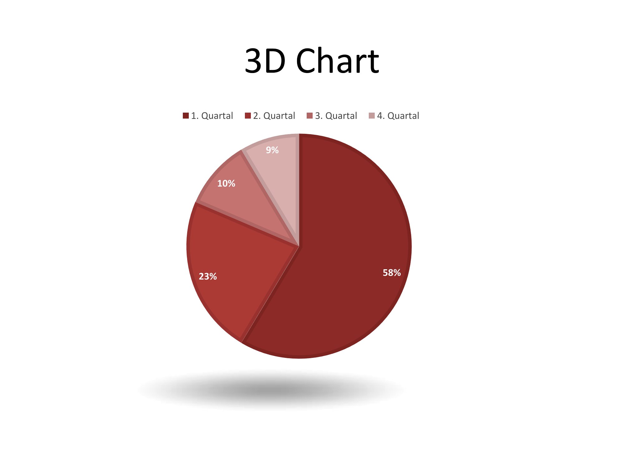
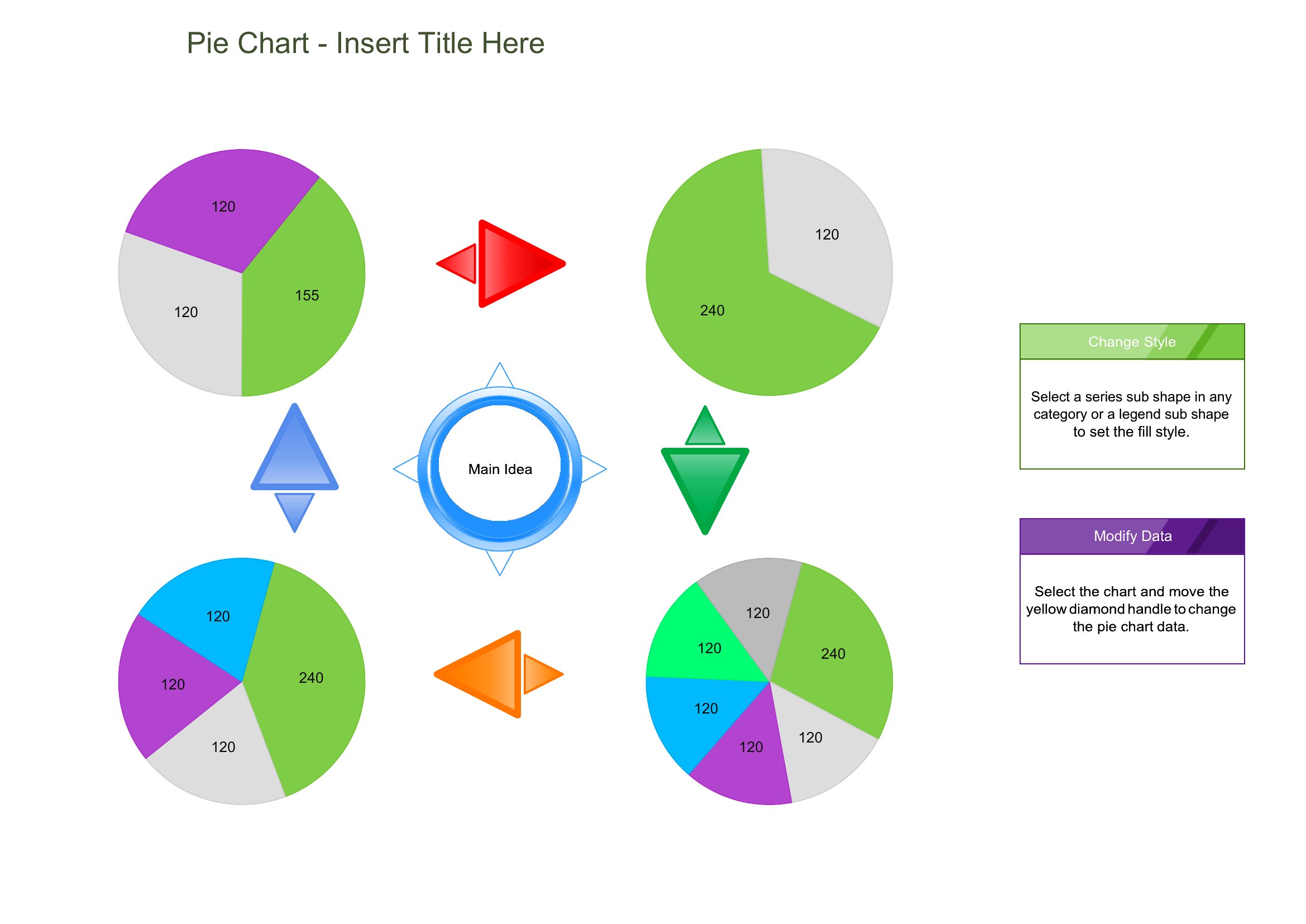
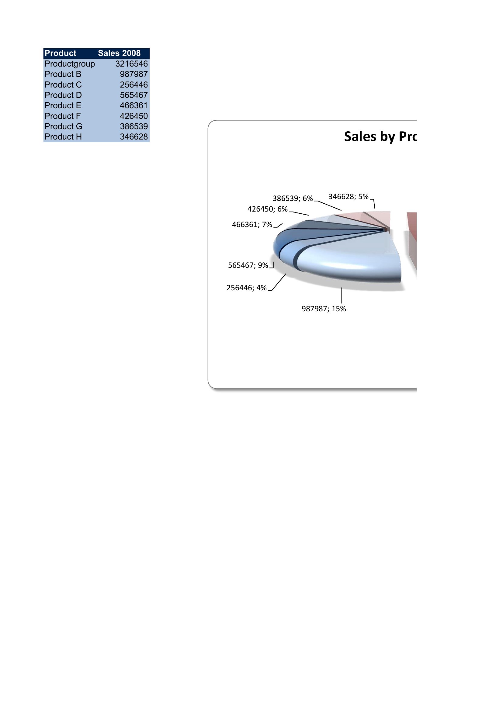
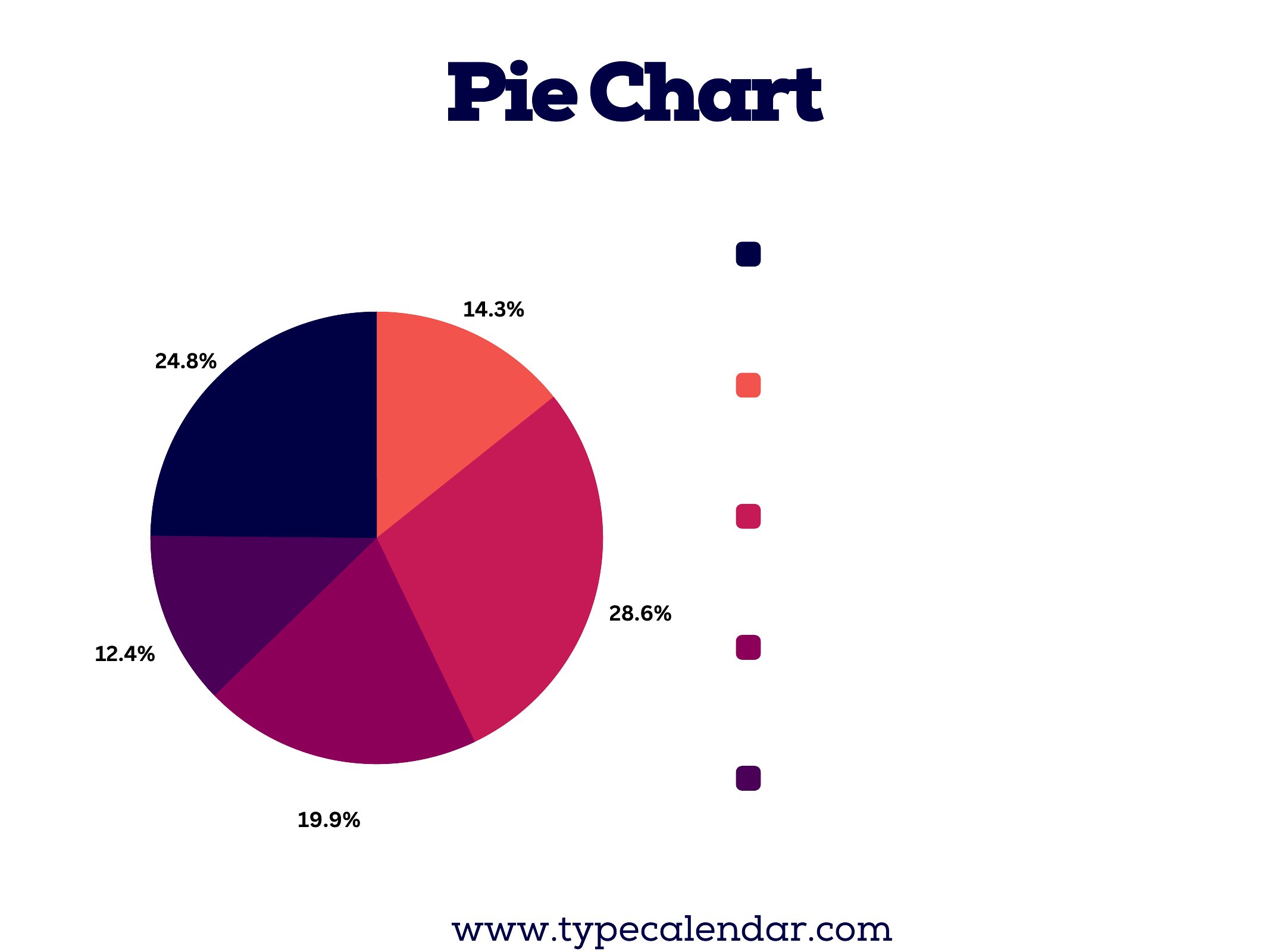
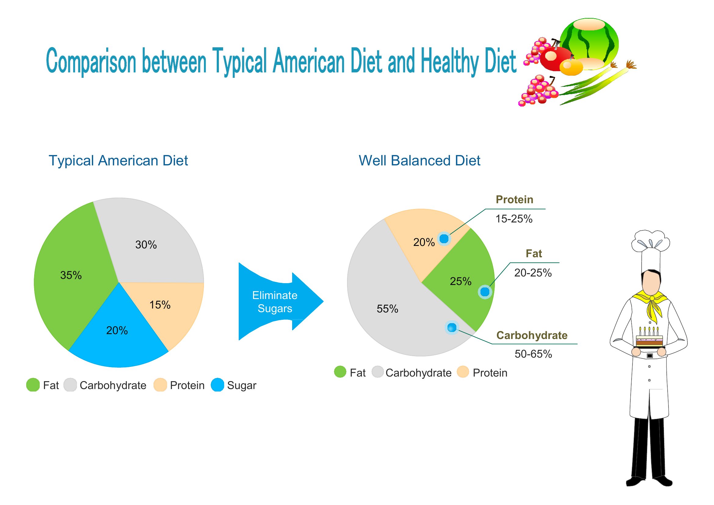
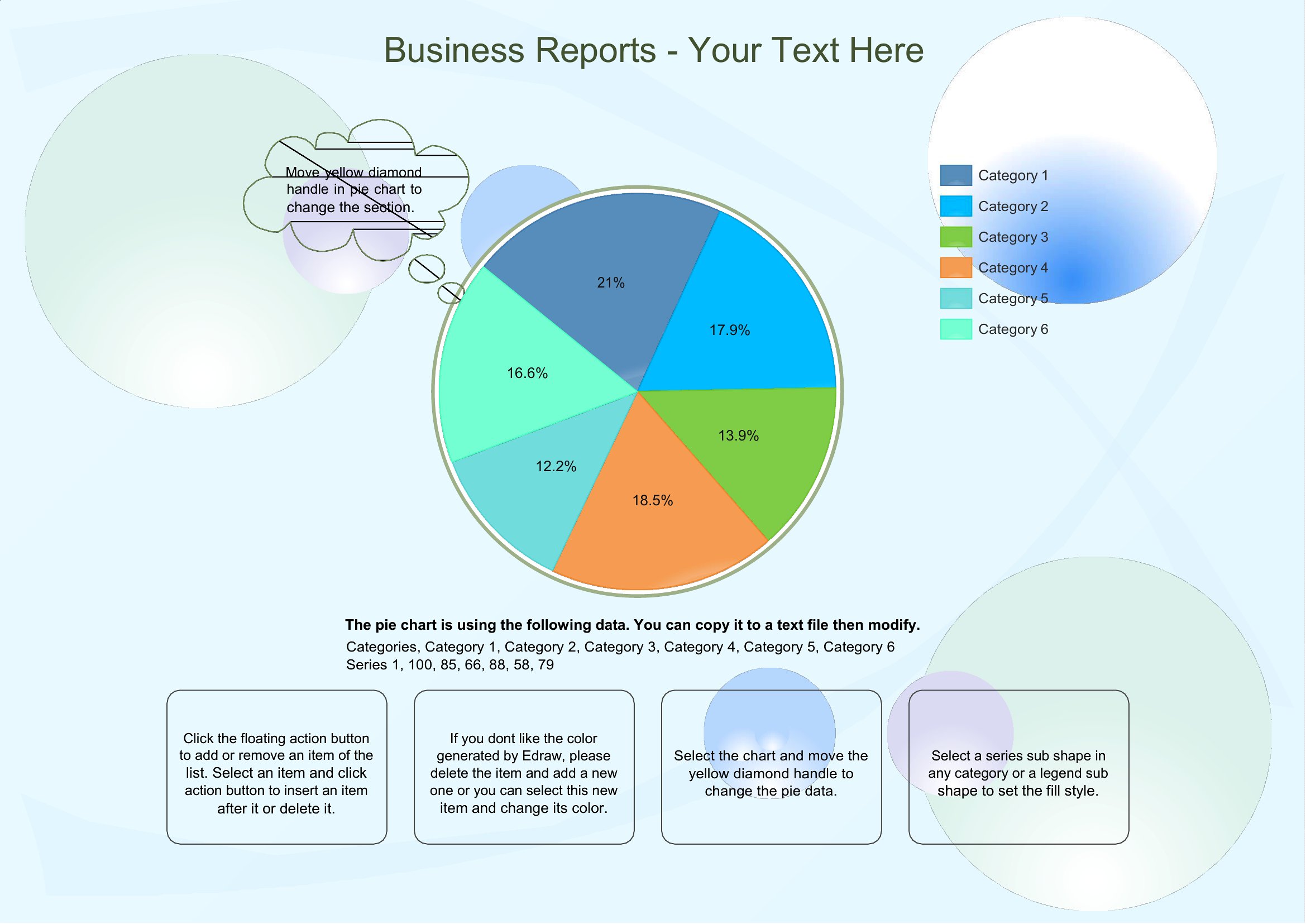
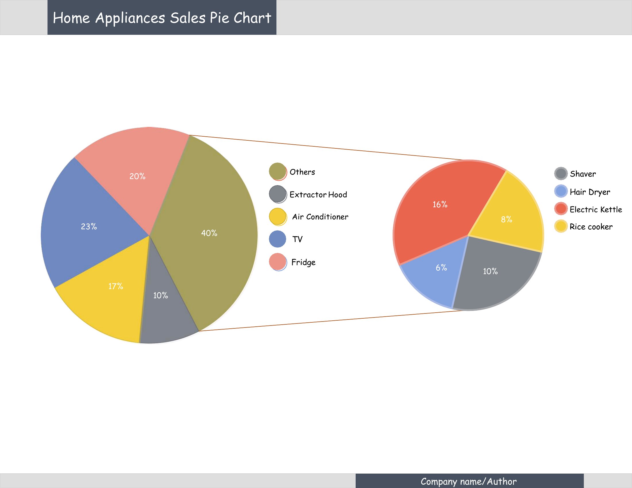
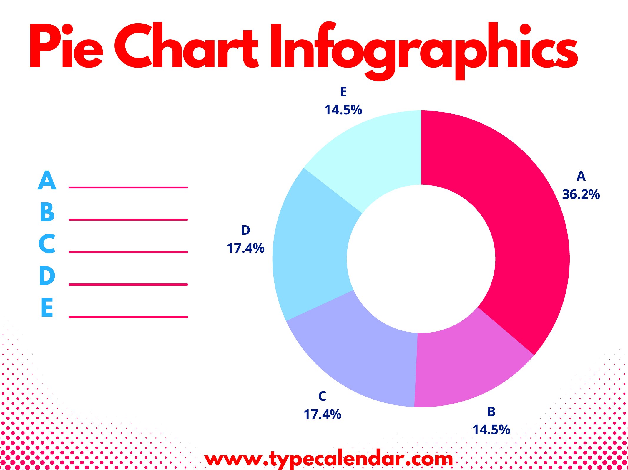
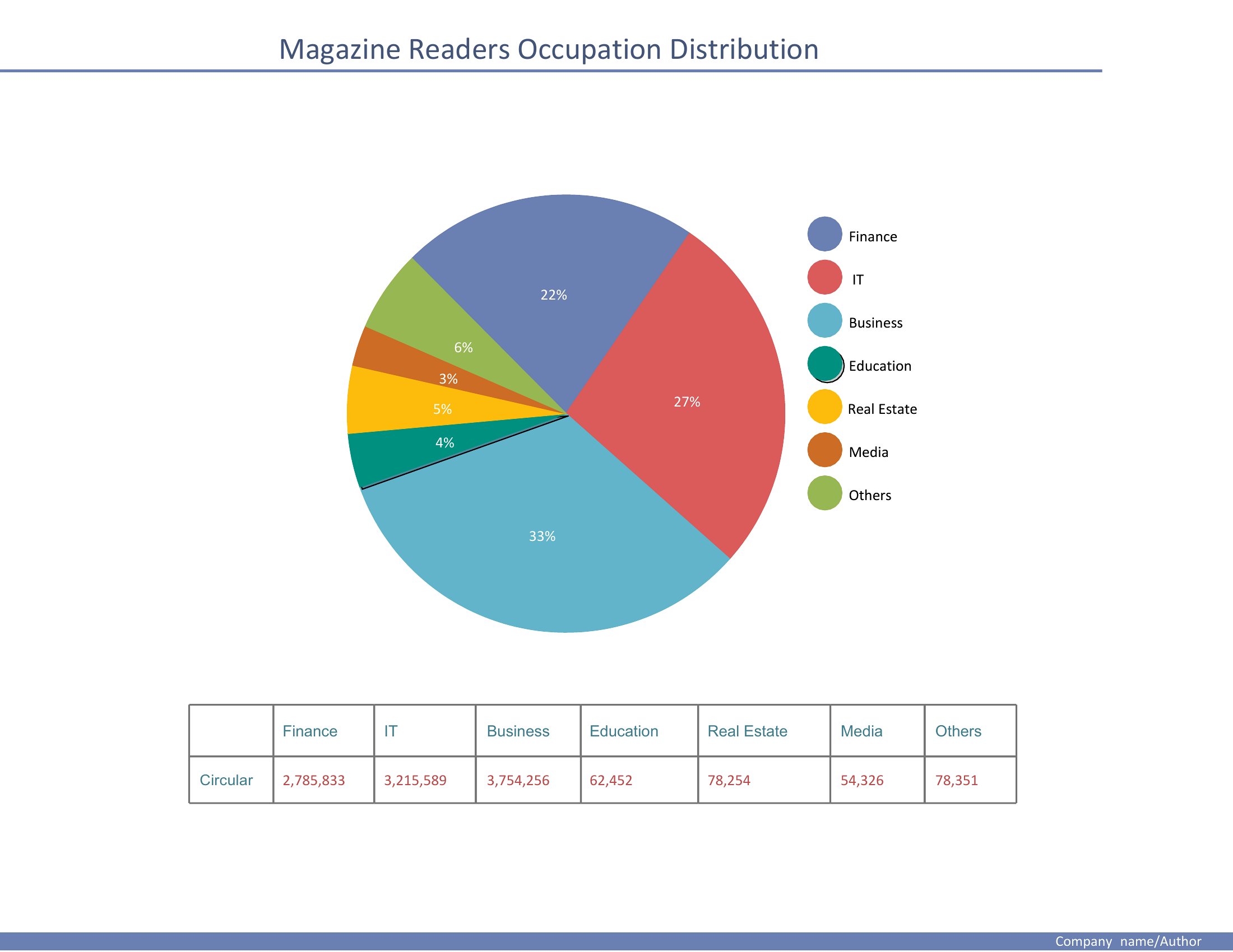
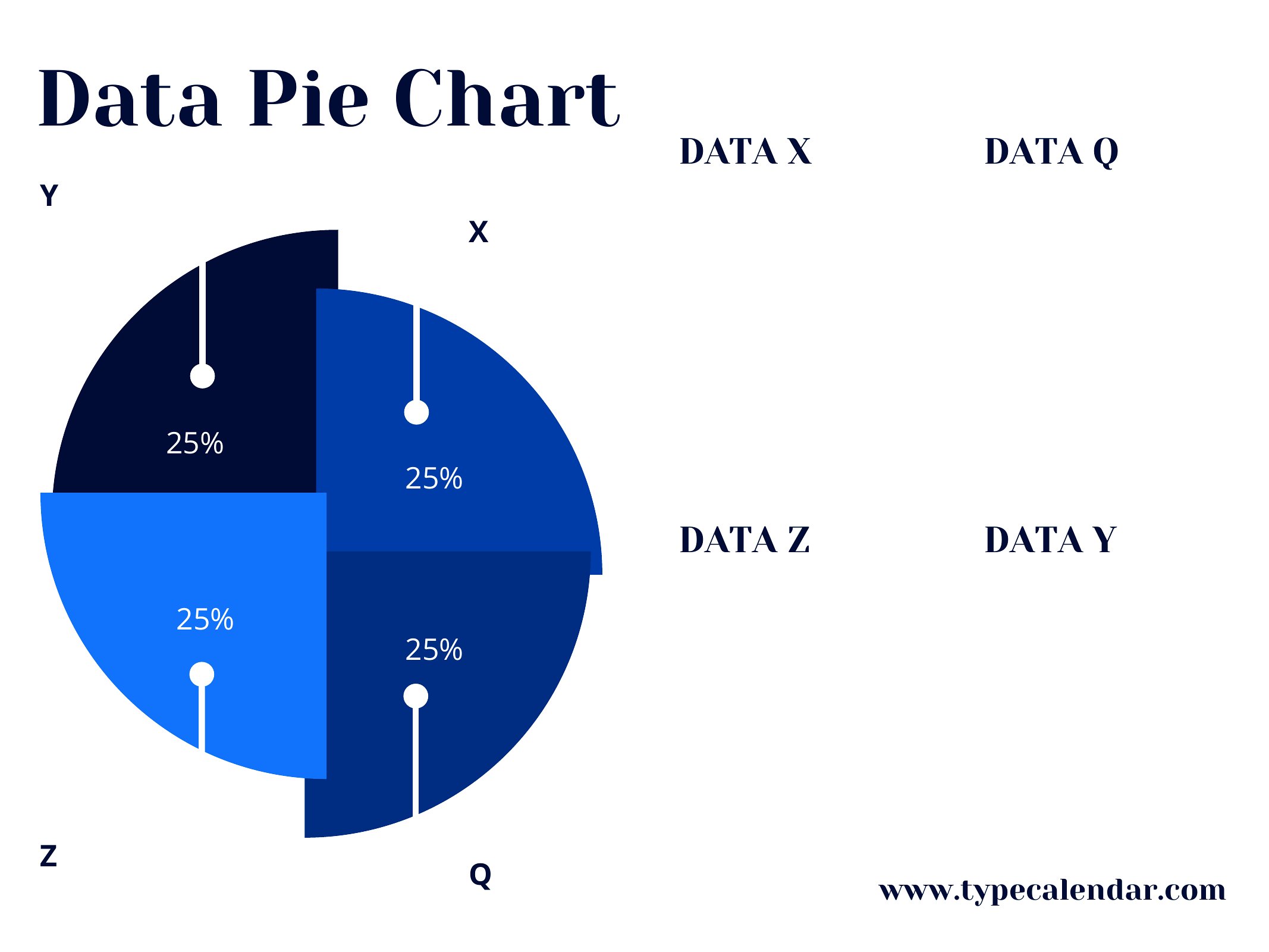
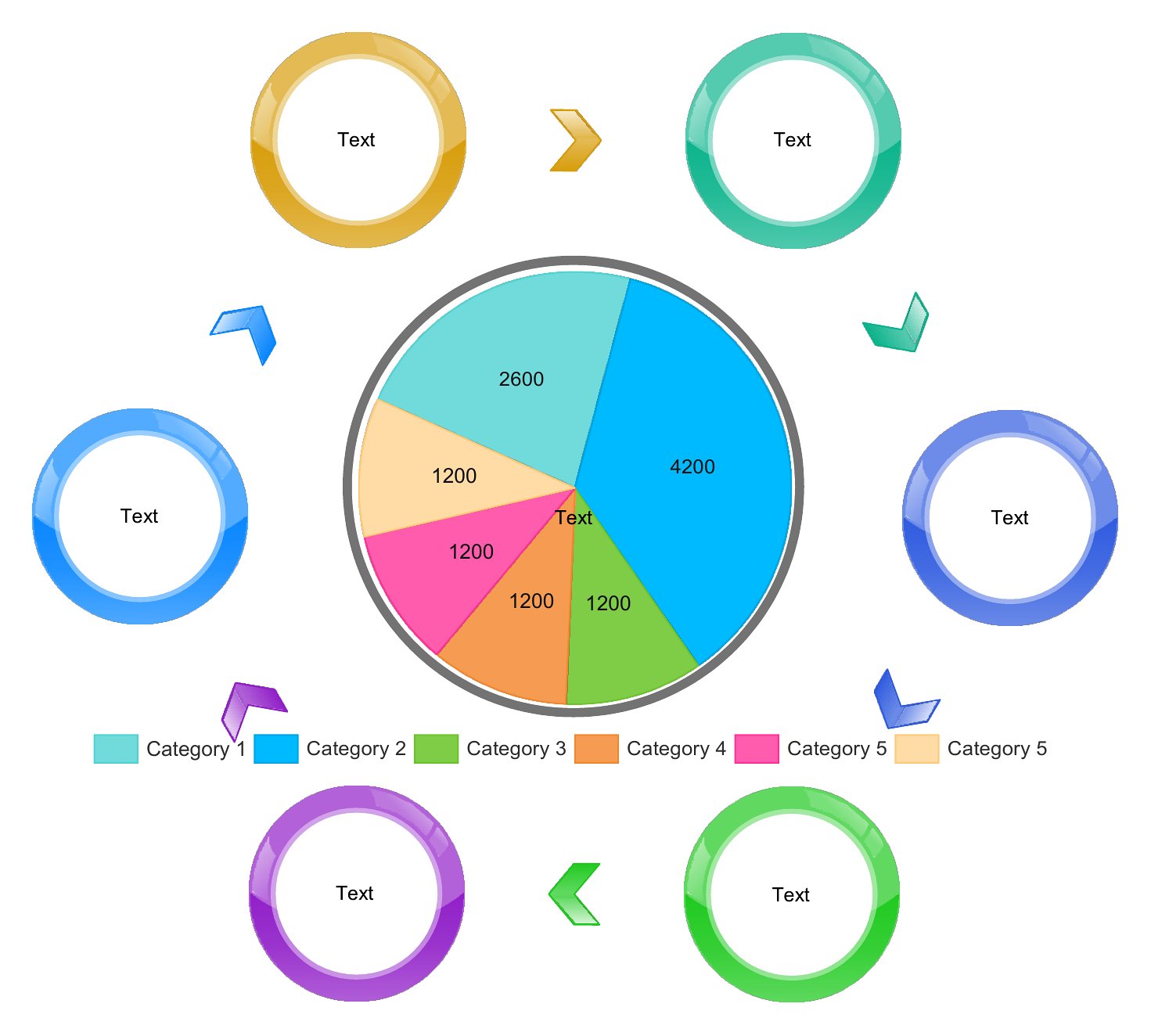
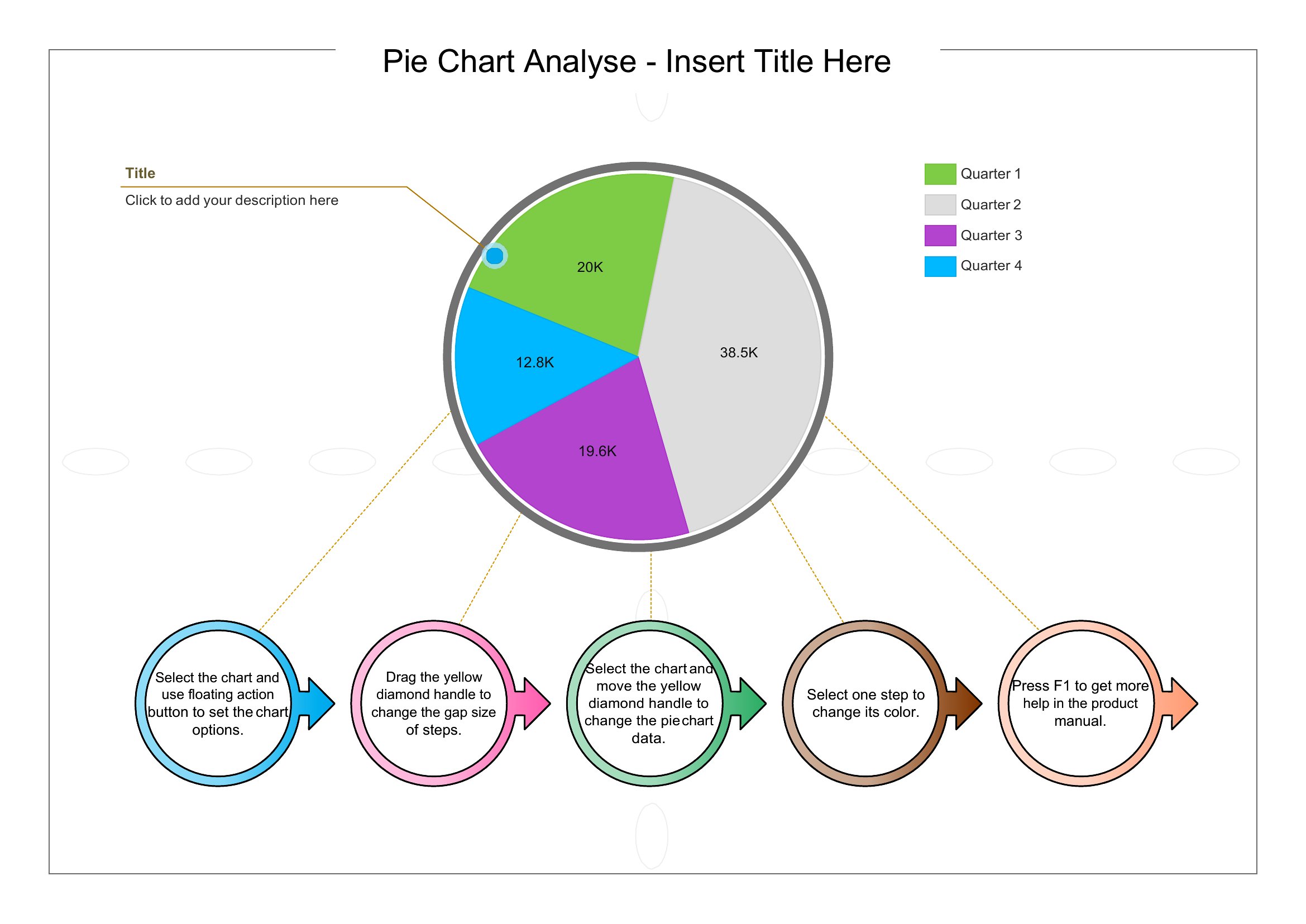
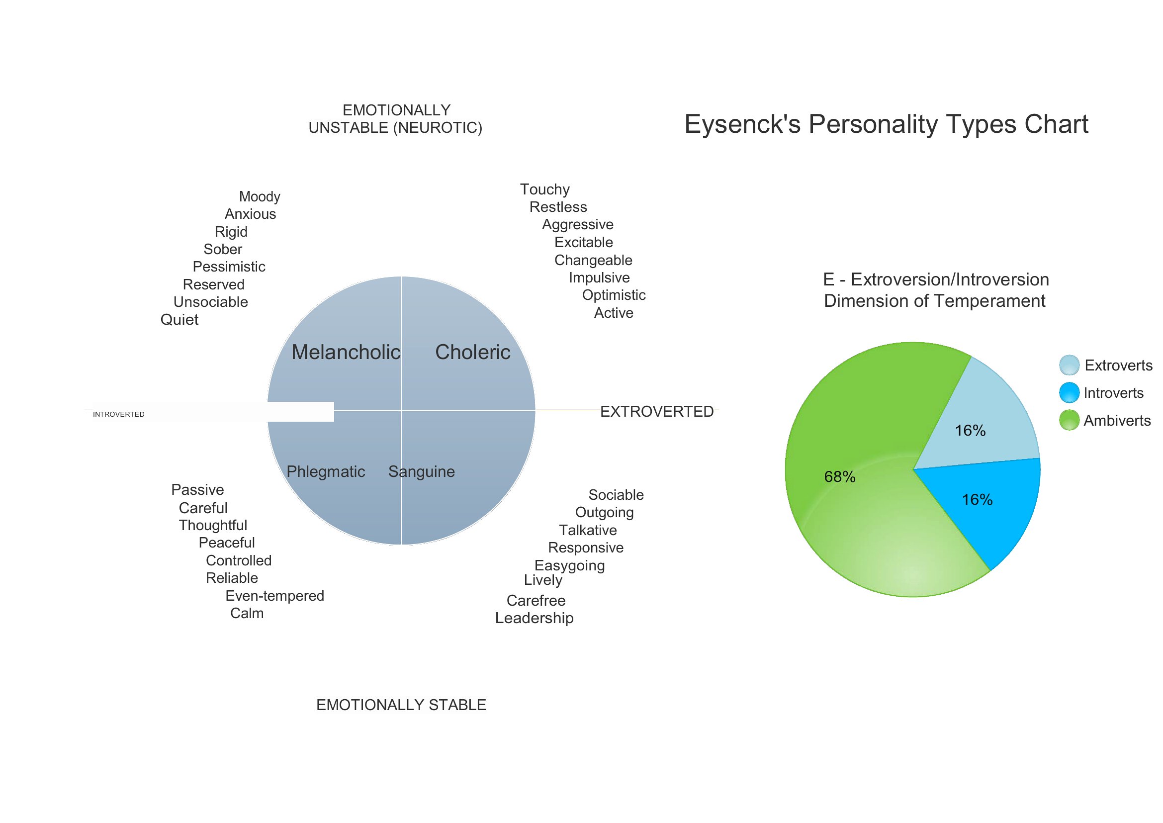
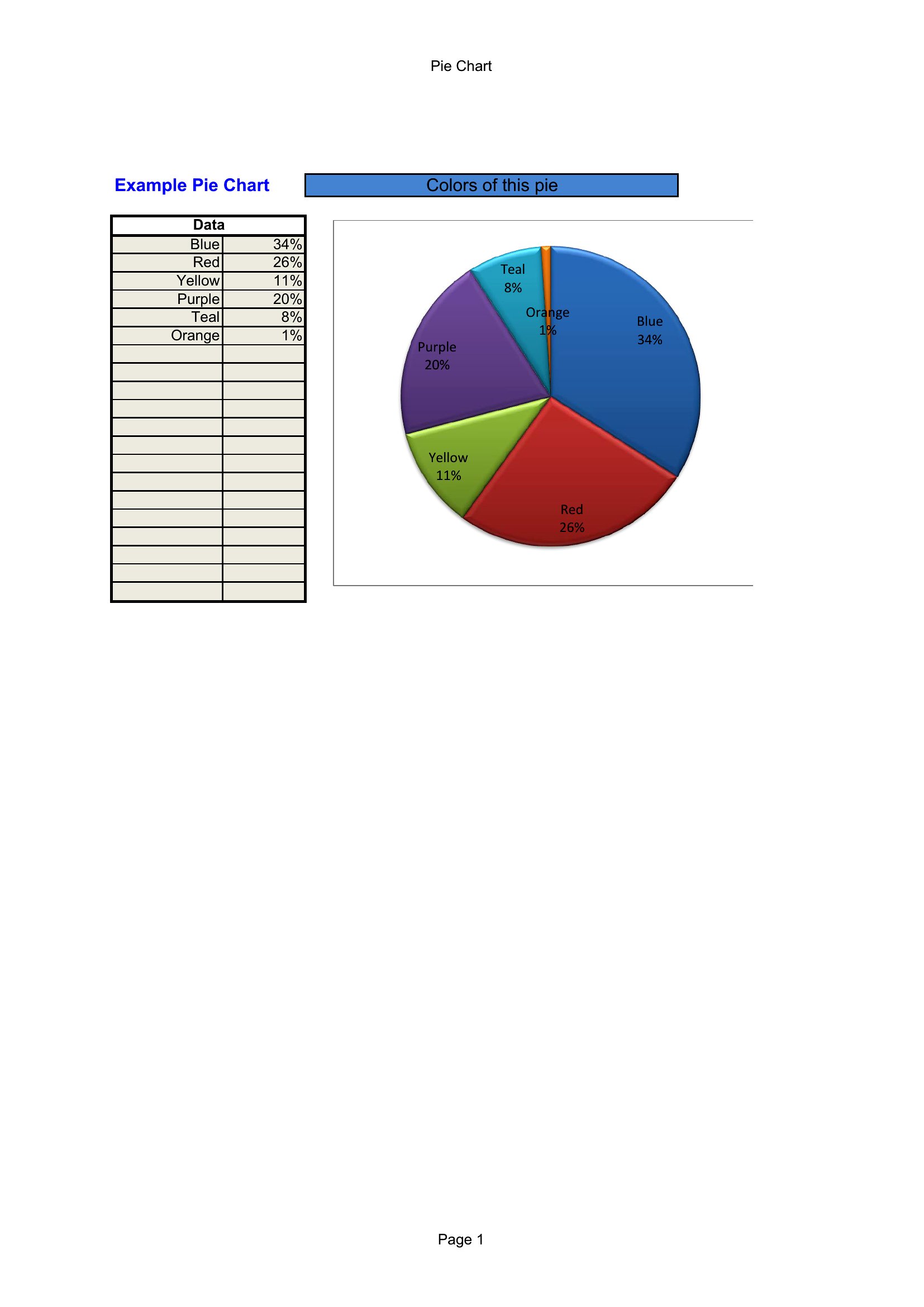
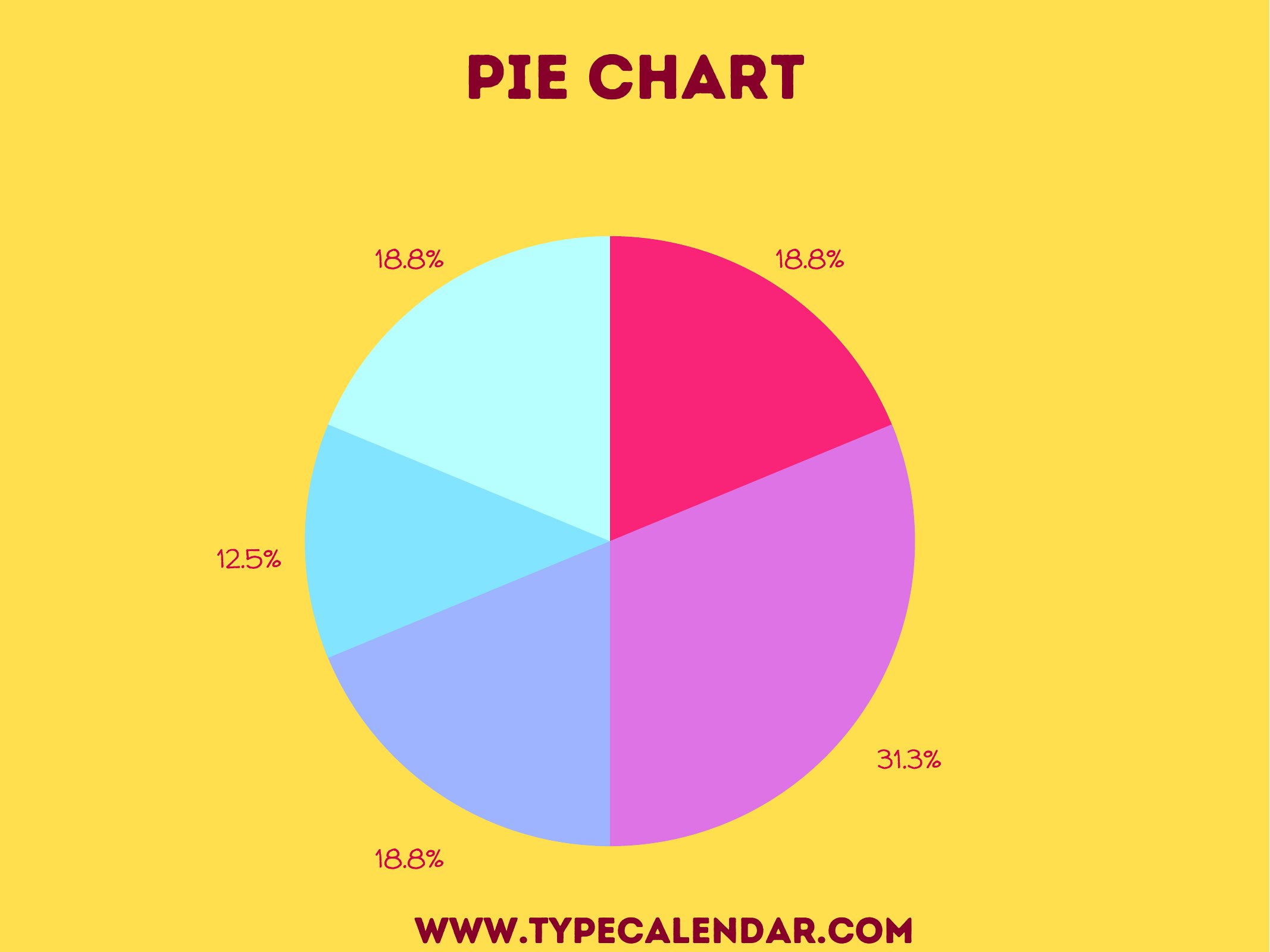
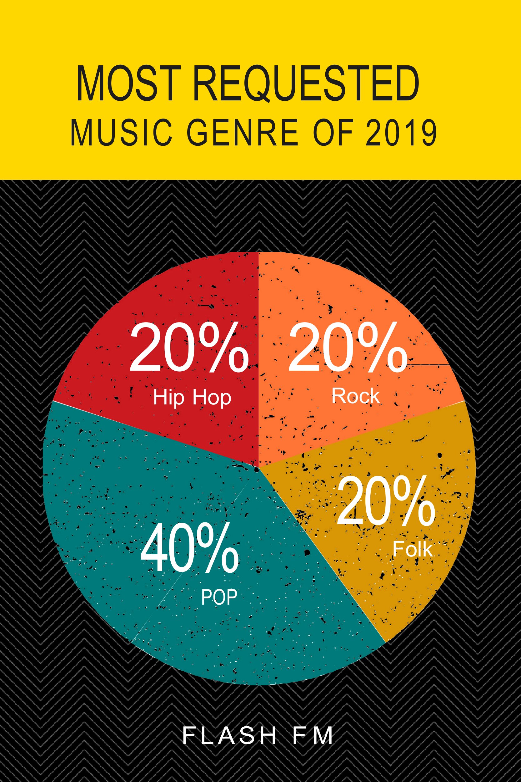
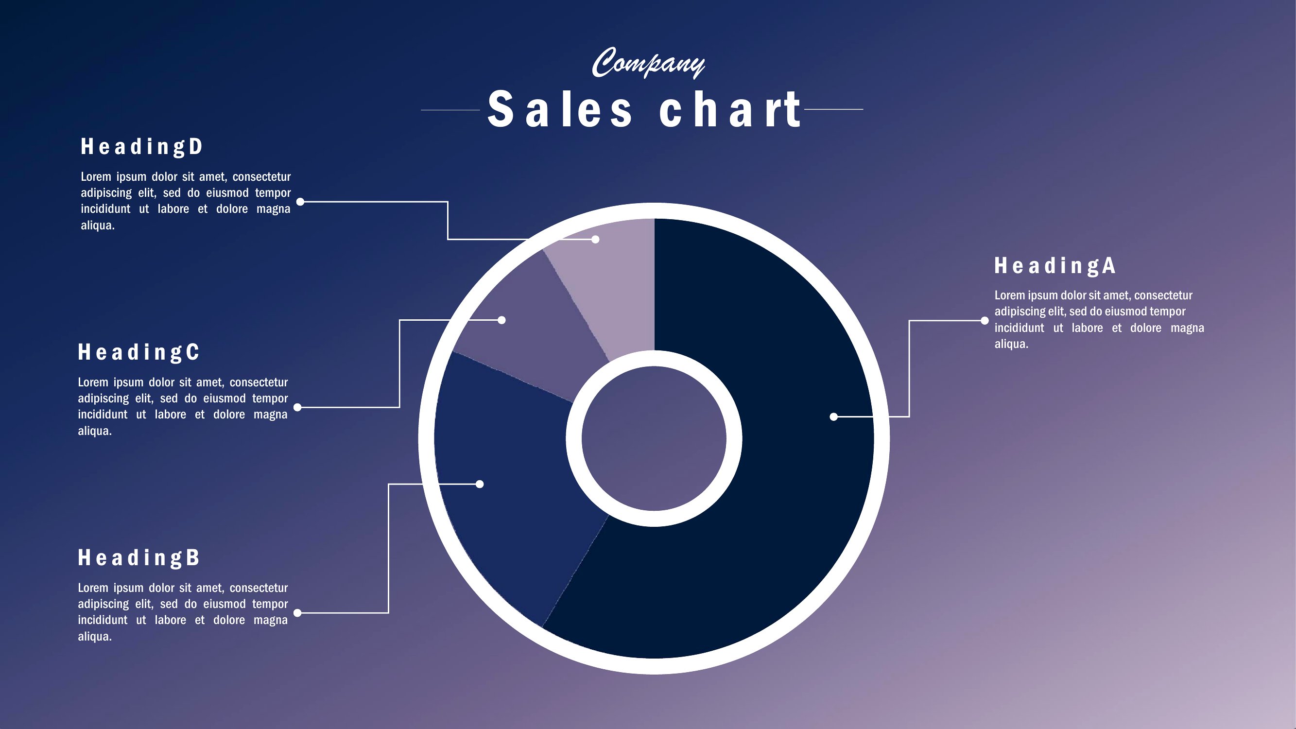
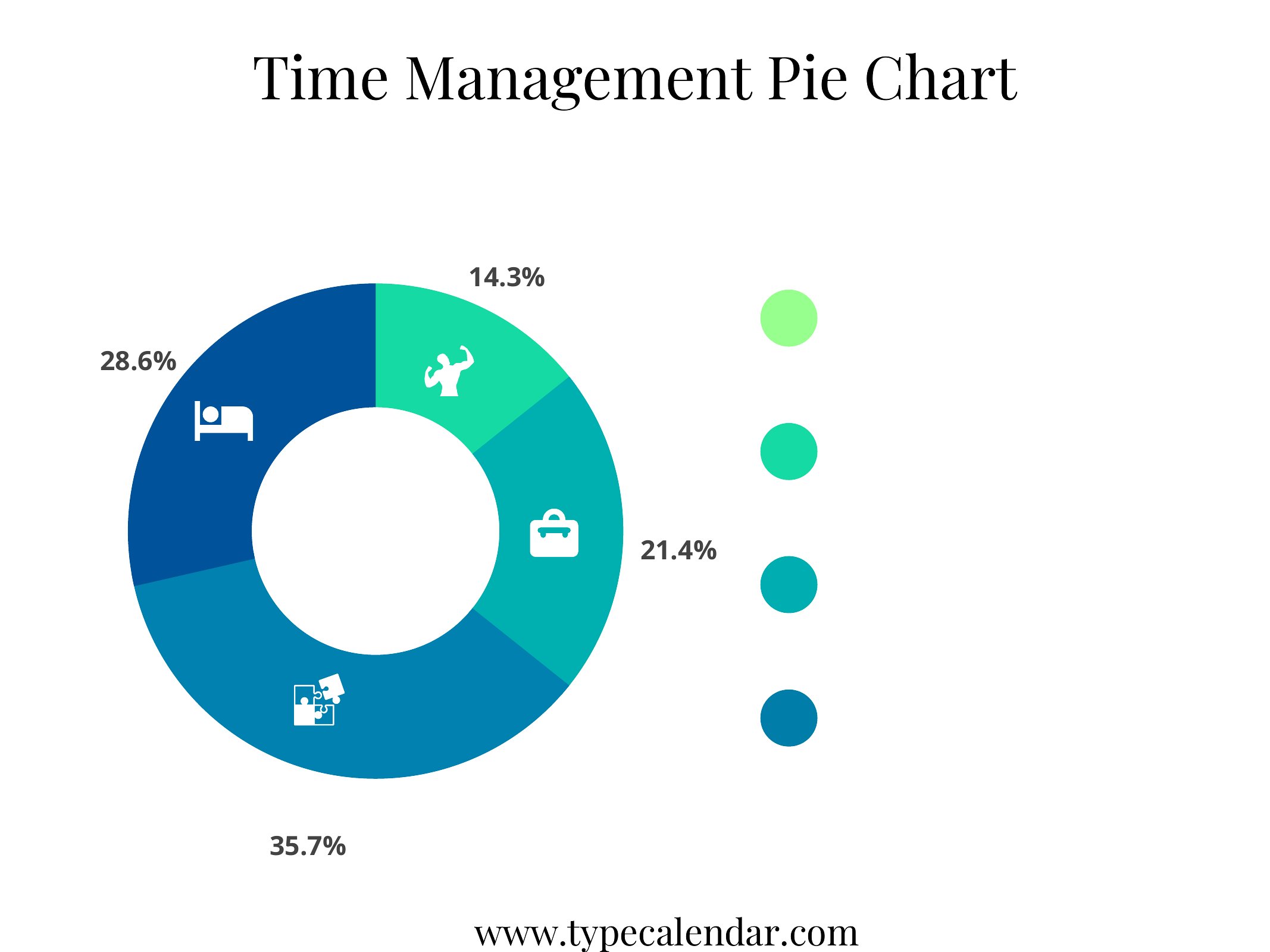
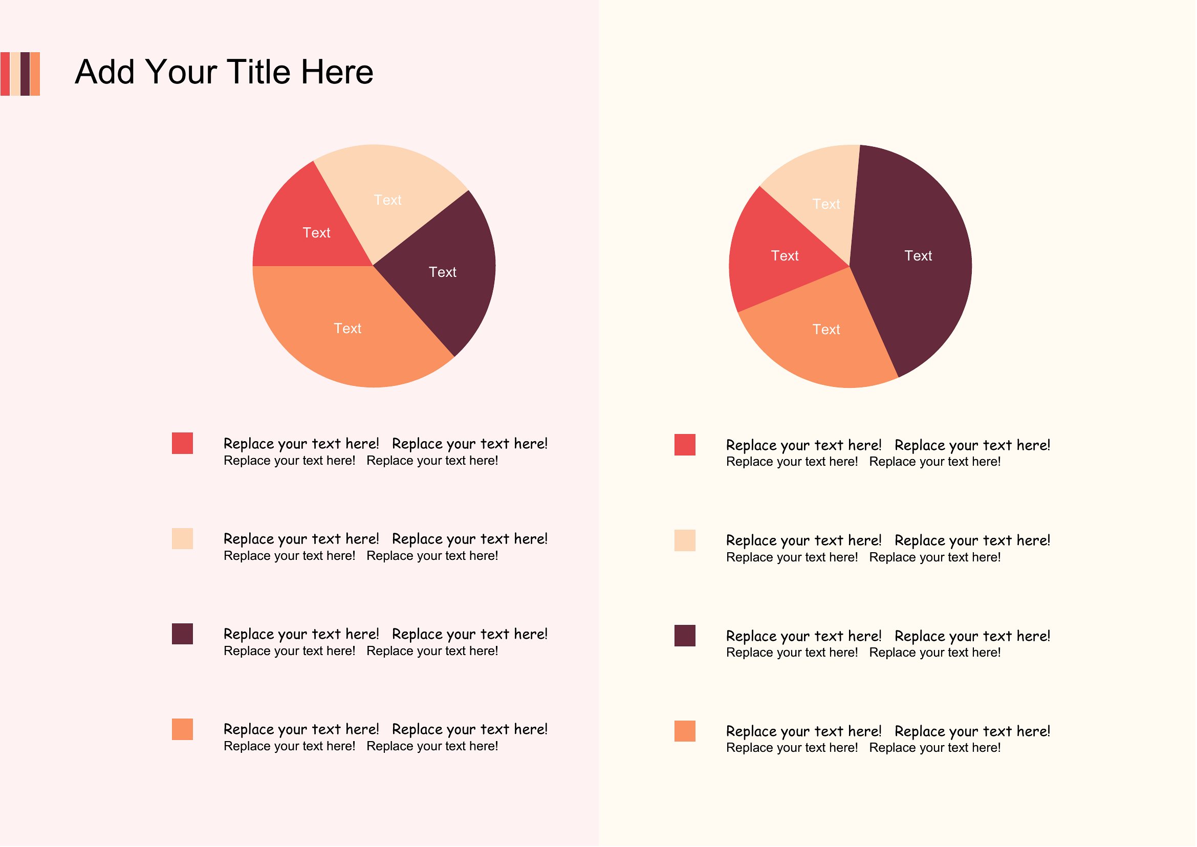
DataTurning numbers into a picture helps an audience grasp proportions at a glance, and a pie chart is one of the clearest ways to do it. These 54 printable templates give teachers, students, and presenters blank and segmented charts for budgets, survey results, or classroom lessons.
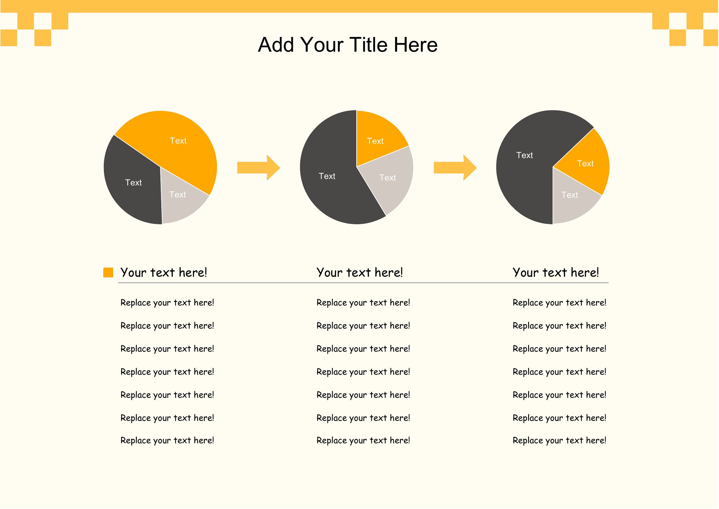
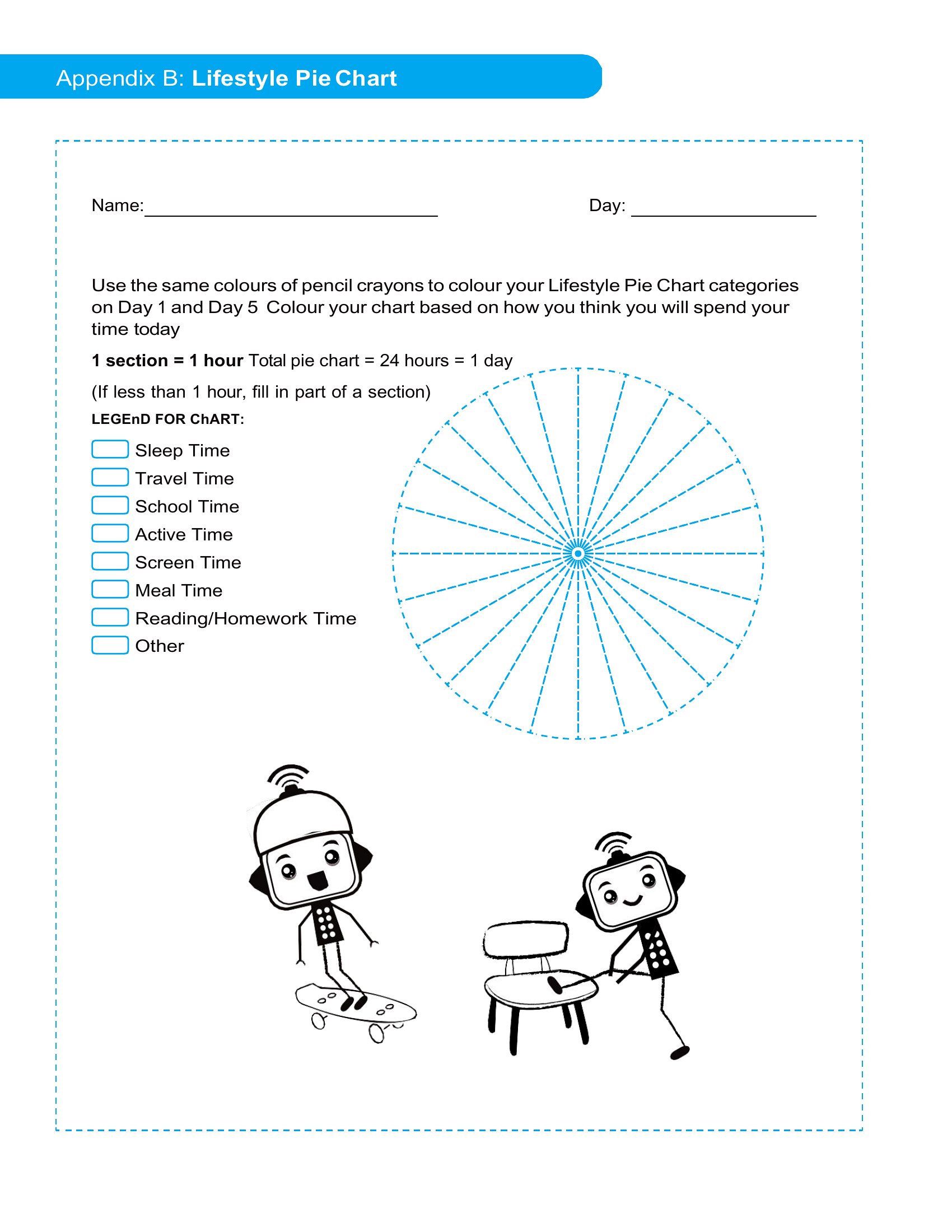
The collection comes as print-ready PDFs, so you can print blank circles to fill by hand or use pre-divided versions for quick visuals. Print as many as a lesson or meeting needs, with nothing to install. Pick the chart that fits your data, print it, and make your numbers easy to read.
When to use this Pie Chart template
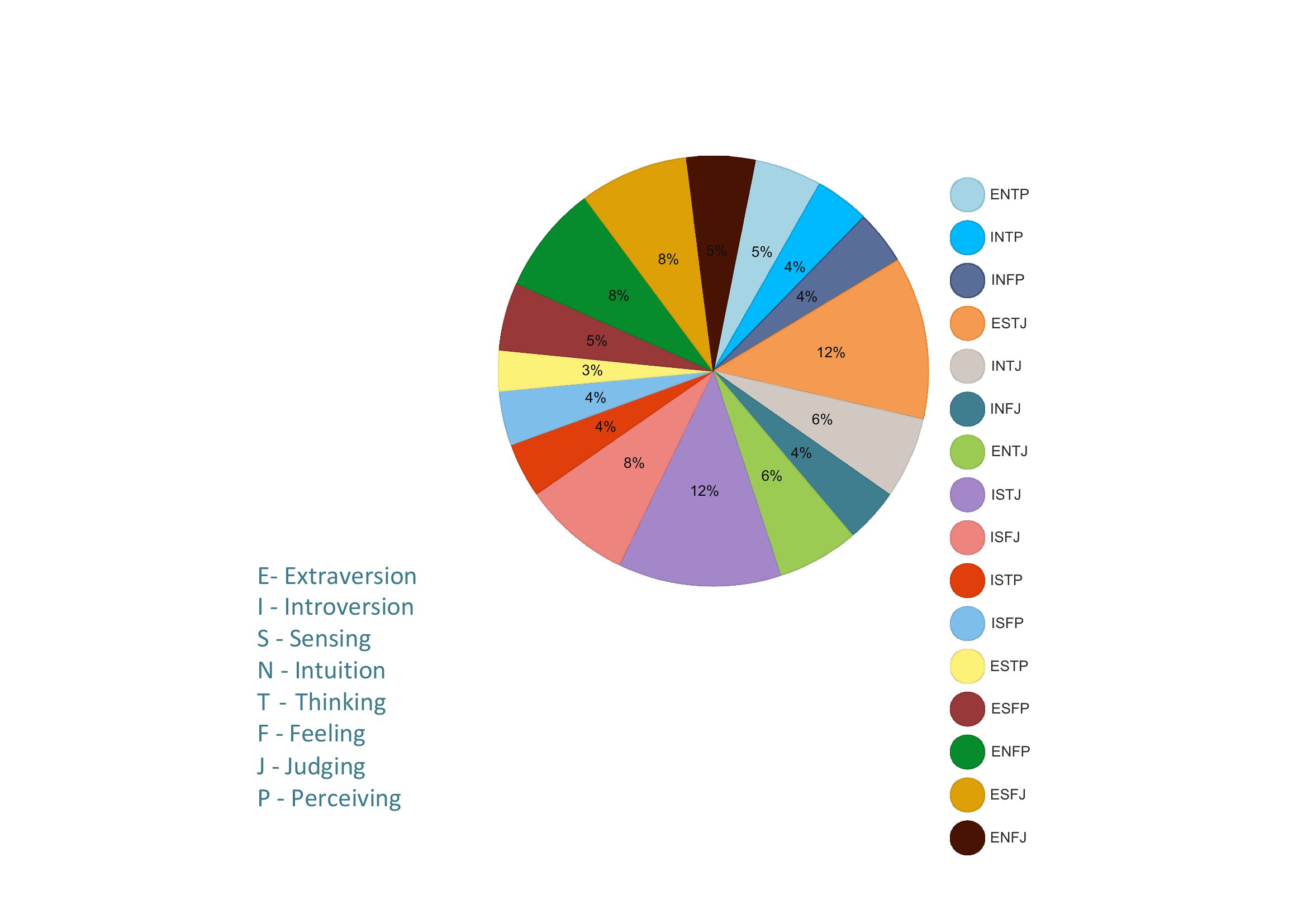
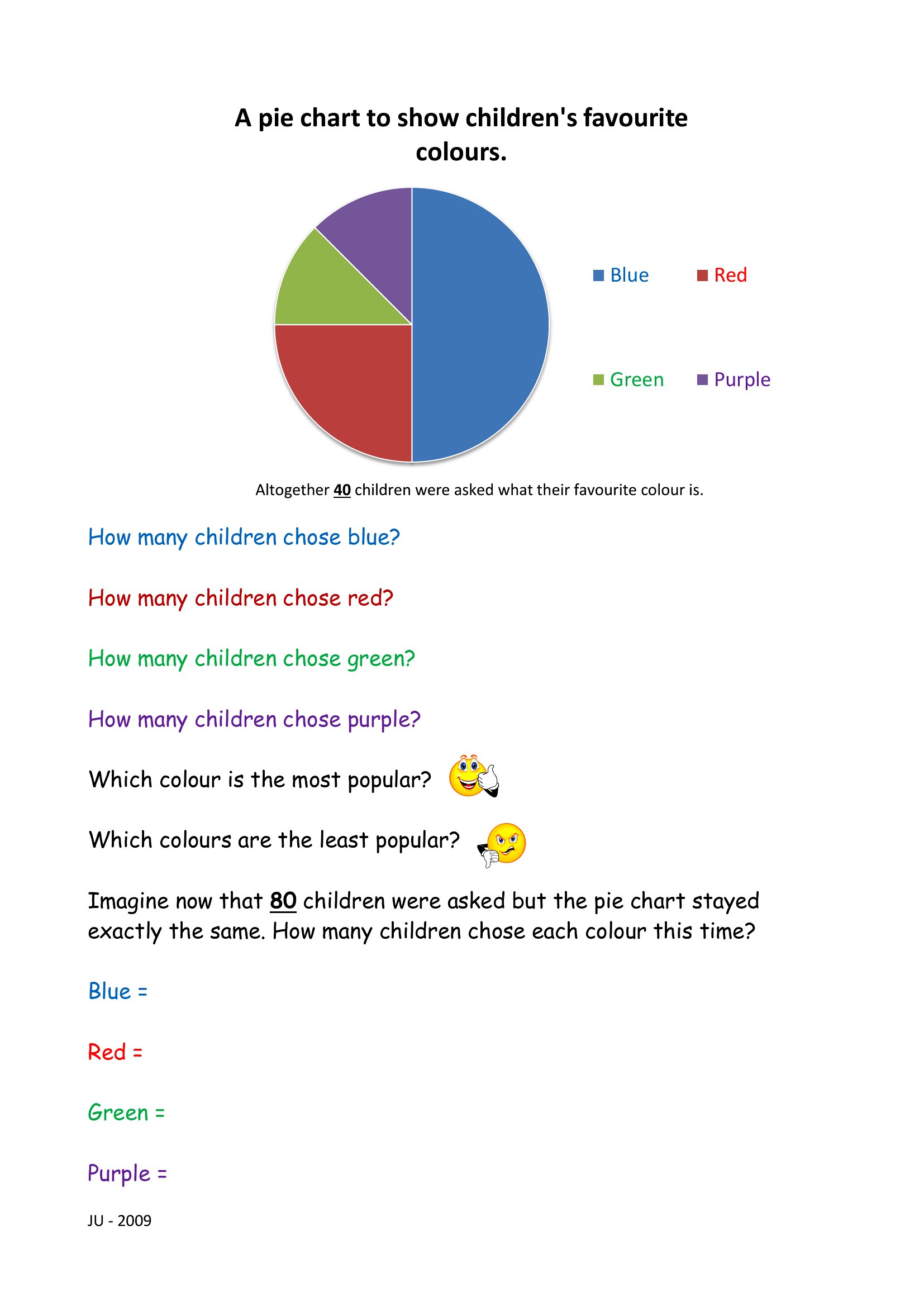
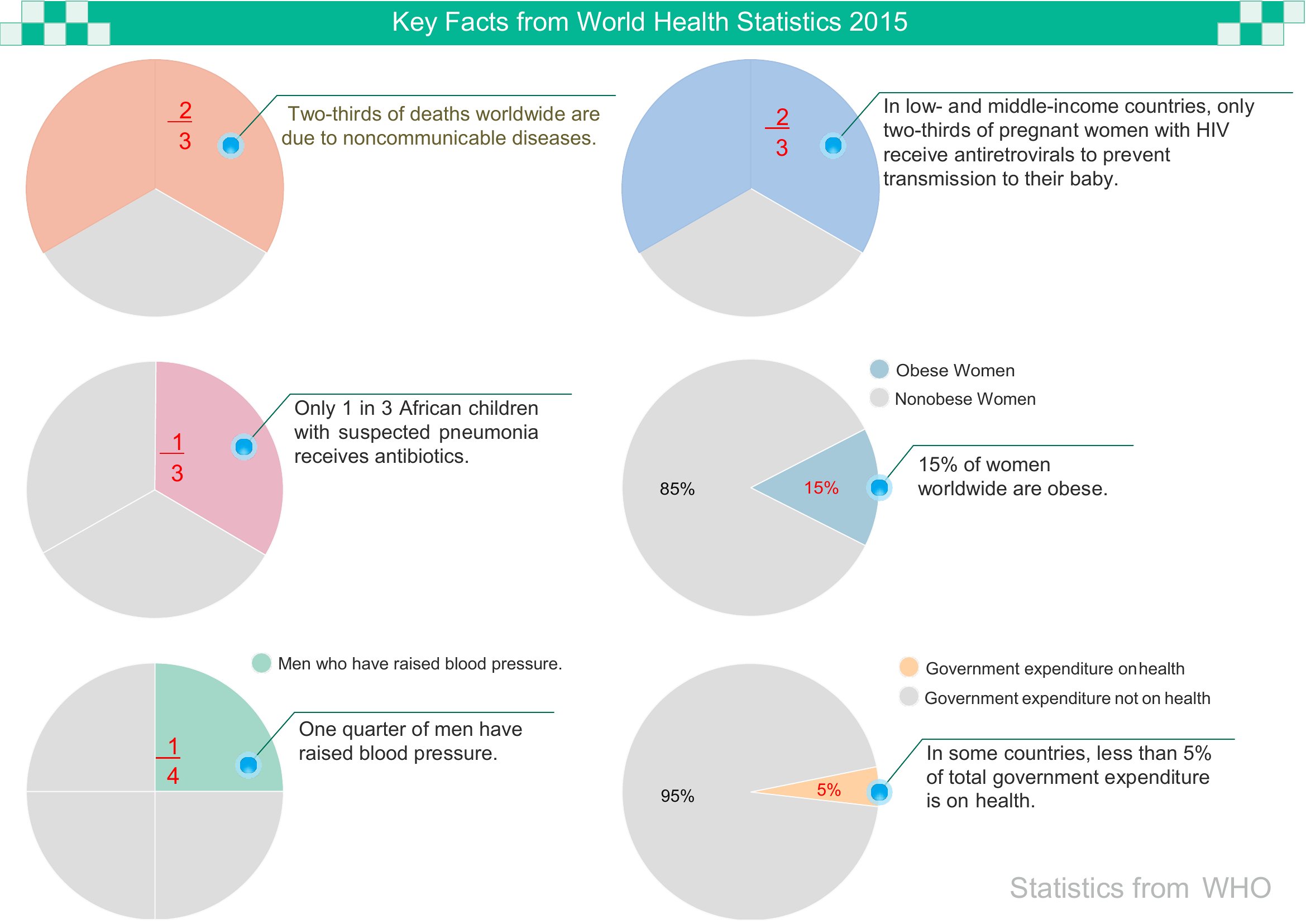
- Teachers planning a lesson on data visualization need simple, printable pie chart templates to demonstrate fractions or survey results during a classroom activity.
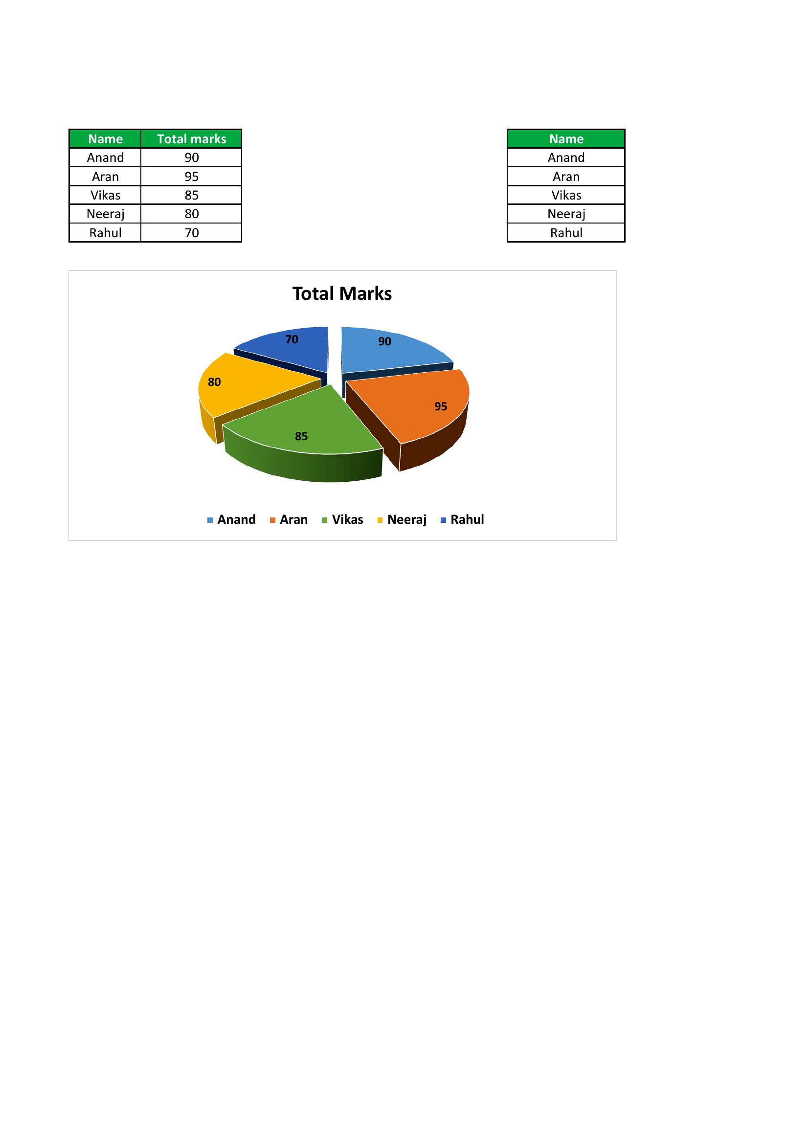
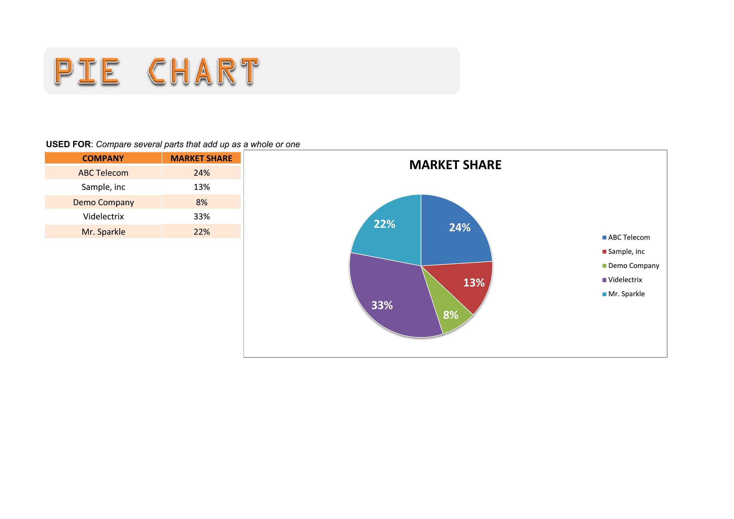
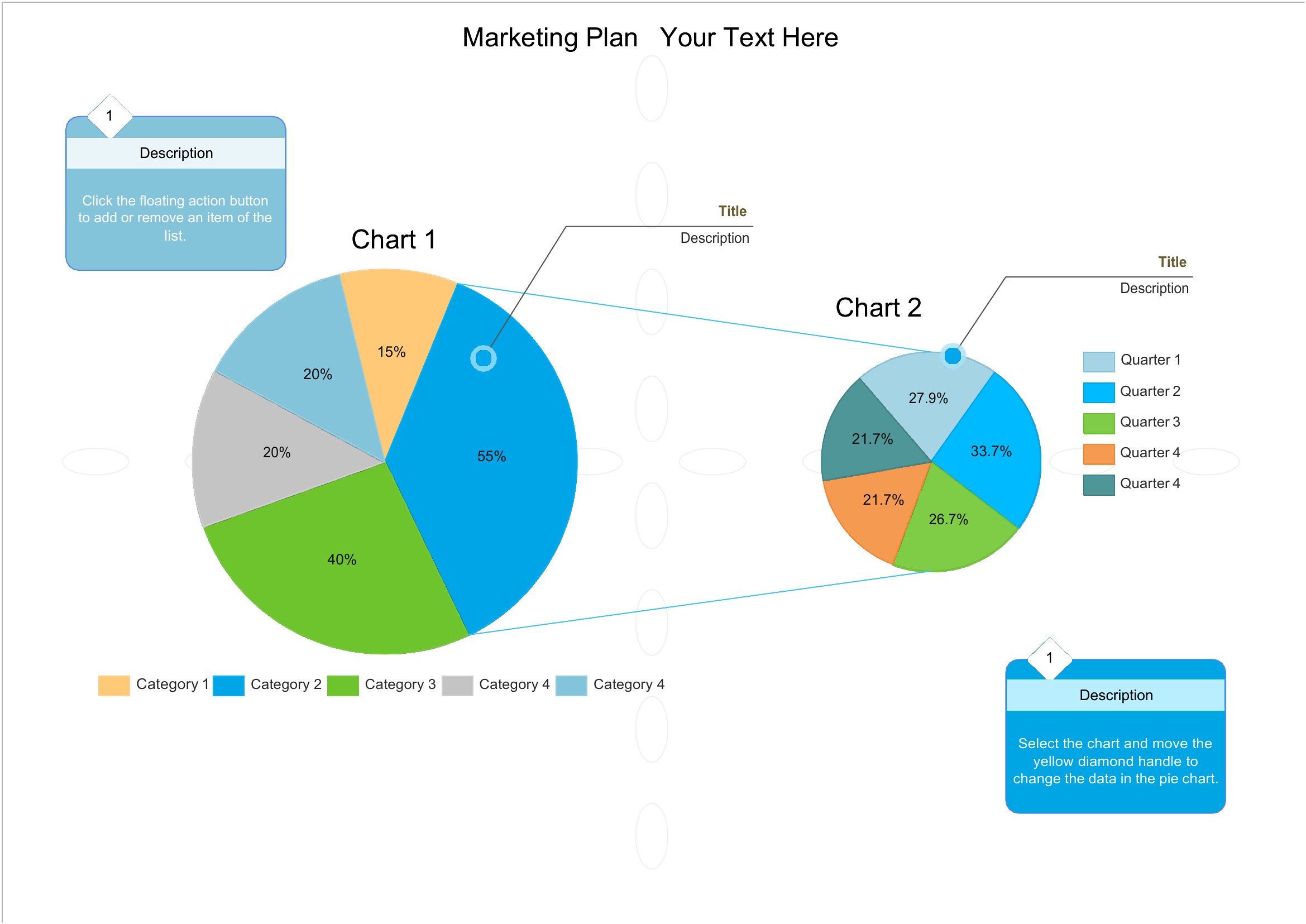
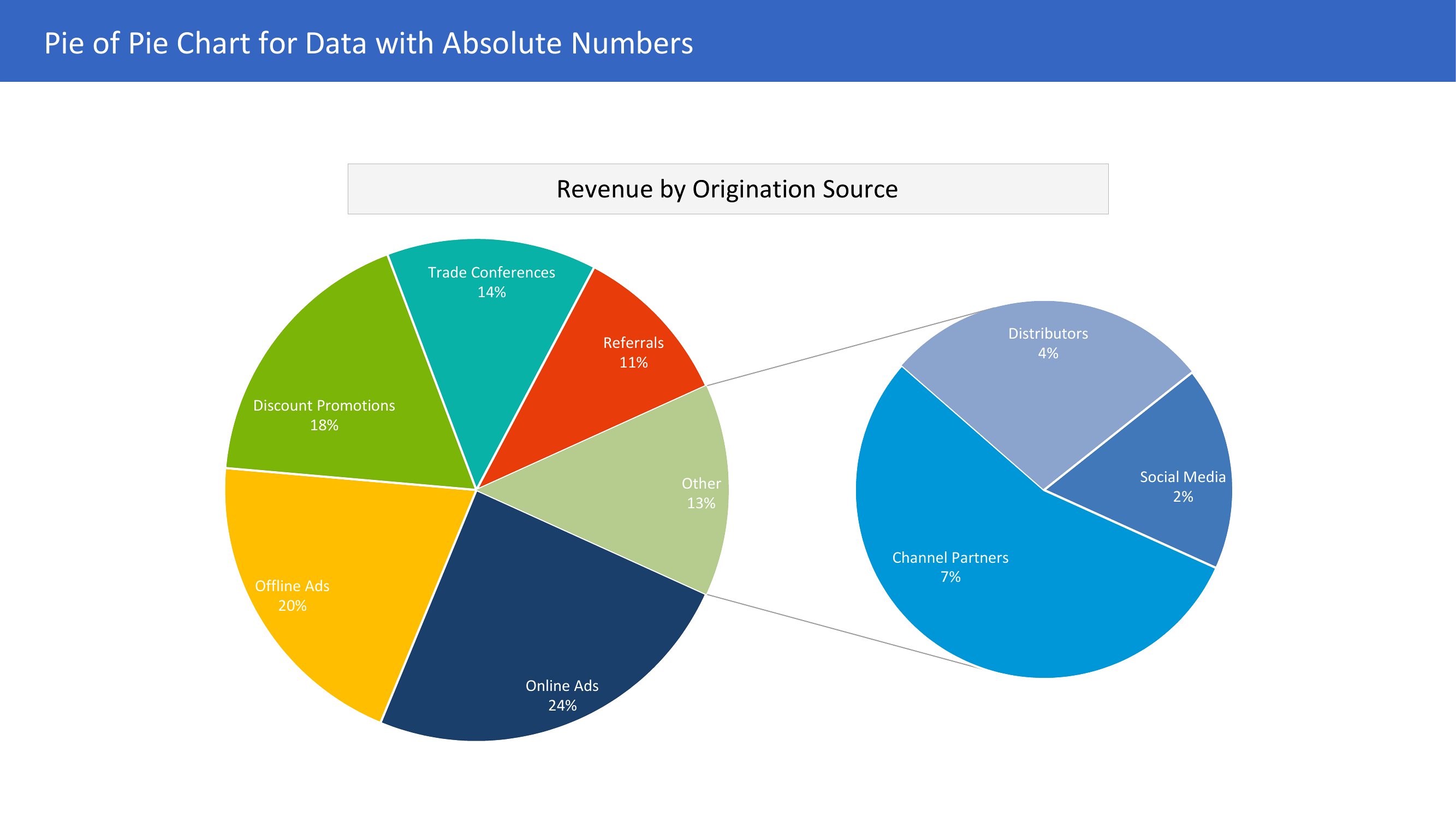
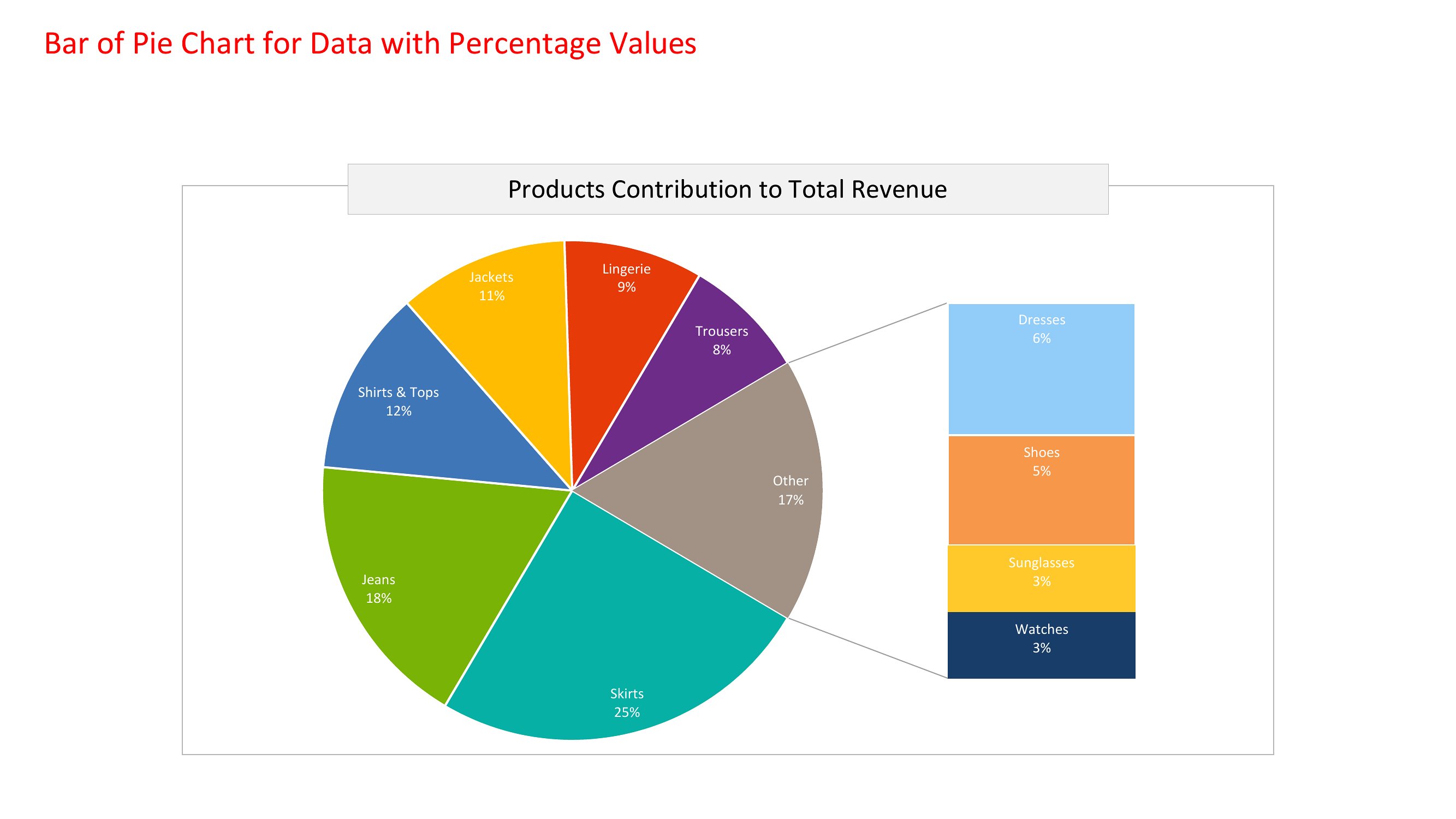
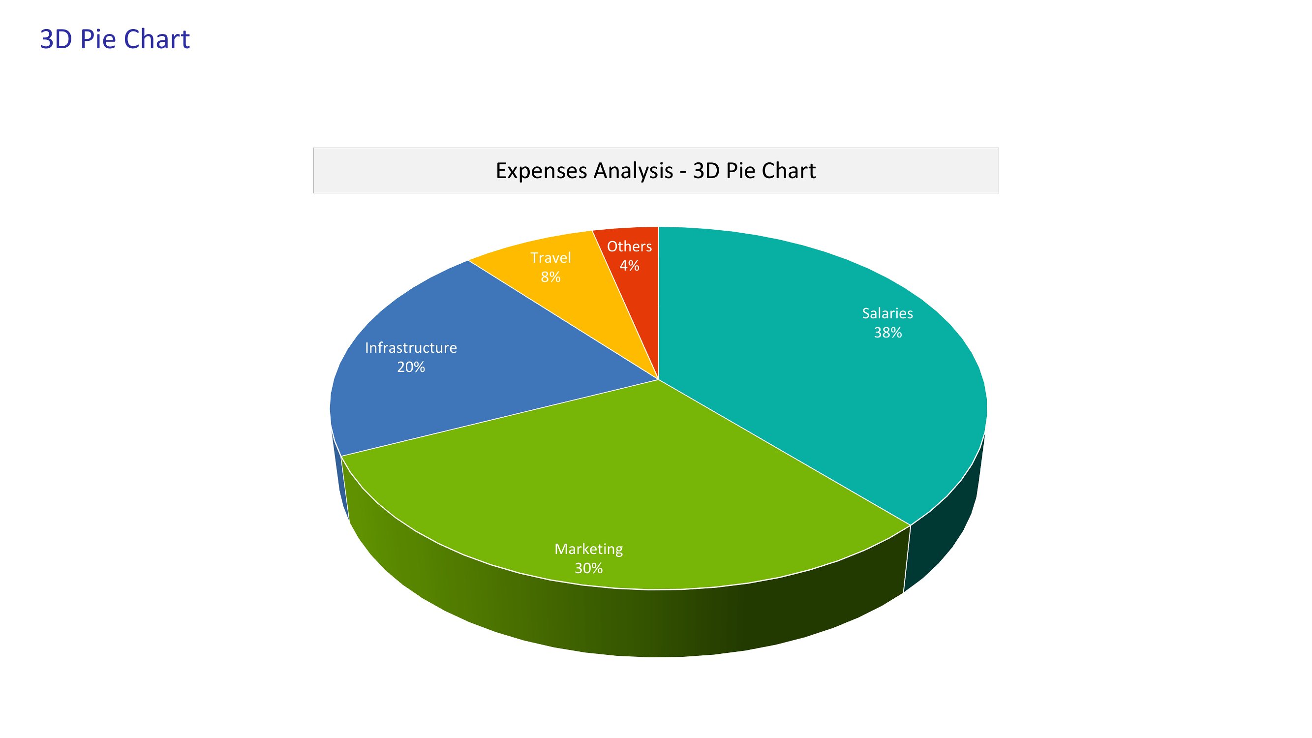
- Small business owners presenting quarterly financial reports to investors or stakeholders benefit from pre-formatted PDF pie charts to highlight revenue allocation or expense breakdowns clearly.
- Nonprofit coordinators organizing donor impact reports can use these templates to visually represent how funds are distributed across programs or regions for grant applications.
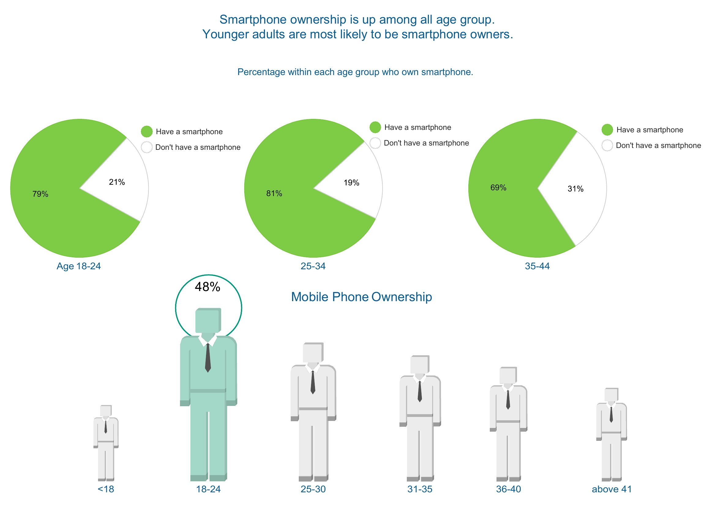
- Marketing analysts reviewing audience demographics for a campaign use segmented pie charts to quickly show client teams the proportion of users by age, location, or engagement level.
Which format should I download?
All templates in this collection come exclusively as PDFs, which makes them ideal for printing, hand-filled annotations, or quick distribution. Use the PDF format when you need a physical hard copy, a simple digital reference without editing software, or when sharing with teams that don’t require editable files. Each template is designed to be print-ready, so you’ll get consistent proportions without distortion—perfect for in-person presentations, classroom handouts, or professional reports.
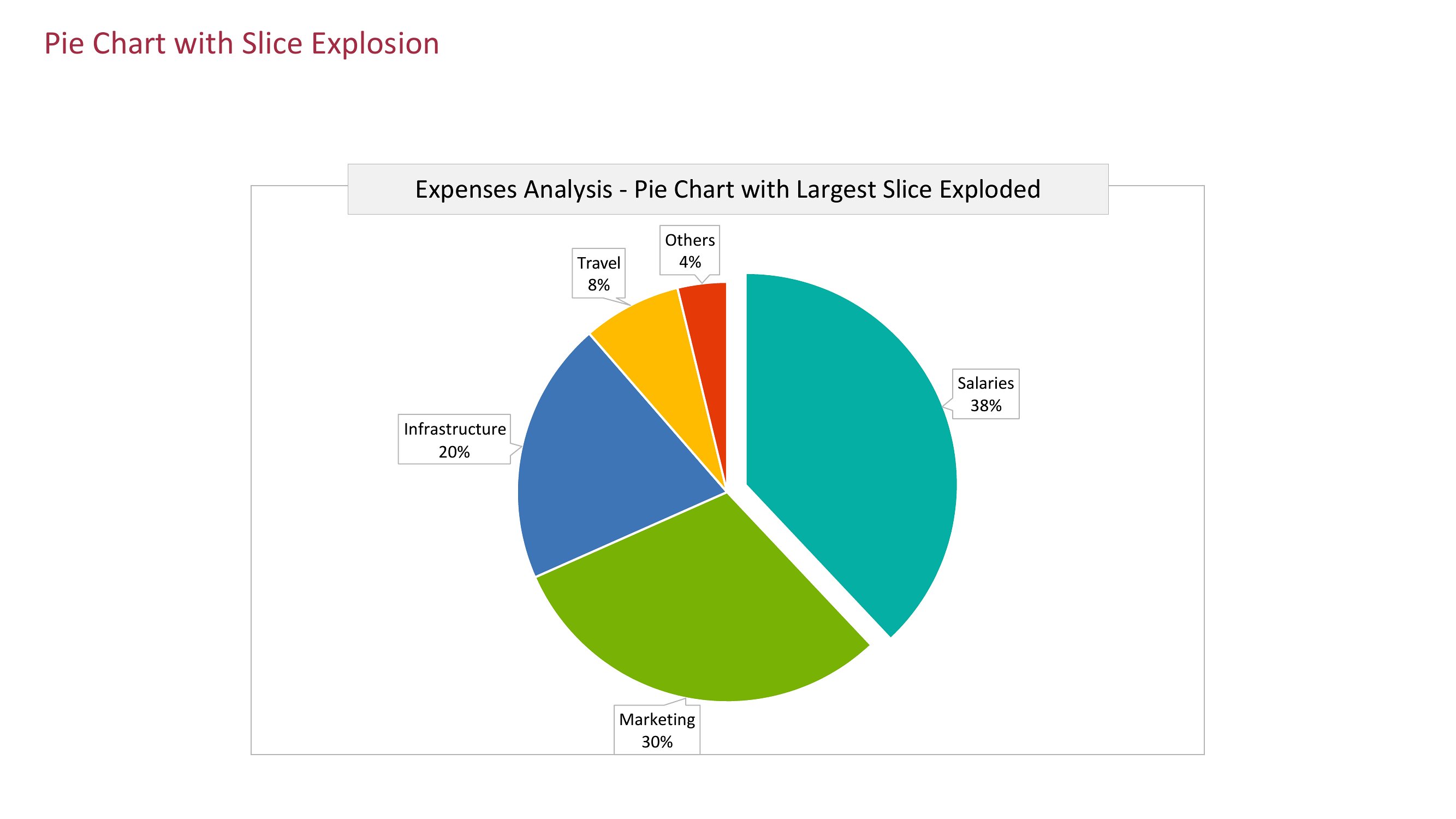
Choose from 54 Pie Chart Templates
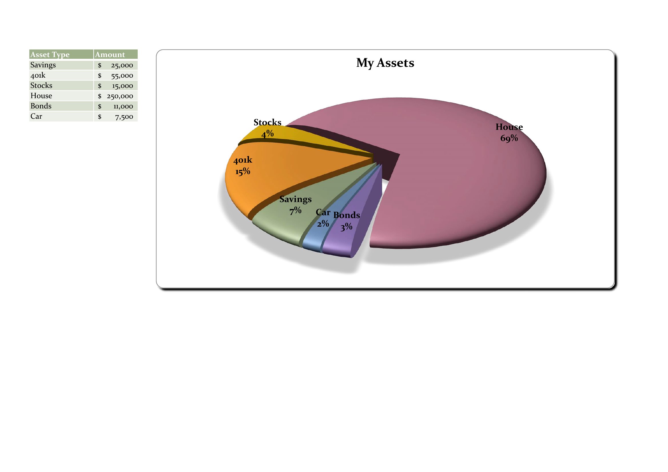
Pie Charts
How to use this Pie Chart template
Can I print these pie chart templates in black and white without losing clarity?
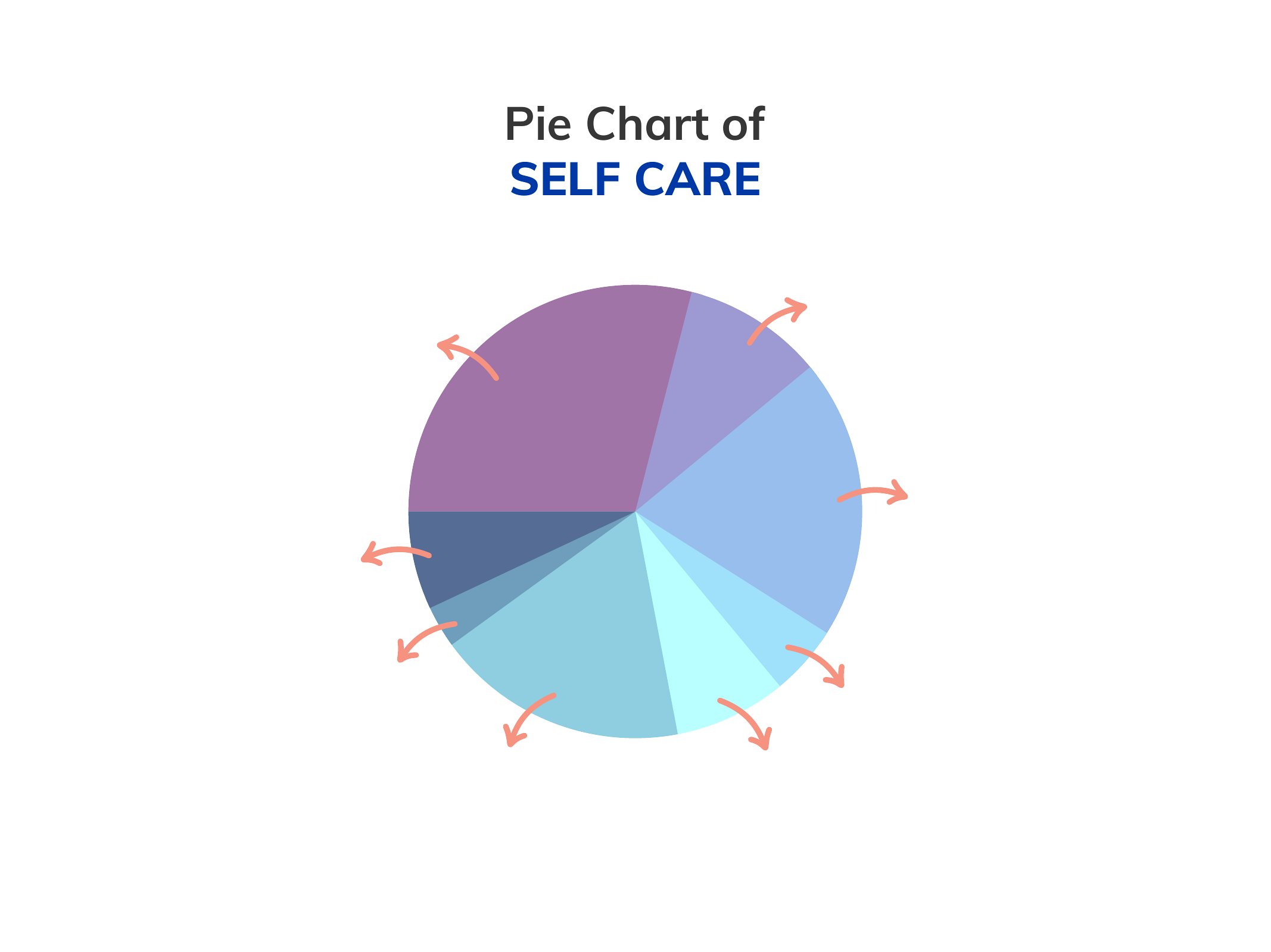
Yes, all templates in this collection are designed to work well in black and white printing. The segmented sections are clearly defined even without color, making them suitable for classroom use, budget reports, or presentations where color printing isn’t available. Avoid overly complex color gradients or shading if you plan to print in grayscale to maintain readability.
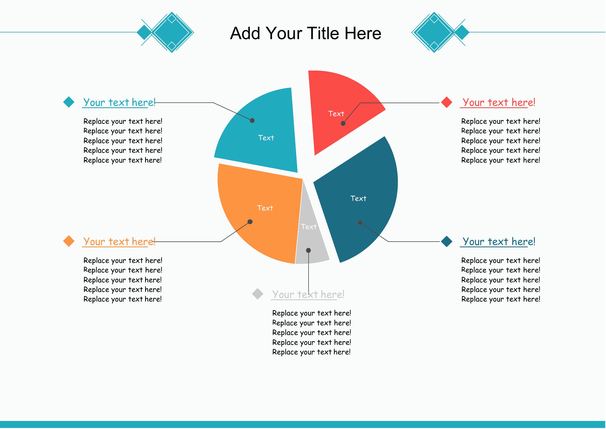
How do I ensure the proportions in my pie chart are accurate when filling in percentages by hand?
Most templates in this set include pre-labeled degree measurements or percentage guides around the circle’s edge. Use a protractor or print a ruler for reference if filling in manually. For greater precision, opt for a template with pre-divided segments or use a digital tool to recreate the chart later. Double-check that the slices add up to 360 degrees or 100% to maintain accuracy.
Are these templates suitable for comparing multiple datasets side by side, like quarterly sales trends?
While these templates are designed for single pie charts, you can create side-by-side comparisons by printing multiple charts on one page or arranging them in a grid layout. For dynamic comparisons, consider exporting the data to Excel or PowerPoint afterward to generate grouped charts. These PDFs are best for static, one-off visualizations rather than interactive or layered data analysis.
Comments
Join the conversation
Sign in to share your thoughts and leave a comment on this resource.