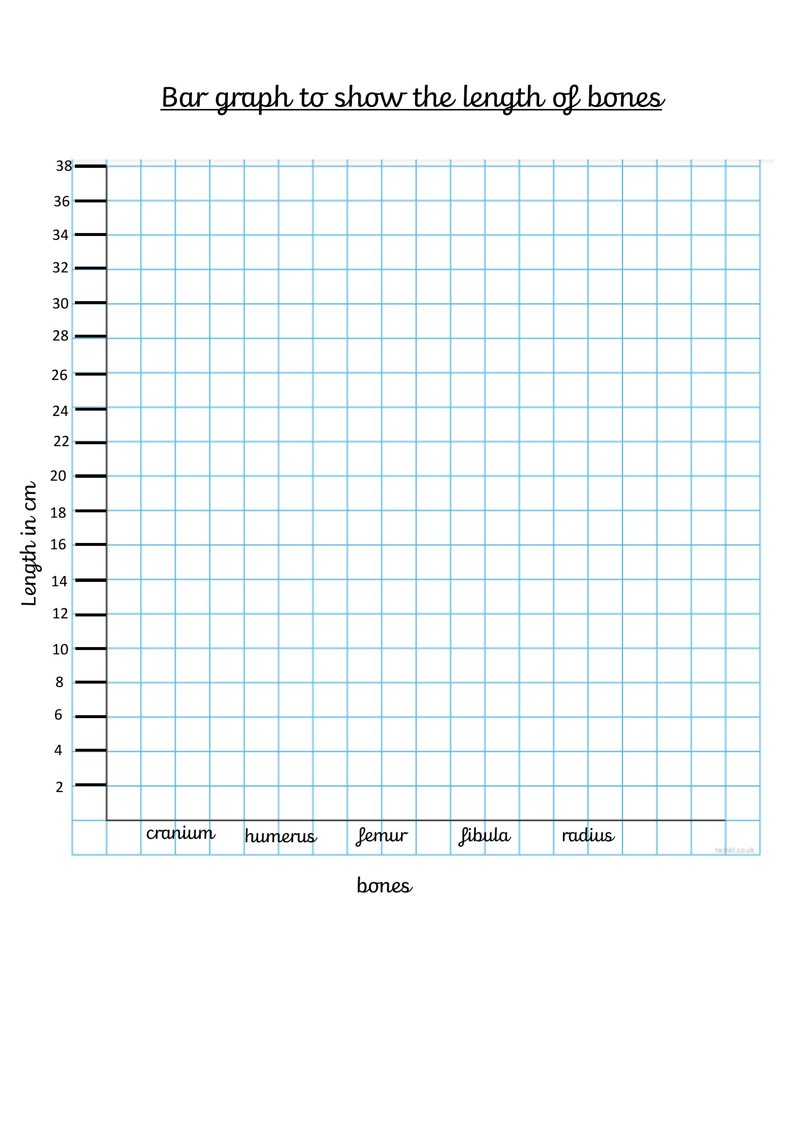
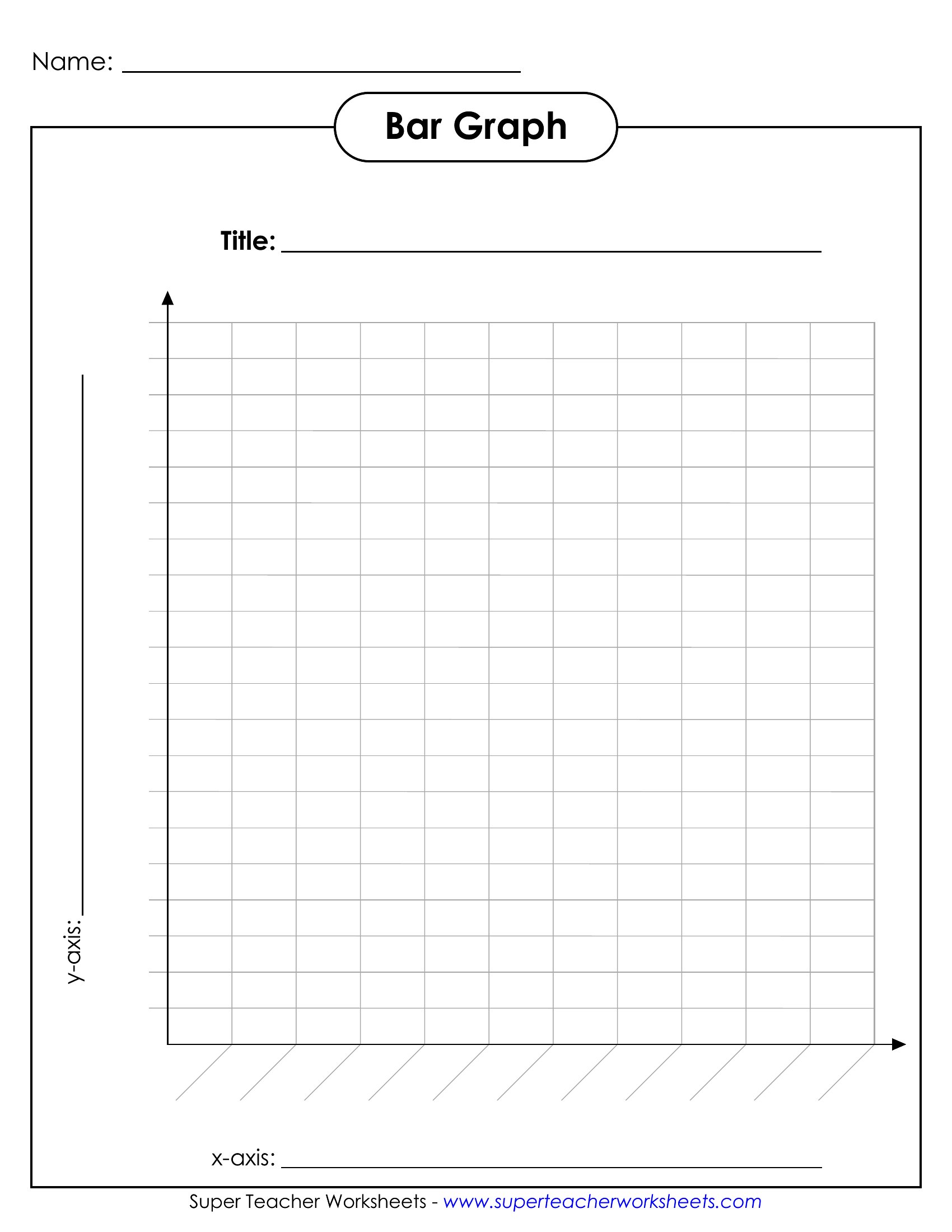
Free Bar Graph Templates (Word, Excel, PDF)
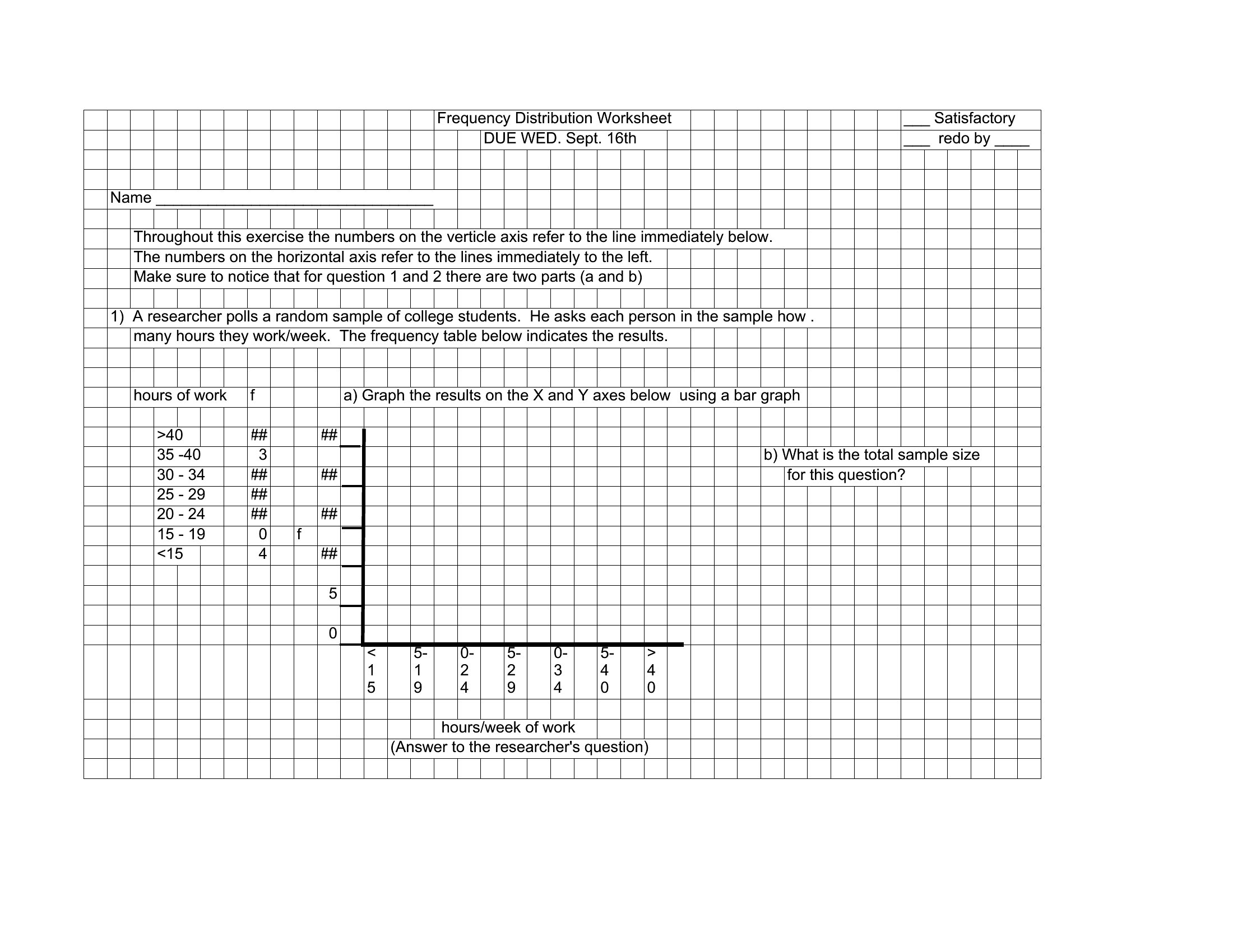
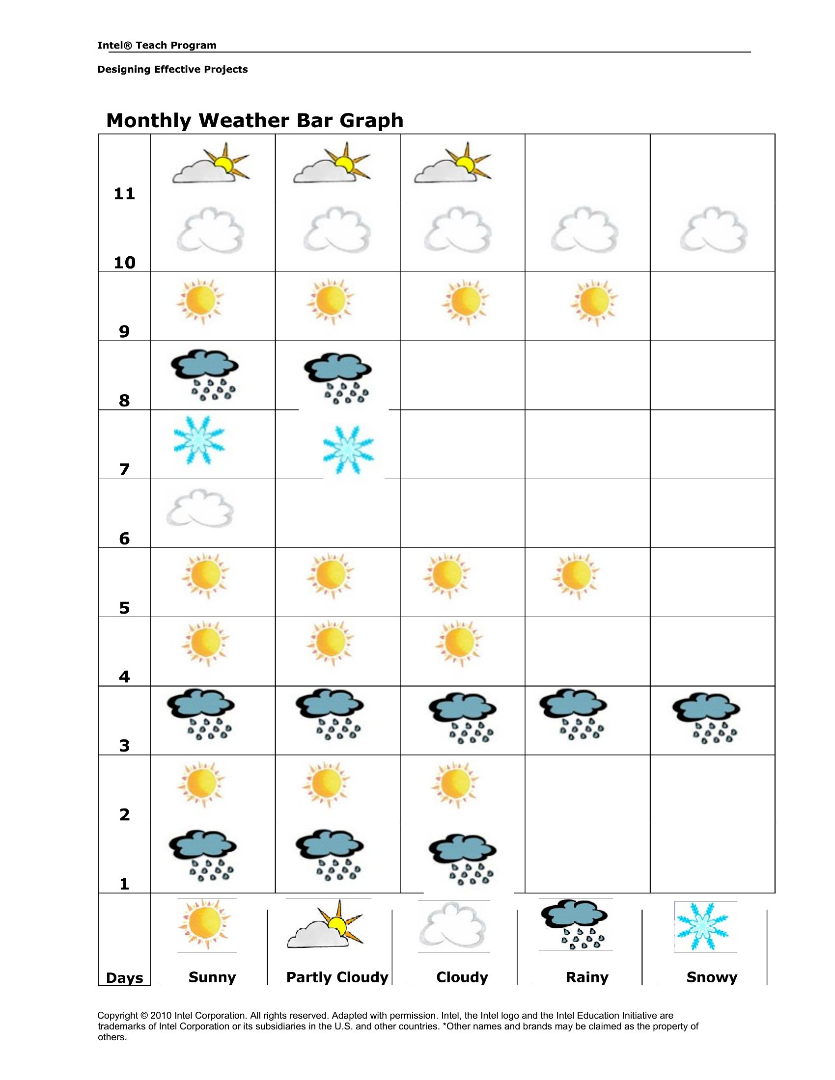
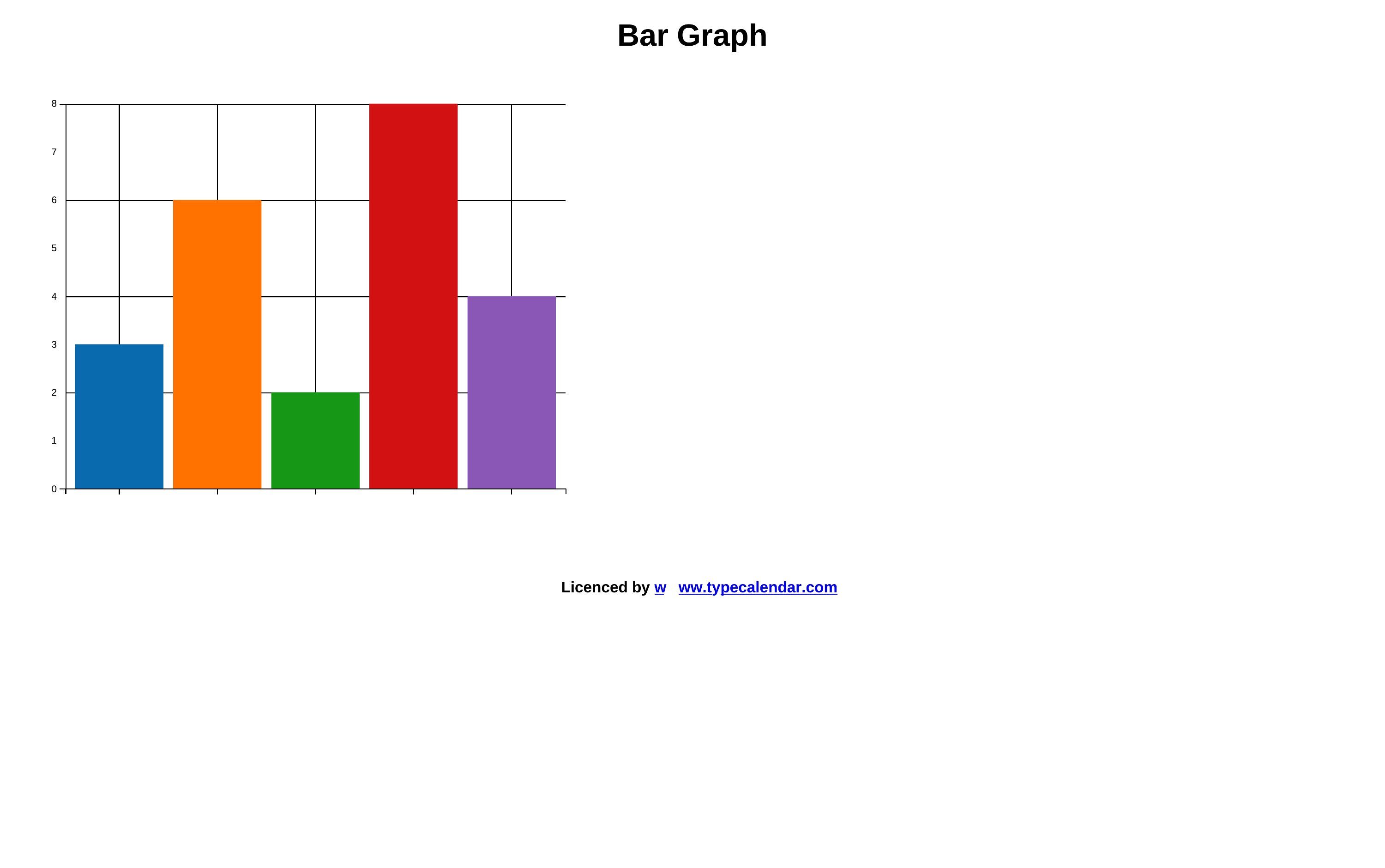
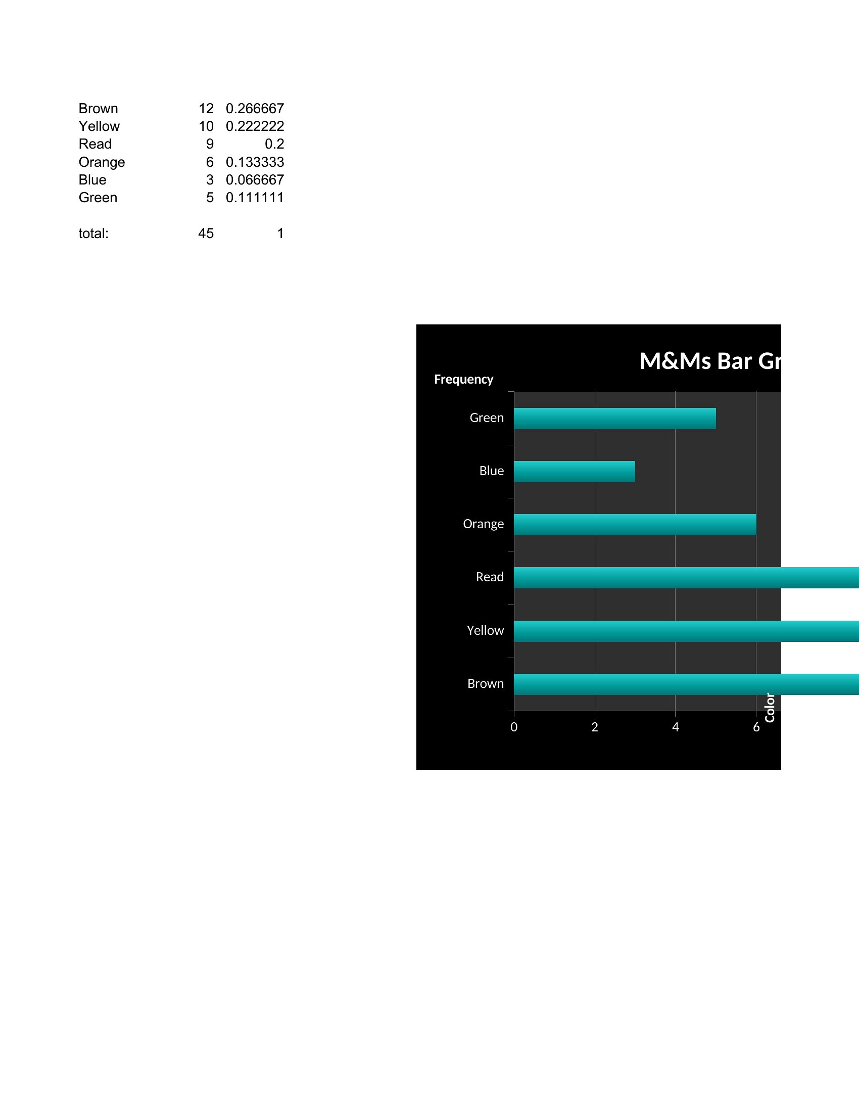
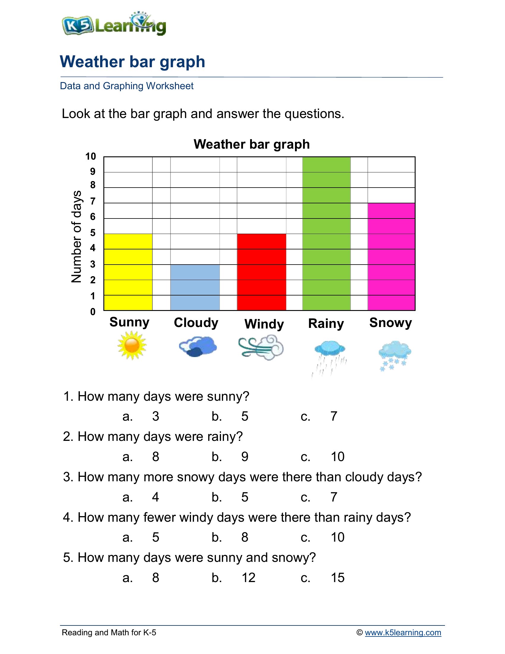
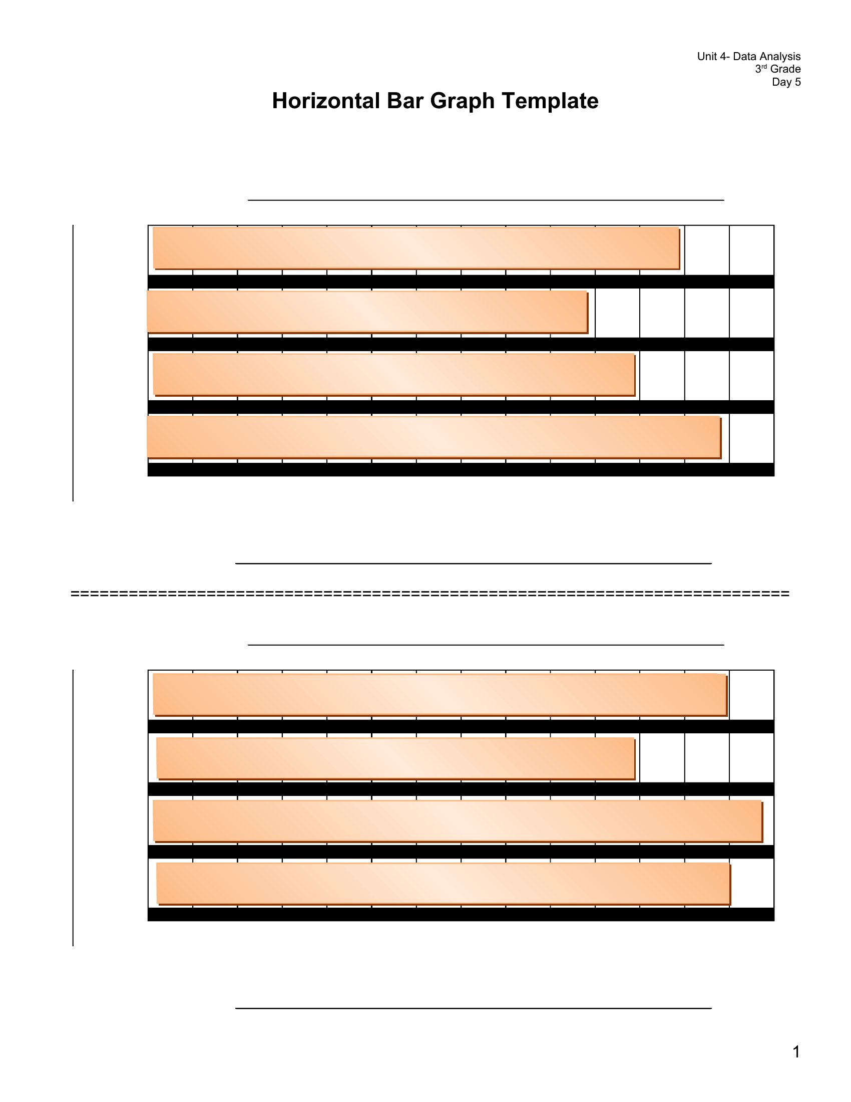
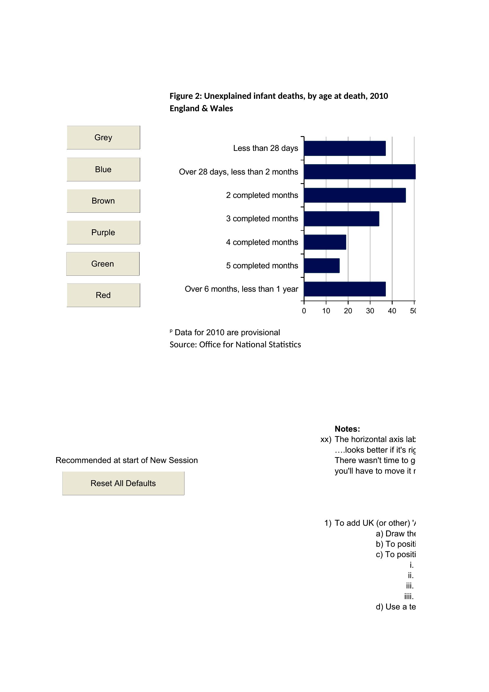
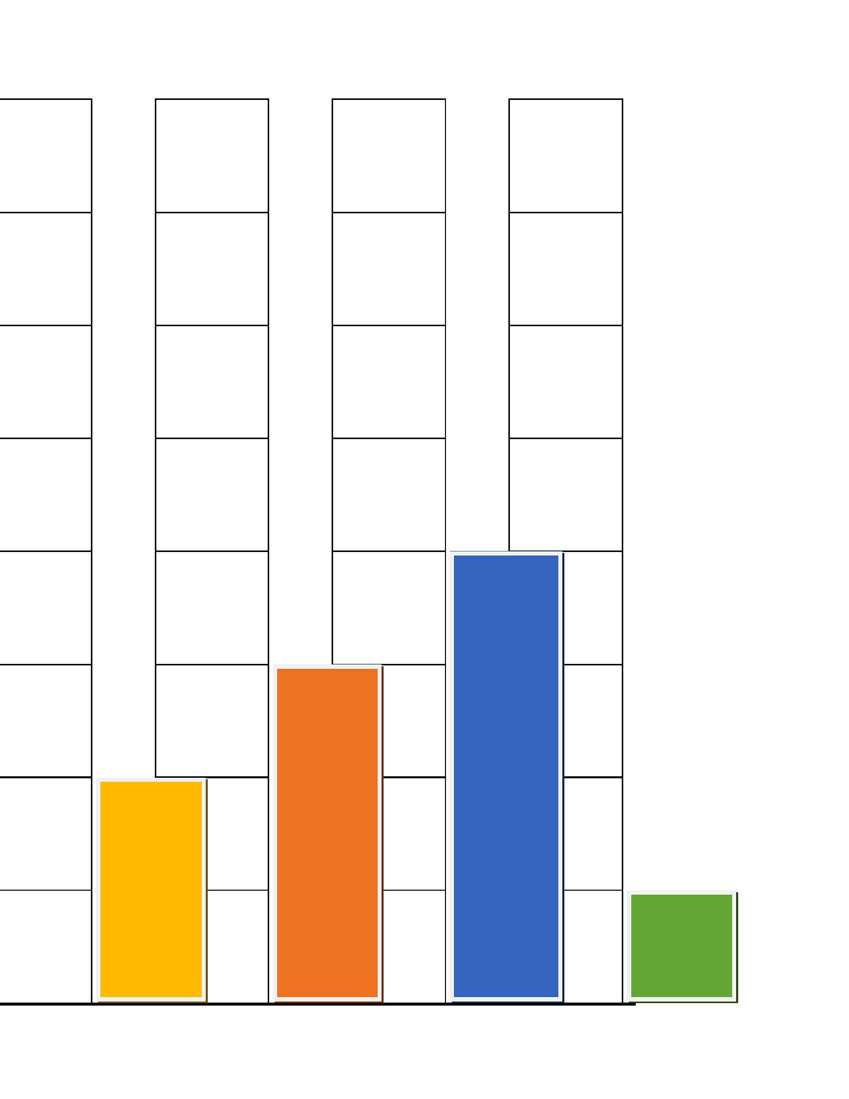
DataBar graphs make numbers easy to compare at a glance, which is why they show up everywhere from classrooms to boardrooms. This collection of 42 templates gives students, teachers, and professionals ready-made charts and worksheets for plotting data without building axes from scratch.
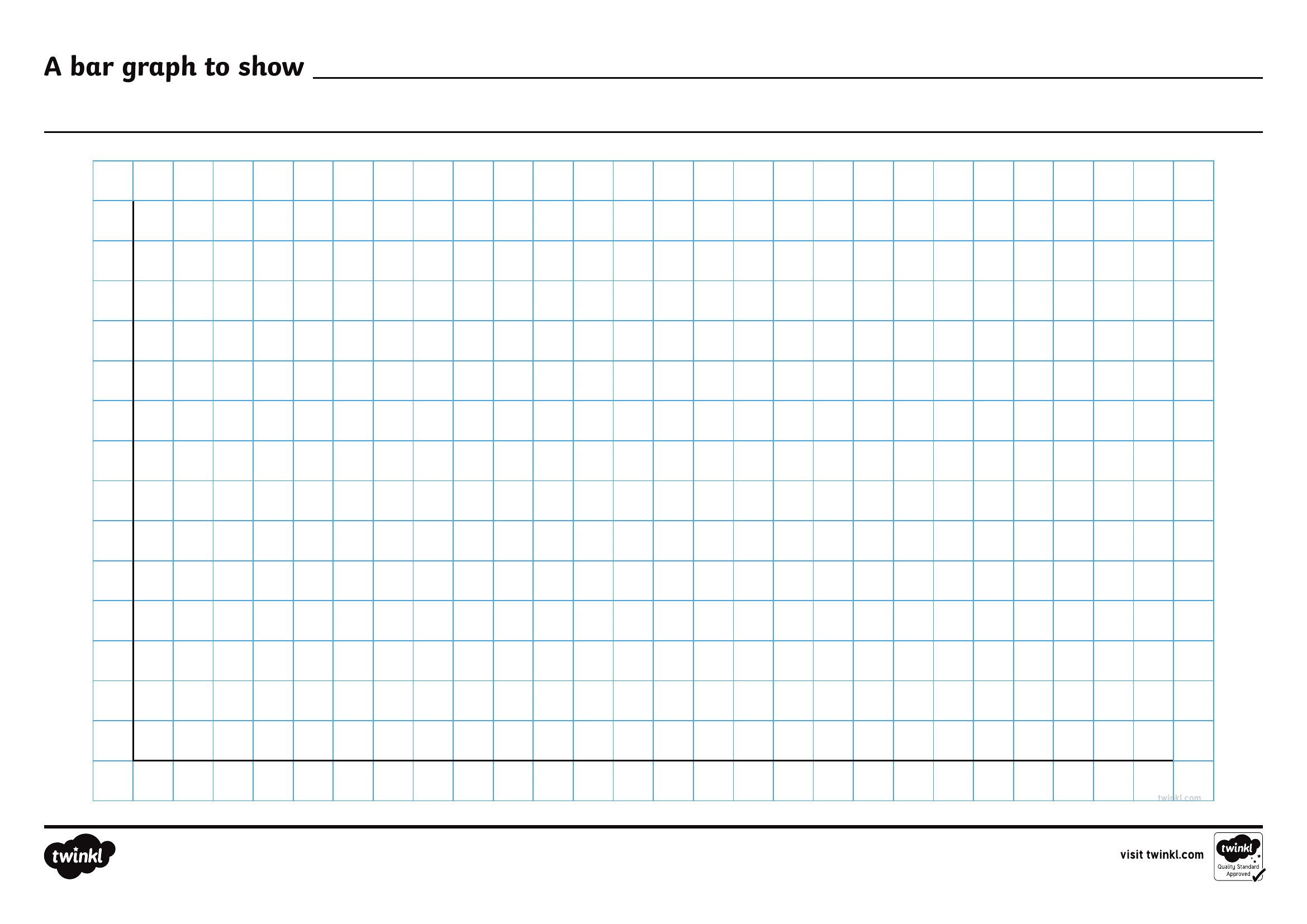
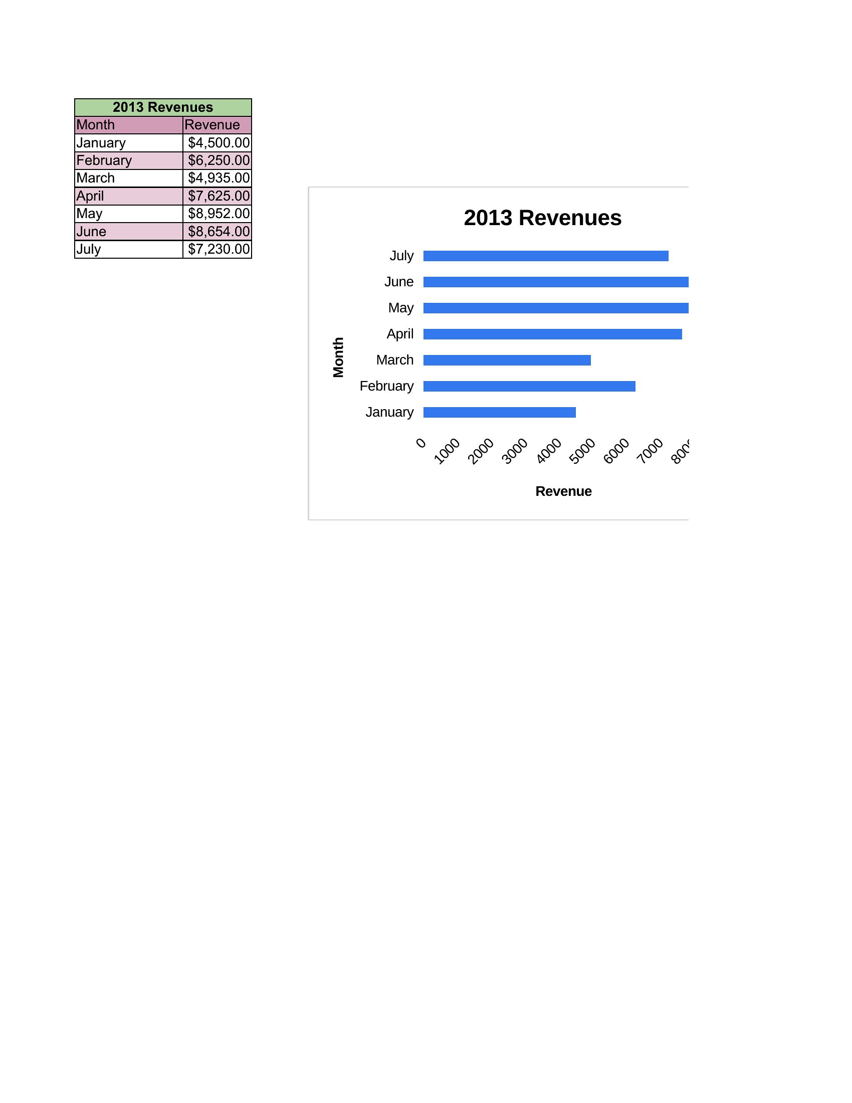
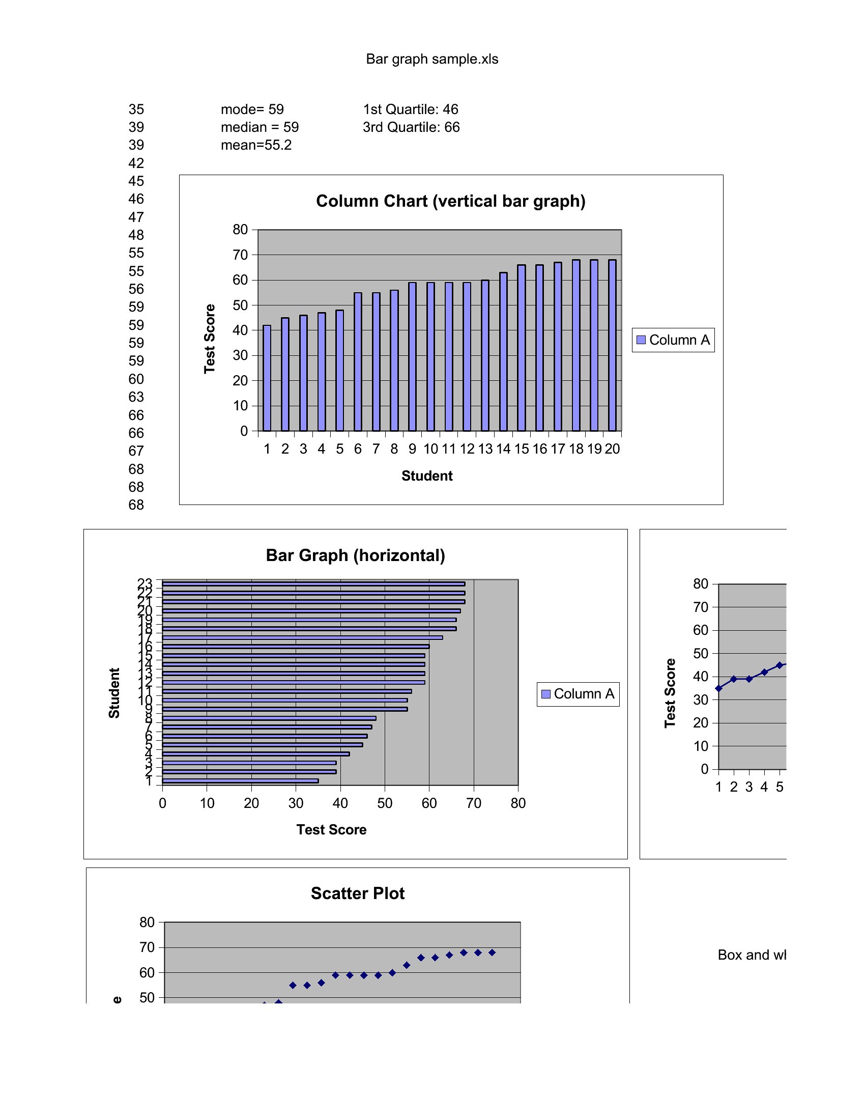
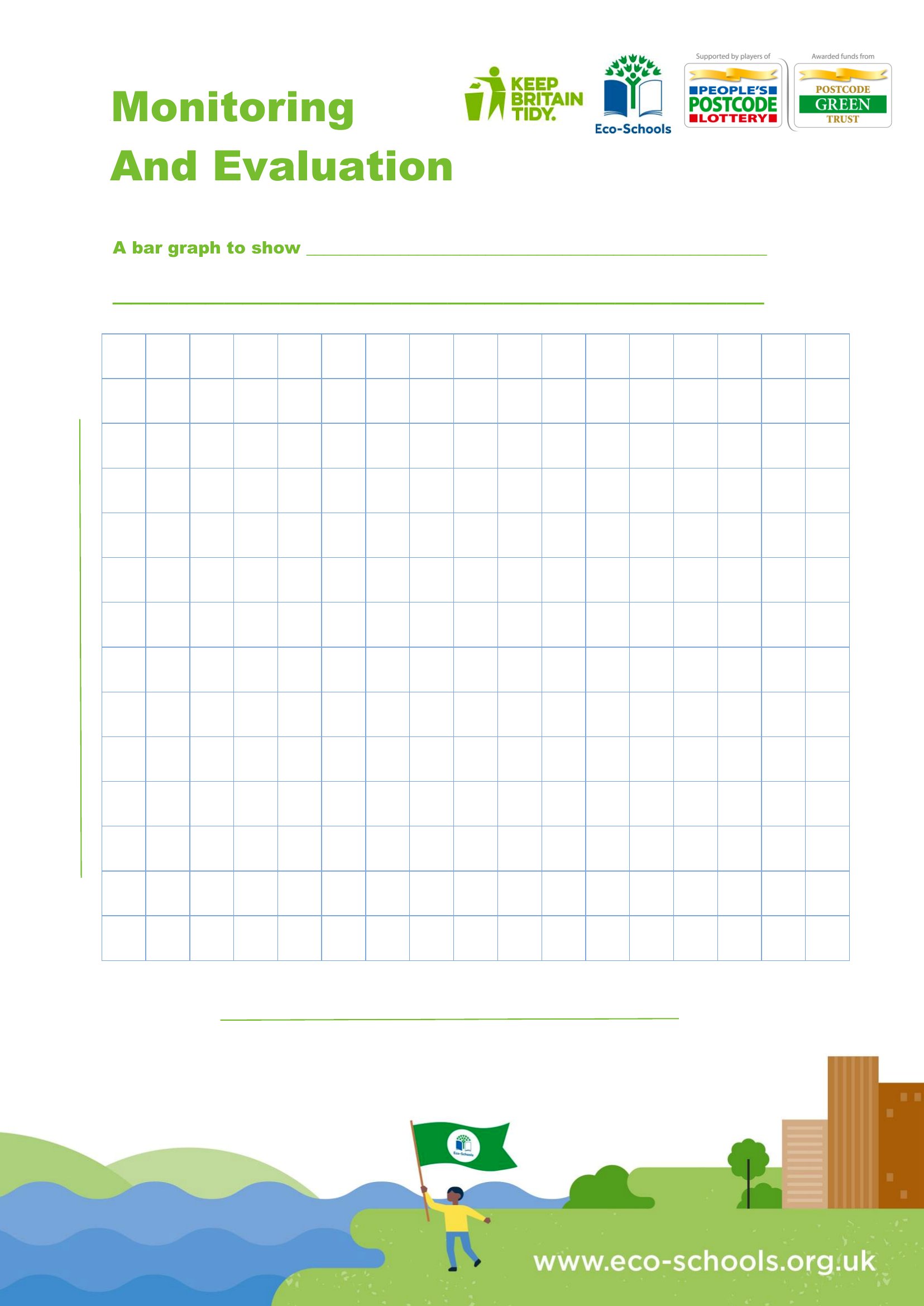
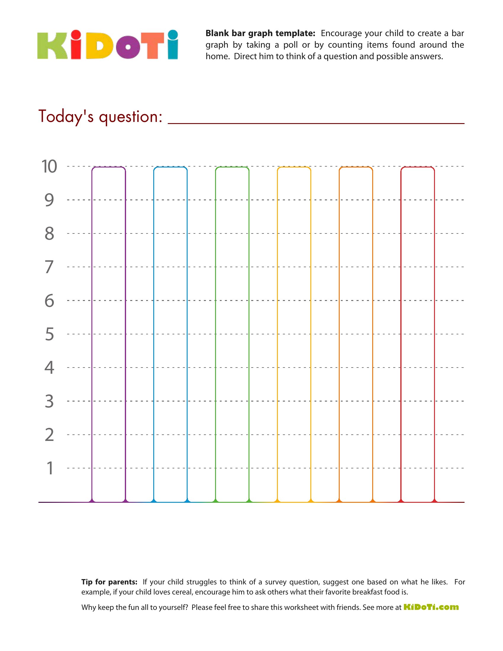
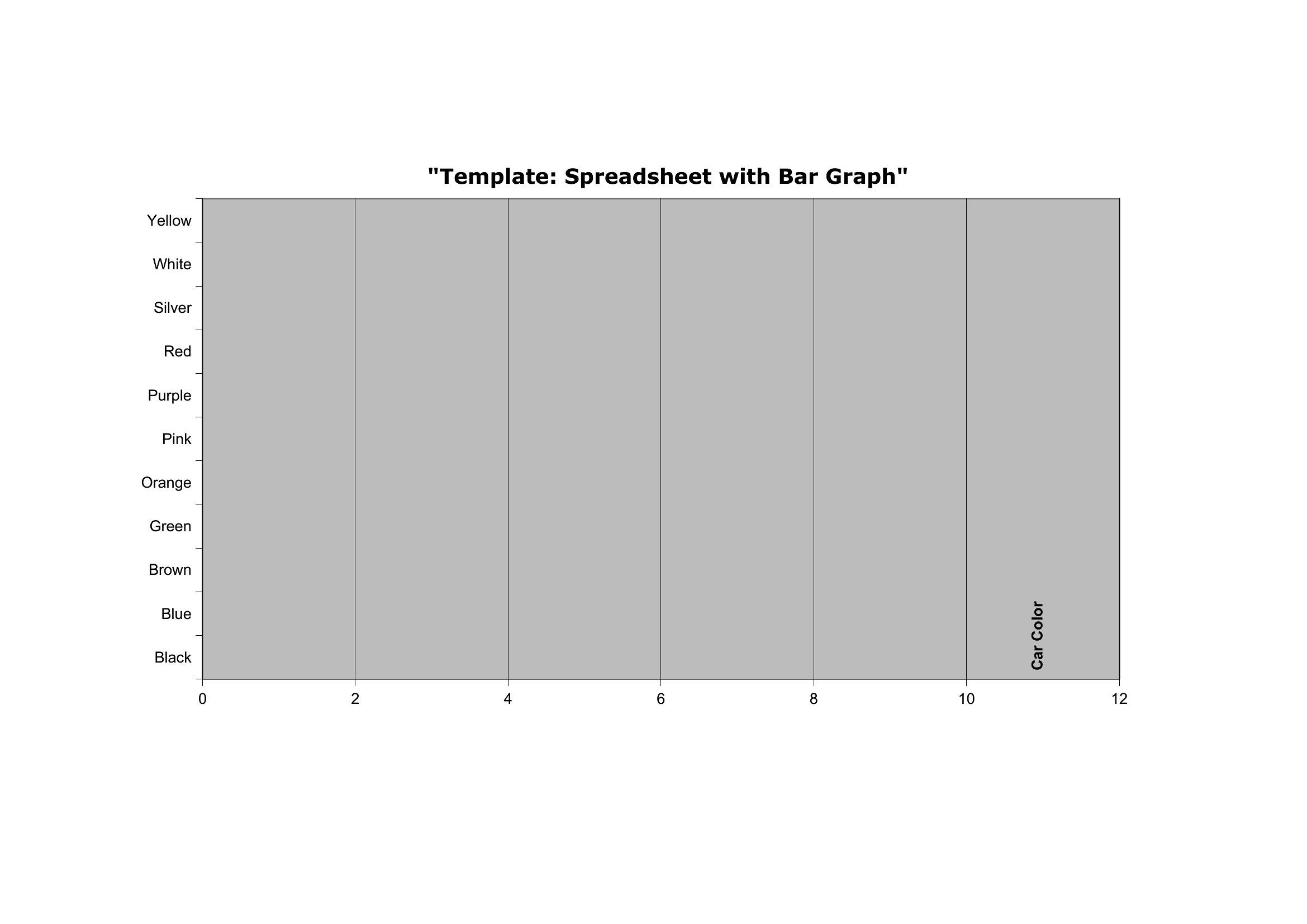
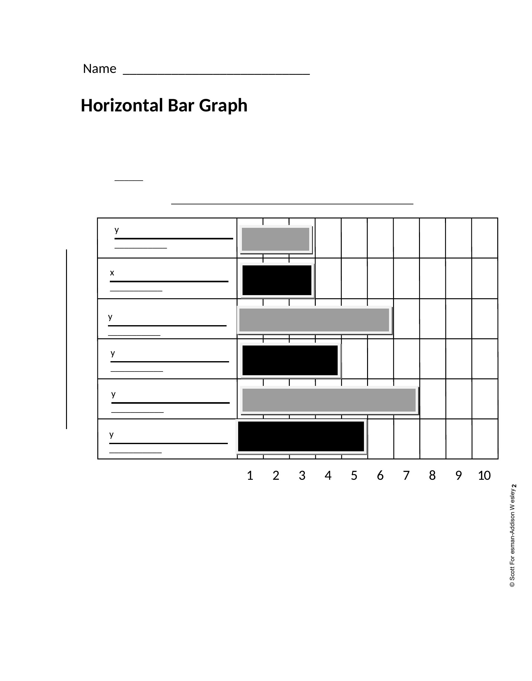
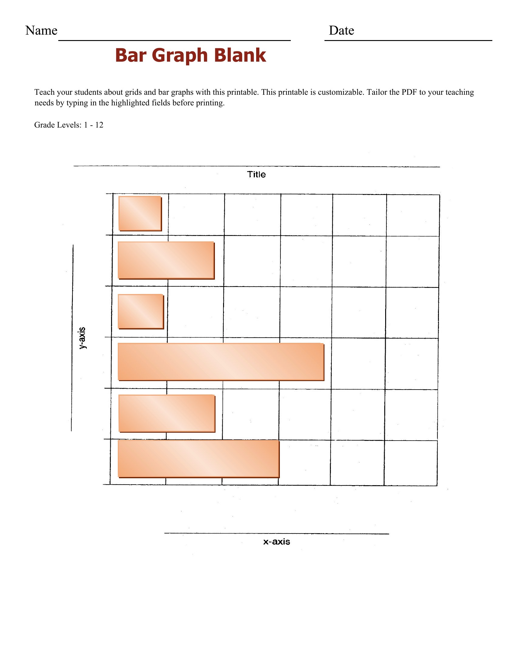
The Excel versions update the bars automatically as you enter values, the Word files drop neatly into reports, and the PDFs print as blank grids for hand-drawn practice. Add your categories and figures, and the graph takes shape. It's free and works for a math lesson, a science fair, or a quarterly review. Choose the format that fits your task and turn your data into a clear, readable chart.
When to use this Bar Graph template
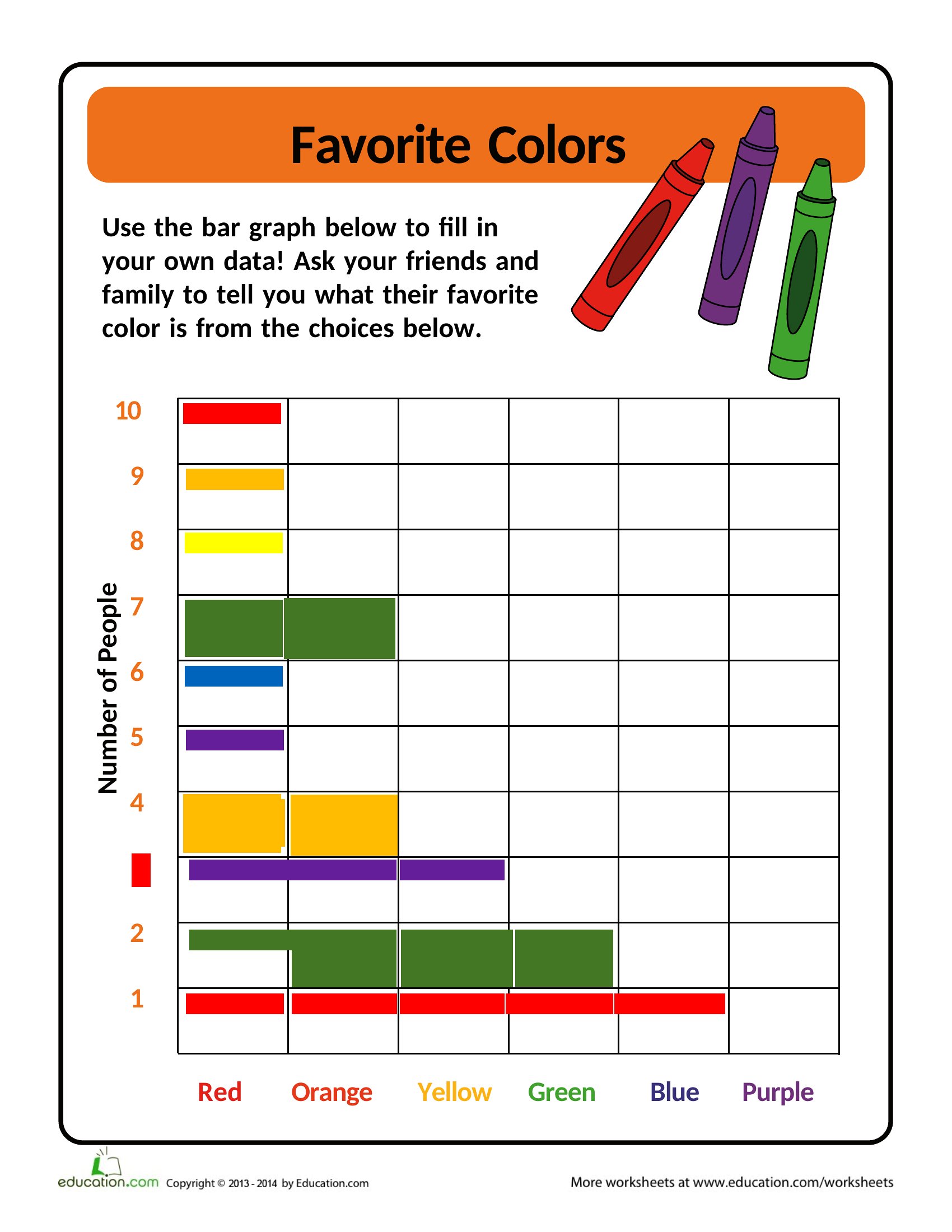
- Middle school teachers assigning a math project where students need to visualize survey results like favorite pizza toppings or weekend activities—no advanced software required.
- Small business owners comparing quarterly sales data across three locations to spot trends during quarterly strategy meetings without hiring a designer.
- College research assistants compiling survey data from 50 participants and needing a polished, print-ready chart for a presentation on student stress levels.
- Healthcare coordinators tracking patient recovery metrics over time, such as rehab progress or medication adherence, for easy comparison in team reviews.
Which format should I download?
Use Excel if you’ll be updating data frequently—its dynamic bars adjust automatically when you modify numbers, ideal for ongoing tracking like sales or experiments. Choose Word when embedding the bar graph into a report for stakeholders who need context alongside visuals, like project summaries or academic papers. Opt for PDF if you’re distributing a finalized chart (e.g., to clients or students) where formatting must remain unchanged and printing is required—no editing tools needed.
Choose from 42 Bar Graph Templates
A Bar Graph
How to use this Bar Graph template
Can I customize the colors or labels on these bar graphs after downloading?
Yes, all formats support basic customization. In Excel and Word, you can edit colors, axis labels, and titles directly. PDF versions are static but can be annotated or printed for reference, though deep edits require converting back to a compatible format first. For precise branding, use the Excel or Word templates before finalizing.
What’s the best template if I need to explain the data in a presentation alongside the graph?
The Word templates integrate seamlessly into presentations or reports. You can insert the graph directly into a slide or document, then add annotations or bullet points nearby to clarify trends. For live presentations, save the Word file as a PDF first to ensure consistency across devices.
Are these templates suitable for comparing more than three categories or data sets?
Most templates in this collection support up to 10–12 categories comfortably, with space for labels and clear differentiation. For larger datasets (e.g., 20+ categories), stick to Excel’s dynamic graphs—they scale better and let you adjust grouping or colors to avoid clutter. Prefer simpler designs for presentations to maintain readability.
Comments
Join the conversation
Sign in to share your thoughts and leave a comment on this resource.