Free Printable Pie Chart Templates (PDF)
Data by dijanastevanovic
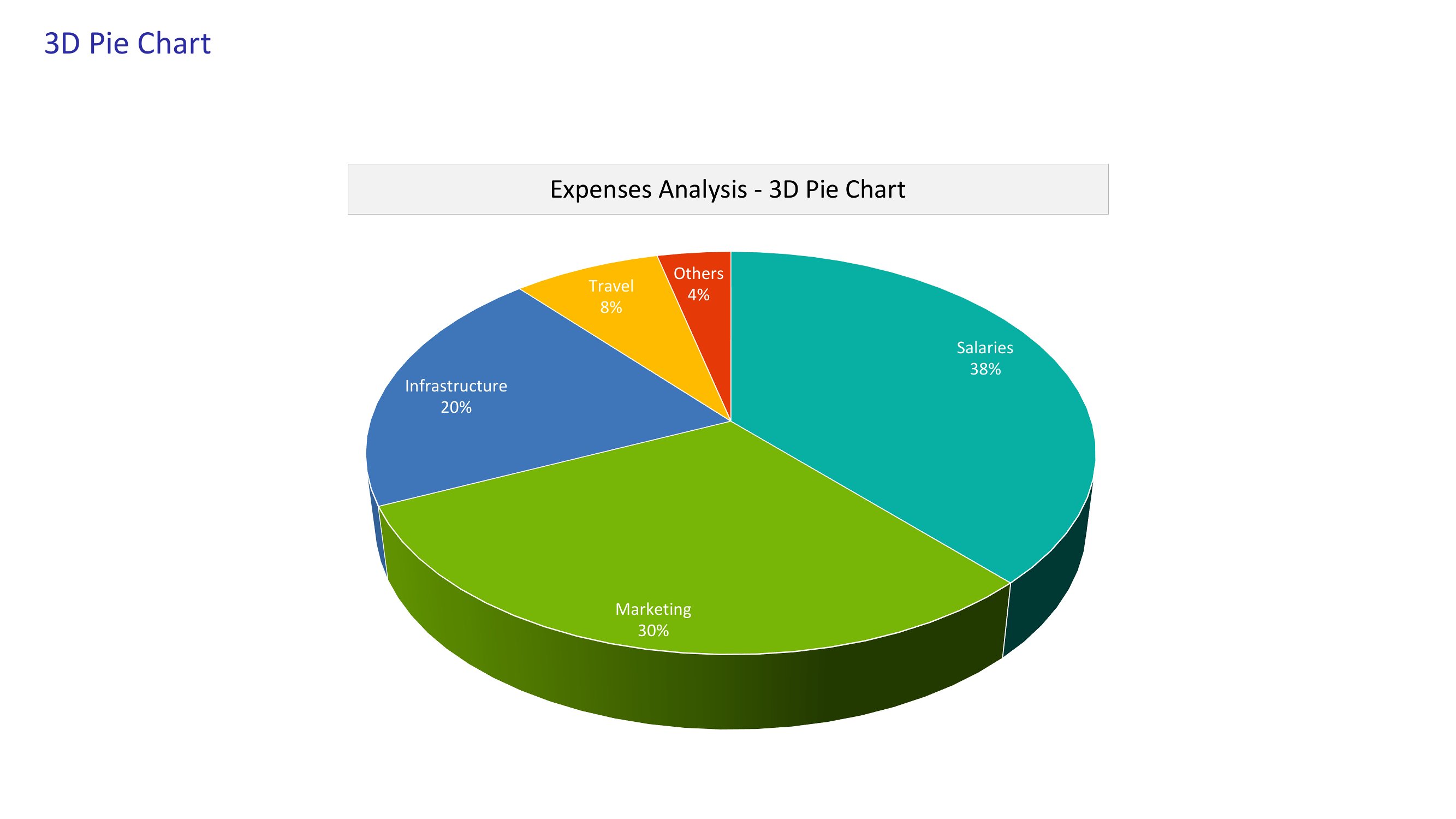
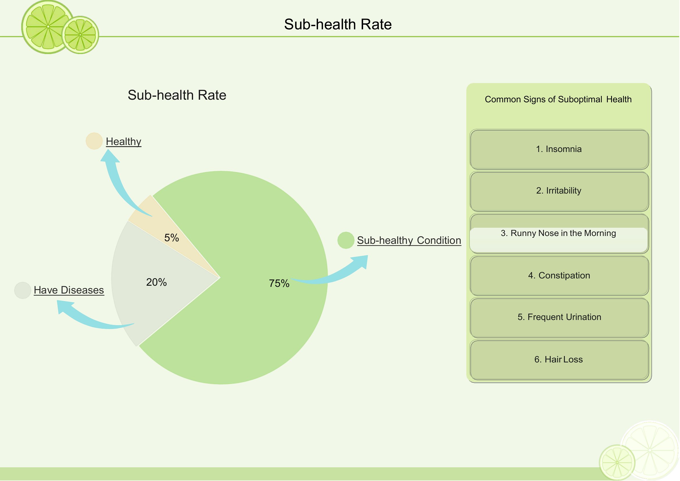
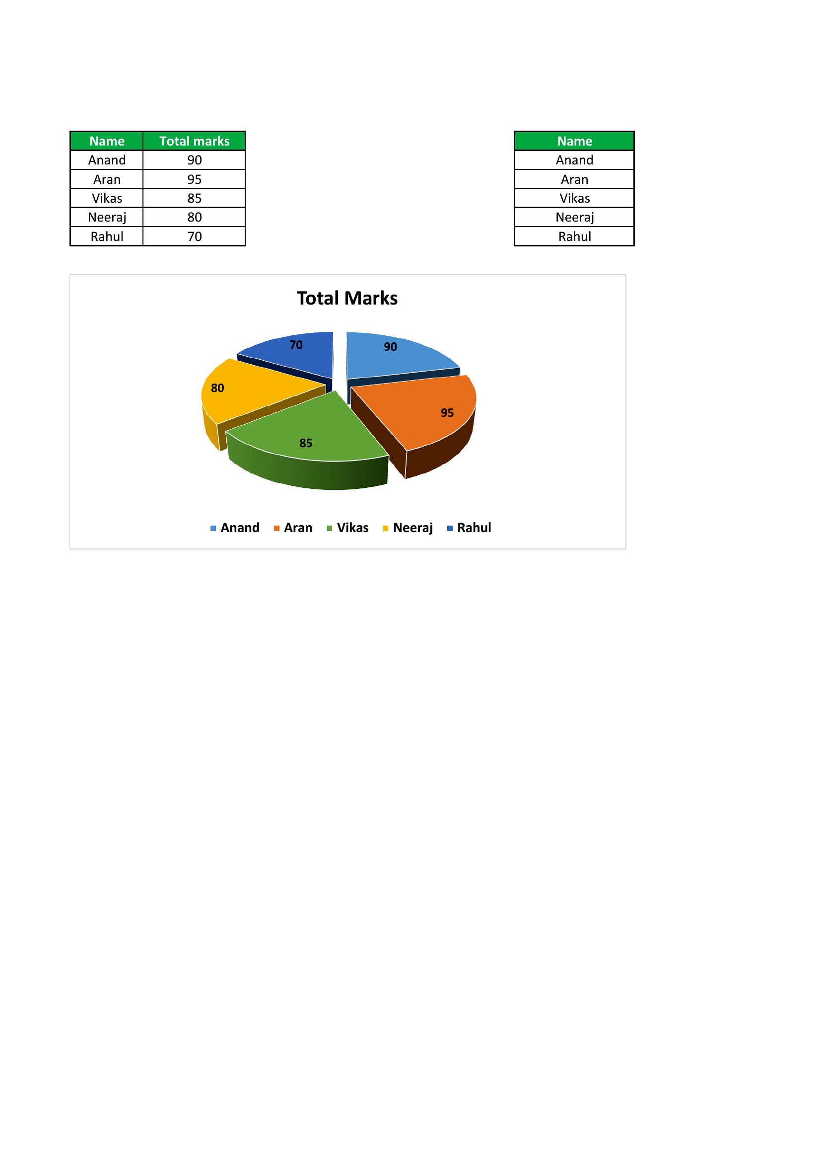
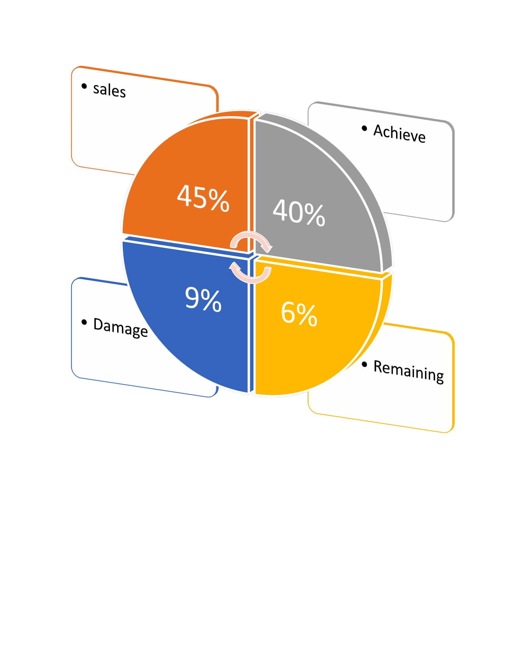
Turning numbers into a picture helps an audience grasp proportions at a glance, and a pie chart is one of the clearest ways to do it. These 54 printable templates give teachers, students, and presenters blank and segmented charts for budgets, survey results, or classroom lessons.
The collection comes as print-ready PDFs, so you can print blank circles to fill by hand or use pre-divided versions for quick visuals. Print as many as a lesson or meeting needs, with nothing to install. Pick the chart that fits your data, print it, and make your numbers easy to read.
Choose from 54 Pie Chart Templates
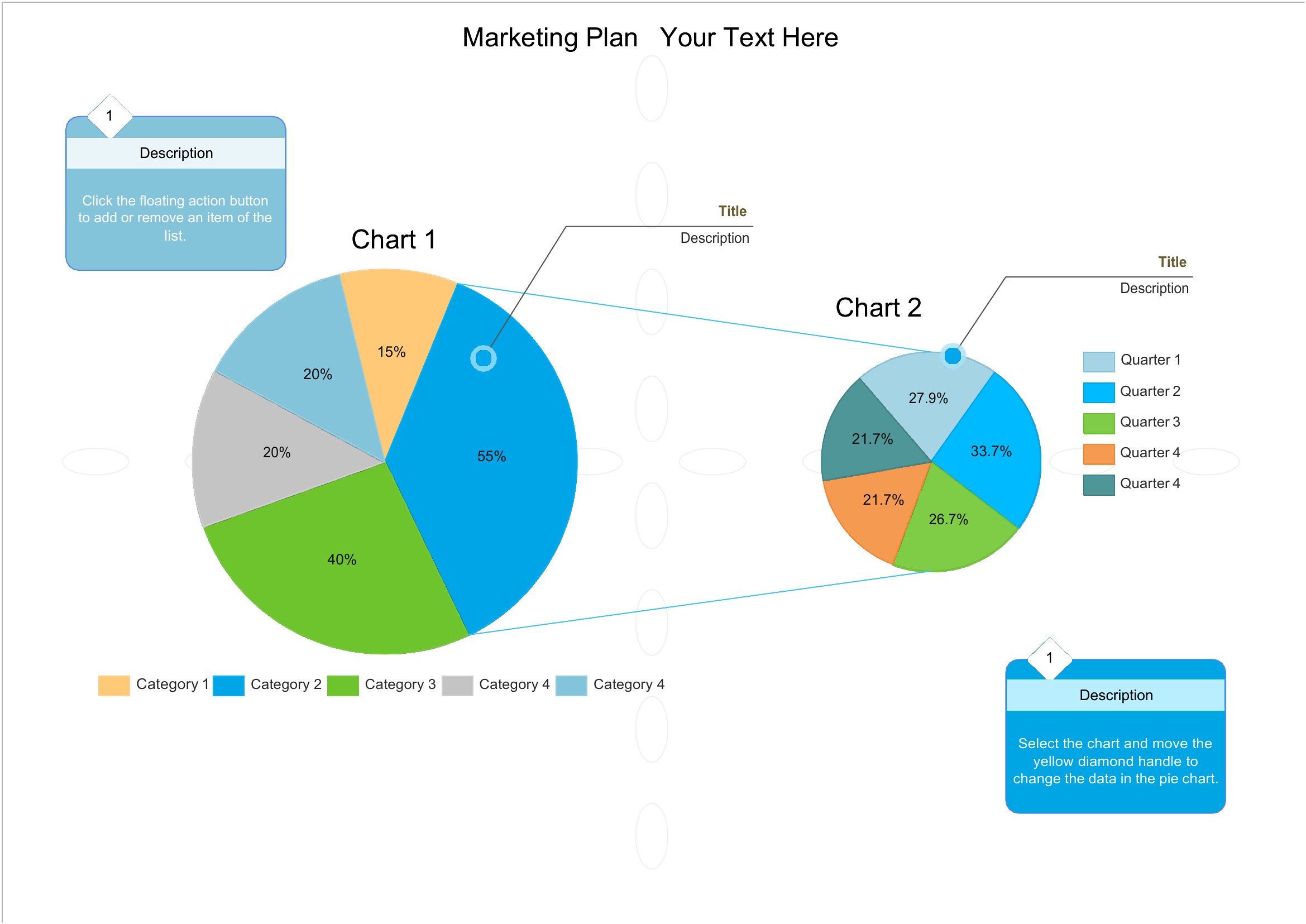
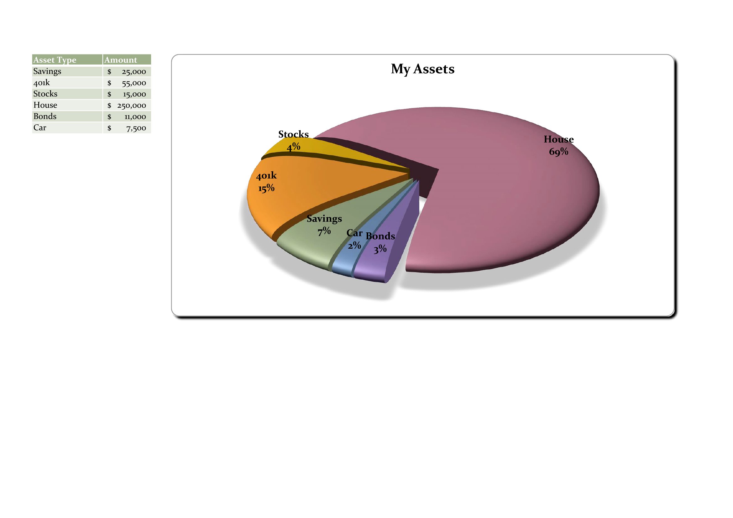
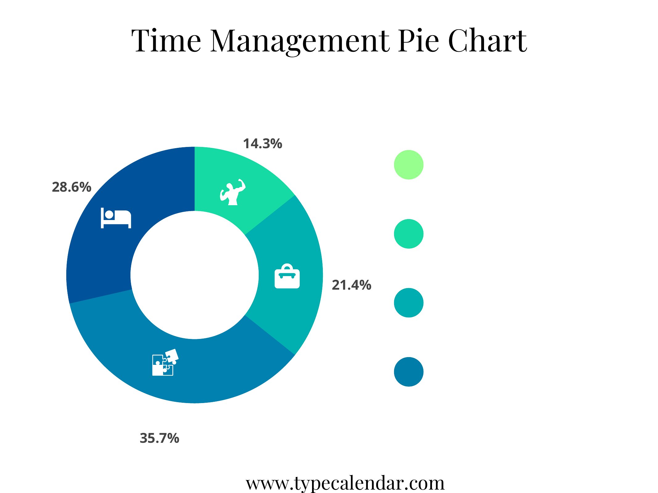
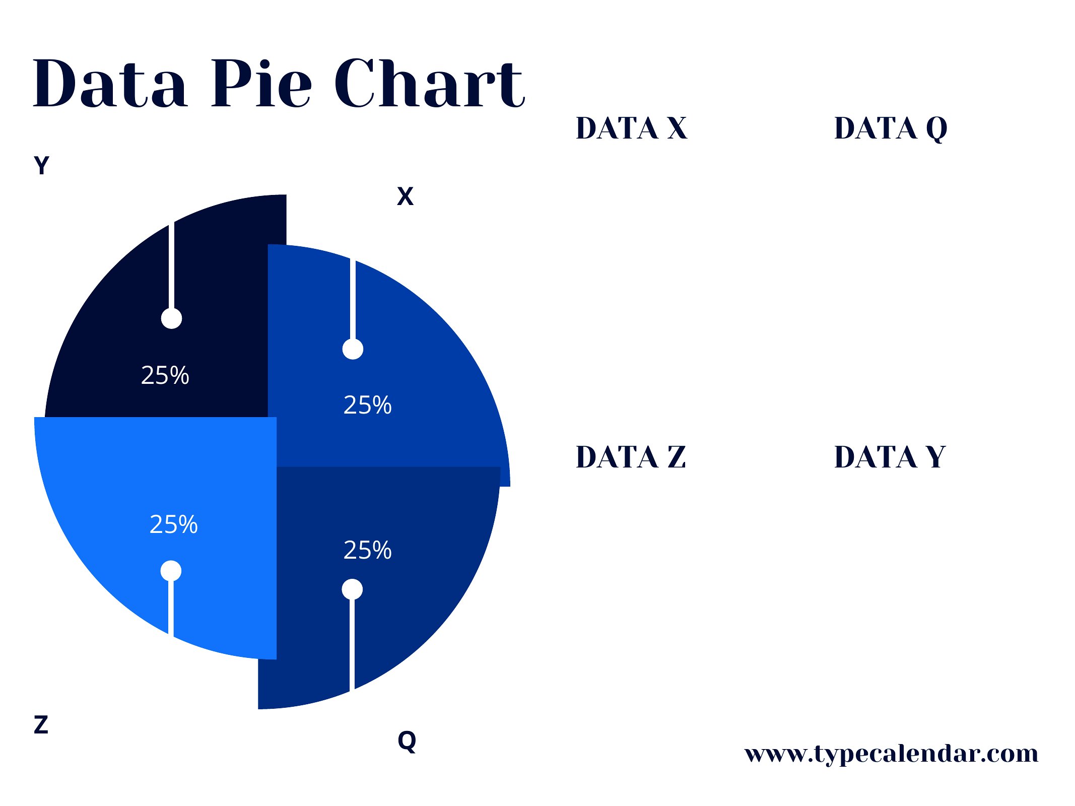
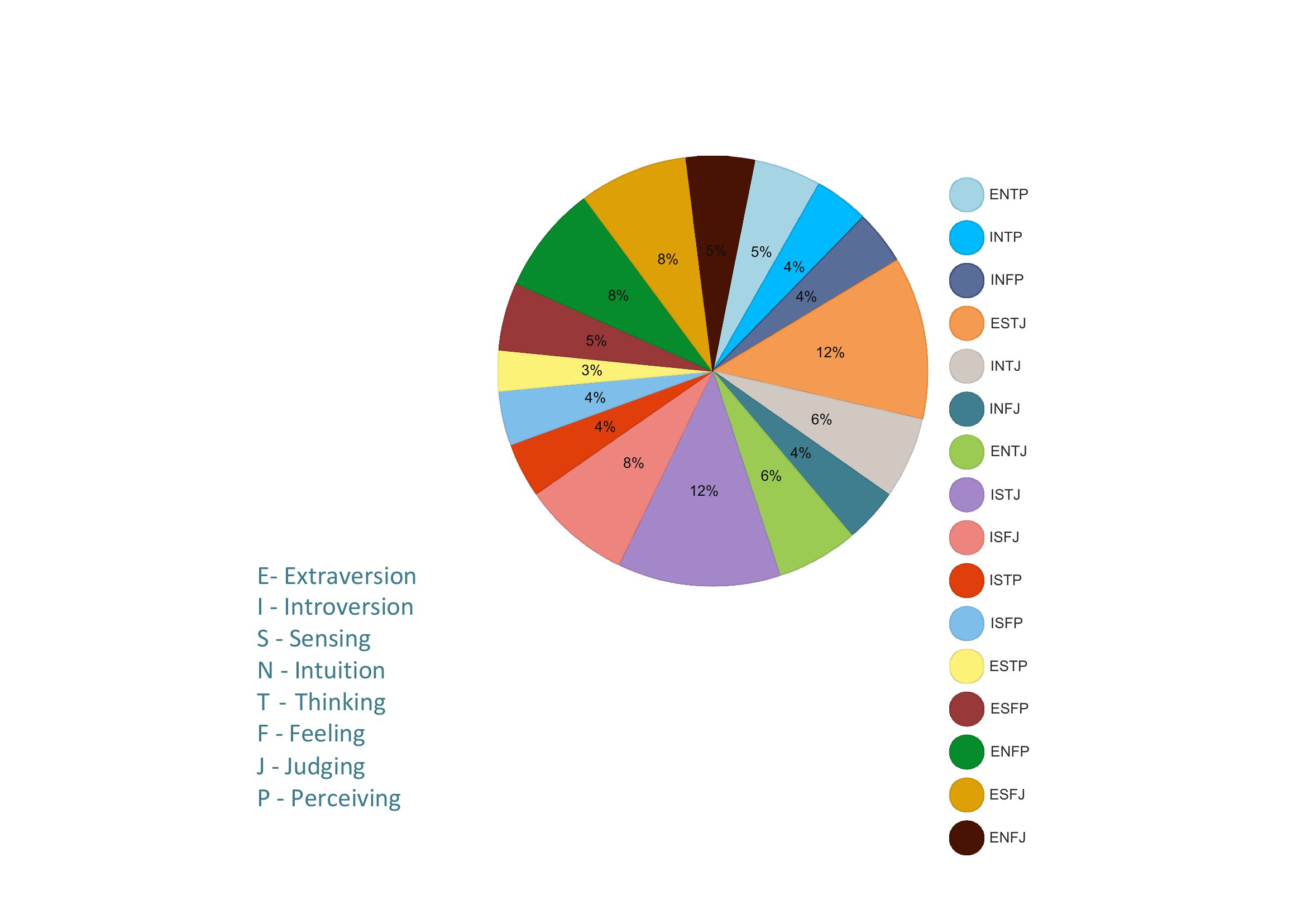
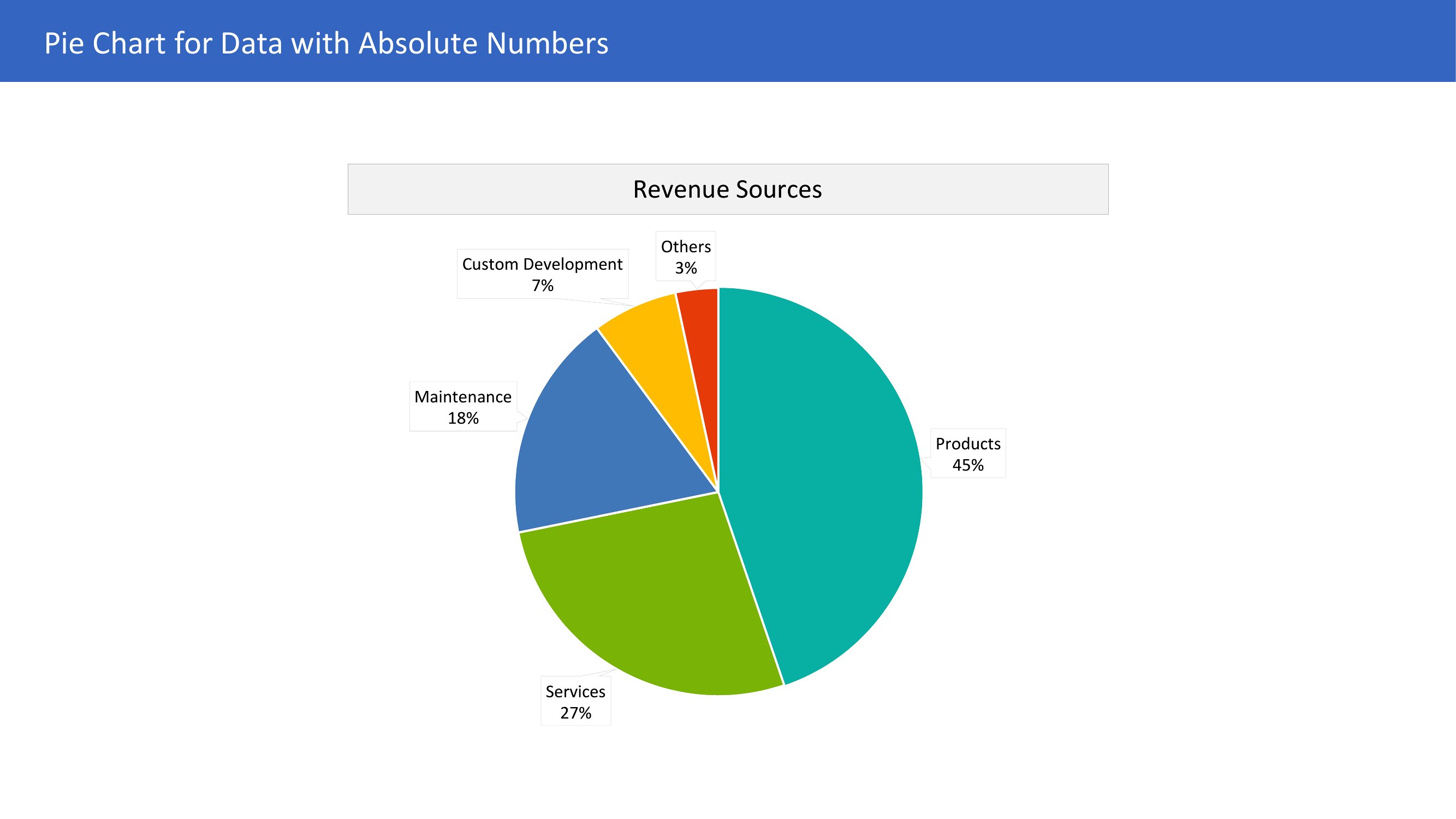
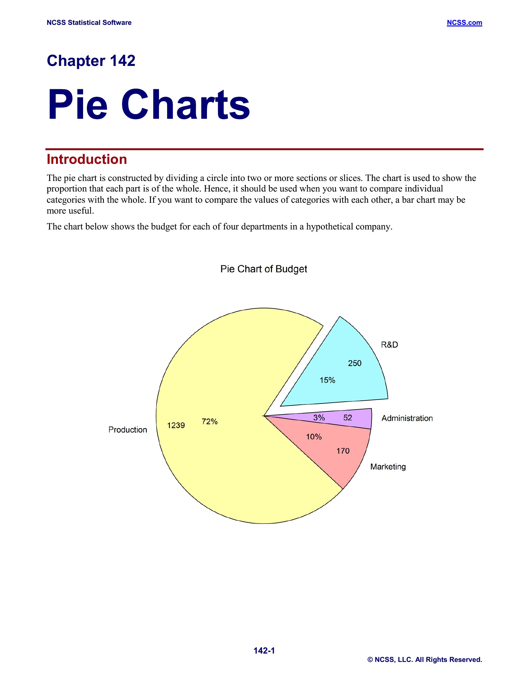
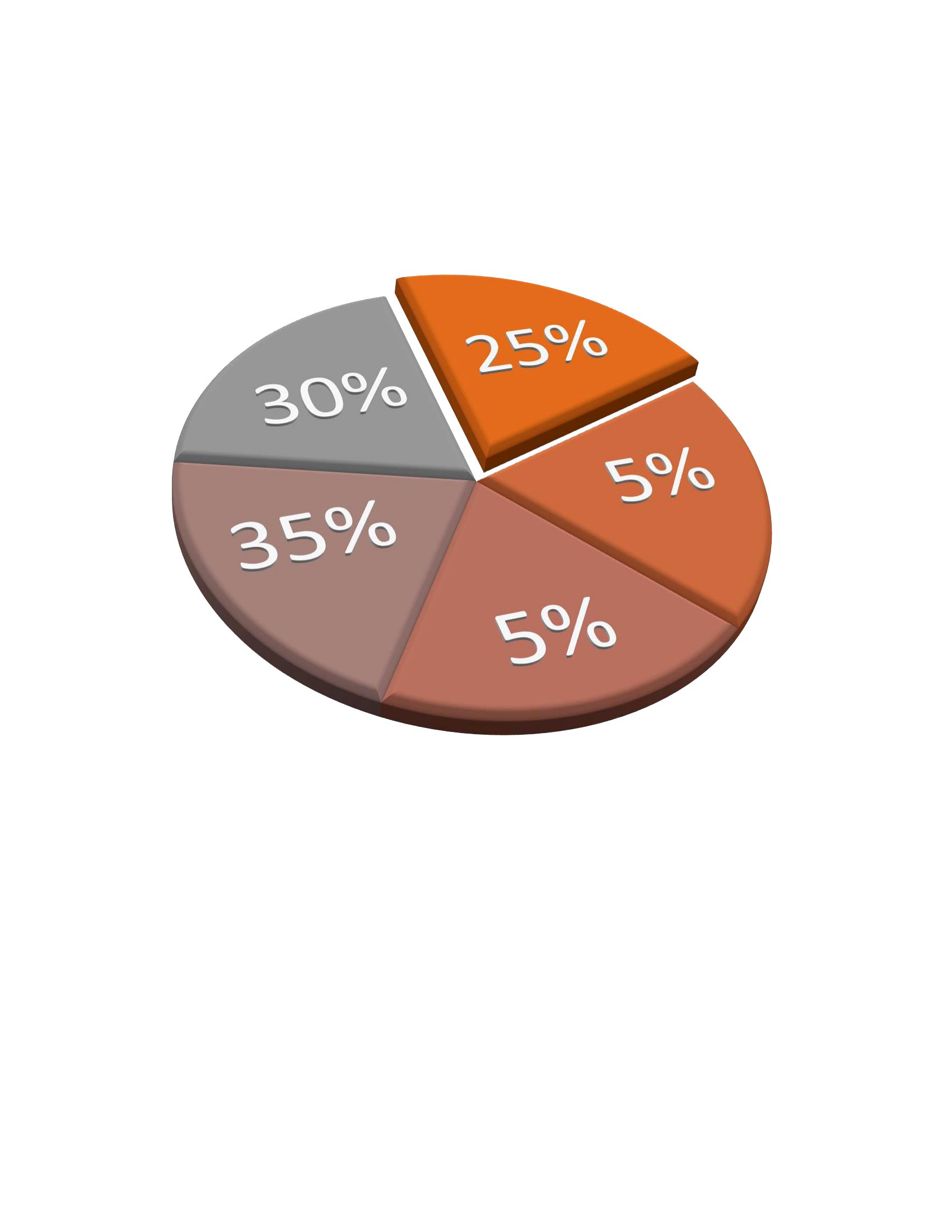
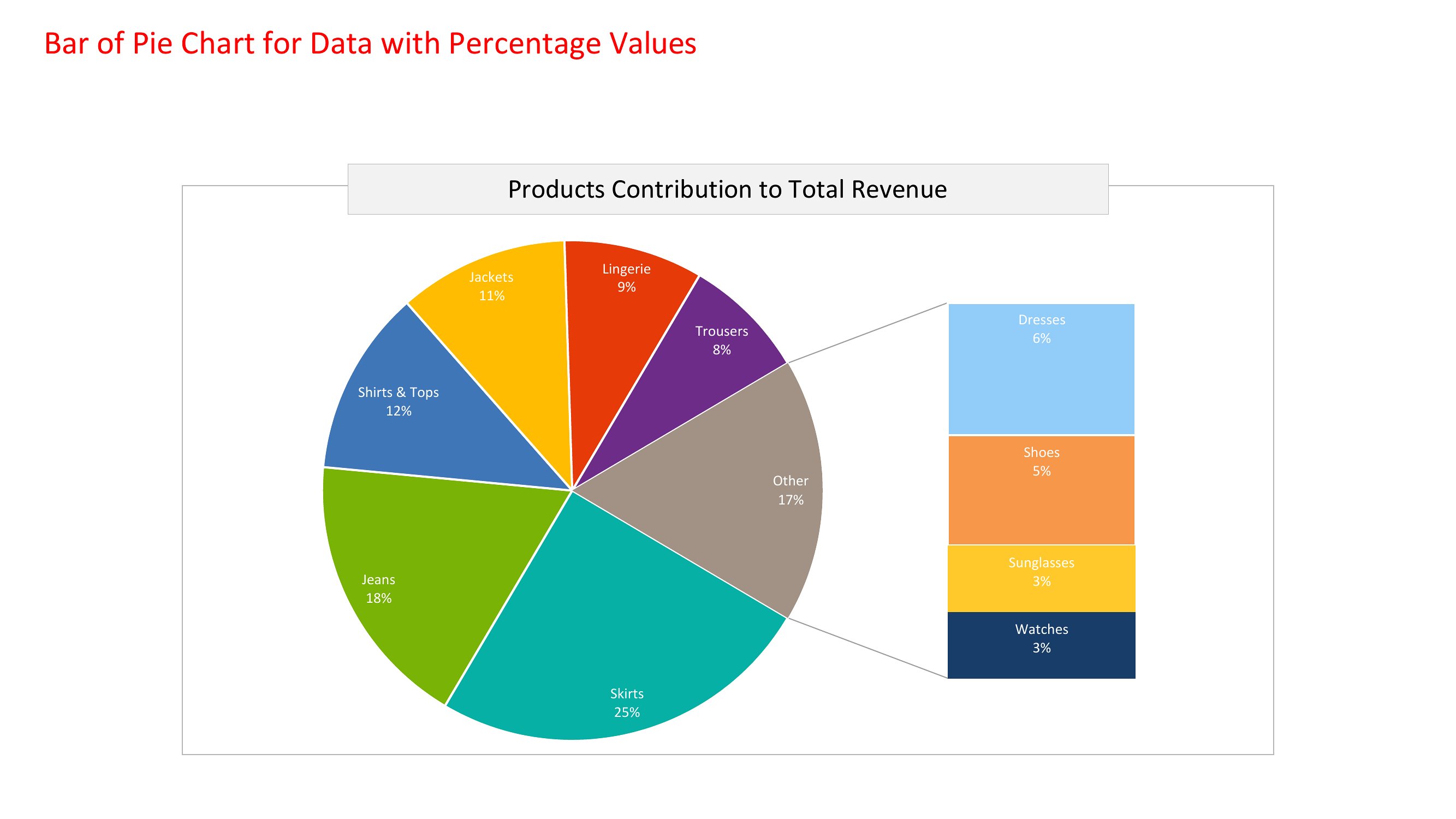
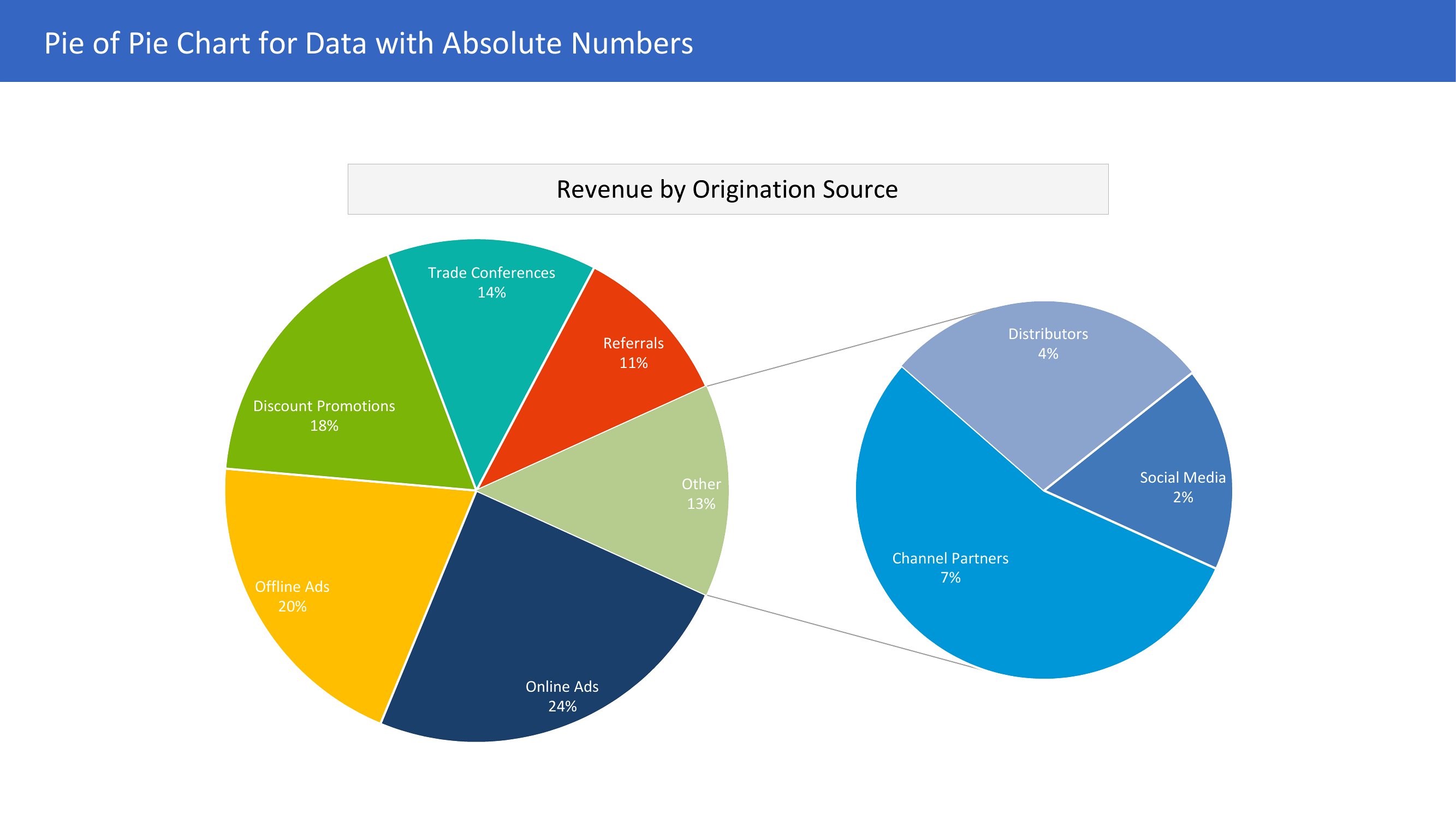
Pie Charts
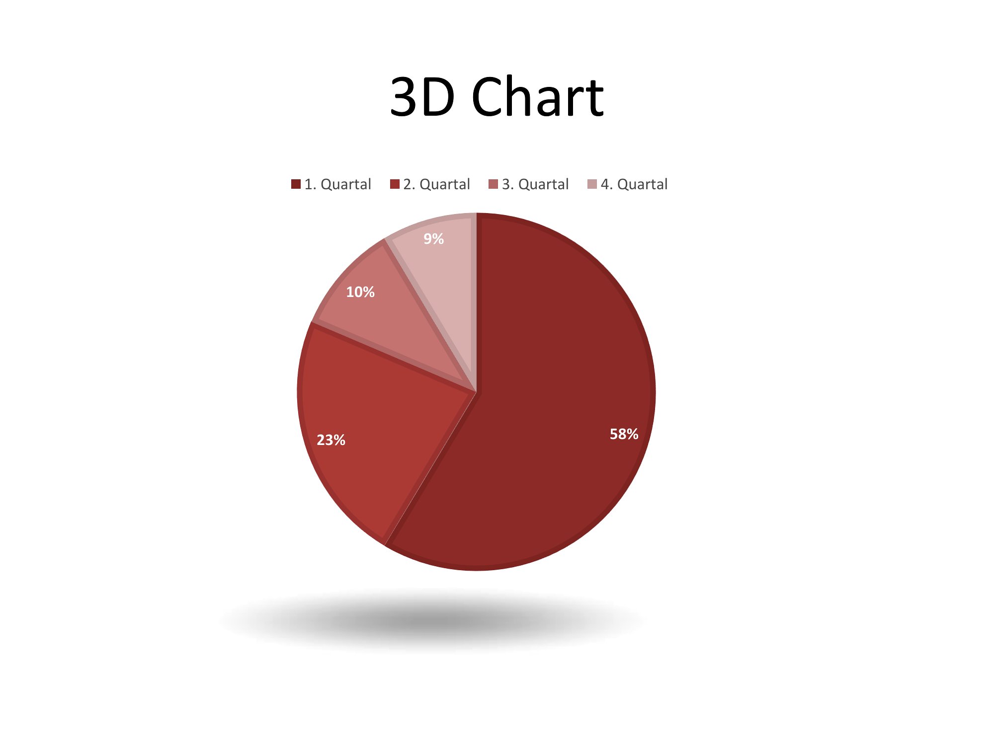
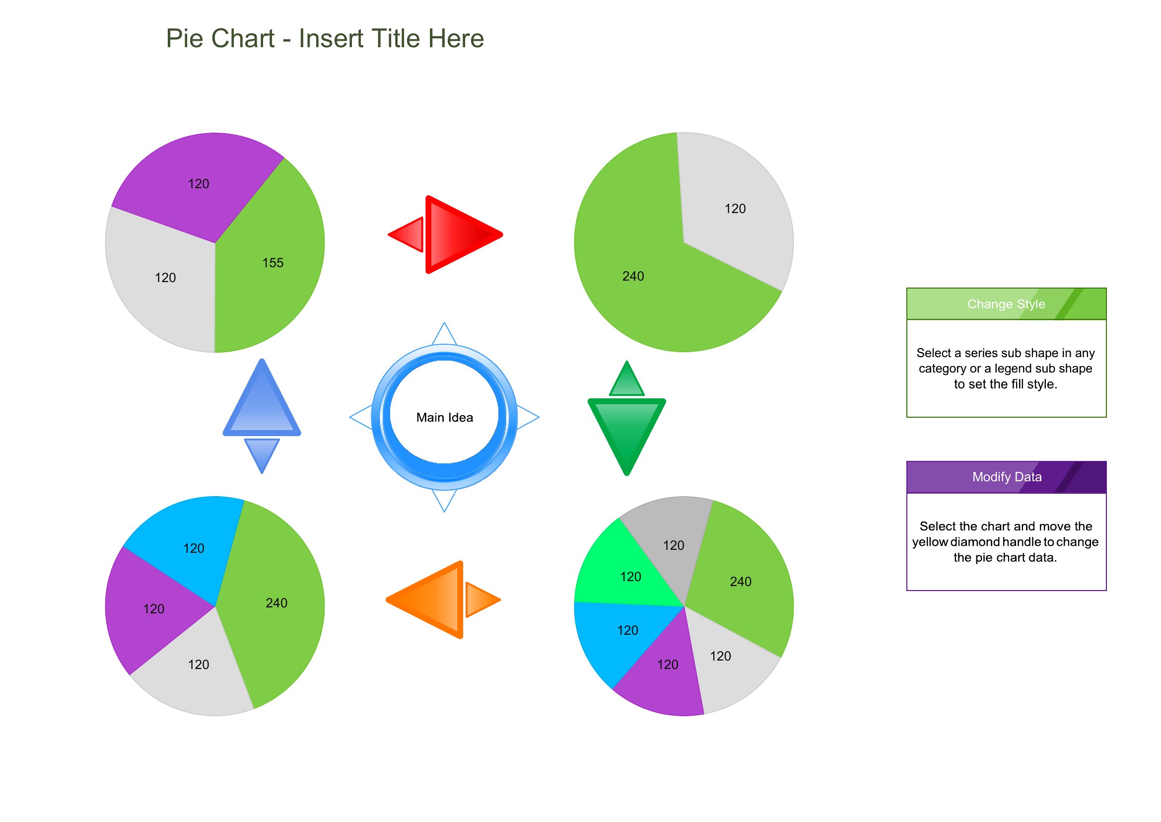
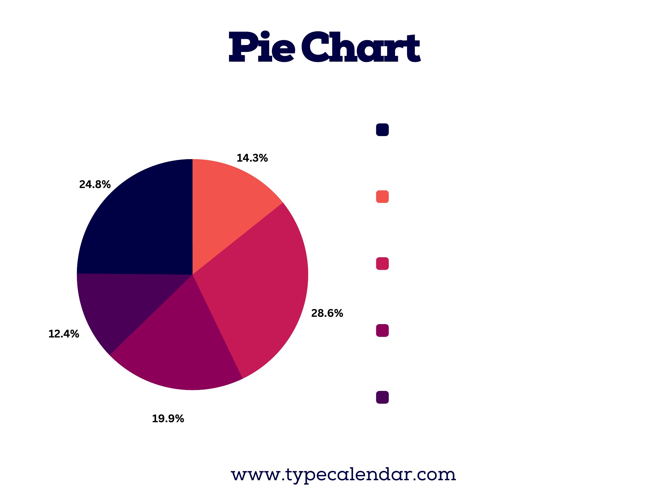
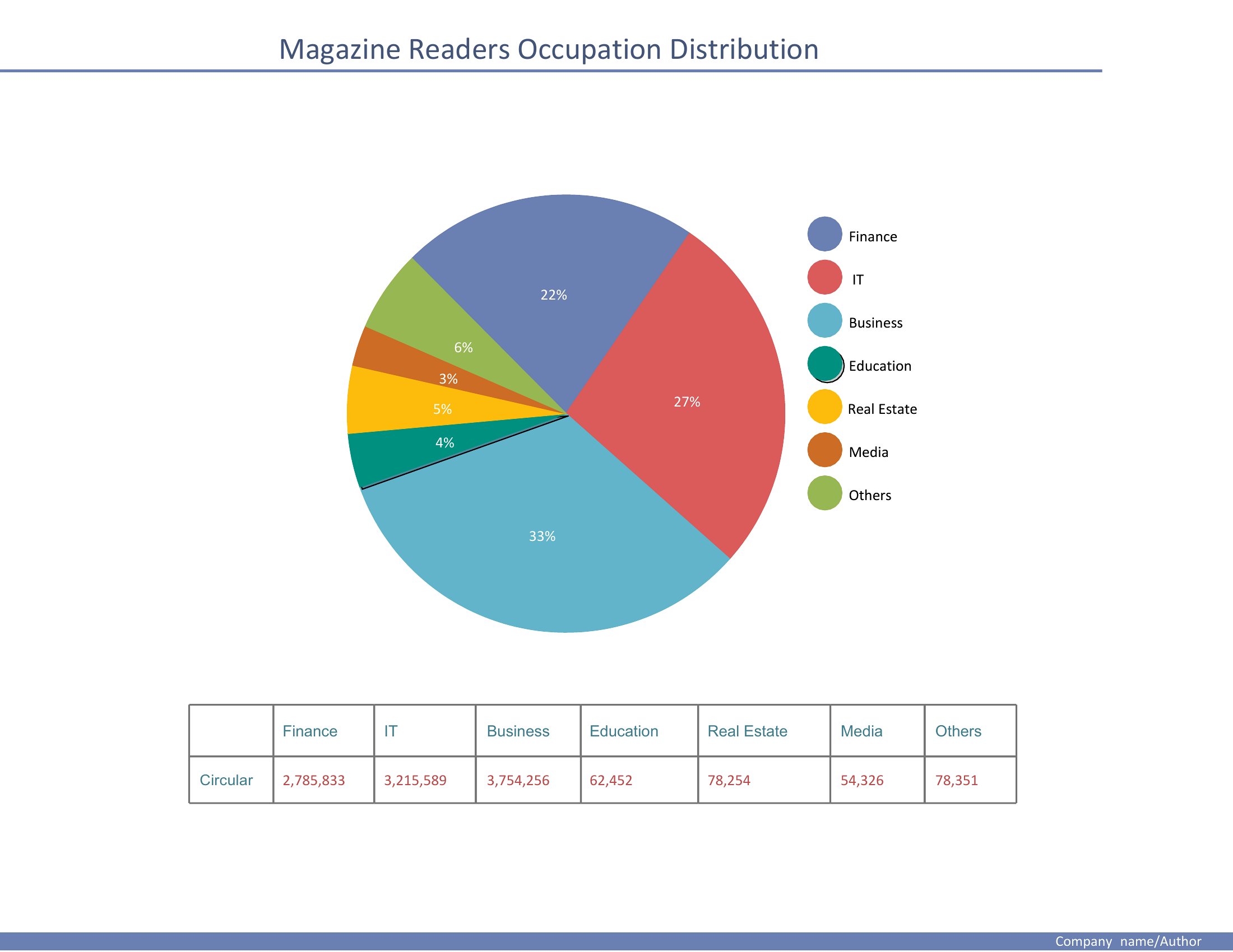
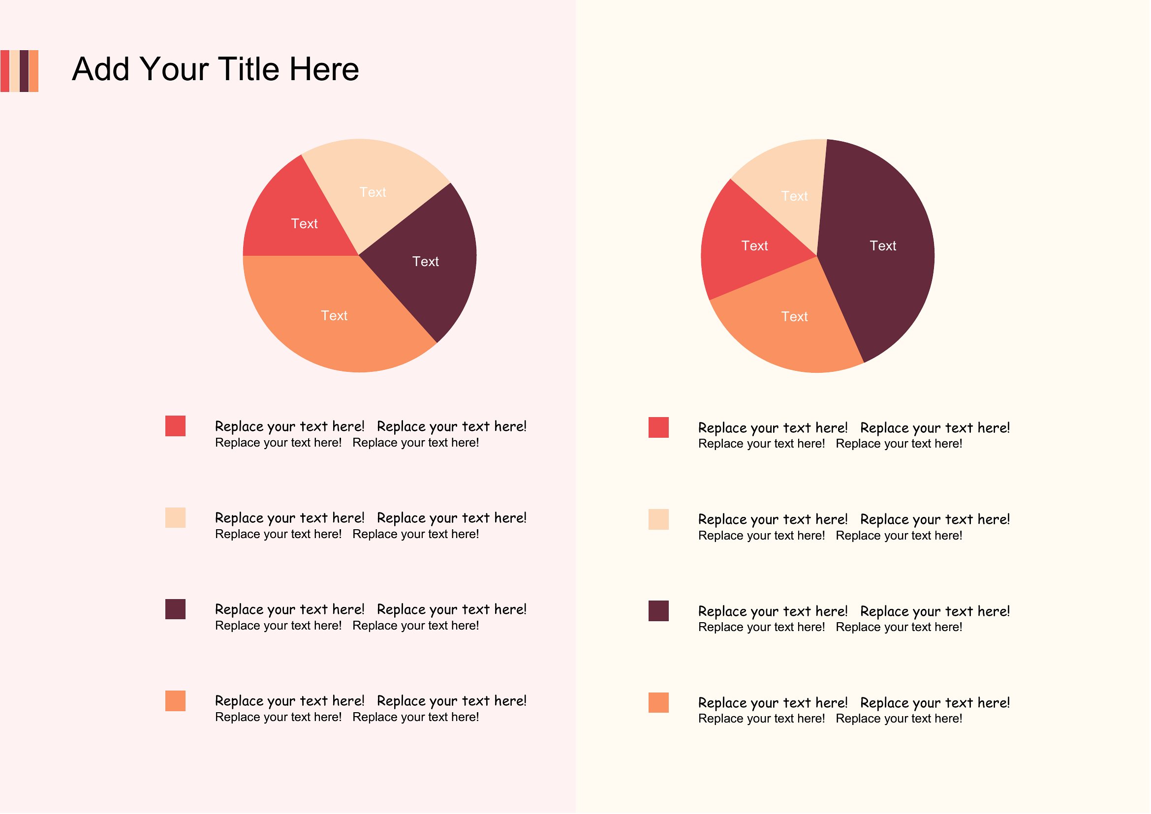
Pie Chart Maker
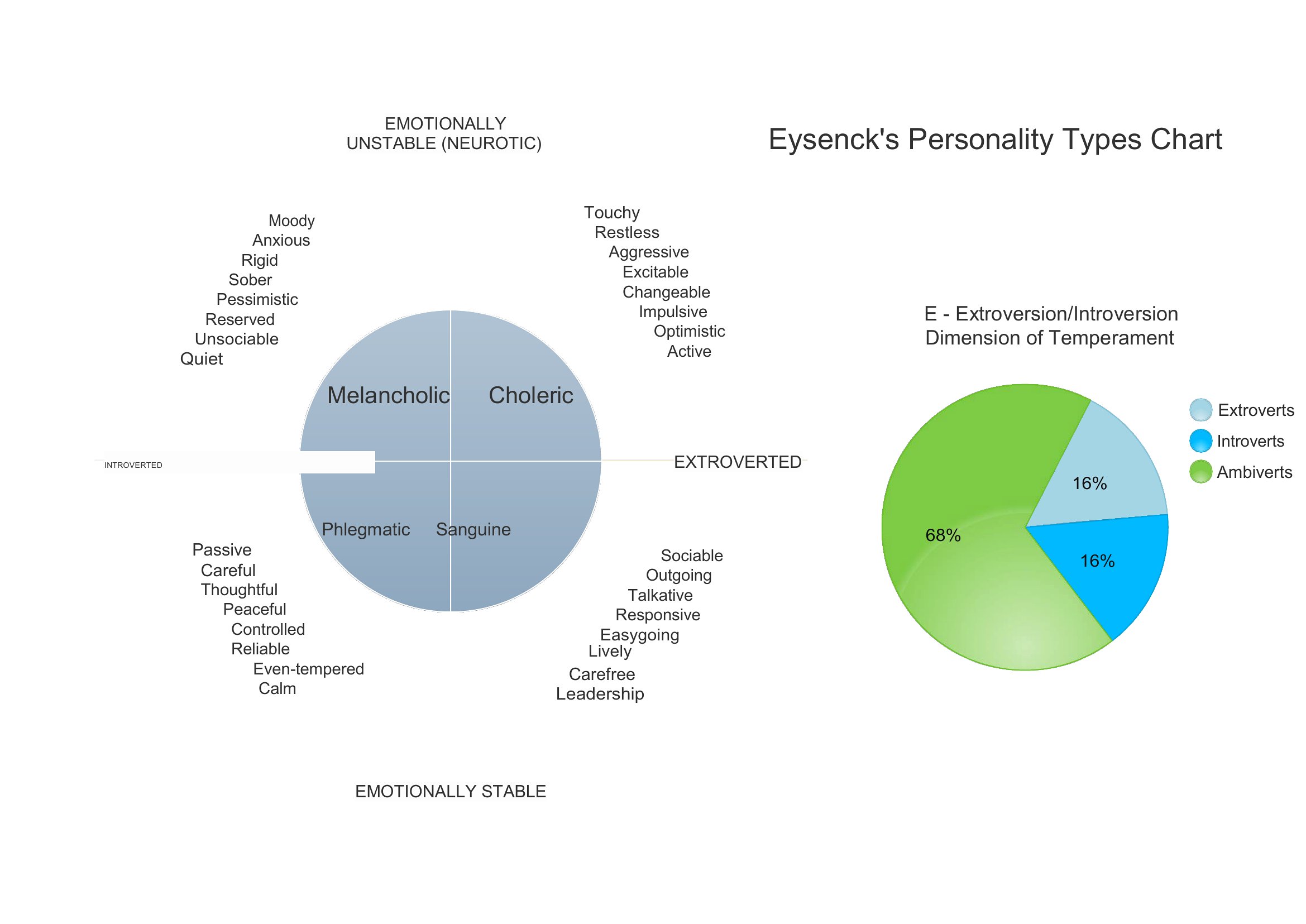
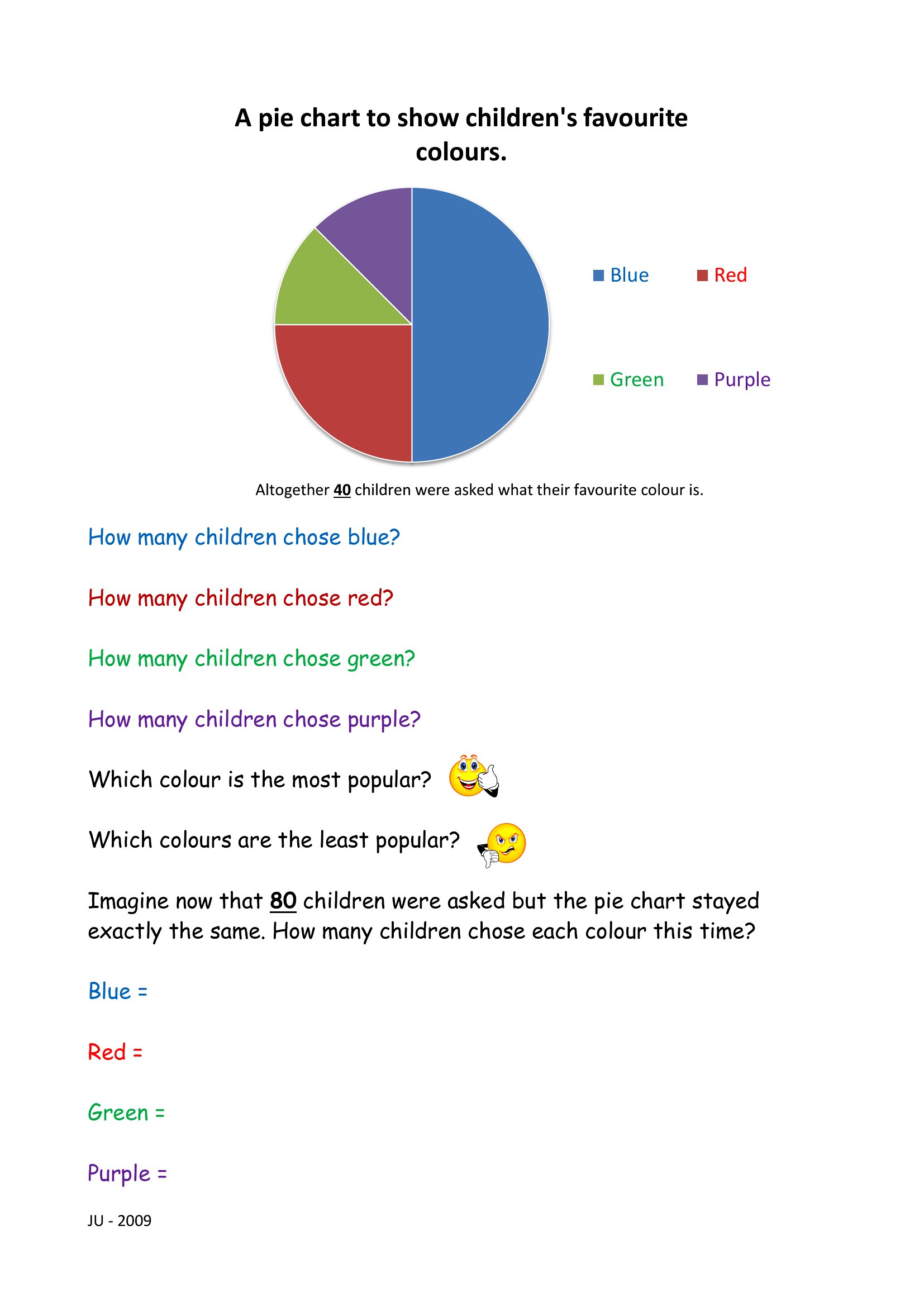
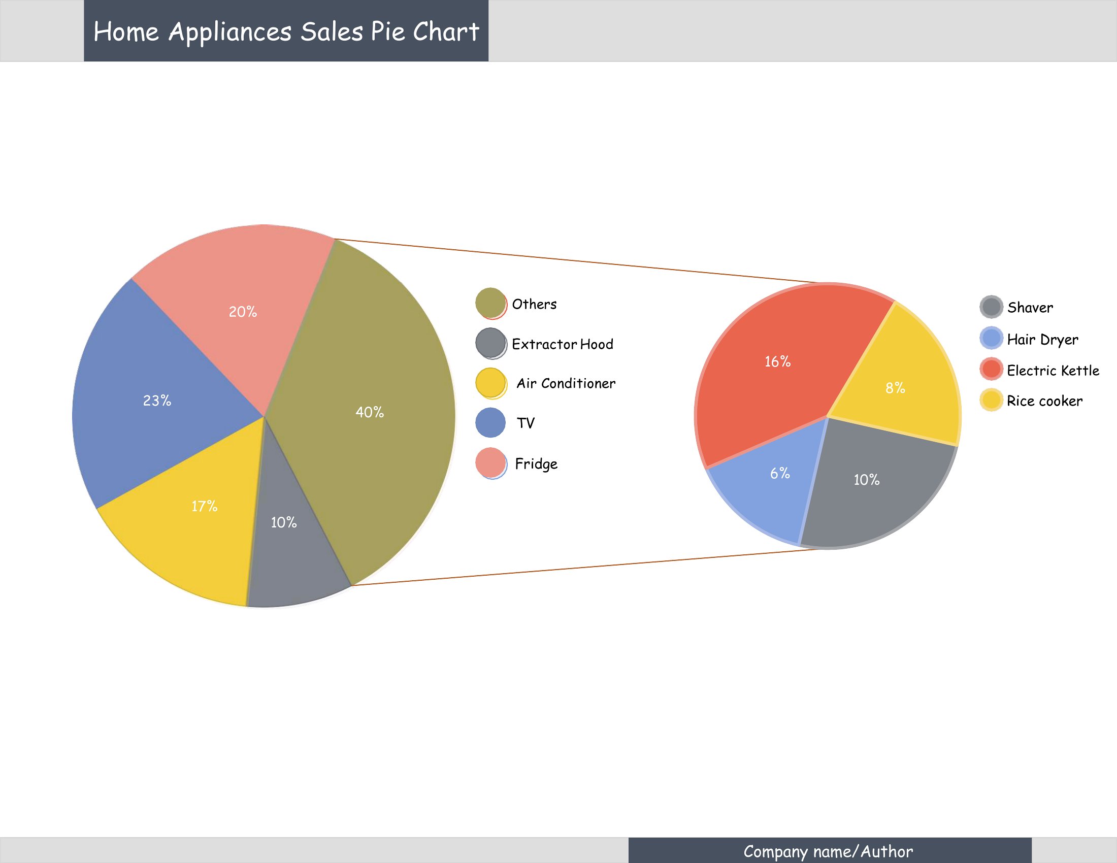
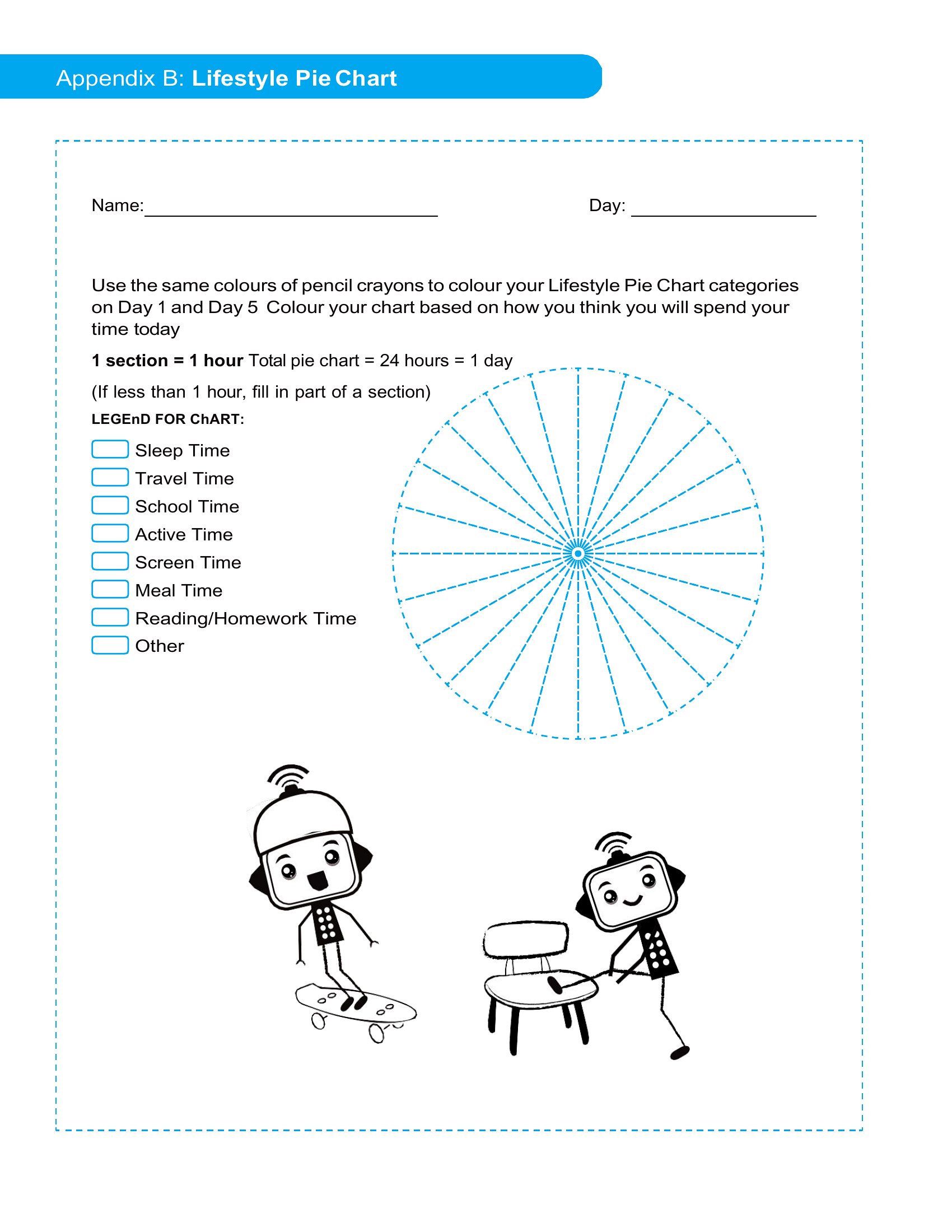
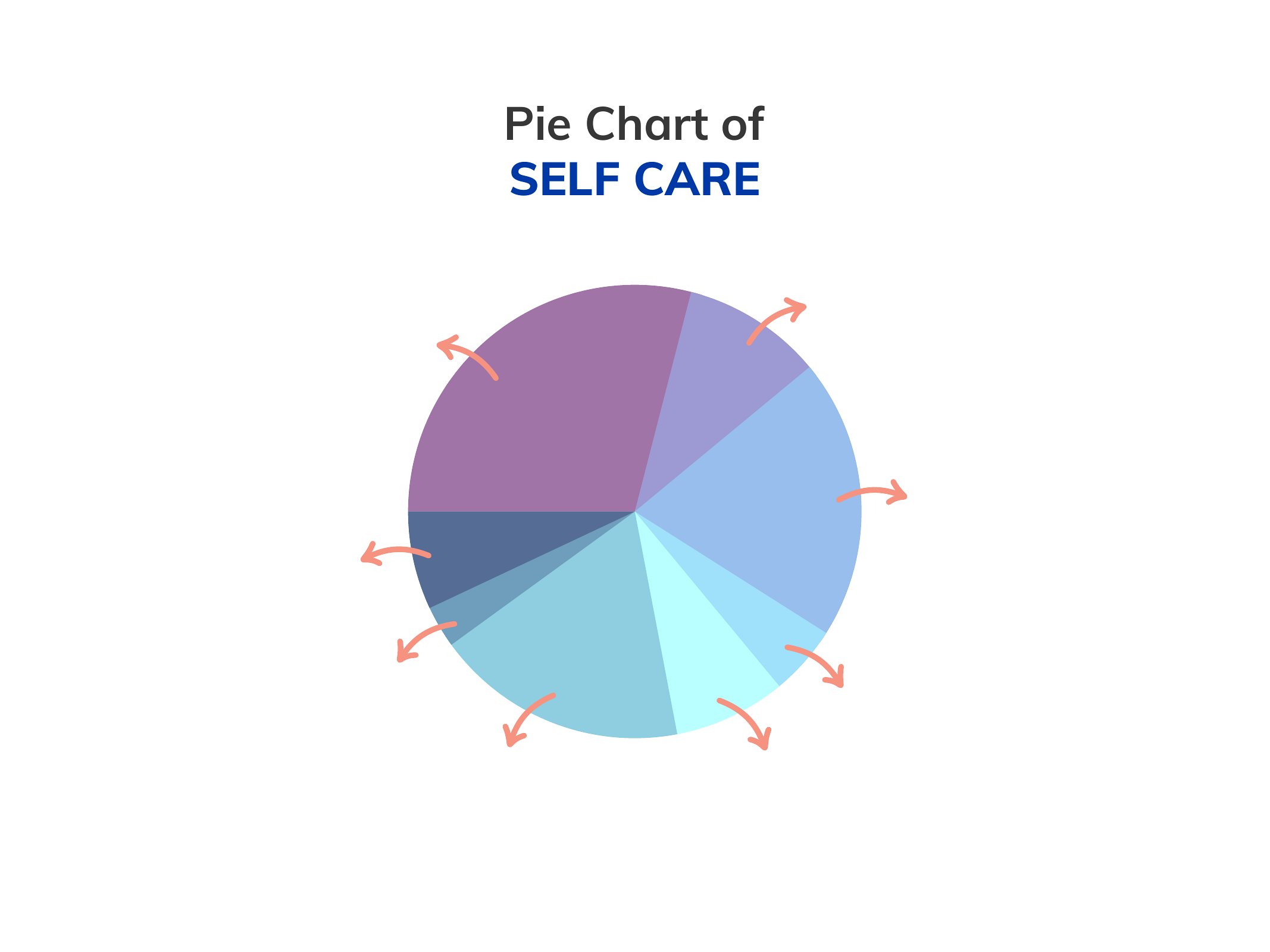
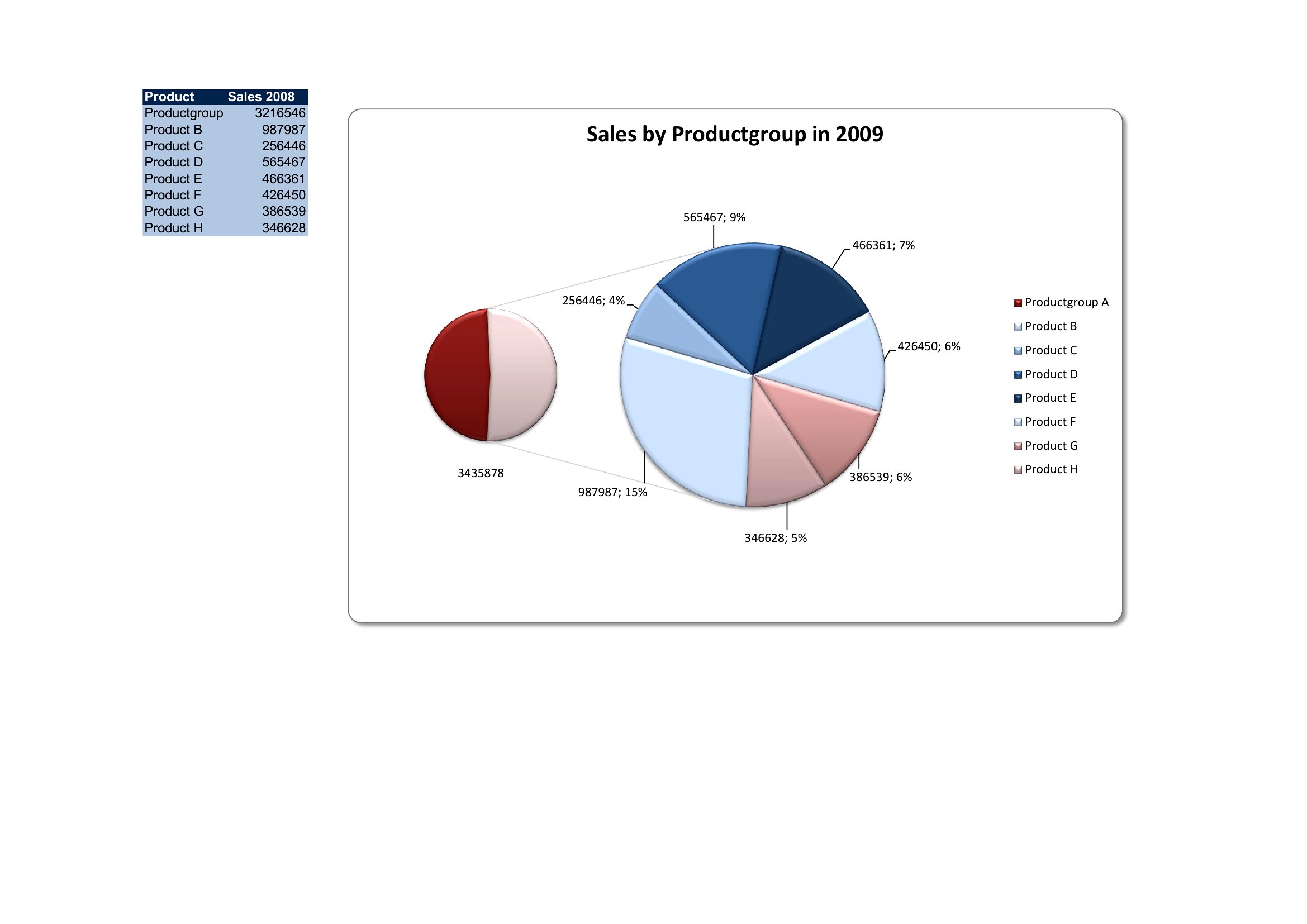
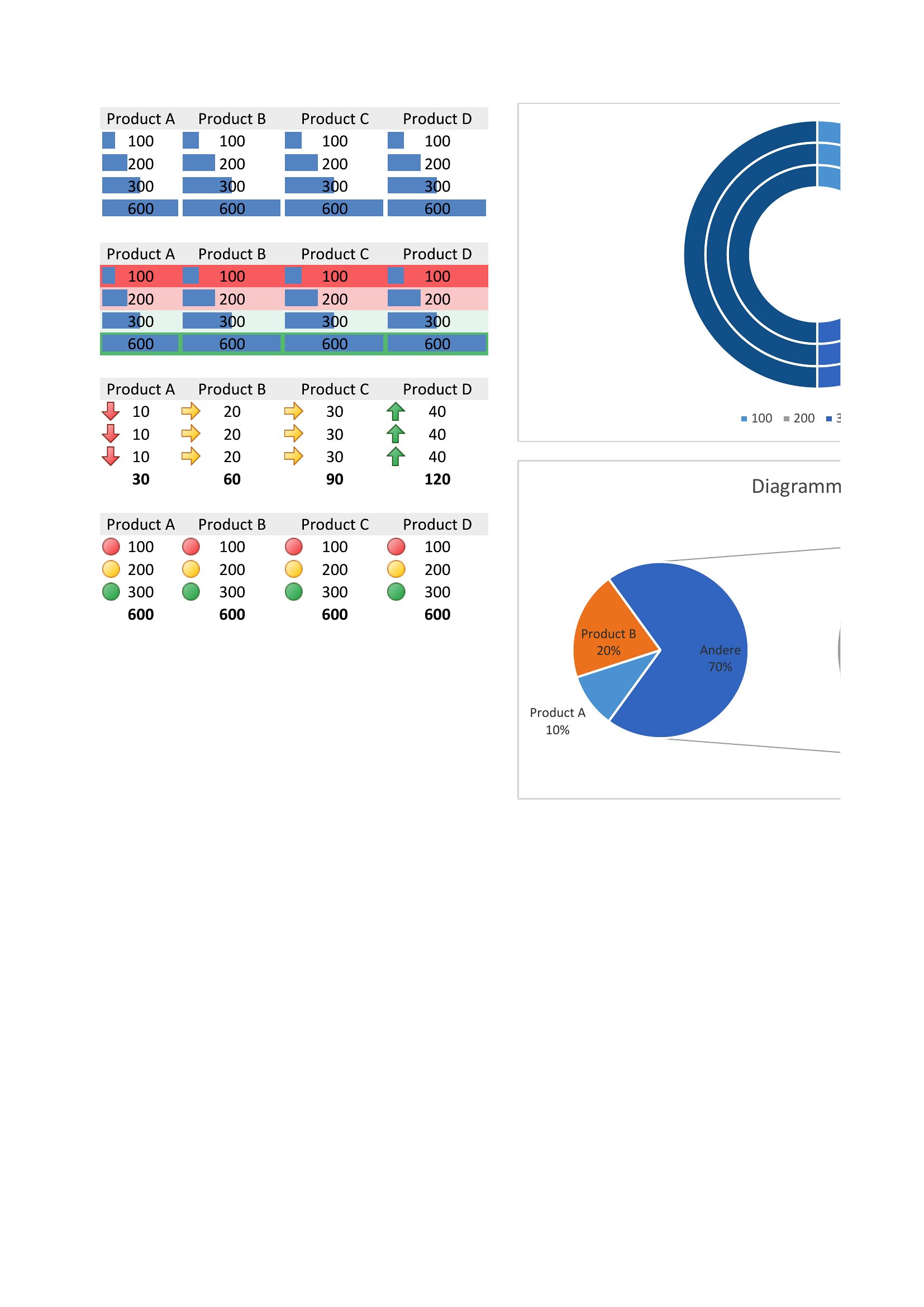
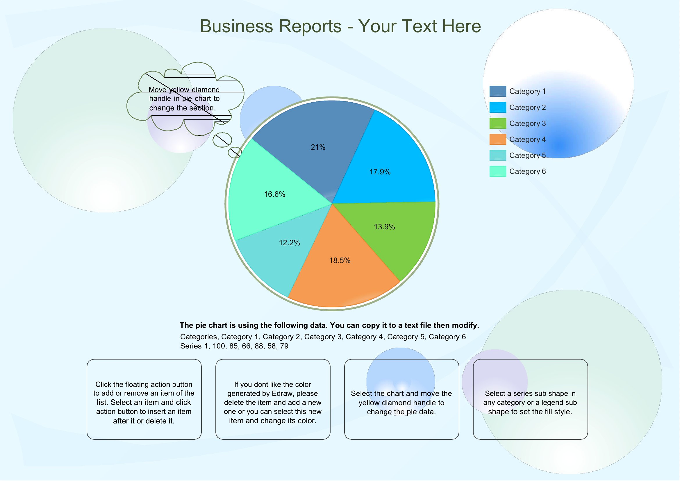
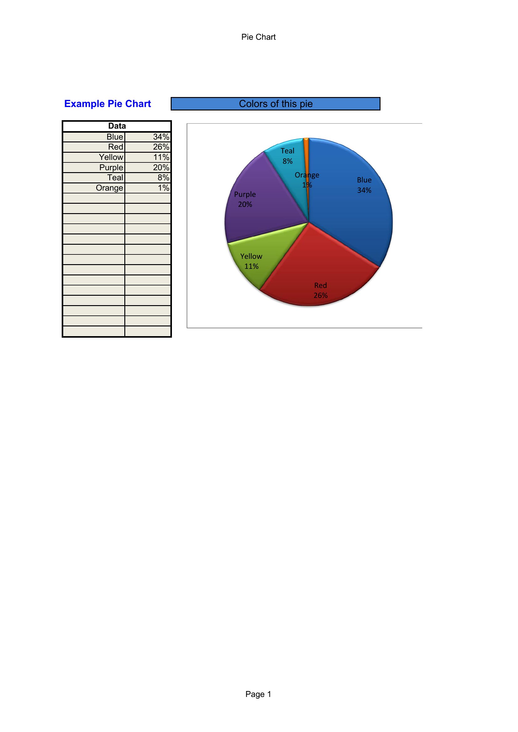
Excel Pie Chart
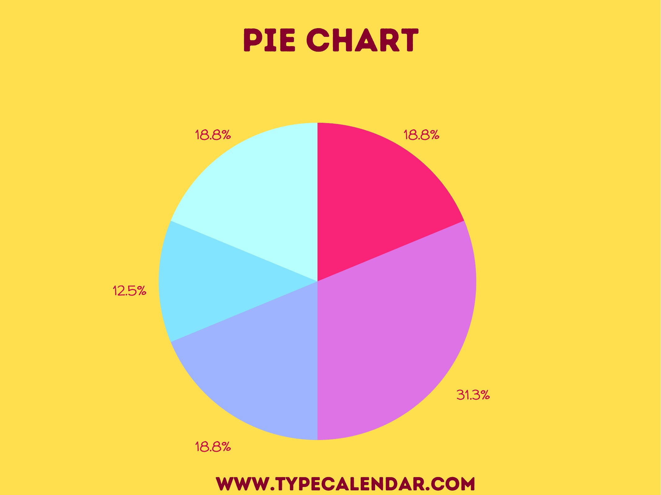
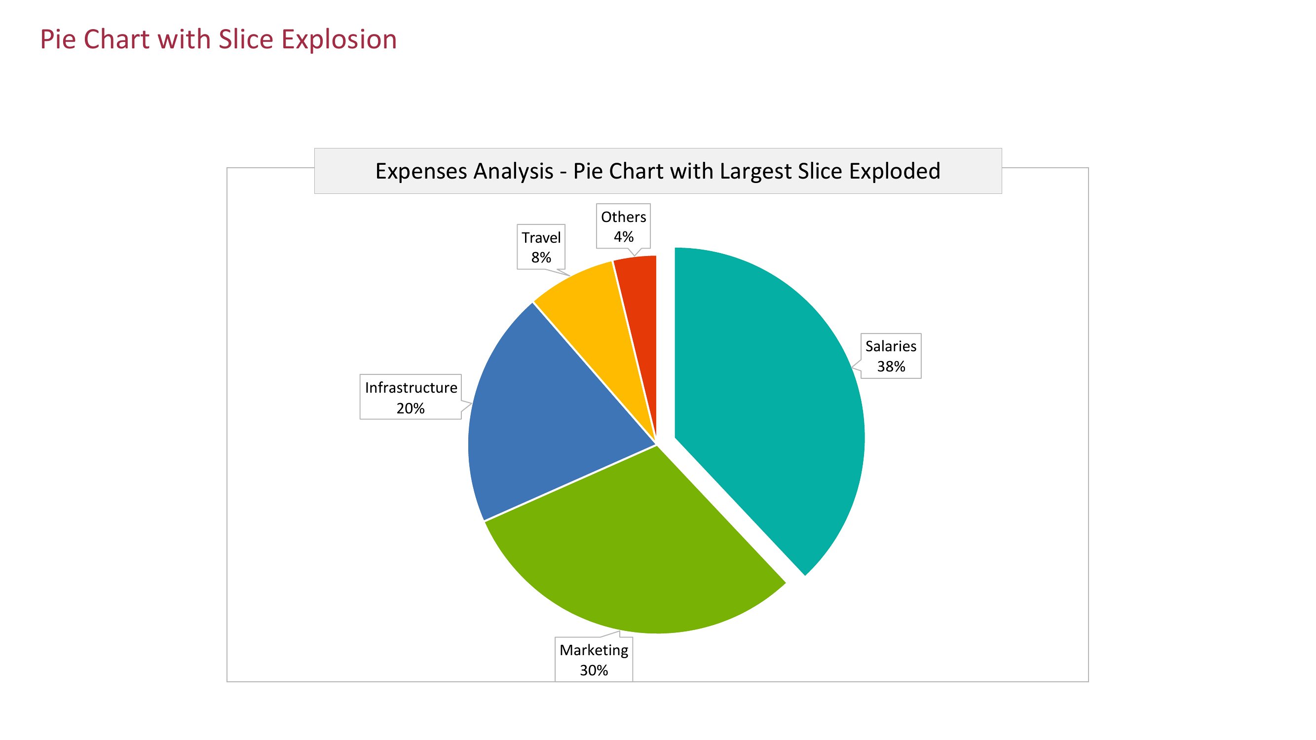
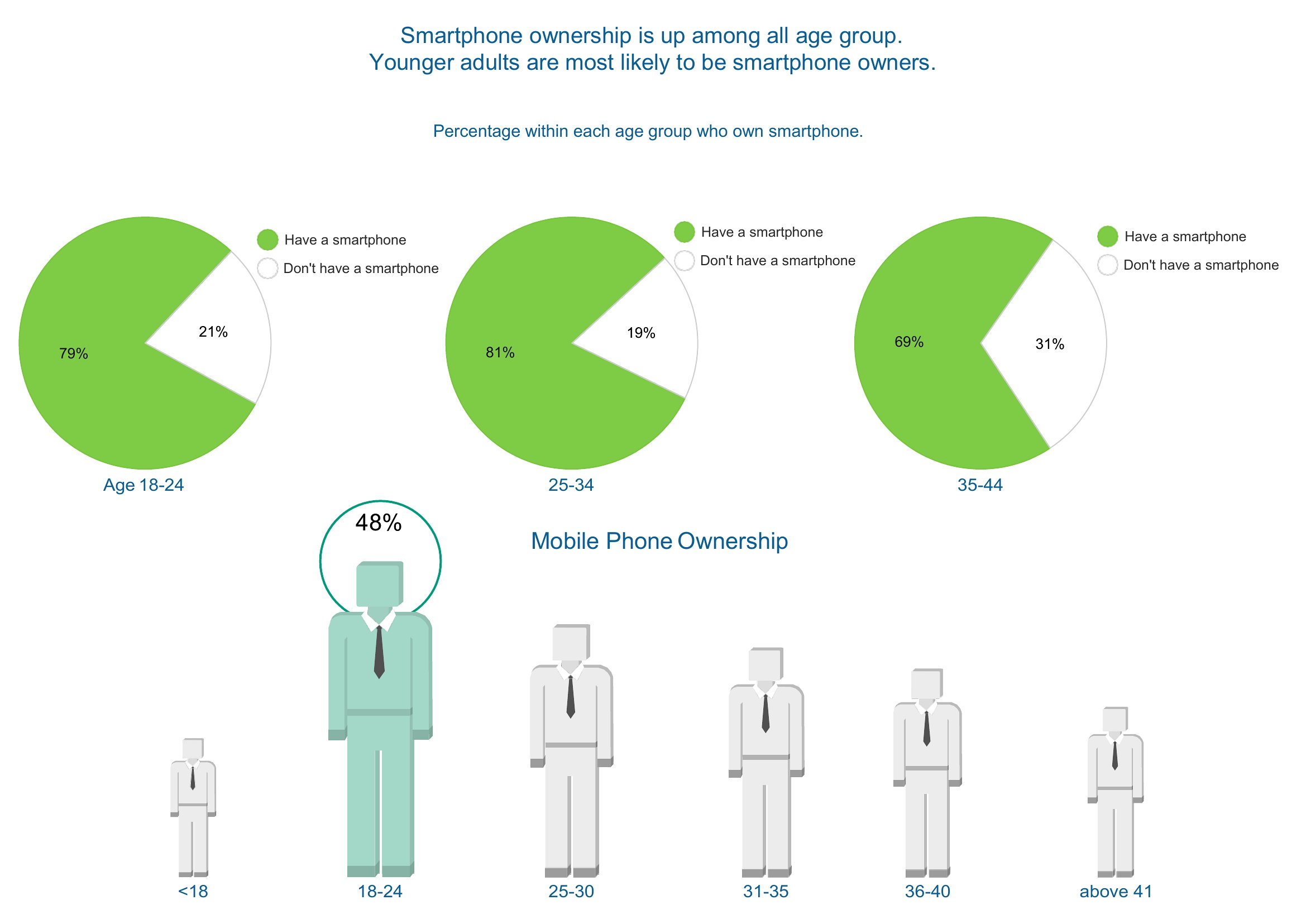

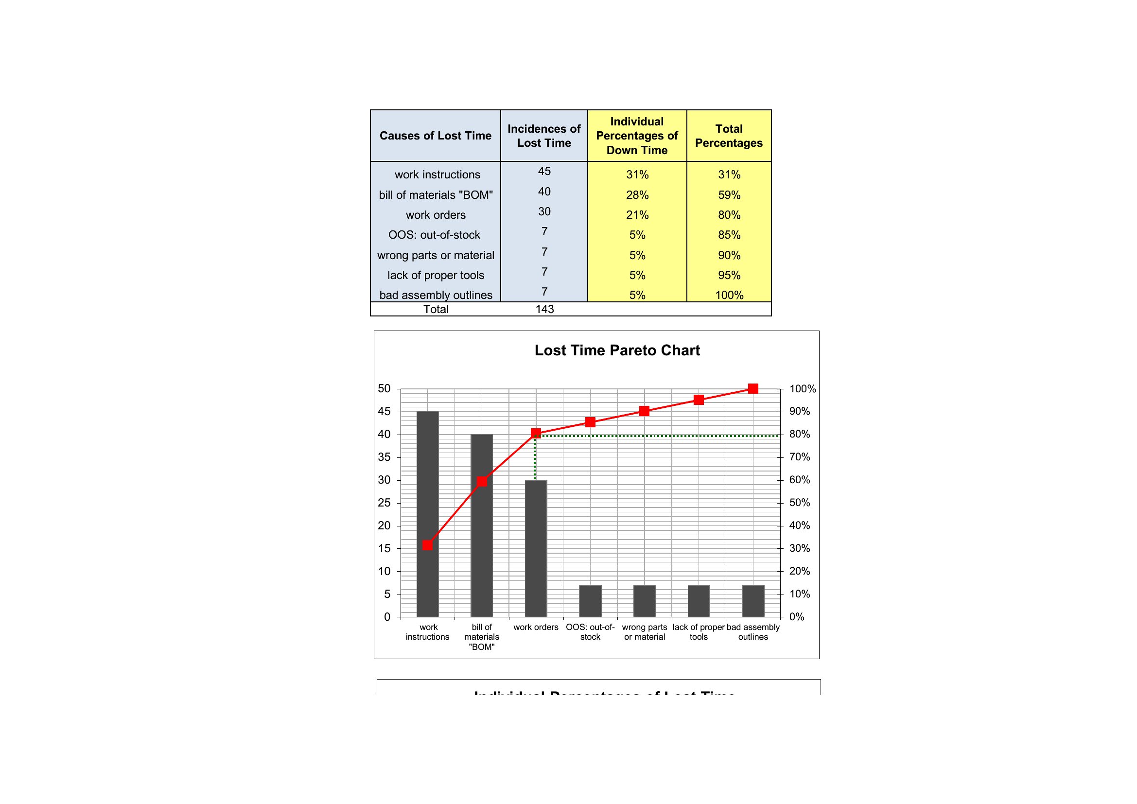
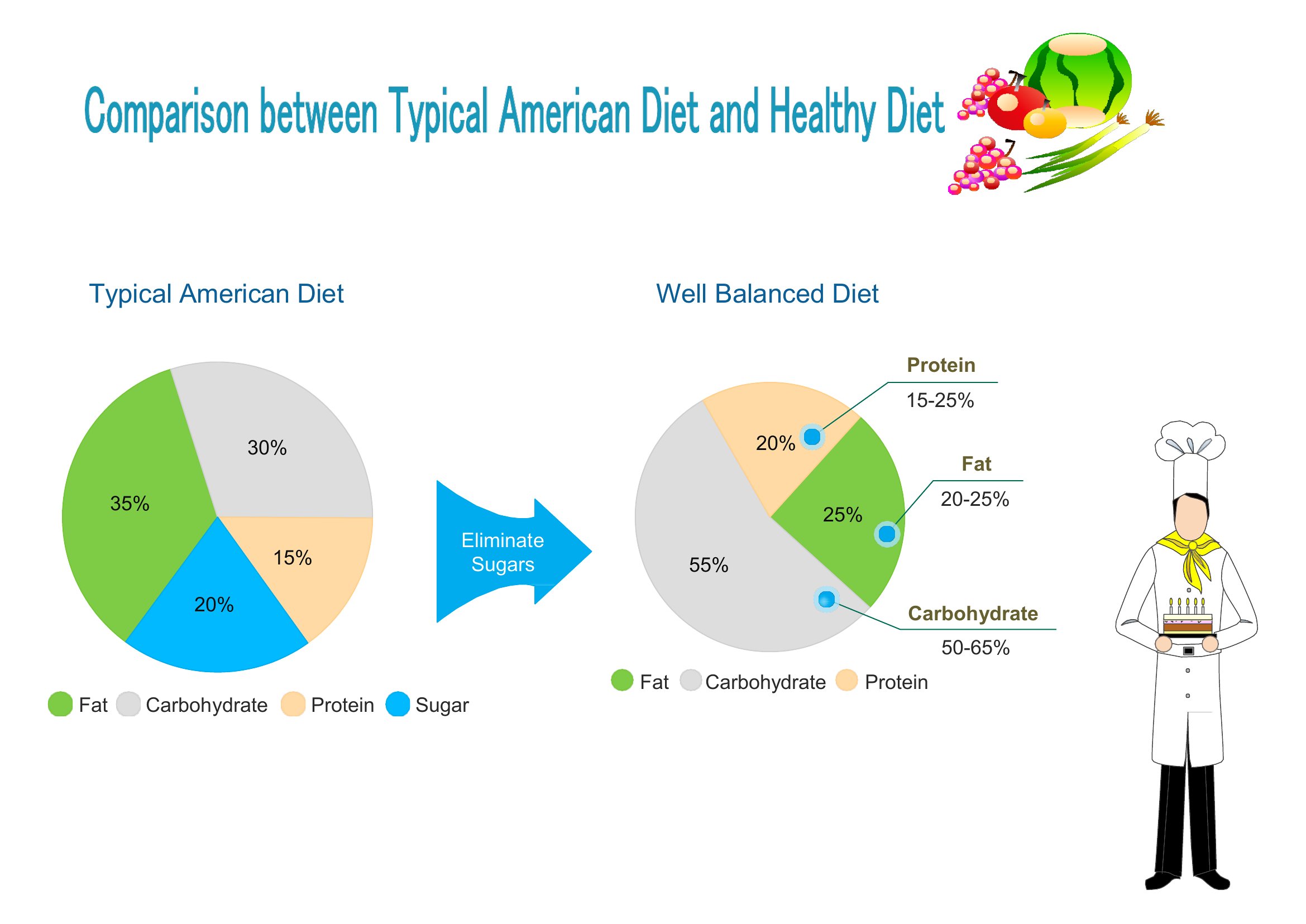
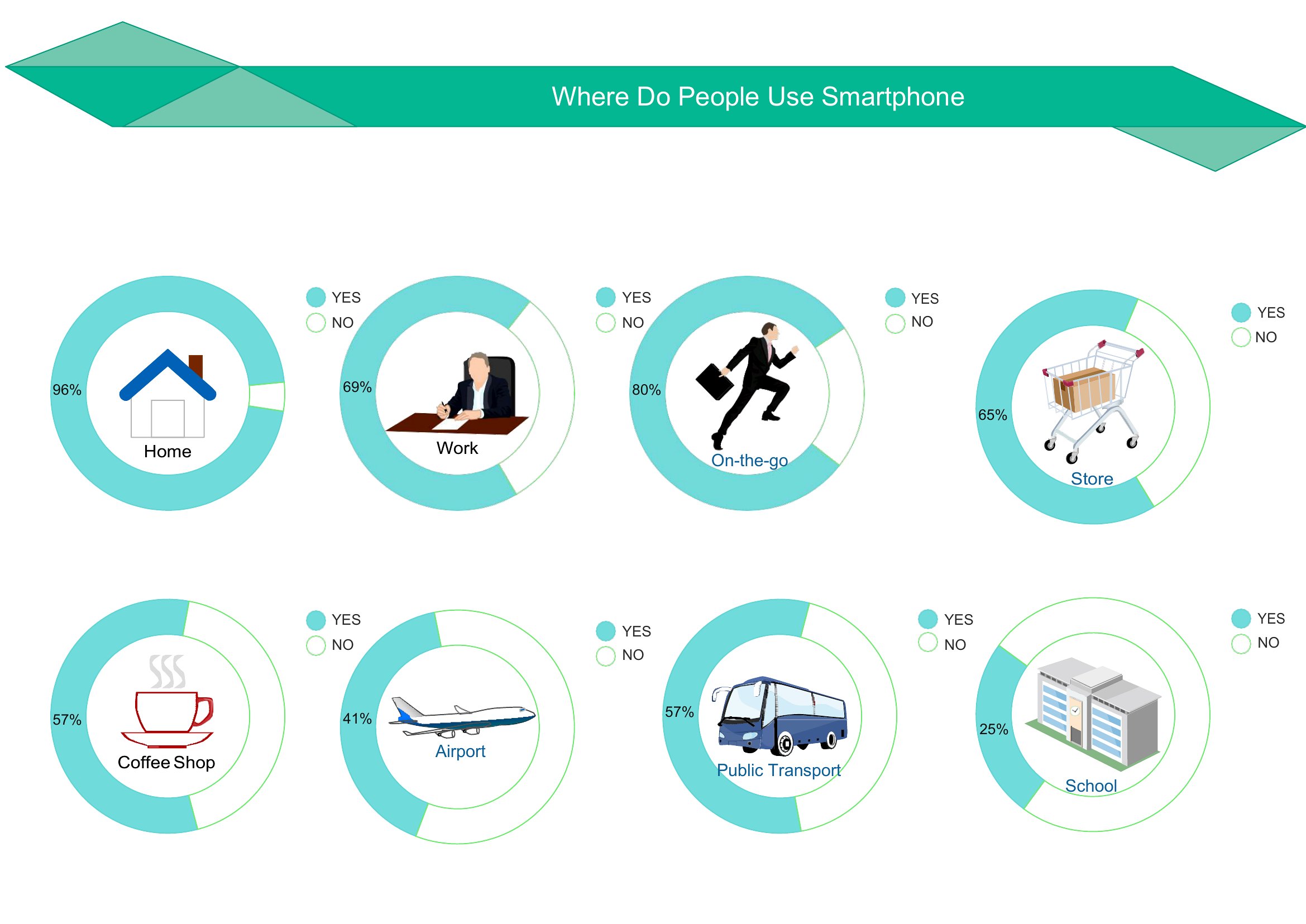
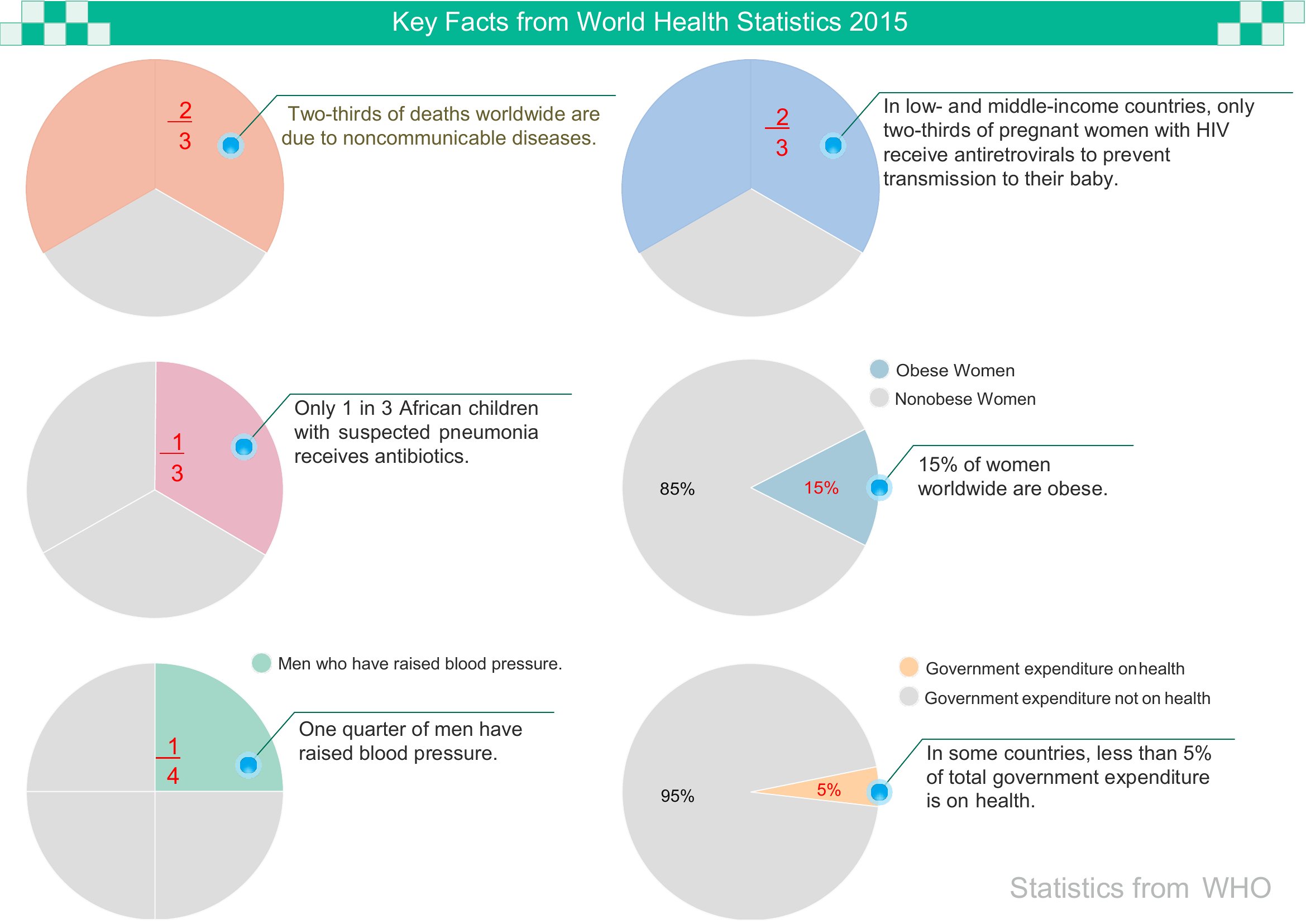
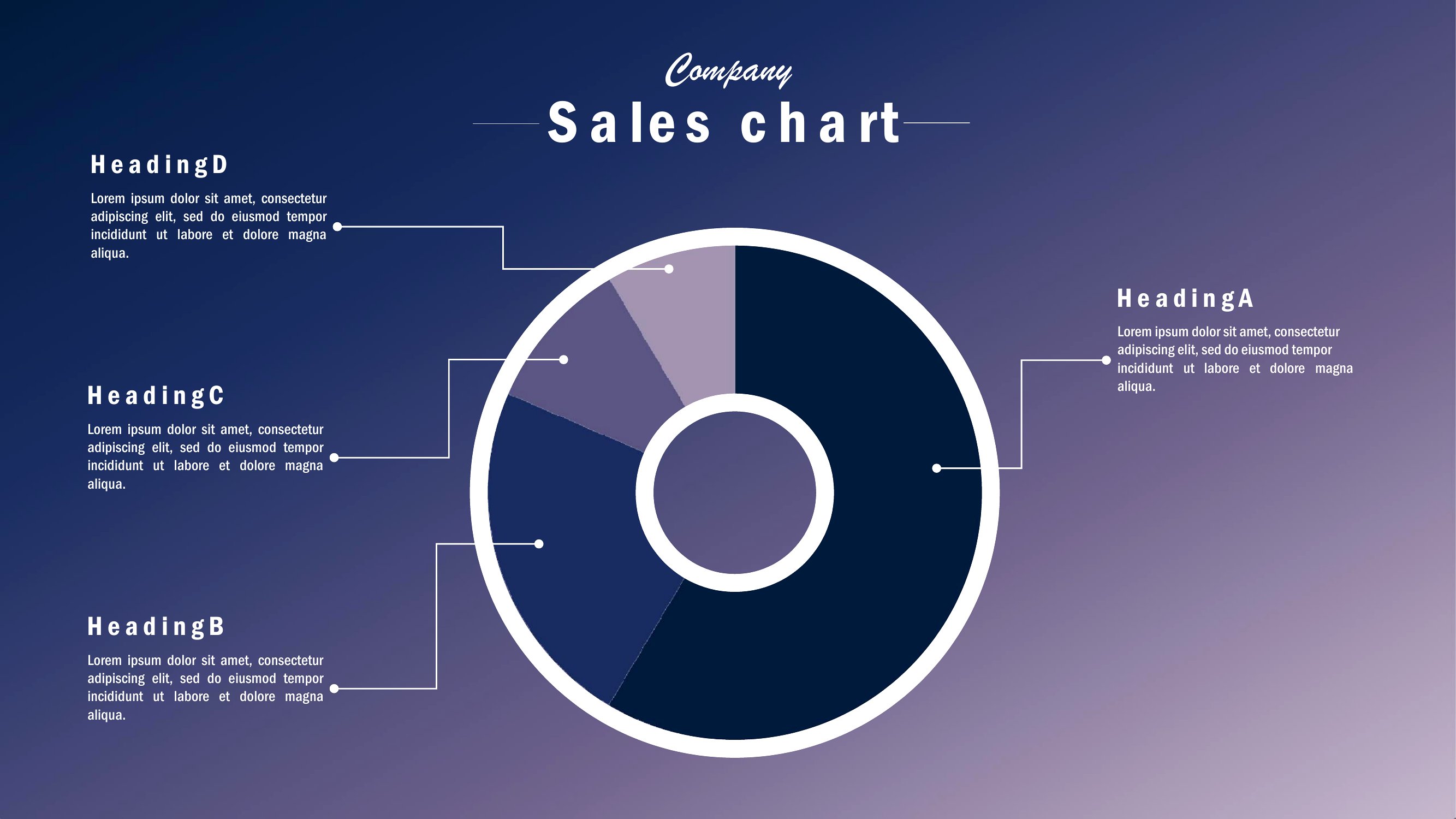
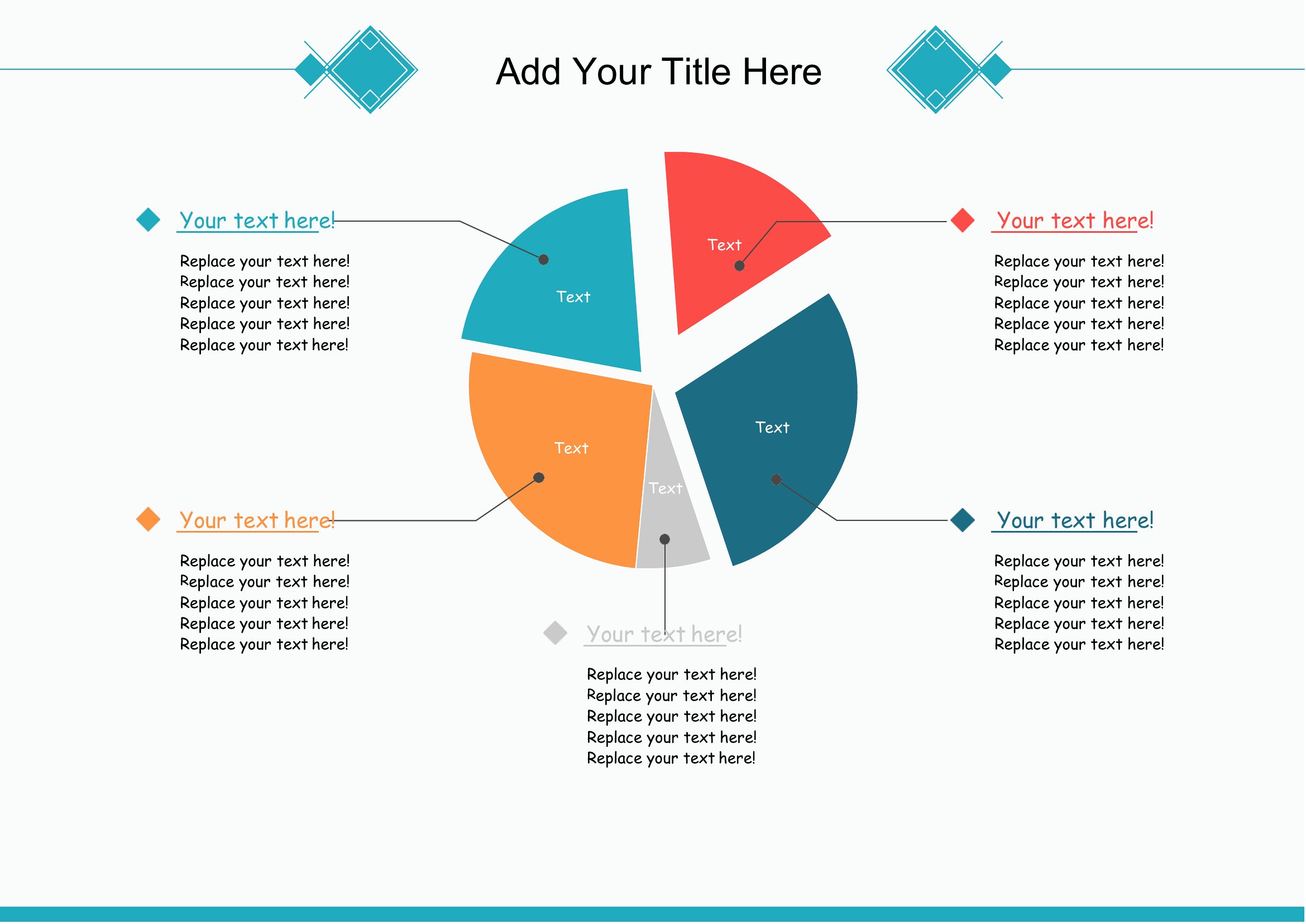
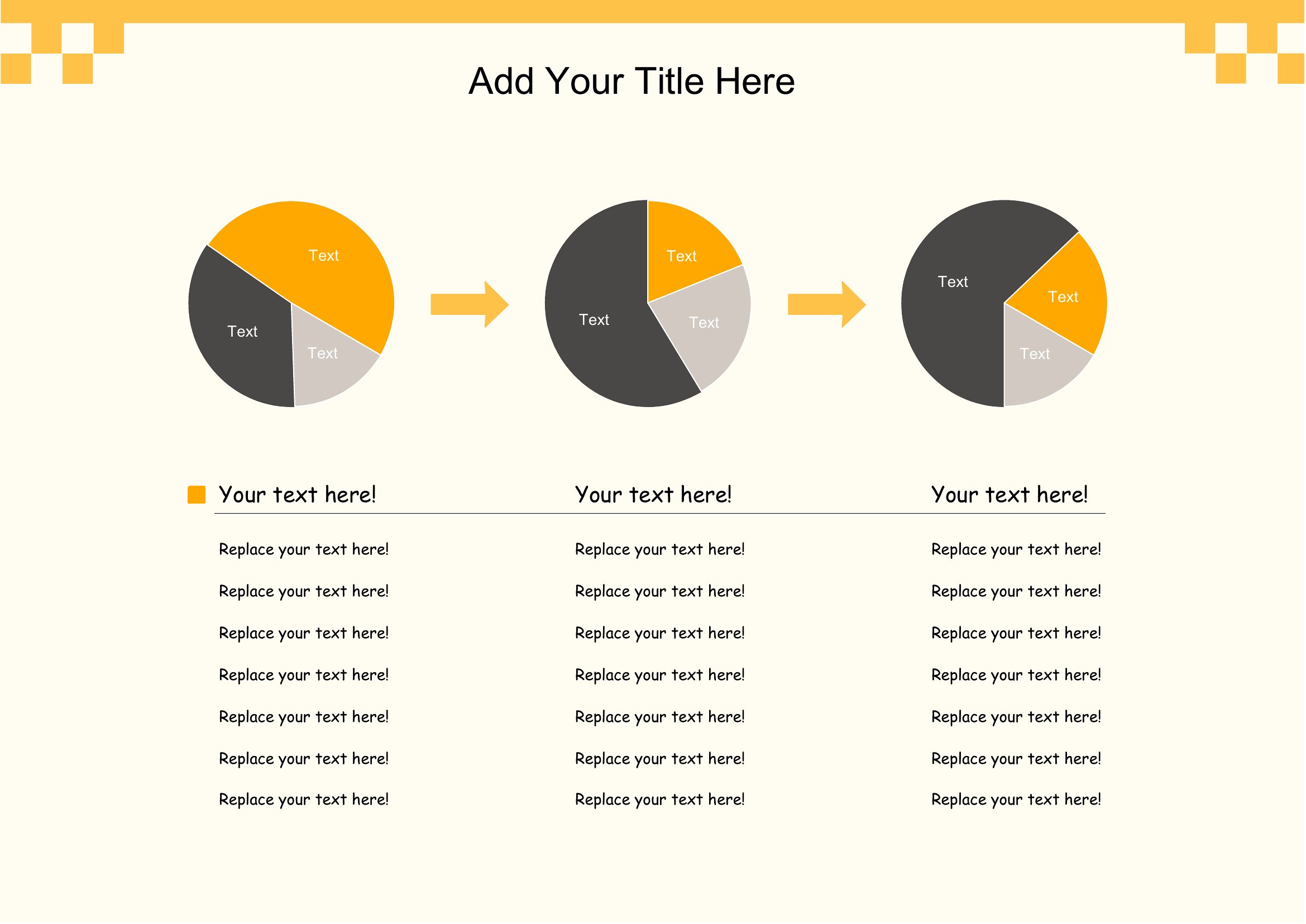
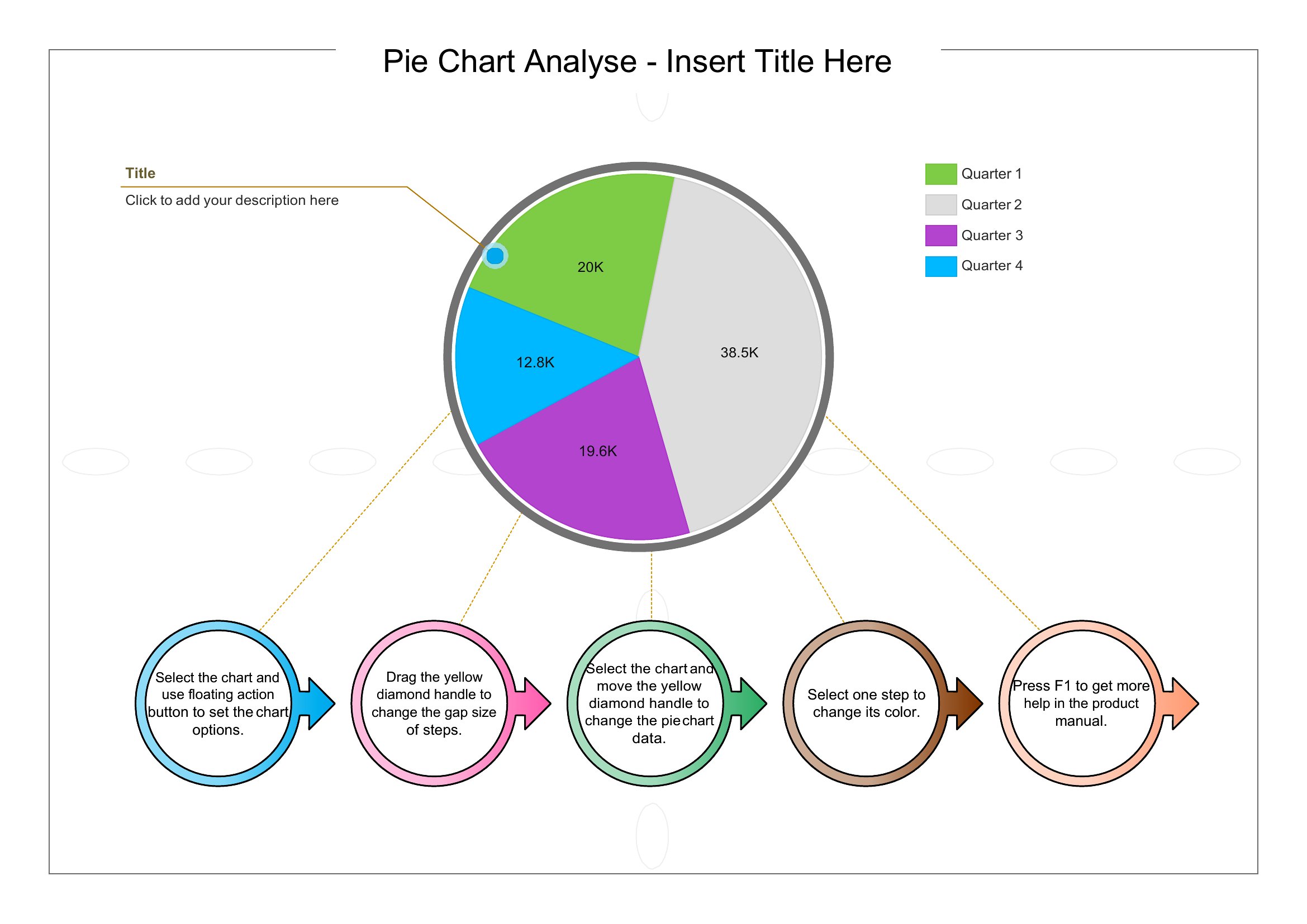
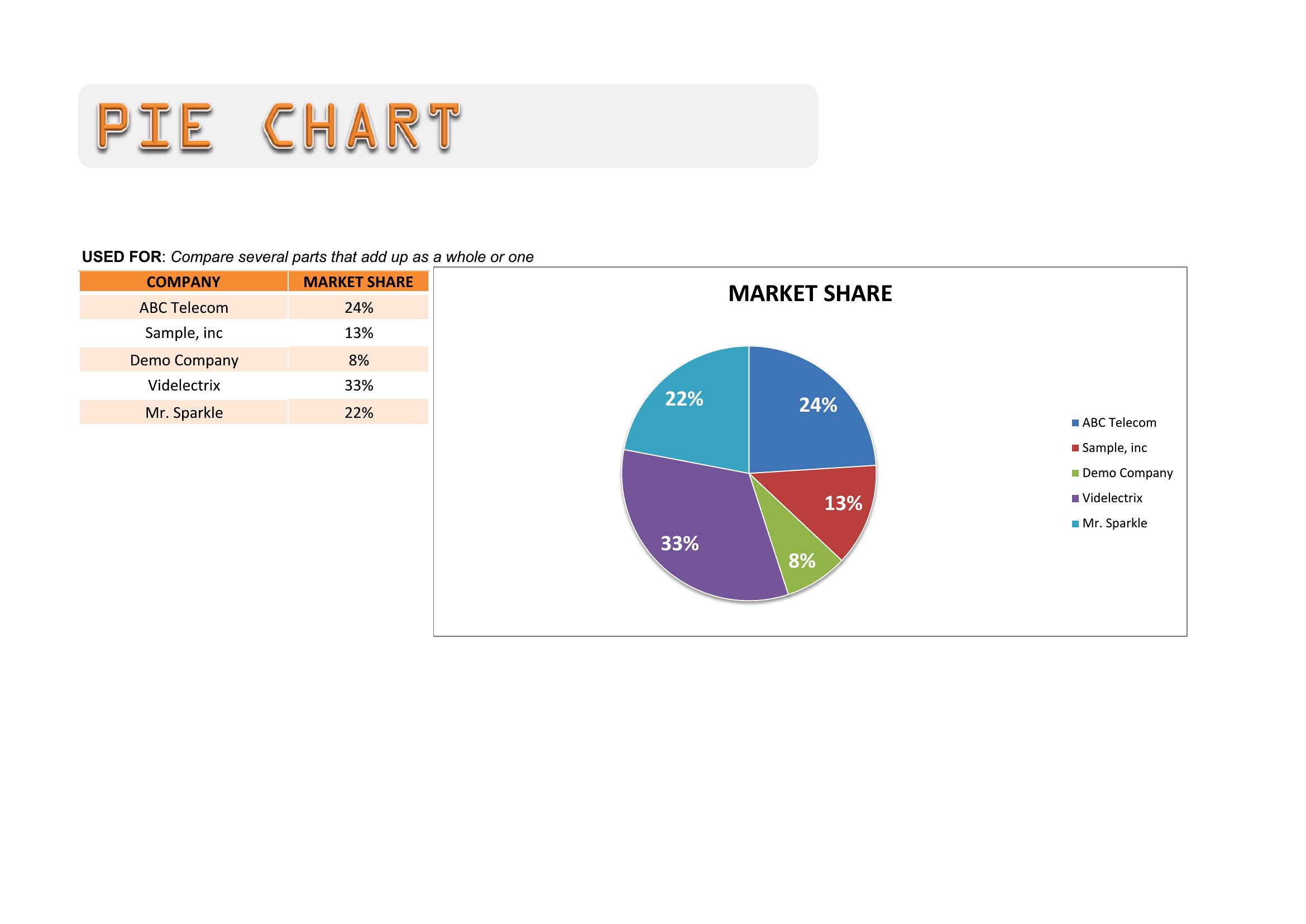
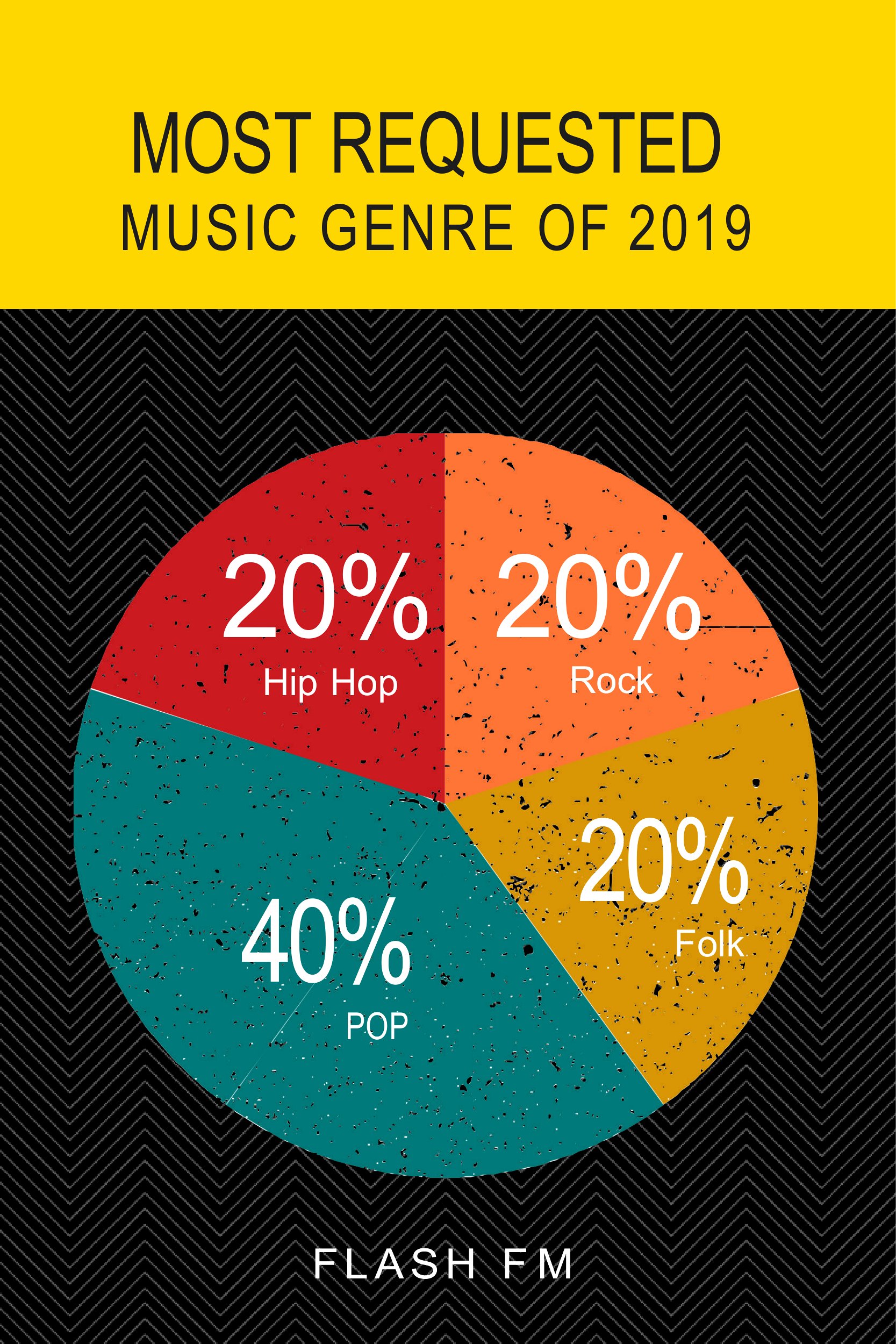
Music Pie Chart

Frequently Asked Questions about Pie Chart Templates
Are these Pie Chart templates free to download?
Yes. Every Pie Chart template in this collection is free to download from TemplateSpark. Just open the template you need, download it, and start editing right away — no subscription required to get started.
What file formats are available for Pie Chart templates?
These Pie Chart templates are available in PDF. Pick the format that matches your workflow — each download keeps the original layout so it looks right whether you open, print, or share it.
Can I edit or fill in these Pie Chart PDF templates?
These Pie Chart templates are print-ready PDFs. You can fill them in with any PDF reader or print and complete them by hand — ideal when you want a clean, consistent layout without changing the original design.
How many Pie Chart templates can I choose from?
This page collects 54 Pie Chart templates so you can compare styles and layouts in one place. Browse the options, open the one that fits your purpose best, and download it in your preferred format.
Can I use Pie Chart templates for commercial purposes?
In most cases, yes — these Pie Chart templates are intended for both personal and business use. Check the license note on the template before redistributing or reselling, and avoid sharing the source files as your own product.
When is a pie chart the best choice for showing data?
A pie chart works best when showing parts of a single whole, such as how a budget divides across categories or how survey responses split among a few options. It is most effective with a small number of slices that together add up to one hundred percent.
How do you calculate the angles for a pie chart?
Each slice's angle equals its share of the total multiplied by 360 degrees. Divide a category's value by the sum of all values, then multiply by 360. For example, a category representing 25 percent of the total occupies a 90-degree slice of the circle.
What are common mistakes to avoid with pie charts?
Avoid using too many slices, which makes proportions hard to compare, and skip pie charts when values are close in size. Comparing multiple pie charts is also difficult. In those cases, a bar chart usually communicates differences more clearly than a circle divided into segments.
Comments
Join the conversation
Sign in to share your thoughts and leave a comment on this resource.