Free Bar Graph Templates (Word, Excel, PDF)
Data by sedefhamzaoglu
Bar graphs make numbers easy to compare at a glance, which is why they show up everywhere from classrooms to boardrooms. This collection of 42 templates gives students, teachers, and professionals ready-made charts and worksheets for plotting data without building axes from scratch.
The Excel versions update the bars automatically as you enter values, the Word files drop neatly into reports, and the PDFs print as blank grids for hand-drawn practice. Add your categories and figures, and the graph takes shape. It's free and works for a math lesson, a science fair, or a quarterly review. Choose the format that fits your task and turn your data into a clear, readable chart.
Choose from 42 Bar Graph Templates
A Bar Graph
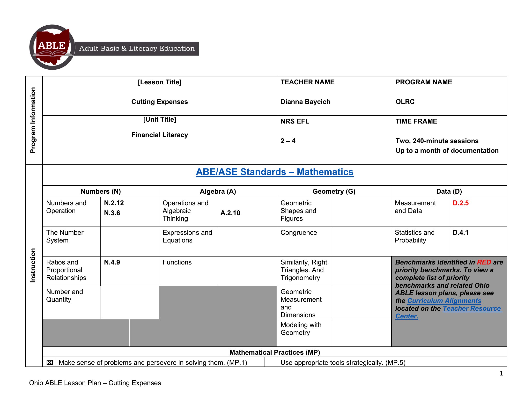
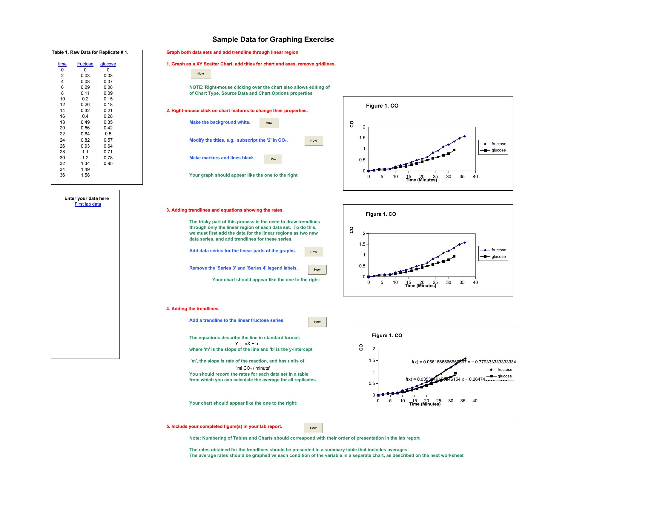
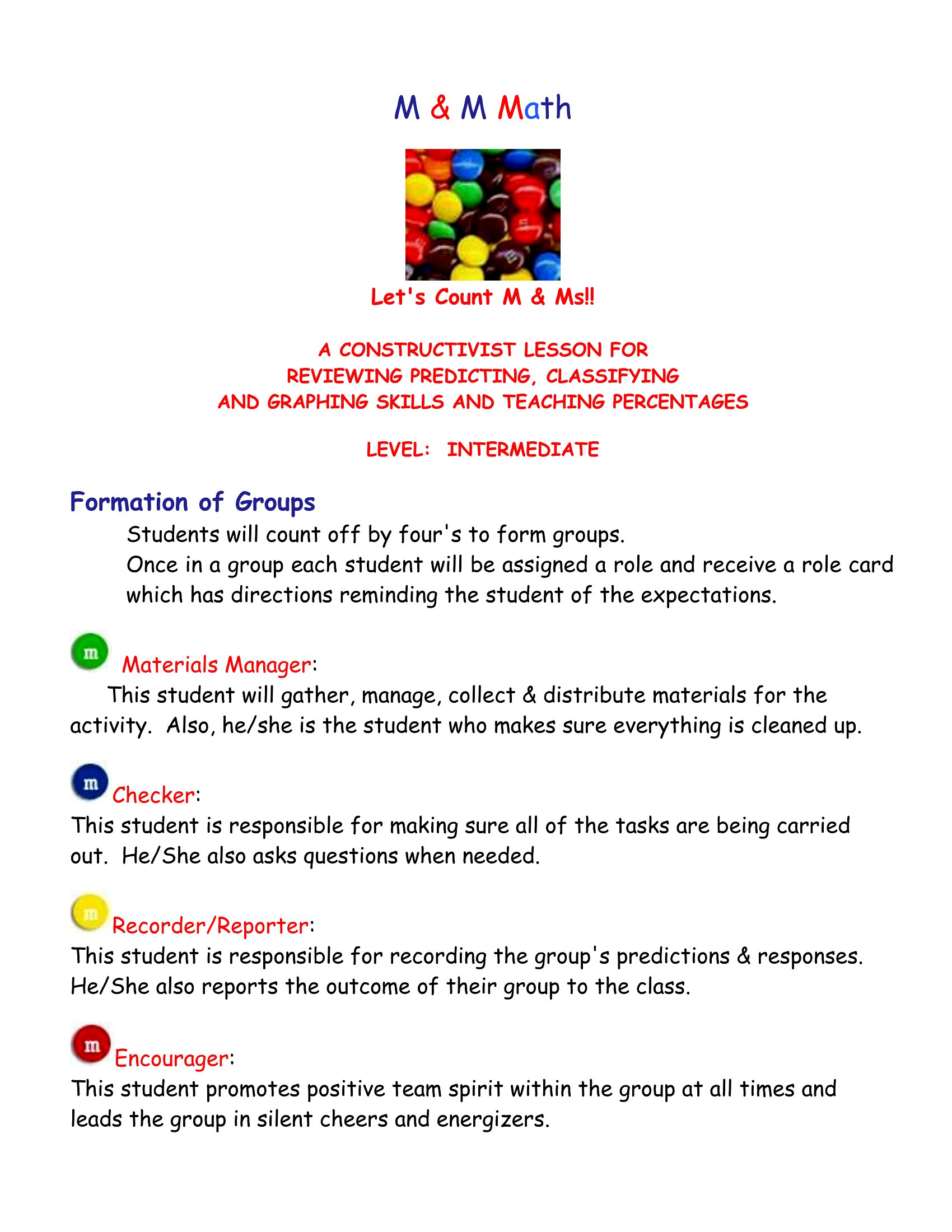
Simple Bar Graph
Bar Graph Tutorial
Bar Graphing
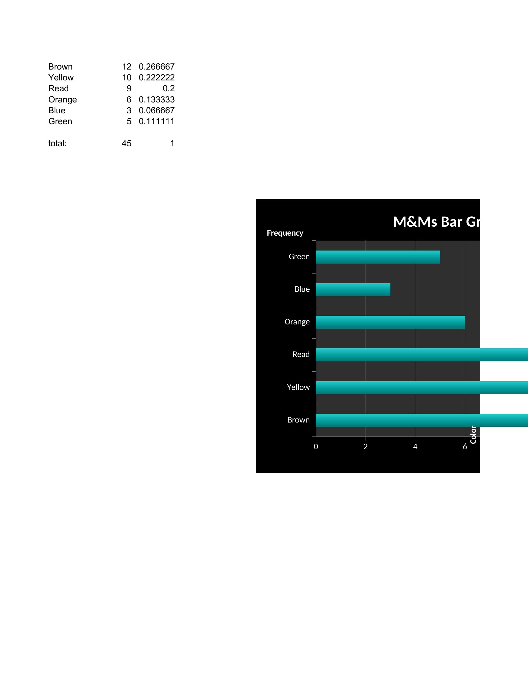
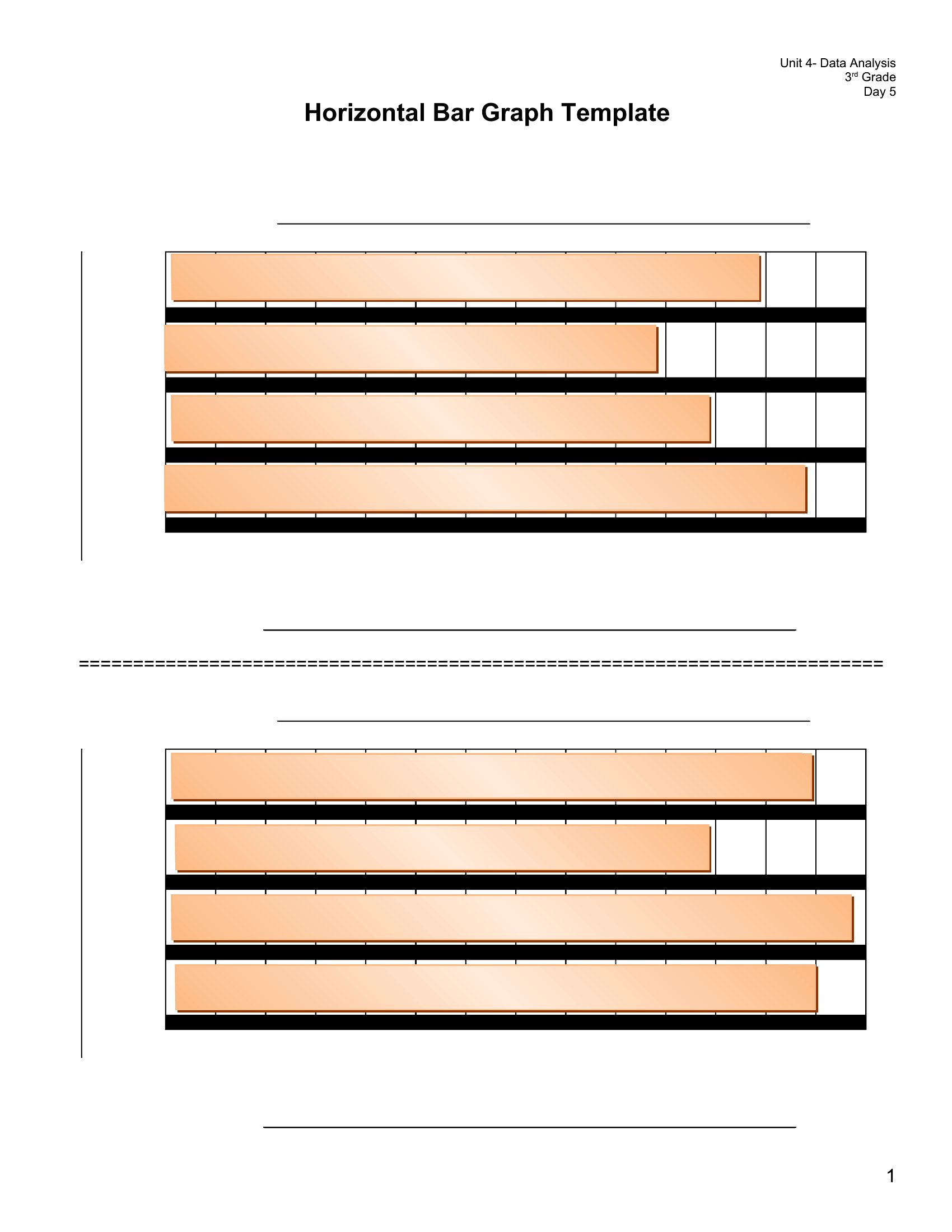
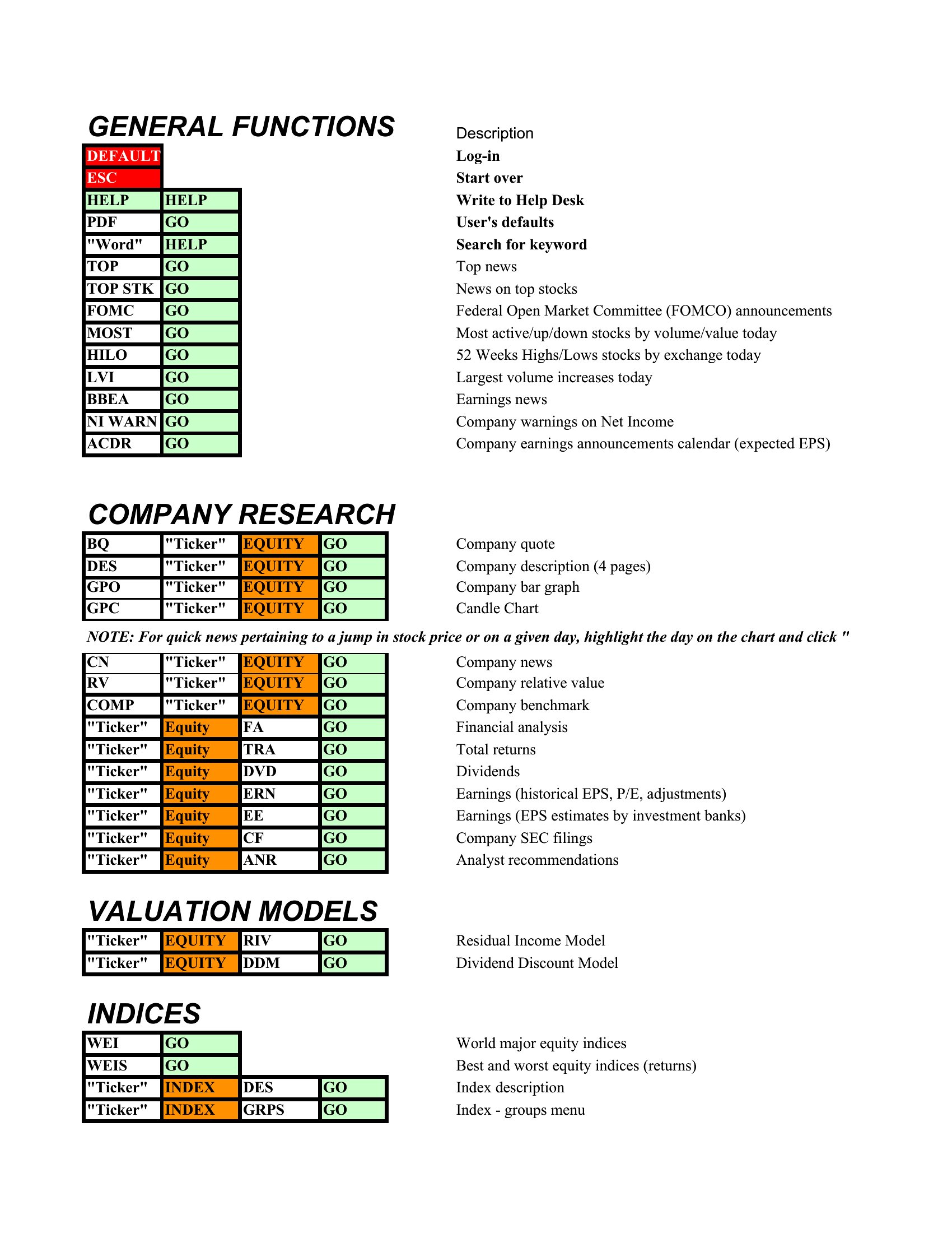
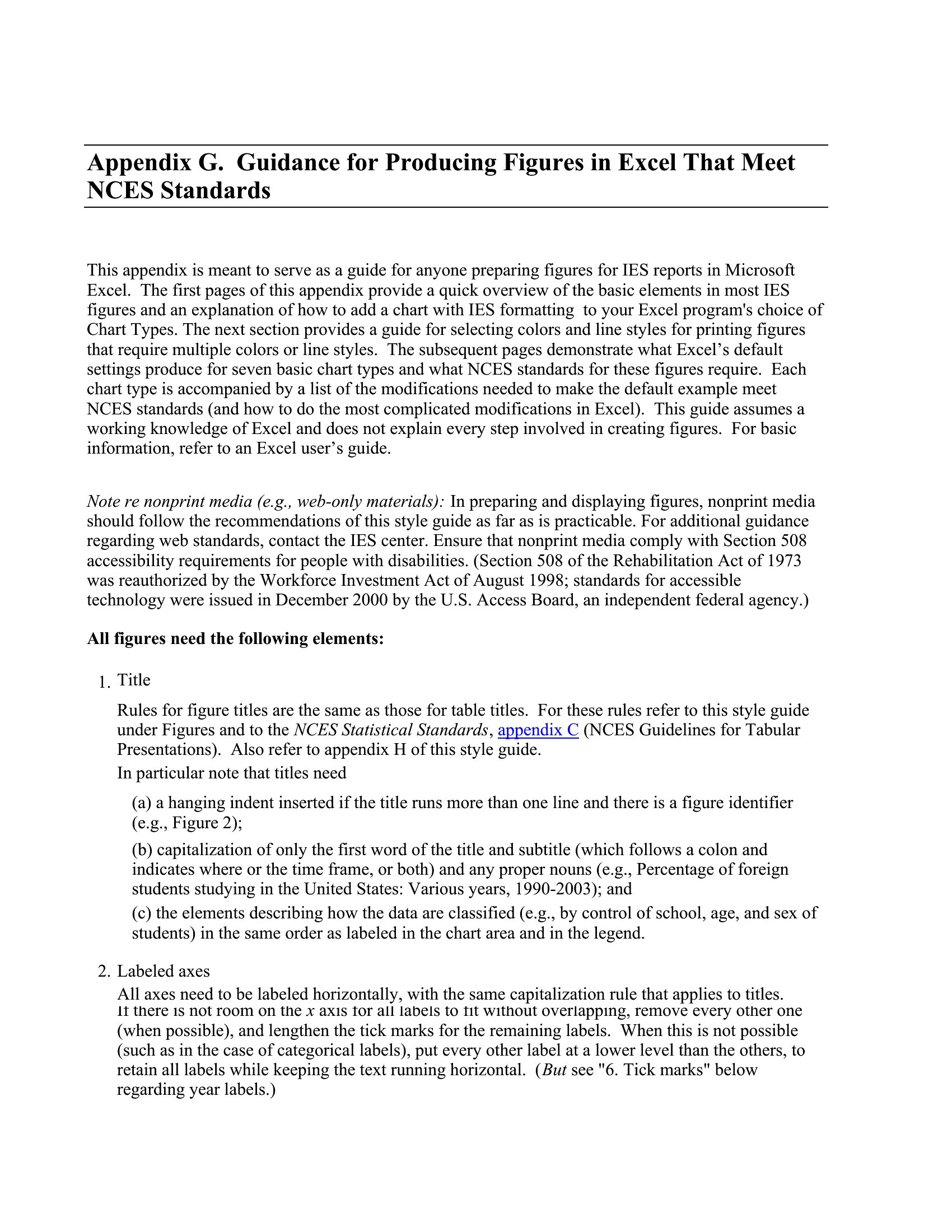
Bar Graph Chart
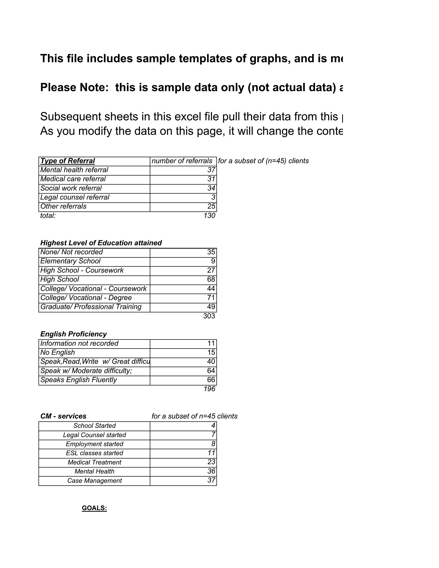
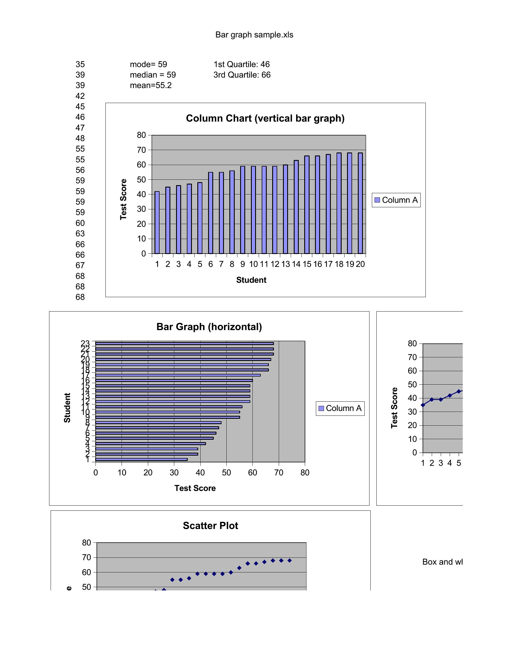
Bar Graph Sample
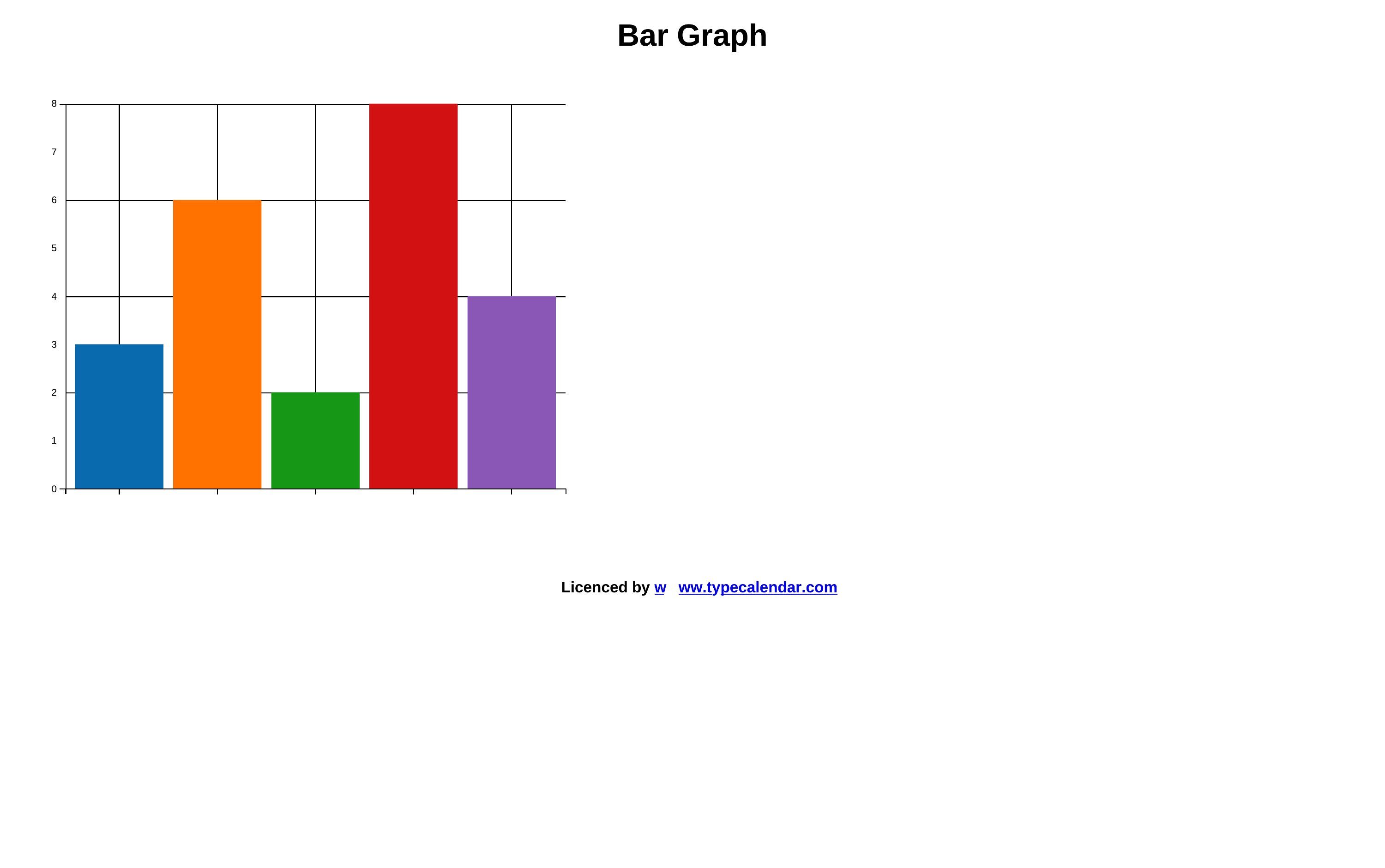
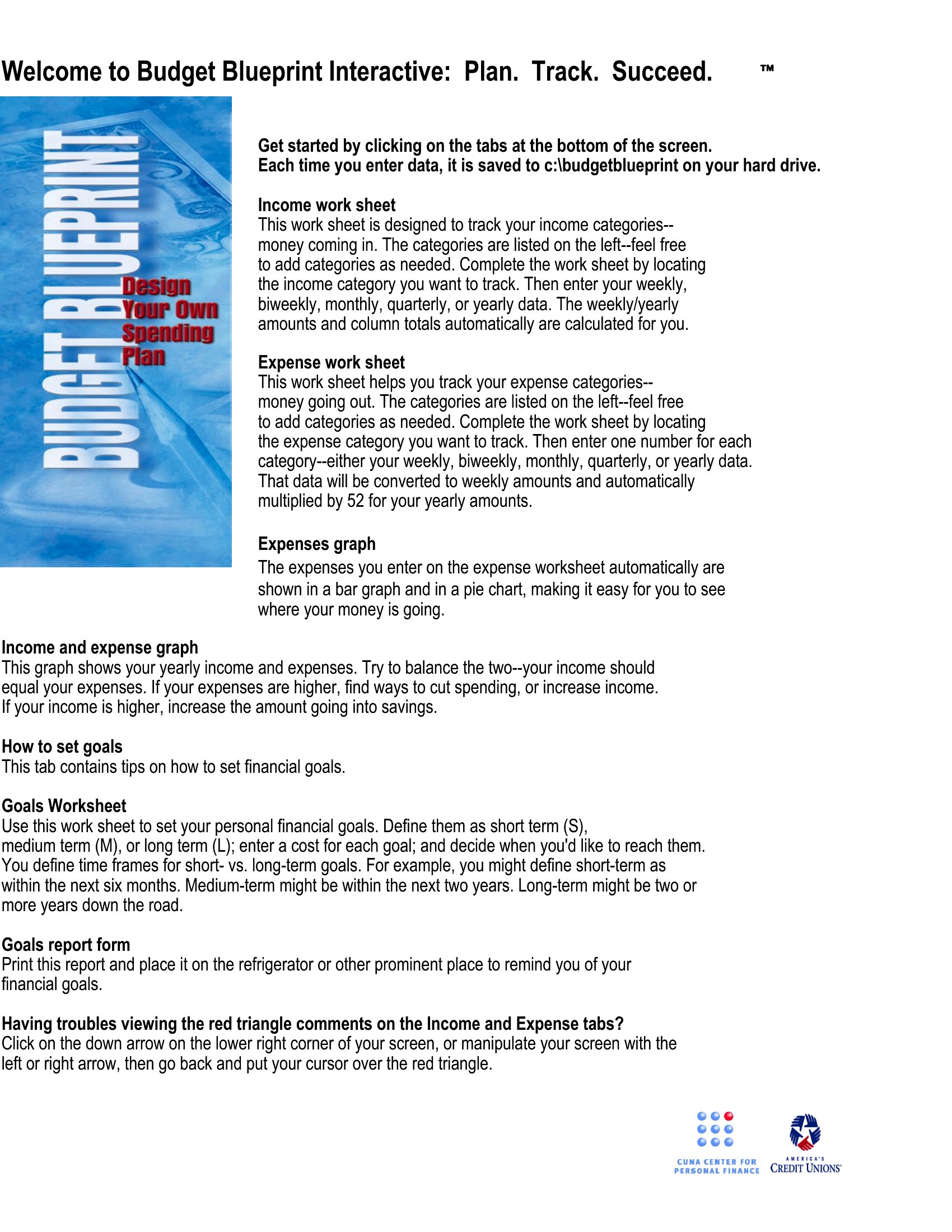
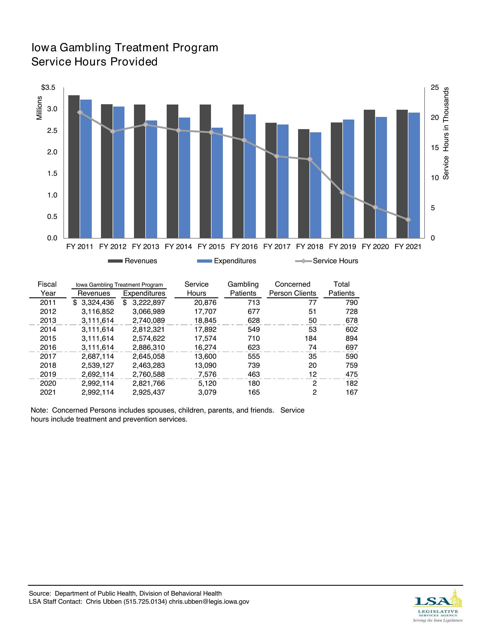
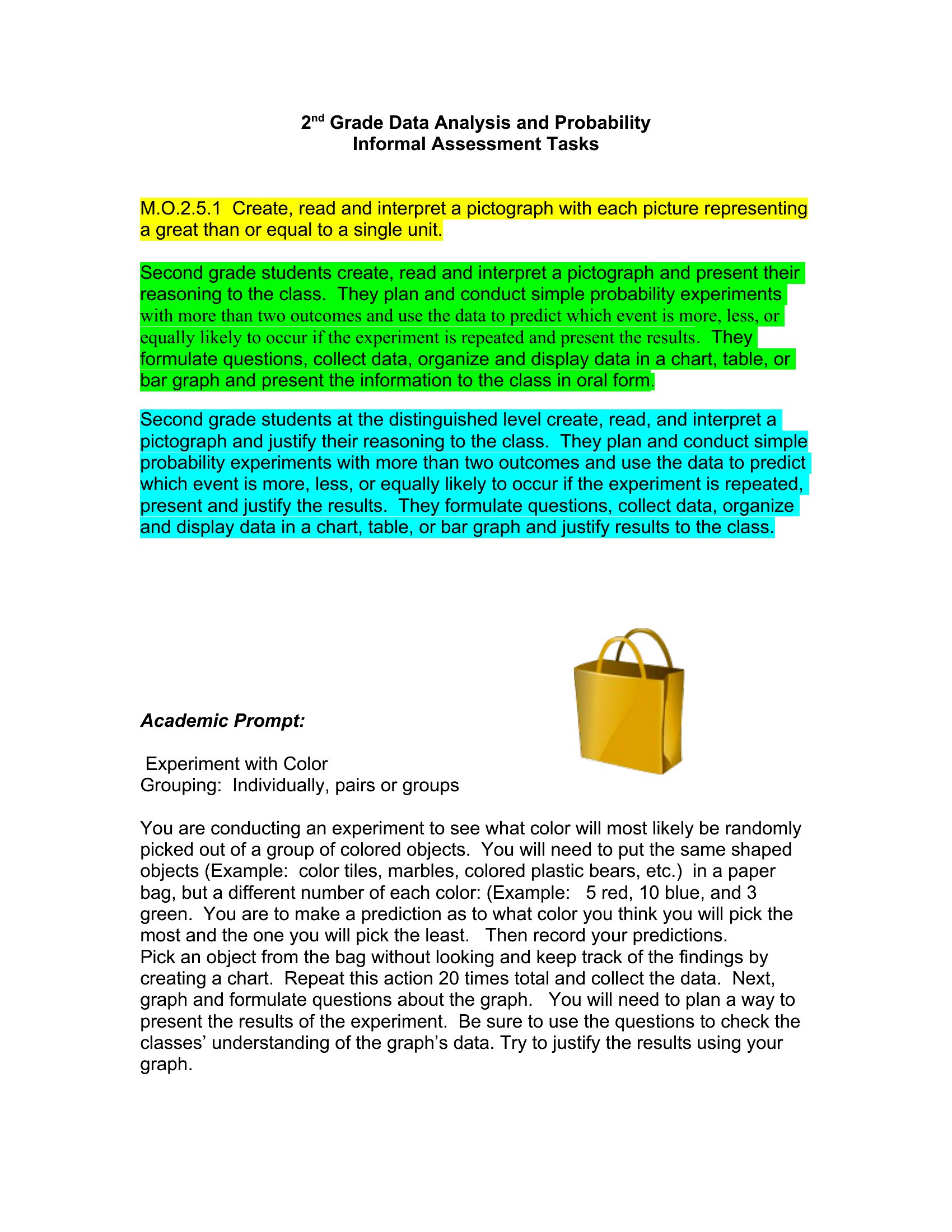
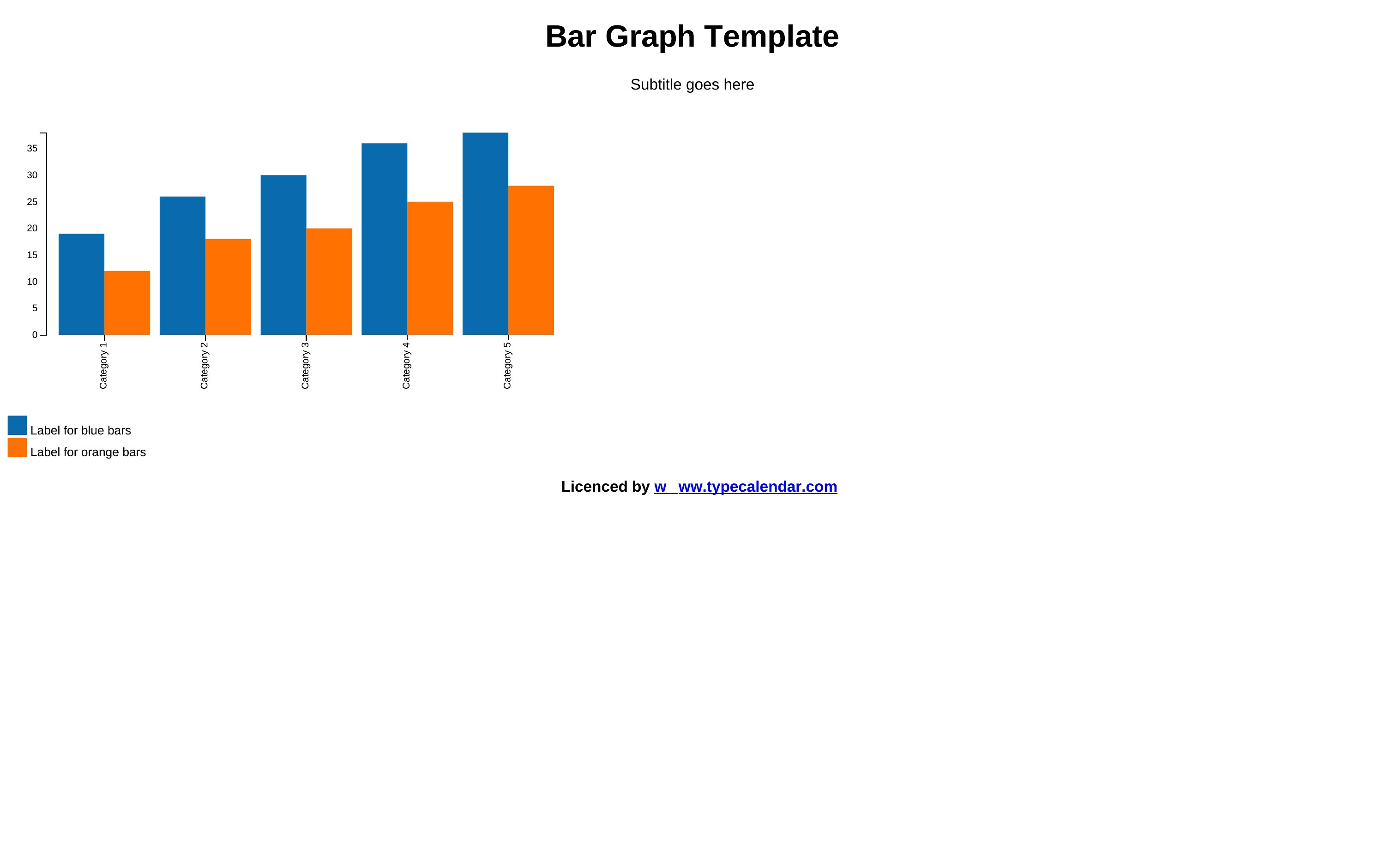
Bar Graphs
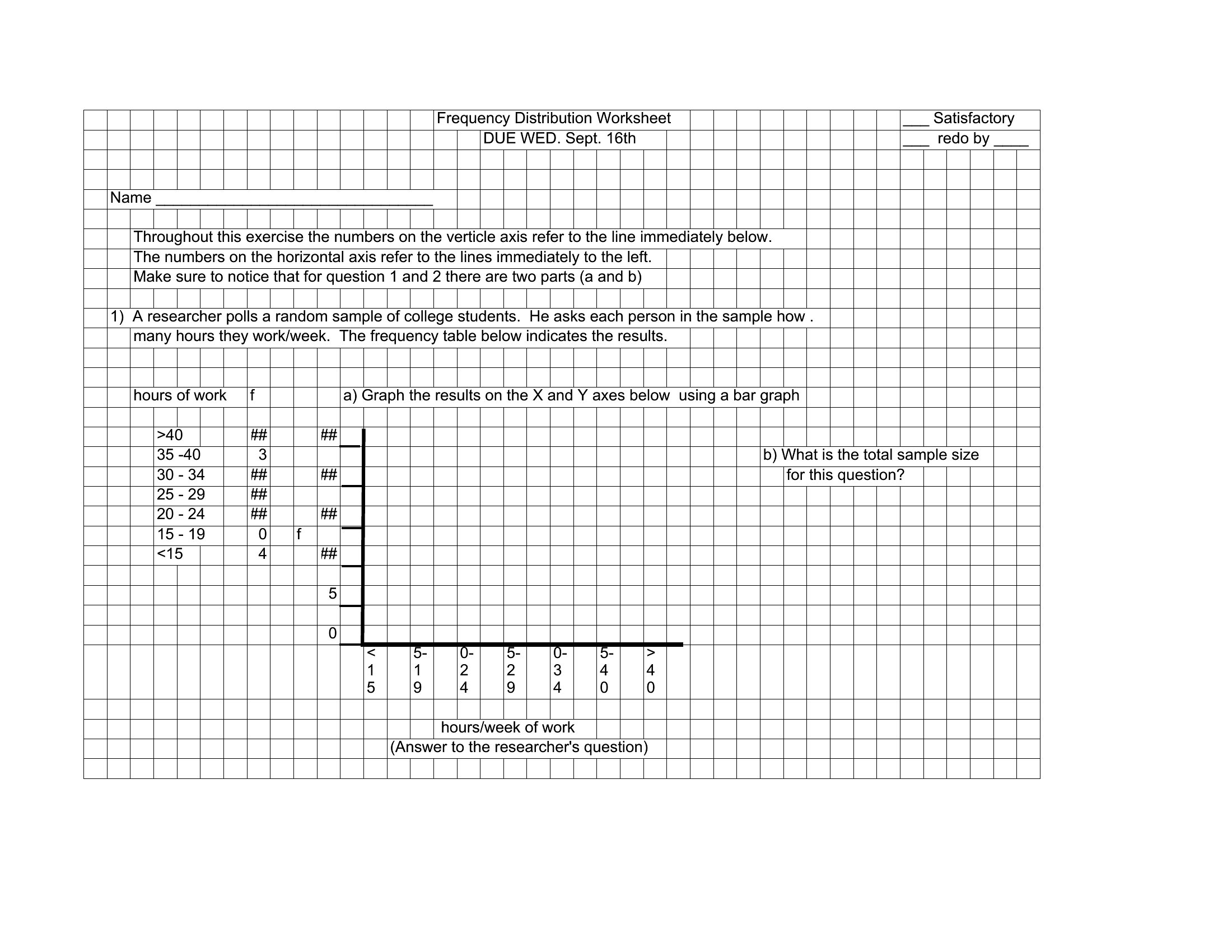
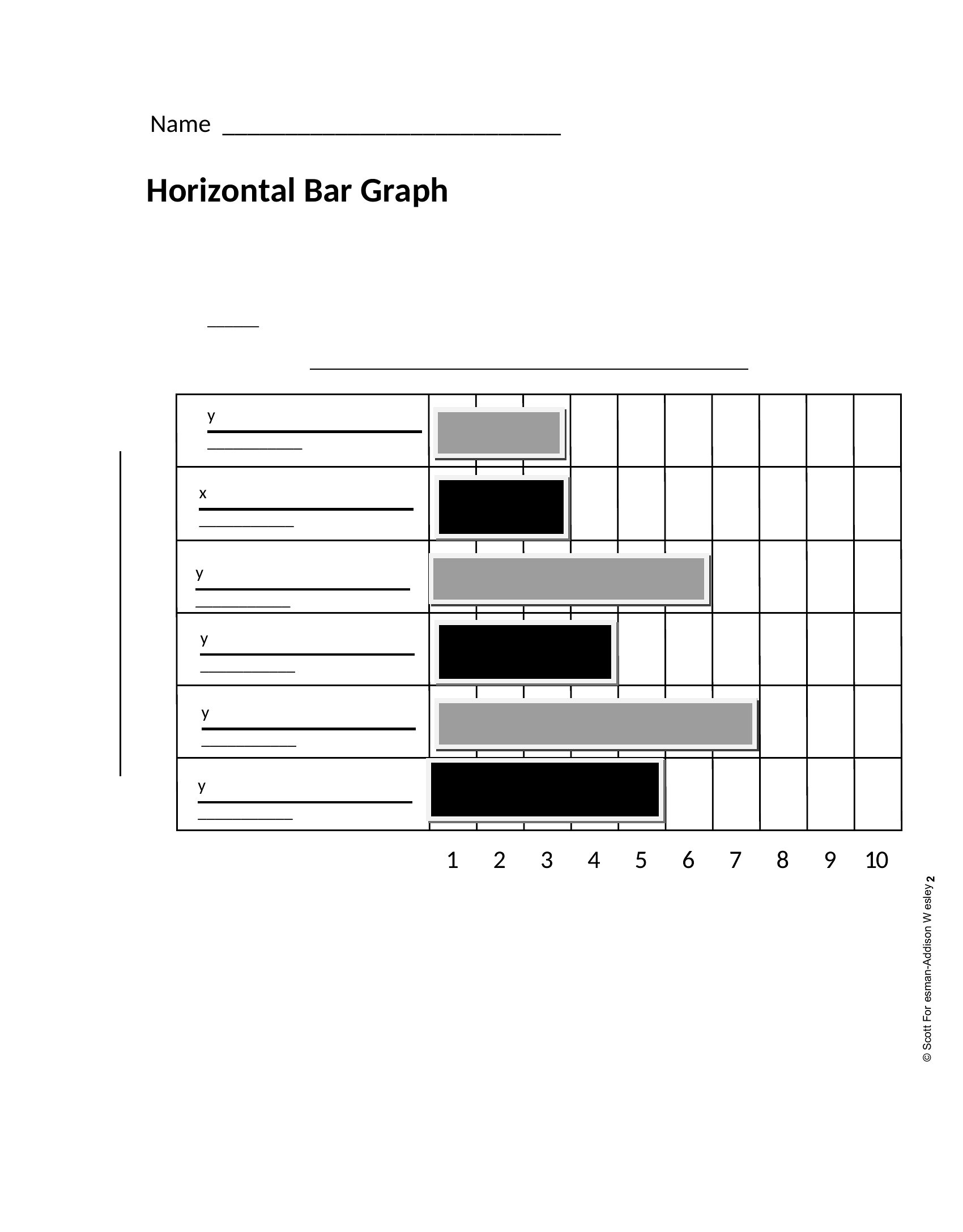
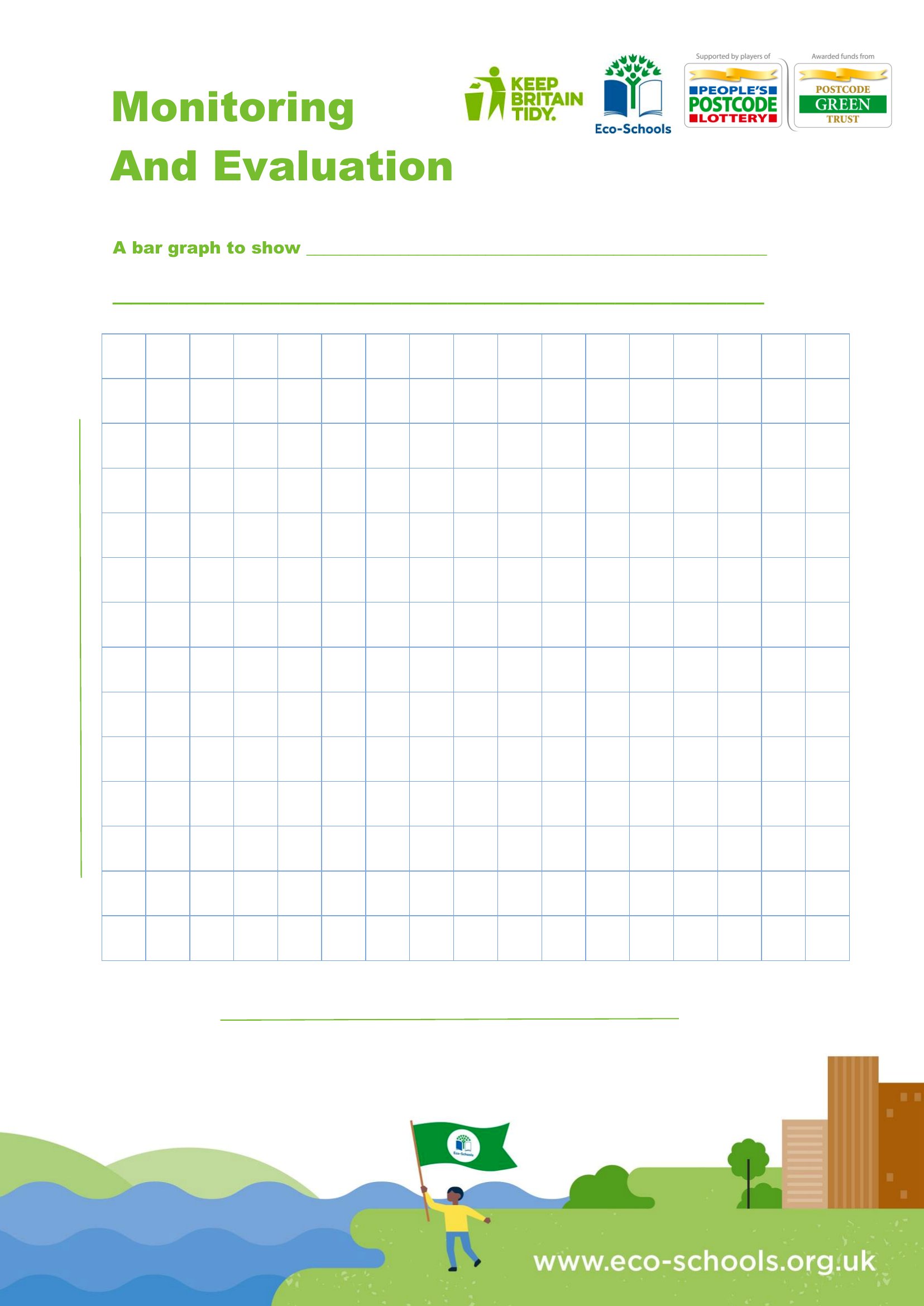
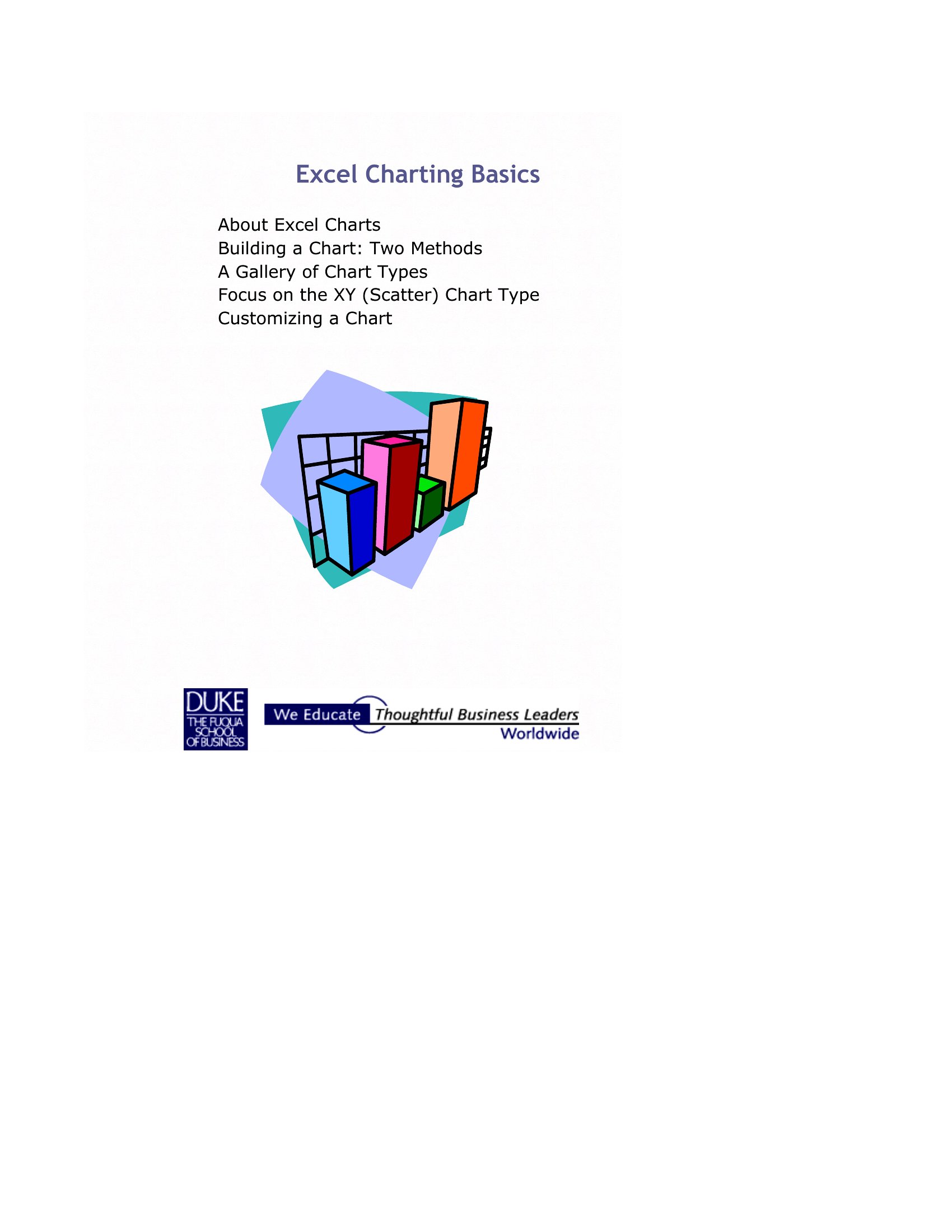
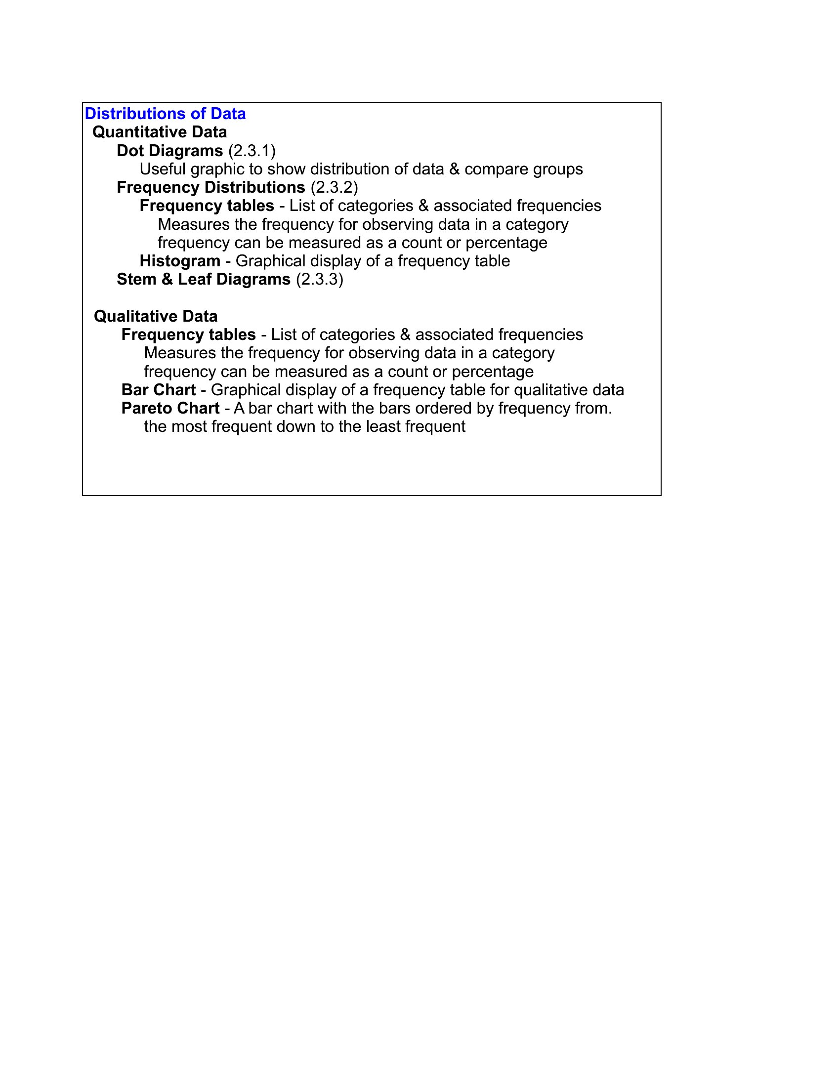
Bar Graph Design
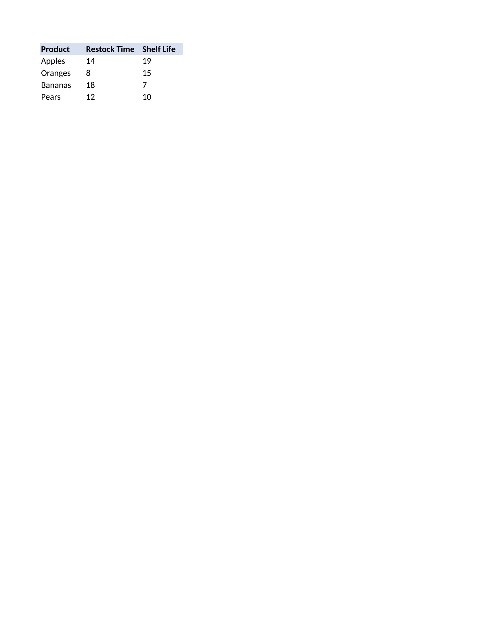
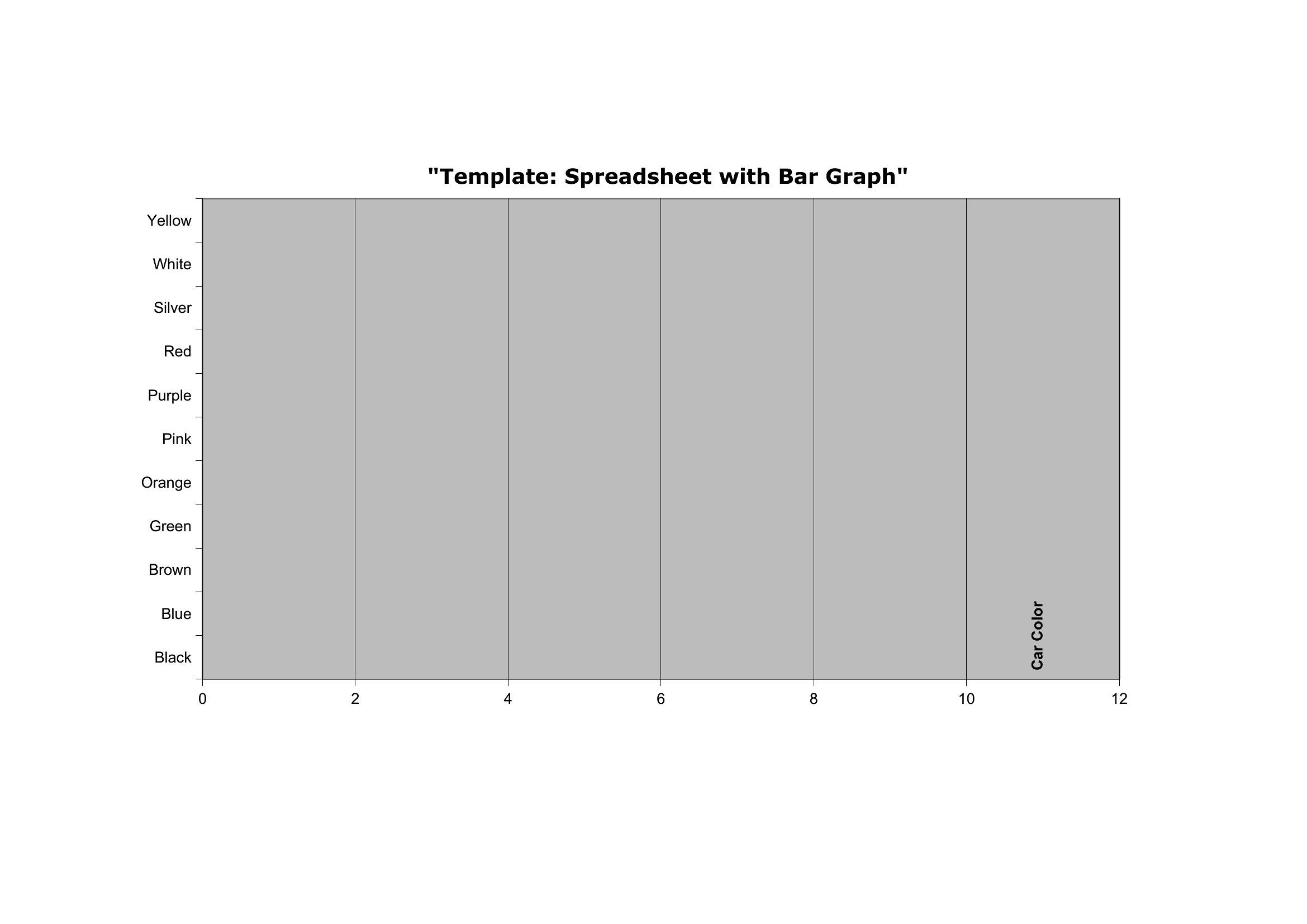
Bar Chart Pdf
Frequently Asked Questions about Bar Graph Templates
Are these Bar Graph templates free to download?
Yes. Every Bar Graph template in this collection is free to download from TemplateSpark. Just open the template you need, download it, and start editing right away — no subscription required to get started.
What file formats are available for Bar Graph templates?
These Bar Graph templates are available in Word, Excel, and PDF. Pick the format that matches your workflow — each download keeps the original layout so it looks right whether you open, print, or share it.
Can I edit these Bar Graph templates?
Yes. The editable files open in Microsoft Word (and compatible apps like Google Docs or LibreOffice), so you can change the text, colors, and layout to fit your needs, then save or export the finished Bar Graph document.
How many Bar Graph templates can I choose from?
This page collects 42 Bar Graph templates so you can compare styles and layouts in one place. Browse the options, open the one that fits your purpose best, and download it in your preferred format.
Can I use Bar Graph templates for commercial purposes?
In most cases, yes — these Bar Graph templates are intended for both personal and business use. Check the license note on the template before redistributing or reselling, and avoid sharing the source files as your own product.
What is a bar graph used for?
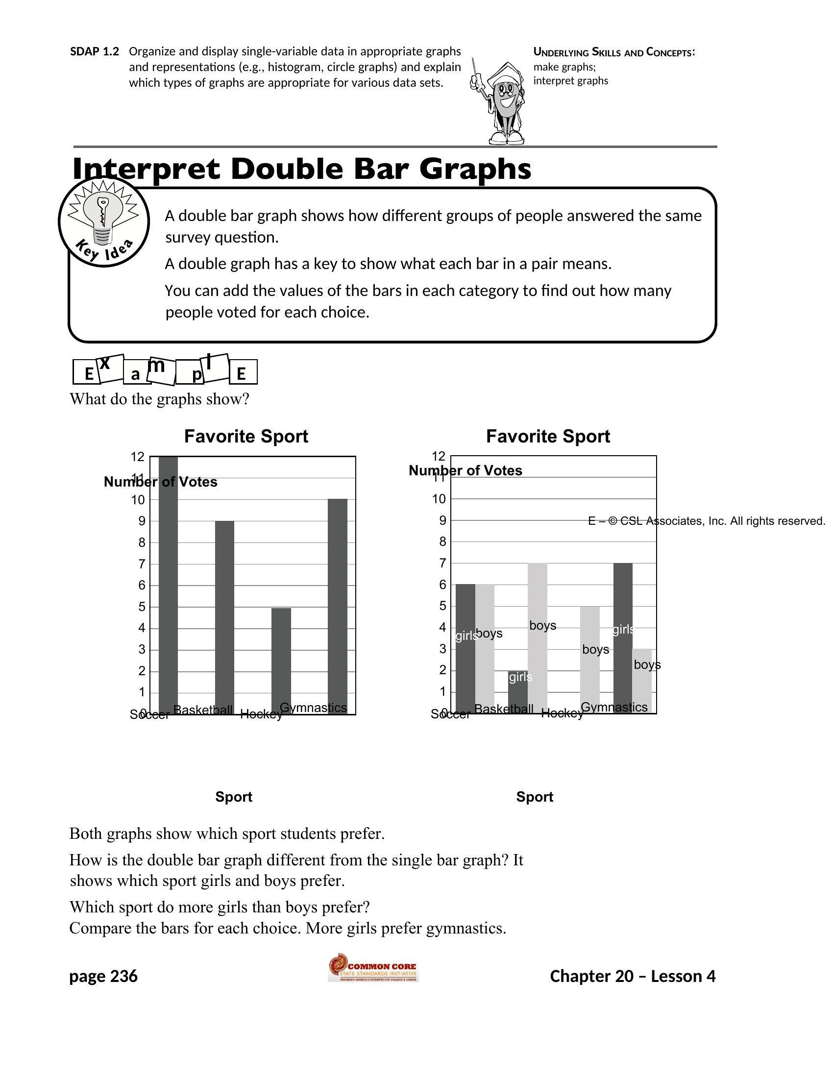
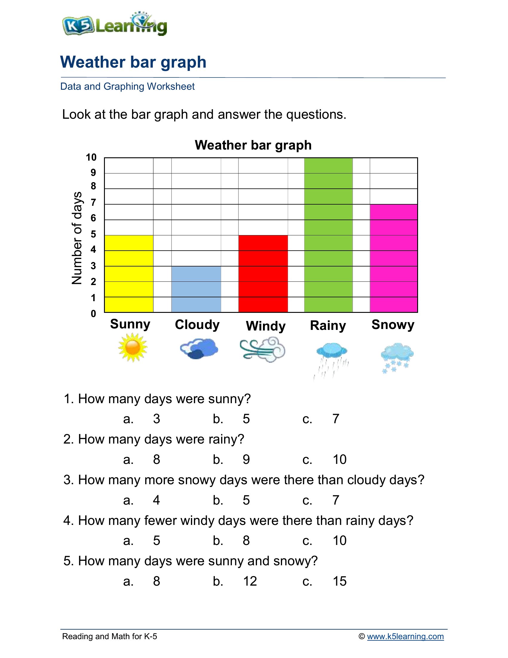
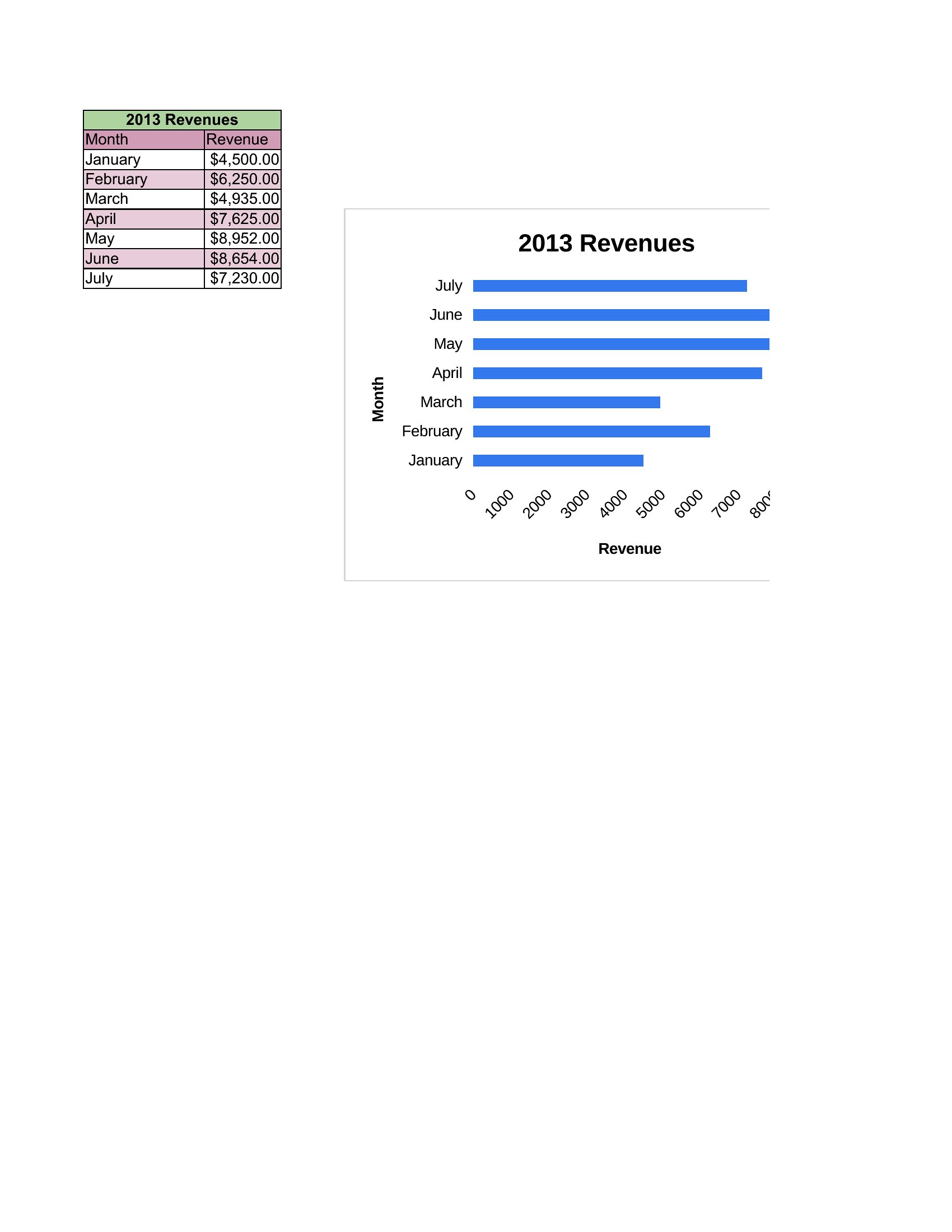
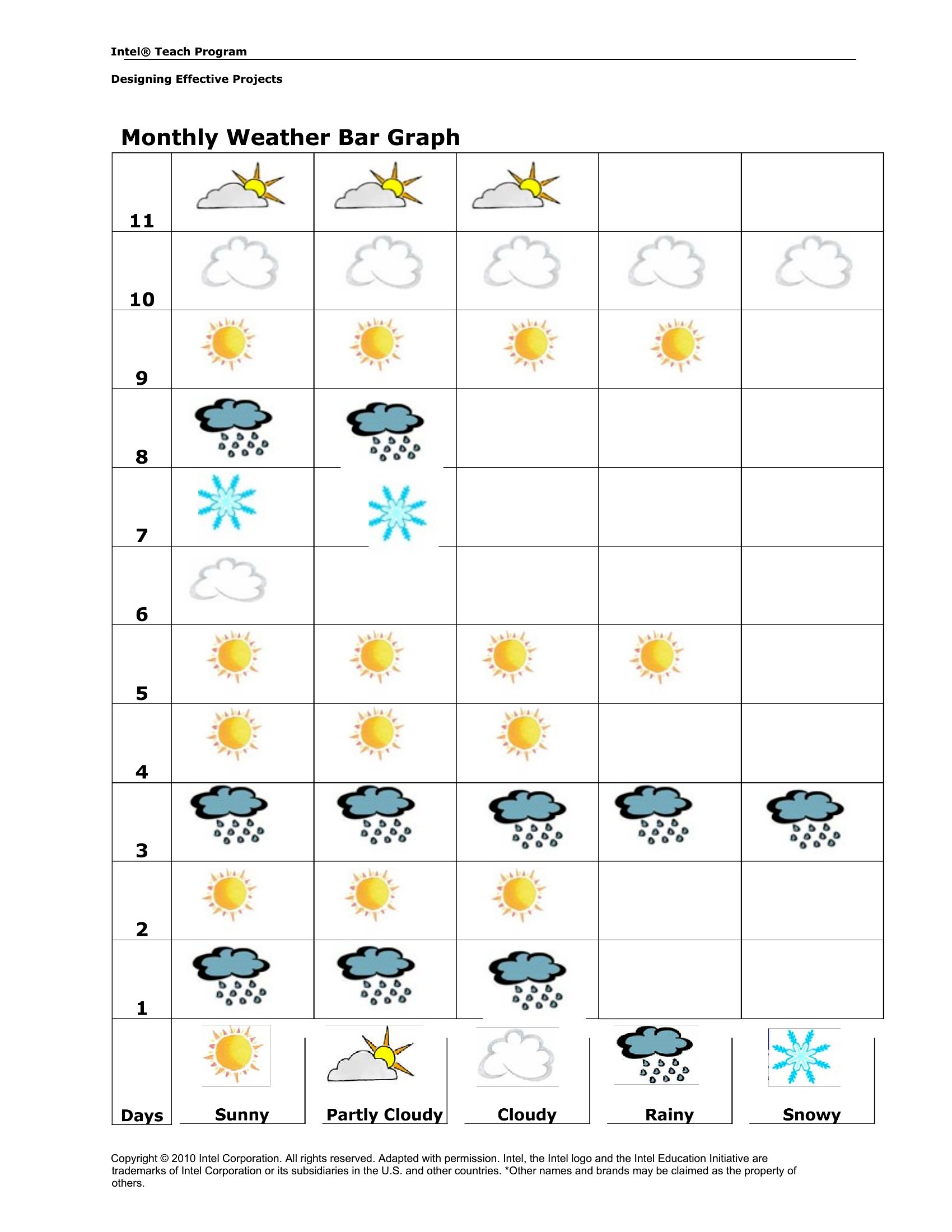
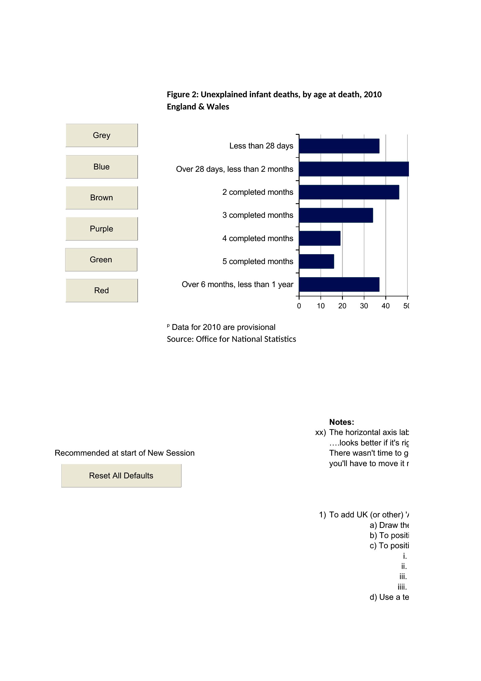
A bar graph displays data using rectangular bars whose lengths represent values, making it easy to compare categories at a glance. It is widely used in classrooms and workplaces to show quantities, frequencies, or comparisons clearly. Bar graphs work best for distinct categories rather than continuous data over time.
What are the key parts of a bar graph?
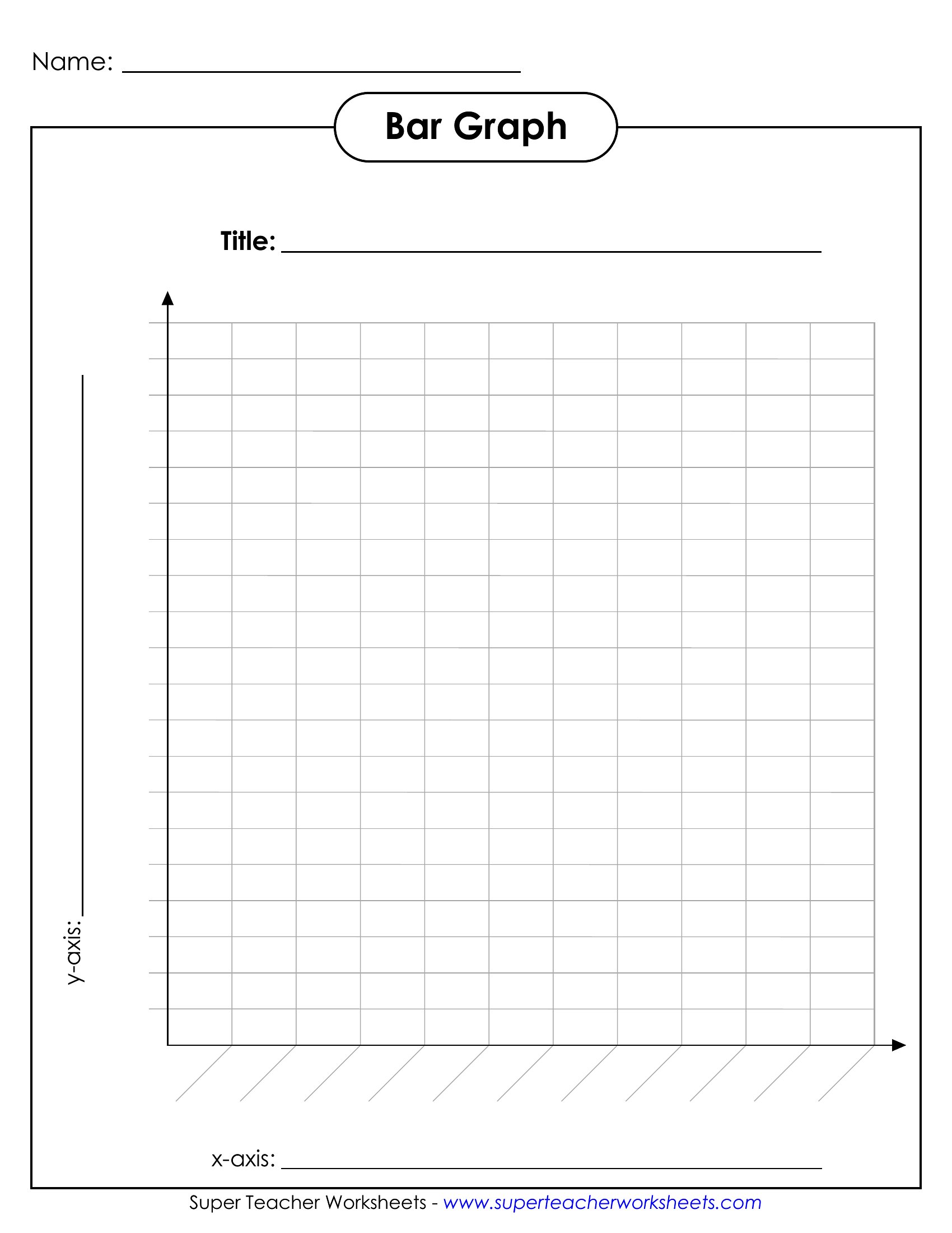
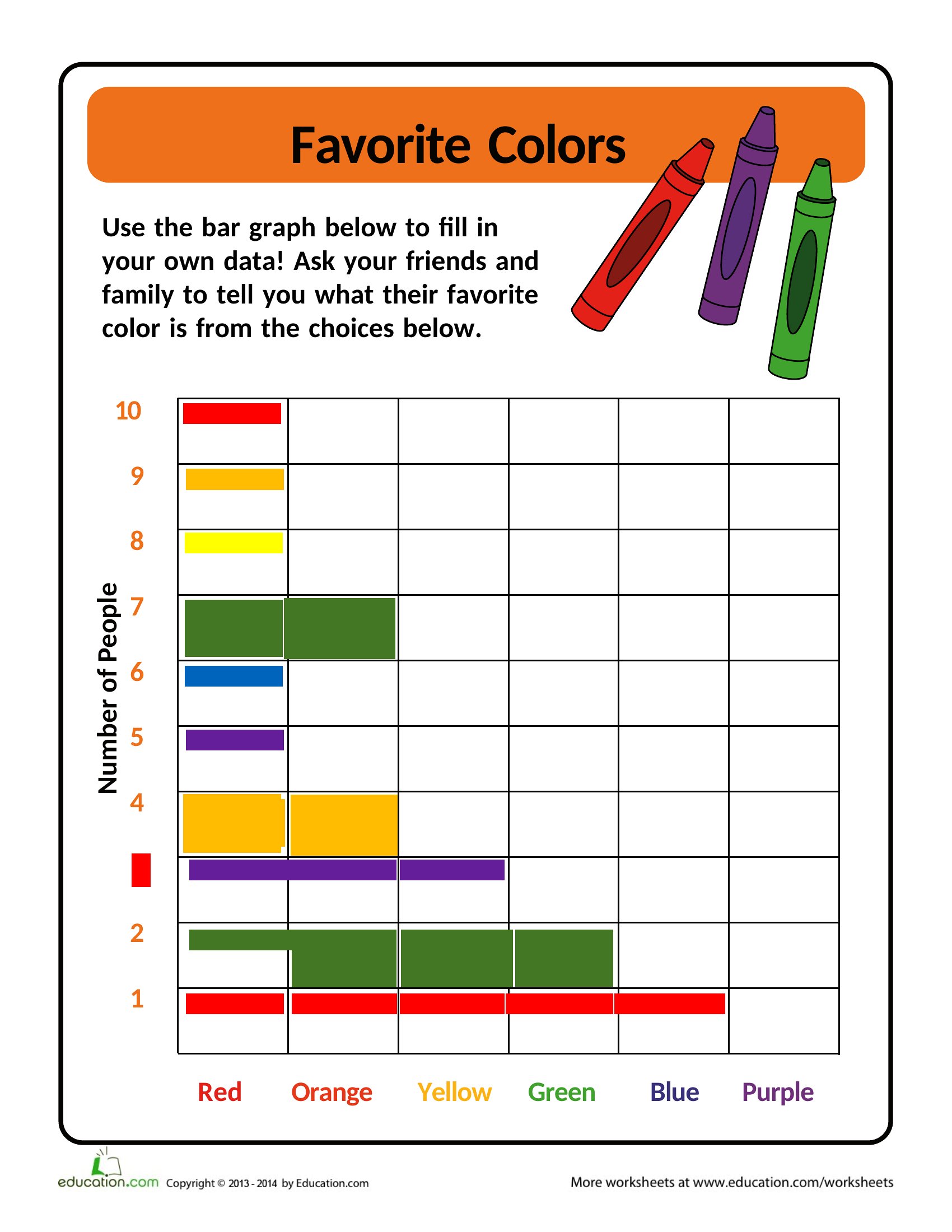
A bar graph includes a title, a horizontal axis and a vertical axis with labels, a consistent scale, and bars representing each category. Clear axis titles and units help readers interpret the values. A legend is useful when comparing grouped or multiple data series in one chart.
What is the difference between a bar graph and a histogram?
A bar graph compares distinct categories, with gaps between bars, while a histogram shows the distribution of continuous data grouped into ranges, with bars touching. Use a bar graph for separate groups and a histogram when displaying how numeric data is spread across intervals.
Comments
Join the conversation
Sign in to share your thoughts and leave a comment on this resource.